Effective countertop blender packaging design serves a dual purpose: safeguarding sophisticated machinery while captivating the modern consumer's eye. As high-performance blenders transition from simple appliances to kitchen status symbols, their packaging must communicate power, versatility, and aesthetic refinement simultaneously.
This exploration delves into the essential concepts of structural integrity, ensuring that heavy glass jars and high-torque motors remain secure during transit. Furthermore, we analyze the visual aesthetics that define market leaders-ranging from vibrant, high-resolution food photography to minimalist typography that reflects a premium brand identity.
By balancing protective engineering with strategic graphic communication, manufacturers create an unboxing experience that resonates with health-conscious shoppers. Understanding these design pillars is crucial for achieving superior shelf presence and ensuring functional durability in the modern retail landscape.
The Fundamentals of Modern Blender Packaging Design
Modern countertop blender packaging integrates structural durability with high-impact visual communication. Because these appliances contain heavy motor bases and fragile jars, the primary design fundamental is protective engineering. Utilizing reinforced corrugated cardboard and custom-molded inserts ensures the product remains secure during transit.
Effective packaging also prioritizes shelf appeal and information hierarchy. Designers use high-resolution graphics to showcase blending power and clearly list technical specifications like wattage and blade material. Key design elements include:
- Sustainable Materials: Transitioning to recyclable pulp and eco-friendly inks.
- Unboxing Experience: Intuitive layouts that simplify component assembly.
- Brand Consistency: Cohesive typography and imagery that reflect product quality.
By balancing functional protection with aesthetic storytelling, manufacturers enhance the consumer's perceived value and ensure the blender arrives in pristine condition.
Defining Visual Identity Through Brand Consistency
In the competitive countertop blender market, establishing a distinct visual identity is paramount for market differentiation. Brand consistency ensures that every design element-from the tactile feel of control toggles to the signature silhouette of the motor base-aligns with the company's core values.
A cohesive design language utilizes uniform color palettes, premium materials like brushed stainless steel, and recurring industrial motifs. This aesthetic harmony fosters brand recognition and consumer trust. When a blender maintains consistent visual cues, it transcends utility, becoming a recognizable kitchen centerpiece.
For manufacturers, this strategic alignment reinforces perceived quality. Whether a consumer selects a professional-grade model or a compact personal blender, a consistent visual identity ensures the brand remains unmistakable, authoritative, and premium within the modern kitchen landscape.
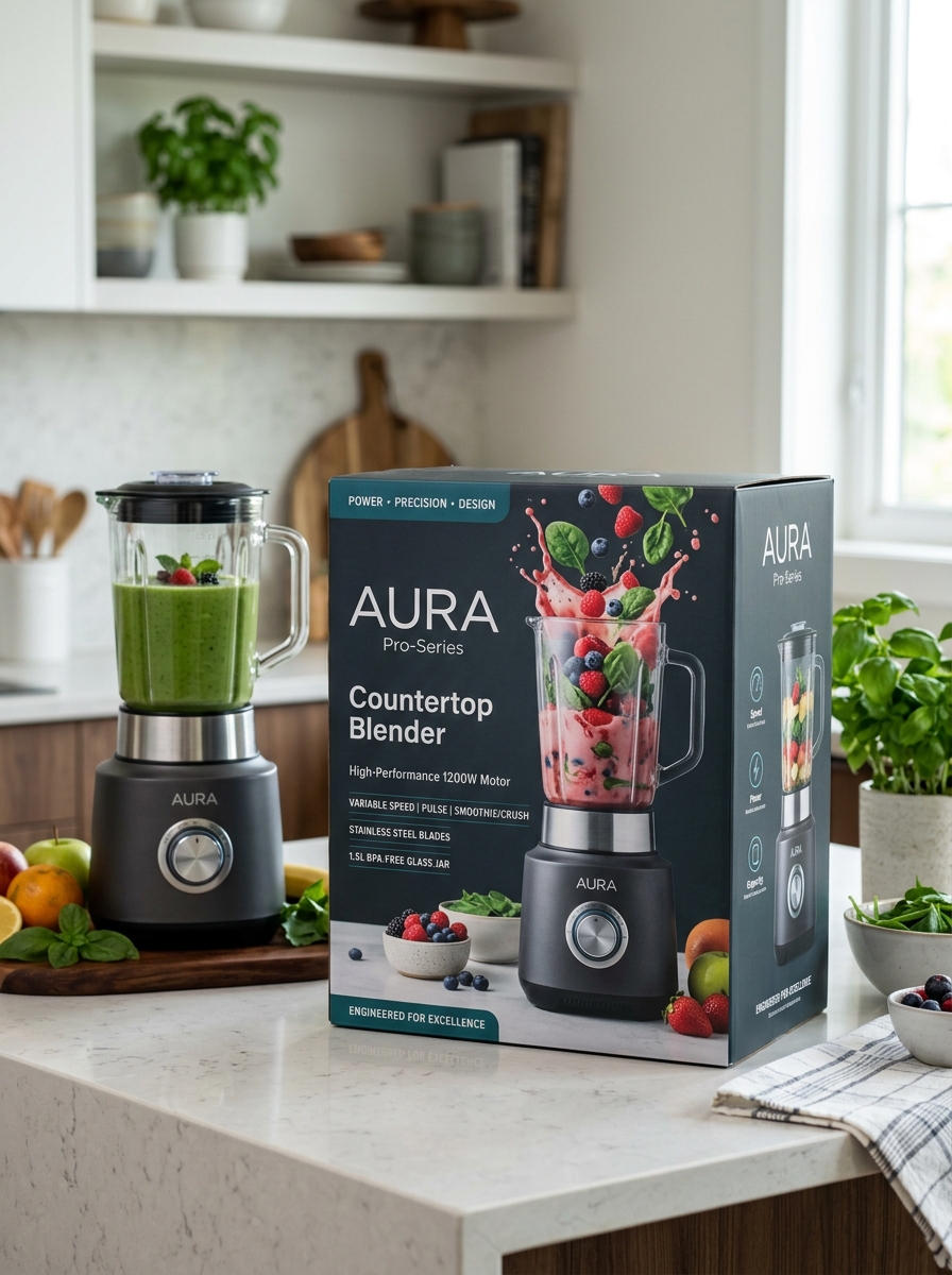
High Resolution Product Photography and Angle Selection
High-resolution photography is essential for showcasing the build quality and sophisticated features of a countertop blender. Sharp, detailed imagery allows consumers to inspect the texture of the motor base, the clarity of the BPA-free jar, and the precision of the stainless-steel blades.
Effective angle selection provides a comprehensive view of the appliance:
- The Hero Shot (45-degree angle): Adds depth and shows both the front controls and the side profile.
- Eye-Level View: Focuses on the interface, highlighting tactile buttons or digital touchscreens.
- Top-Down Perspective: Ideal for displaying the blade assembly and internal capacity.
- Macro Close-ups: Emphasizes material durability and safety seals.
By combining high pixel density with strategic perspectives, brands can communicate power and reliability, ultimately driving higher conversion rates in competitive e-commerce markets.
Structural Integrity and Protective Interior Engineering
The longevity of a high-performance countertop blender depends on its structural integrity and the engineering of its internal components. Robust construction starts with a heavy-duty base and reinforced jars made from BPA-free Tritan™ or tempered glass, designed to withstand the kinetic energy of high-speed blade rotations.
Protective interior engineering focuses on motor durability and thermal management. Advanced models utilize all-metal drive systems instead of plastic couplings to ensure efficient torque transfer without stripping. Internally, integrated cooling fans and strategic airflow vents prevent the motor from overheating during heavy-duty tasks like grinding grains or crushing ice. Additionally, built-in thermal protection sensors automatically shut down the unit if temperatures spike, safeguarding the circuitry. This combination of vibration-dampening mounts and shielded electronics ensures the blender remains stable and functional under intense culinary demands.
Typography Strategies for Technical Specification Clarity
Effective typography is essential for communicating complex countertop blender specifications such as motor wattage, blade RPM, and jar capacity. To ensure clarity, prioritize sans-serif typefaces for numerical data; their clean lines prevent character ambiguity, particularly between digits and units of measurement.
Implement a clear typographic hierarchy by using bold weights for attribute labels-such as Peak Horsepower-and medium weights for their corresponding values. Utilizing tabular figures (monospaced numbers) ensures precise vertical alignment in comparison charts, allowing consumers to evaluate performance metrics at a glance.
Finally, optimize line height and letter spacing to prevent visual crowding in dense spec sheets. This structured approach reduces cognitive load, helping buyers quickly identify critical safety certifications and dimensions, ultimately streamlining the purchasing decision for high-performance kitchen equipment.
The Psychology of Color in Kitchen Appliance Marketing
Color selection for countertop blenders is a strategic marketing tool designed to influence consumer emotion and purchasing intent. Manufacturers utilize color psychology to position products within specific lifestyle categories. For instance, vibrant red blenders evoke energy and stimulate appetite, often signaling high power and performance.
In contrast, stainless steel and matte black finishes convey professional-grade durability and modern sophistication, appealing to culinary enthusiasts seeking a "chef-inspired" kitchen. Neutral white tones emphasize cleanliness and clinical precision, while pastel hues tap into retro nostalgia, transforming the appliance into a trendy décor piece. By aligning product aesthetics with psychological triggers, brands ensure that a blender is perceived not just as a functional tool, but as an essential reflection of the user's personal style and wellness goals.
Integrating Lifestyle Imagery to Connect with Consumers
Leveraging lifestyle imagery is a pivotal strategy for marketing countertop blenders. Unlike isolated product shots, lifestyle photography places the appliance within a relatable kitchen environment, allowing consumers to visualize the product as an essential part of their daily wellness routine. By showcasing the blender creating vibrant green smoothies or steaming soups, brands transition from selling a mechanical tool to promoting a healthier, more convenient lifestyle.
These visual narratives build emotional resonance and consumer trust. Highlighting real-world scenarios-such as quick morning breakfast prep or post-workout nutrition-effectively demonstrates the blender's versatility and ease of use. Integrating authentic imagery bridges the gap between technical specifications and user experience, ultimately enhancing brand relatability and driving higher purchase intent among modern shoppers seeking both functionality and kitchen aesthetics.
Sustainable Material Innovation in Small Appliance Boxing
Modern countertop blender manufacturers are prioritizing environmental stewardship through sustainable material innovation in appliance boxing. Traditionally, small kitchen appliances were encased in non-recyclable polystyrene foam. Today, industry leaders are transitioning to biodegradable molded pulp inserts and 100% recycled FSC-certified corrugated cardboard.
These packaging advancements significantly reduce the carbon footprint associated with shipping high-performance kitchen electronics. By utilizing soy-based inks and water-soluble adhesives, brands ensure that every component of the blender packaging is either compostable or fully recyclable. This shift toward circular economy practices minimizes landfill waste without compromising the structural integrity required to protect glass pitchers and motor bases during transit. Choosing a blender with eco-friendly packaging reflects a commitment to green technology that extends beyond the appliance itself.
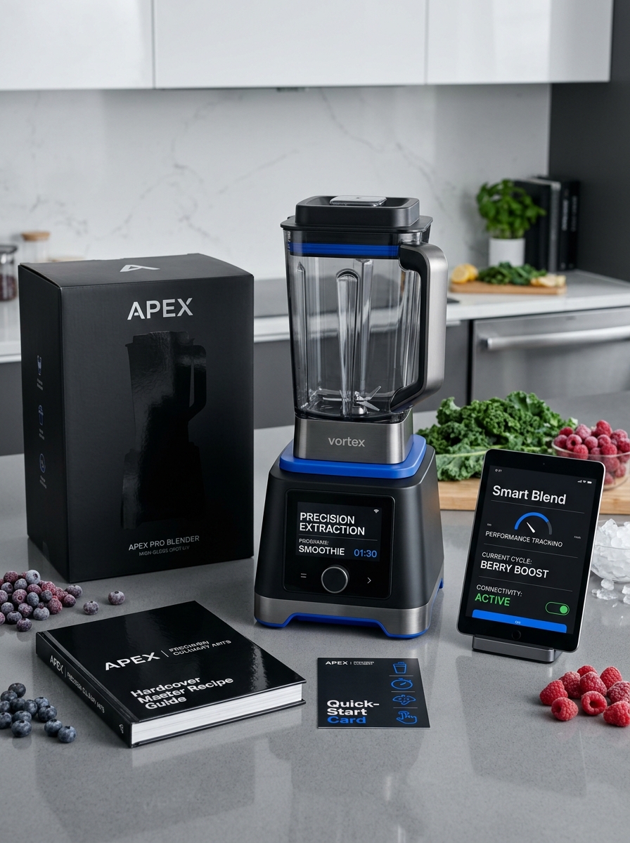
Optimizing the Premium Unboxing User Experience
A premium countertop blender requires an unboxing journey that mirrors its high-end engineering. To optimize this experience, manufacturers must focus on tactile packaging materials and a logical layout that protects sensitive components like glass pitchers and precision stainless steel blades.
Key elements for a superior first impression include:
- Intuitive Component Placement: Ensuring the motor base and accessories are accessible in the logical order of assembly.
- Visual Documentation: Providing a high-quality, high-contrast quick-start guide to facilitate immediate, successful use.
- Sustainable Luxury: Utilizing eco-friendly, custom-molded inserts that offer maximum protection without the aesthetic clutter of excessive plastic.
By refining these touchpoints, brands enhance the product's perceived value, reduce initial friction, and foster long-term customer loyalty from the very first interaction.
Retail Shelf Impact and Competitive Visual Differentiation
In the crowded countertop blender market, capturing consumer attention requires strategic retail shelf impact. Brands achieve visual differentiation by moving beyond basic functionality to focus on distinctive industrial design and premium aesthetics. High-visibility elements such as brushed metallic finishes, vibrant color palettes, and intuitive digital interfaces help a product stand out against competitors.
To maximize point-of-sale conversion, manufacturers prioritize the following visual drivers:
- Form Factor: Sleek, professional silhouettes that suggest power and durability.
- Packaging Design: High-contrast graphics and transparent windows that showcase the appliance's build quality.
- Brand Identity: Consistent use of logos and signature styling, such as retro toggles or modern touchscreens.
By optimizing these visual cues, a countertop blender effectively communicates its value proposition and performance capabilities, ensuring it dominates the physical retail landscape and appeals to style-conscious shoppers.
Leave a comment