Modern kitchen appliance marketing requires more than functional excellence; it demands a visual language that resonates with contemporary lifestyles. As slow cookers evolve from basic utility tools into stylish home centerpieces, aesthetic packaging design plays a pivotal role in capturing consumer attention. By integrating sophisticated visual concepts and premium textures, brands can effectively differentiate themselves within the retail landscape.
Strategic graphic elements and thoughtful color palettes do more than protect the product-they communicate a story of culinary convenience and domestic elegance. High-end design principles transform standard appliance boxes into powerful brand ambassadors, fostering an emotional connection with the modern home chef. Through innovative visual storytelling and intentional structural design, slow cooker manufacturers can elevate their market presence and drive long-term loyalty by appealing to the aesthetic sensibilities of today's discerning buyers.
The Role of Visual Identity in Modern Slow Cooker Branding
In the evolving kitchen appliance market, visual identity serves as a critical differentiator for slow cooker manufacturers. Beyond mere utility, modern branding focuses on lifestyle integration through sophisticated color palettes, minimalist logos, and sleek product silhouettes. Whether utilizing matte finishes or brushed stainless steel, these design choices signal premium quality and reliability to the contemporary consumer.
A cohesive visual strategy extends from the physical appliance to digital interfaces and sustainable packaging. By prioritizing aesthetic appeal alongside functional innovation, brands create an emotional connection with home cooks. This strategic use of brand assets-such as consistent typography and high-definition product imagery-builds consumer trust, enhances shelf presence, and positions the slow cooker as a stylish centerpiece in the modern kitchen environment.
Psychological Impact of Color Palettes in Culinary Product Design
The color palette of a slow cooker profoundly influences consumer psychology and kitchen ambiance. Warm tones, such as vibrant reds or deep copper, are strategically used to stimulate appetite and evoke the comforting sensation of a hearty, home-cooked meal. In contrast, stainless steel and matte black finishes signal professional durability and modern sophistication, appealing to tech-focused home chefs who prioritize performance.
Soft neutrals and whites emphasize hygiene and simplicity, while vintage pastels evoke nostalgia, linking the appliance to traditional culinary heritage. These visual cues do more than match kitchen decor; they shape the emotional relationship between the user and the slow-cooking process. By leveraging color psychology, designers enhance the perceived value and sensory appeal, making the "low and slow" cooking experience feel more rewarding and aesthetically integrated into the domestic environment.
Strategic Use of High Fidelity Food Photography and Product Imagery
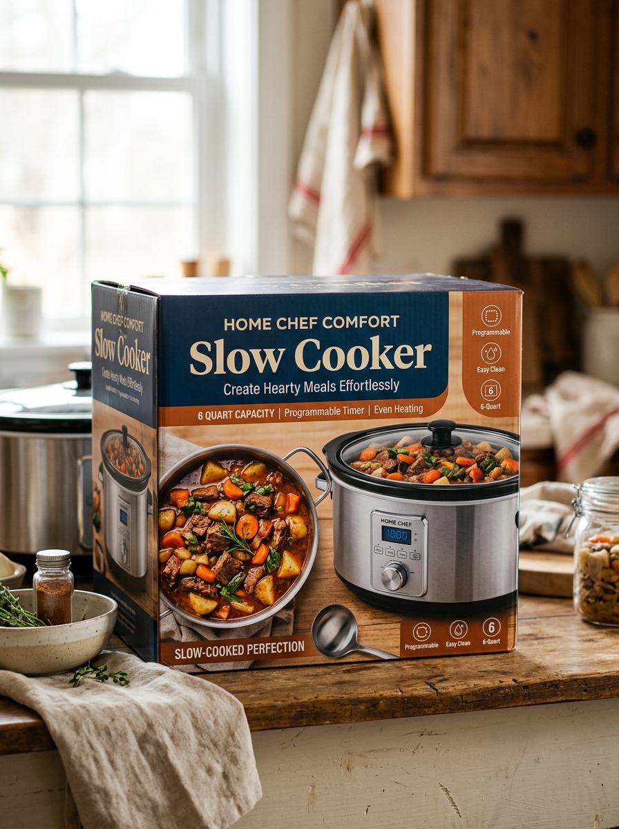
High-fidelity food photography is a vital asset for marketing slow cookers, transforming a simple kitchen appliance into a gateway for culinary inspiration. High-resolution visuals capture the rich textures of tenderized meats and vibrant, slow-simmered vegetables, evoking a sensory response that drives consumer desire. By showcasing the appetizing results of "set-it-and-forget-it" cooking-such as glistening stews and succulent roasts-brands bridge the gap between technical utility and emotional appeal.
Strategic product imagery should also emphasize functional design features, including intuitive digital interfaces, durable ceramic inserts, and tempered glass lids. Clear, detailed shots build consumer trust by highlighting build quality and ease of use. When these images are optimized with descriptive metadata, they enhance search engine visibility and click-through rates, successfully positioning the slow cooker as an essential tool for both convenience and gourmet home cooking.
Minimalist Design Principles for Premium Kitchen Appliance Packaging
Premium slow cooker packaging leverages minimalist design to communicate luxury and functional elegance. By employing a clean visual hierarchy, brands emphasize essential features-such as programmable interfaces or high-quality ceramic stoneware-without cluttering the consumer's visual field.
Key elements include the strategic use of negative space, high-contrast typography, and high-resolution product imagery. These choices reflect the appliance's modern aesthetic and intuitive operation. Furthermore, incorporating sustainable materials and tactile finishes enhances the unboxing experience, aligning the brand with eco-friendly gourmet values.
Ultimately, a minimalist approach reduces cognitive load, allowing the slow cooker's premium craftsmanship to remain the focal point. This clarity builds consumer trust and reinforces the product's value within the competitive high-end kitchenware market.
Communicating Functionality Through Intuitive Graphic Hierarchy
Effective slow cooker design relies on a clear graphic hierarchy to guide users effortlessly through the cooking process. By prioritizing essential information-such as heat settings (Low, High, Warm) and remaining cook time-manufacturers enhance appliance usability and safety.
Bold typography and high-contrast iconography ensure that even novice cooks can differentiate between complex functions at a glance. Intuitive layouts group related controls together, reducing cognitive load and preventing programming errors. Whether utilizing digital LED displays or traditional rotary dials, a well-defined visual structure communicates the appliance's current state-preheating, active, or resting-instantly.
This strategic organization of visual elements makes advanced features accessible, ensuring consistent culinary results while improving the overall user experience through thoughtful interface design.
Sustainable Materials and Eco-Conscious Structural Packaging
Modern slow cooker manufacturing increasingly prioritizes environmental stewardship through the integration of sustainable materials and eco-conscious structural packaging. High-quality models now feature lead-free ceramic inserts and recycled stainless steel housings, ensuring longevity and safety while reducing resource extraction.
Beyond the appliance, innovative structural packaging eliminates non-biodegradable plastics and Styrofoam. Brands are adopting:
- Molded pulp buffers made from recycled paper fibers.
- Corrugated cardboard engineered for impact resistance without synthetic adhesives.
- Soy-based inks for clear, non-toxic product information.
This holistic approach to slow cooker design minimizes the carbon footprint of logistics and promotes a circular economy. By choosing products with plastic-free packaging and durable, natural components, consumers support a greener kitchen environment without sacrificing performance or convenience.
Integrating Lifestyle Storytelling into Box Art and Visual Layouts
Effective slow cooker packaging transcends technical specifications by using lifestyle storytelling to build an emotional connection with consumers. Visual layouts should move beyond the physical hardware, featuring high-resolution imagery of savory, steam-filled meals that evoke a sense of home, comfort, and warmth.
To optimize the consumer experience, visual storytelling should incorporate:
- Contextual Imagery: Depicting the cooker in a modern kitchen setting to emphasize ease of use.
- Aspirational Results: Showcasing vibrant stews or roasts to demonstrate the appliance's culinary potential.
- Narrative Layouts: Using icons and typography to illustrate a "prep-to-plate" journey, focusing on time-saving benefits.
By blending product features with relatable lifestyle cues, brands help buyers visualize the slow cooker as a solution for their busy schedules, driving higher conversion through relatable visual narratives.
Typography and Font Selection for Enhancing Brand Authority
In the slow cooker industry, typography serves as a visual representation of brand reliability and culinary expertise. To establish authority, manufacturers must select typefaces that balance domestic warmth with technical precision. Serif fonts, such as Playfair Display, evoke a sense of heritage and trustworthiness, positioning the appliance as a timeless kitchen staple.
Alternatively, sans-serif fonts like Helvetica provide a modern, clean aesthetic that mirrors the simplicity of "set-and-forget" cooking. Effective typography selection focuses on several key factors:
- Legibility: Ensuring cooking presets and safety instructions are easy to read.
- Visual Hierarchy: Using weight and scale to emphasize innovative features like programmable timers.
- Brand Voice: Aligning font curves with the physical design of the slow cooker.
Strategically chosen typography reinforces professional credibility, making your brand the preferred choice for home chefs seeking quality and durability.
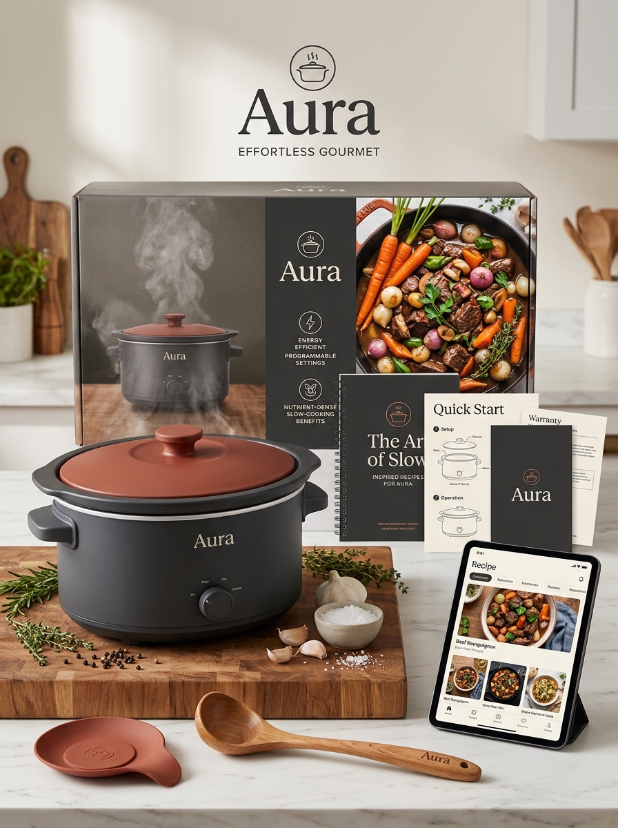
Crafting a Memorable Unboxing Experience for the Home Chef
For any home chef, the culinary journey begins the moment their new slow cooker arrives. A premium unboxing experience transforms a standard appliance into an inspiring kitchen centerpiece. Effective packaging should balance robust protection with elegant design, utilizing eco-friendly materials that resonate with the modern, environmentally-conscious consumer.
Key elements like a vibrant recipe lookbook, intuitive quick-start guides, and neatly organized accessories create an immediate sense of value. When a brand focuses on these tactile details-from the smooth finish of the ceramic pot to the clarity of the digital interface-it sparks instant creativity. This thoughtful first impression builds lasting brand loyalty and excites the user for the savory, slow-cooked meals to come. Ultimately, a well-crafted unboxing delivers more than just a tool; it provides an invitation to explore new flavors and effortless cooking techniques.
Future Trends in Interactive and Digitally Enhanced Packaging Design
The evolution of slow cooker packaging is increasingly focused on digital integration to enhance the consumer unboxing experience. Modern brands are adopting interactive packaging solutions that bridge the gap between the physical appliance and digital convenience.
Key trends include:
- QR Codes: Scanning the box provides instant access to curated slow cooker recipes, nutritional data, and instructional videos.
- NFC Technology: Near Field Communication allows users to register warranties or download digital manuals with a simple smartphone tap.
- Augmented Reality (AR): AR-enabled designs let consumers visualize the slow cooker on their kitchen counter or view 3D assembly tutorials before opening the package.
These digitally enhanced designs prioritize sustainability by reducing paper waste while offering a personalized, high-tech experience for the modern home cook.
Leave a comment