
Elevating a deck of cards from a functional tool to a collector's masterpiece begins long before the first shuffle; it starts with the tuck box. Mastering playing card packaging requires a sophisticated fusion of structural integrity and visual storytelling. For designers catering to magicians, poker enthusiasts, or luxury collectors, the packaging serves as the definitive first impression and a vital protector of the art within.
This guide explores the essential design principles that define modern industry standards-from deliberate typography and color theory to advanced printing techniques like foil stamping, embossing, and soft-touch finishes. By adhering to rigorous aesthetic standards and selecting premium paper stocks, creators can craft an immersive tactile experience. Understanding these nuances ensures that your custom card deck stands out as a high-value centerpiece, balancing durability with unparalleled artistic innovation.
Historical Context of Playing Card Tuck Case Design
The evolution of the playing card tuck case reflects a shift from simple utility to sophisticated marketing. Before the late 19th century, decks were typically sold wrapped in paper or tied with string. The introduction of the folding cardboard "tuck box" in the 1800s revolutionized the industry by providing durable protection for standard playing cards.
Historically, these cases were designed to display mandatory government tax stamps, which proved the manufacturer had paid duties. As printing technology like lithography advanced, brands such as Bicycle and Bee began using the tuck case as a canvas for intricate artwork and brand identity. Today, the design of the tuck case is a vital aspect of card collecting, often featuring premium finishes like embossing and metallic foils to signal the quality of the deck inside.
Structural Integrity and Standard Tuck Box Dimensions
The structural integrity of a standard playing card deck depends on the precision of its tuck box. For a Poker-sized deck (2.5" x 3.5"), the standard tuck box dimensions are approximately 2.6" x 3.6" x 0.7". This specific sizing ensures a snug fit, preventing internal movement that leads to corner dings and edge wear.
To maintain durability, manufacturers prioritize several engineering factors:
- Paper Stock: Most boxes utilize 300 to 350 GSM cardstock for crush resistance.
- Protective Coatings: Aqueous or UV coatings are applied to shield against moisture and oils.
- Functional Design: Thumb cuts and reinforced glue flaps provide easy access while maintaining the box's shape over repeated use.
These specifications ensure that the 52-card deck remains protected, portable, and structurally sound throughout its shelf life.
Material Selection for Durability and Premium Feel
The construction of standard playing cards relies on two primary materials: premium cardstock and 100% plastic (PVC). Each choice significantly impacts the deck's tactile response, shuffle-ability, and longevity.
- Paper Cardstock: Professional-grade paper decks utilize a layered construction with a black-core center to ensure total opacity. These are often finished with an "air-cushion" or linen texture, which reduces friction and allows cards to glide effortlessly during flourishes.
- Plastic (PVC): Known for extreme durability, plastic cards are waterproof and resistant to creasing. They are the industry standard for casinos because they maintain their shape and "snap" through thousands of rounds.
Selecting high-quality materials ensures a balance between a luxurious, textured grip and the structural integrity required to withstand repetitive shuffling and heavy gameplay.
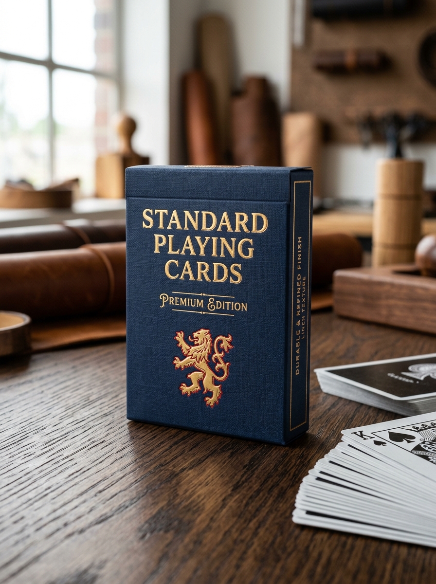
Visual Hierarchy and Front Panel Branding Strategies
In the competitive market of standard playing cards, visual hierarchy on the front panel-or tuck case-is vital for brand recognition. Designers use strategic placement to guide the eye, typically centering the primary brand logo or deck title to establish immediate authority. This focal point is often supported by intricate illustrations that reflect the deck's unique theme.
Effective branding strategies include:
- Typography: Using bold or foiled lettering to communicate luxury and craftsmanship.
- Negative Space: Balancing ornate borders with clean areas to prevent visual clutter and highlight key graphics.
- Information Layout: Placing manufacturer stamps and suit indicators in consistent locations to satisfy collector expectations.
By leveraging contrast, scale, and texture, card manufacturers create a professional aesthetic that distinguishes premium decks from budget alternatives on retail shelves.
Advanced Embellishments: Foil Stamping and Embossing
To elevate standard playing cards into premium collector's items, manufacturers employ sophisticated techniques like foil stamping and embossing. Foil stamping uses heat and pressure to bond metallic or holographic pigments onto the cardstock, resulting in a brilliant, reflective finish that signifies luxury and high production value.
Complementing this visual shine is embossing, a process that physically alters the paper's texture to create raised, three-dimensional patterns. This tactile enhancement provides depth and a superior feel, particularly on tuck cases and card backs. When combined, these embellishments transform functional decks into works of art. These processes are essential for high-end decks, offering both visual brilliance and a unique sensory experience that distinguishes professional-grade playing cards from basic alternatives.
Typography Principles for Card Deck Packaging
Typography on playing card packaging serves both functional and aesthetic purposes, bridging the gap between brand identity and legibility. Visual hierarchy is the primary principle, ensuring the deck name and manufacturer stand out against intricate tuck box illustrations.
Key design considerations include:
- Thematic Consistency: Typefaces must reflect the deck's style, such as Victorian-era serifs for classic designs or minimalist sans-serifs for modern cardistry sets.
- Readability: Designers prioritize high-contrast colors and optimal kerning to ensure technical details, like "Air-Cushion Finish," remain legible at small sizes.
- Print Integrity: Choosing fonts with appropriate stroke weights prevents ink bleed on textured or metallic-foiled cardstock.
Ultimately, effective typography reinforces the premium feel of the deck, using font weight and placement to guide the consumer's eye across the packaging narrative.
The Role of Custom Seals and Security Stamps
In the world of standard playing cards, custom seals and security stamps serve as critical indicators of authenticity and deck integrity. Originally derived from historical tax requirements, modern adhesive seals act as a tamper-evident barrier, guaranteeing that the cards remain in mint condition from the manufacturer to the collector.
For enthusiasts and cardists, an unbroken seal confirms the deck has never been handled, preserving its secondary market value. Beyond security, these stamps often feature intricate designs or unique numbering for limited editions, enhancing the aesthetic appeal of the tuck box. By providing a physical layer of brand protection, seals ensure that users receive a genuine product, while adding a professional, prestigious finish to high-quality playing card decks.
Enhancing the Unboxing Experience with Interior Printing
Customizing standard playing cards extends beyond the deck itself; the packaging plays a crucial role in brand perception. Utilizing interior printing on tuck boxes transforms a simple container into a premium experience. Instead of basic white cardstock, designers can incorporate intricate patterns, hidden messages, or vibrant colors inside the box.
This attention to detail provides several key benefits for creators and collectors:
- Visual Surprise: Creates an immediate "wow" factor the moment the recipient opens the flap.
- Brand Depth: Allows for immersive storytelling and thematic consistency across the entire product.
- Increased Perceived Value: Elevates a standard deck to a luxury collector's item, justifying premium price points.
By leveraging the interior space of the tuck case, you ensure the unboxing journey is as memorable as the gameplay itself.
Designing for Limited Editions and Luxury Markets
Designing luxury playing cards requires a focus on premium materials and artisanal craftsmanship to appeal to collectors and cardists. Unlike standard decks, luxury editions utilize high-grade cardstock-often thin-crushed for superior handling-and intricate finishes such as metallic foiling, blind embossing, and spot UV textures.
To optimize for the high-end market, designers implement several key features:
- Bespoke Artistry: Fully custom court cards, aces, and jokers that replace standard pips with thematic illustrations.
- Premium Packaging: Tuck cases crafted from heavy-duty matte paper, featuring interior printing and laser-cut details.
- Scarcity: Limited print runs secured with numbered, holographic, or tax-style seals to drive collectibility.
By integrating tactile feedback with visual depth, these decks transcend utility, becoming prized art pieces that command higher value through aesthetic excellence and exclusivity.
Sustainable Sourcing and Eco Friendly Packaging Trends
The manufacturing of standard playing cards is shifting toward environmental responsibility. Industry leaders are increasingly adopting sustainable sourcing practices by using FSC-certified paper, ensuring that cardstock originates from responsibly managed forests. This commitment extends to the core materials, where recycled fibers are blended to maintain the classic "snap" and durability players expect.
Current eco-friendly packaging trends focus on eliminating single-use plastics. Many brands are replacing traditional cellophane wraps with biodegradable seals or recyclable paper bands. Furthermore, the transition from petroleum-based pigments to vegetable-based inks, such as soy-derived alternatives, reduces chemical runoff during production. These innovations allow collectors and magicians to enjoy premium, high-performance decks that align with modern ecological standards, significantly reducing the environmental impact of the gaming industry.
Leave a comment