For over five decades, Hot Wheels has defined the visual landscape of die-cast culture through a masterful blend of high-octane graphics and strategic product presentation. The brand's packaging is not merely a protective shell; it is a meticulously engineered marketing tool that bridges the gap between childhood play and high-stakes collecting.
At the heart of the Hot Wheels brand aesthetic lies the iconic "Blue Brand" carding, the legendary flame logo, and dynamic illustrations that evoke a sense of kinetic energy. This exploration delves into the essential design principles-ranging from visual hierarchy and bold typography to the tactical use of the transparent "blister" window-that sustain Mattel's global appeal. By understanding these core elements, one gains insight into how a consistent design language transforms a miniature vehicle into a timeless cultural icon.
The Legacy of the Hot Wheels Flame Logo
The Hot Wheels flame logo is an iconic symbol of speed, power, and custom car culture. Designed in 1968 by graphic artist Otto Kuhni, the logo was crafted to mirror the vibrant "California Look" of the era's hot rod scene. Its bold typography wrapped in a dynamic orange flame immediately signaled high-performance action to children and collectors alike.
Throughout its history, the emblem has undergone subtle refinements, yet it remains remarkably consistent. This visual continuity has helped Mattel maintain a powerful brand identity for over five decades. Today, the flame represents a global legacy of automotive passion, signifying quality and innovation in the die-cast industry. As a cornerstone of the brand's heritage, the logo continues to inspire generations of fans, remaining a universal mark of adrenaline-fueled play.
Anatomy of the Classic Blister Pack Design
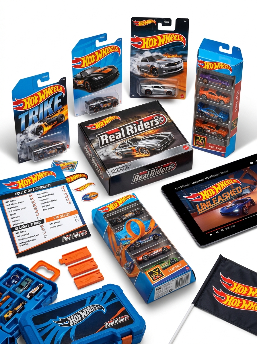
The Hot Wheels blister pack is a masterclass in retail packaging, designed to showcase and protect the die-cast vehicle within. Its anatomy consists of several key components:
- Cardboard Backing (The Card): Provides structural integrity and features high-octane graphic illustrations specific to the car model.
- Plastic Blister: A clear, vacuum-formed plastic bubble that secures the car, allowing for maximum visibility while preventing paint chips or damage.
- Brand Identity: The iconic "Flame" logo is positioned prominently at the top, accompanied by the specific model name and series numbering.
- Collector Details: The card often includes sub-series identifiers and, for rare finds, hidden "Treasure Hunt" symbols located behind the vehicle.
This functional design has remained largely unchanged since 1968, making it an essential, recognizable element of the die-cast collecting hobby.
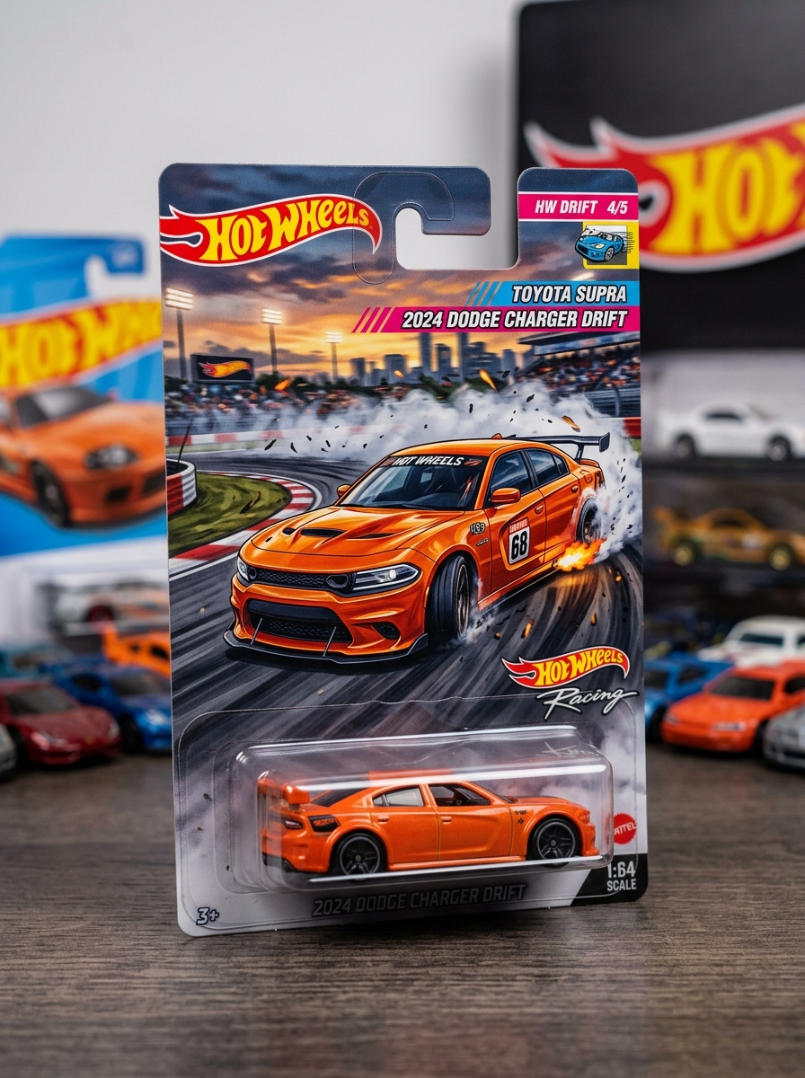
The Dynamic Role of Card Back Illustration
In the world of Hot Wheels collecting, the card back illustration is far more than mere packaging; it is a vital marketing tool and a piece of collectible art. These vibrant, high-action graphics are designed to create immediate "peg appeal," capturing the speed and personality of the die-cast vehicle held within the blister pack.
The strategic role of card art includes:
- Brand Identity: Establishing distinct visual themes for Mainline, Treasure Hunt, and Premium series.
- Collectibility: Enhancing the value of "Mint on Card" (MOC) items through unique, artist-driven designs.
- Narrative: Providing a cinematic context that sparks the imagination of both kids and adult hobbyists.
By blending automotive realism with stylized graphic design, card back illustrations transform 1:64 scale cars into iconic symbols of car culture.
Signature Color Schemes and Brand Recognition
Hot Wheels' global dominance is fueled by its iconic visual identity, defined largely by signature color schemes. Central to this brand recognition is the legendary Spectraflame paint finish. Debuting in 1968, this metallic, candy-coated luster immediately distinguished Mattel's die-cast cars from more muted competitors.
The strategic use of "Hot Wheels Blue" on packaging, paired with the vibrant orange of their track sets, creates an immediate psychological connection for consumers. These high-contrast palettes, alongside the classic flame logo and Redline wheels, ensure instant shelf recognition. By maintaining these consistent aesthetic markers, Hot Wheels has built massive brand equity. Today, these specific hues are synonymous with speed, performance, and automotive culture, transforming simple die-cast vehicles into a globally recognized lifestyle brand for collectors and children alike.
High-Octane Typography and Graphic Elements
Hot Wheels' visual identity is defined by High-Octane Typography and dynamic graphic design. The iconic "flame" logo utilizes bold, italicized lettering to simulate a sense of velocity and power. This aggressive typographic style is paired with high-contrast color palettes-typically orange, red, and yellow-to evoke the heat of the racetrack.
Beyond the logo, card art plays a vital role in collectibility. Each blister pack features stylized illustrations that dramatize the vehicle's features. On the cars themselves, tampo printing adds intricate details like racing stripes, sponsor decals, and the coveted "Circle Flame" symbol found on rare Treasure Hunts. These graphic choices create a cohesive brand language that emphasizes speed, custom car culture, and performance, ensuring that every 1:64 scale model feels like a high-performance machine before it even hits the track.
Strategic Placement of Series and Collector Data
Hot Wheels packaging utilizes precise metadata positioning to enhance brand recognition and collector efficiency. The collector number is typically situated in the top right corner, allowing enthusiasts to quickly identify set completion progress while cars are hanging on retail pegs.
The series name and sub-series segment (such as HW Screen Time or Baja Blazers) are strategically printed on the card's side margin or lower third. This layout ensures that key identification data remains visible even when packages overlap on crowded shelves.
Additionally, the inclusion of Treasure Hunt symbols and production codes on the card back facilitates digital tracking and rarity verification. This deliberate structural hierarchy prioritizes high-value data points, optimizing the browsing experience for hobbyists and streamlining inventory management for secondary market investors.
Designing for Retail Visibility and Shelf Presence
Hot Wheels dominates the toy aisle by utilizing iconic blister pack packaging designed for maximum shelf impact. The combination of a transparent plastic window and high-octane card art allows collectors to inspect die-cast details while experiencing the brand's "speed and power" aesthetic.
To ensure high visibility, Mattel focuses on several key design elements:
- Vibrant Branding: The signature orange flame logo and high-contrast blue backgrounds ensure instant brand recognition from a distance.
- Vertical Peg Presence: Cardbacks are engineered for uniform hanging, creating a "wall of cars" effect that attracts foot traffic.
- Dynamic Illustrations: Custom card art depicts the vehicle in action, increasing emotional appeal and perceived value.
By balancing functional protection with aggressive graphic design, Hot Wheels maintains a competitive edge, turning simple retail shelves into immersive collector destinations.
Visual Cues for Treasure Hunts and Limited Editions
Identifying rare Hot Wheels requires a keen eye for specific icons and premium finishes. Collectors look for these key visual markers to distinguish high-value models from standard mainline releases:
- Treasure Hunts (TH): These feature the "Circle Flame" logo on the vehicle's paint and a silver flame icon printed on the card behind the car.
- Super Treasure Hunts ($TH): Look for "Spectraflame" metallic paint, "TH" graphics, and Real Riders rubber tires. A gold flame logo is hidden on the blister card.
- Chase Cars: Often part of premium series, these limited editions may feature unique numbering (e.g., 0/5) or distinct "blacked-out" colorways that differ from the rest of the set.
Recognizing these subtle cues is essential for spotting rare die-cast gems and building a valuable collection.
The Intersection of Materiality and Packaging Durability
In the world of Hot Wheels collecting, the synergy between die-cast materiality and packaging engineering determines a model's long-term value. The physical composition of these vehicles-primarily zamac (a zinc alloy) and molded plastic-requires a robust housing to maintain "Mint on Card" (MOC) status.
The standard packaging architecture consists of a thermoformed plastic blister heat-sealed to a clay-coated cardstock backer. Durability is frequently tested by the heavy metal chassis, which exerts structural tension on the adhesive bond. High-quality cardstock prevents "soft corners," while the thickness of the plastic bubble protects against blister cracks. For serious collectors, this intersection is vital; premium materials ensure the vehicle remains shielded from oxidation and environmental degradation, preserving the intricate paintwork and structural integrity of the die-cast car for decades.
Modern Trends in Die-Cast Packaging Evolution
Hot Wheels packaging has transitioned from basic retail blisters to sophisticated, collector-oriented displays. A primary trend is sustainability; Mattel is increasingly utilizing recyclable materials and FSC-certified paperboard to reduce environmental impact without sacrificing durability.
In the premium sector, such as the Redline Club (RLC) and Car Culture series, packaging now features high-fidelity card art and protective acrylic cases designed for long-term preservation. We are also seeing a rise in digital integration, where QR codes and NFC technology link physical models to mobile gaming ecosystems.
Modern designs often prioritize "shelf presence" for adult hobbyists, employing minimalist aesthetics and re-sealable clamshells. These innovations reflect a strategic shift toward premiumization, ensuring that the unboxing experience is as valuable to collectors as the die-cast vehicle itself.
Leave a comment