Effective permanent marker packaging requires a strategic fusion of industrial utility and high-end retail aesthetics. To achieve maximum visual impact, designers must prioritize functional structural design alongside bold graphic elements that communicate ink reliability and longevity. Every detail, from high-contrast color schemes to ergonomic blister packs, serves to reinforce brand identity and improve shelf visibility.
Mastering the visual language of marker design involves understanding consumer psychology and the importance of tactile feedback. By integrating minimalist typography and transparent windows that showcase nib precision, manufacturers can create an immediate connection with artists and professionals alike. These aesthetic guidelines focus on transforming a standard writing tool into an iconic product through innovative material choices and sophisticated visual hierarchy.
The Psychology of Color in Permanent Marker Branding
Color psychology plays a pivotal role in permanent marker branding, influencing consumer perception and purchase intent. Brands strategically select ink and packaging colors to evoke specific emotional responses. For instance, black permanent markers signify authority, professionalism, and permanence, making them the industry standard for office and industrial use. In contrast, blue markers are often associated with trust and dependability.
High-visibility shades like red create a sense of urgency or caution, ideal for labeling safety hazards or important corrections. Beyond functional use, vibrant neon or metallic tones target creative demographics, associating the product with inspiration and innovation. By leveraging color theory, manufacturers ensure their markers stand out on retail shelves while communicating intended utility-whether for professional organization, artistic expression, or heavy-duty labeling tasks.
Material Selection for Durability and Tactile Appeal
The longevity of permanent markers is primarily determined by the quality of their external housing and internal components. Manufacturers typically utilize high-grade polypropylene (PP) or lightweight aluminum for marker barrels to provide exceptional chemical resistance and impact durability. These materials are chosen for their low moisture vapor transmission rates, which prevent ink desiccation and extend the product's shelf life.
To enhance tactile appeal and user ergonomics, high-performance markers often feature rubberized grips or matte-finished resins. These textures provide a non-slip surface that reduces hand fatigue during prolonged industrial or artistic use. By balancing structural integrity with soft-touch coatings, the selection of materials ensures that the writing instrument remains functional in harsh environments while offering a premium, comfortable experience for the end-user.
Typography Trends for Industrial and Creative Markets
Permanent markers are at the forefront of evolving typography, bridging the gap between functional utility and artistic expression. In industrial markets, the trend prioritizes high-visibility, bold block lettering. Heavy-duty markers are essential for creating legible, weather-resistant markings on surfaces like steel, concrete, and timber, where durability is paramount.
In contrast, creative markets are seeing a surge in hand-lettering and "faux calligraphy." Artists leverage chisel and brush-tip permanent markers to achieve variable line weights and vibrant, layered effects. From large-scale mural work to personalized retail signage, the demand for ergonomic designs and archival-quality ink remains high. Whether used for precision-driven logistics or fluid artistic typography, permanent markers continue to adapt to the aesthetic and technical requirements of modern labeling and design.
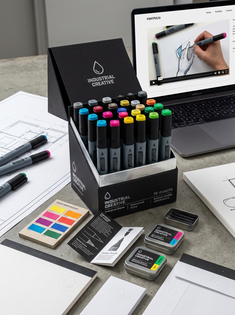
Iconography and Visual Cues for Nib Size Identification
To enhance user efficiency, permanent marker manufacturers employ standardized iconography and visual cues to indicate nib dimensions. These semantic markers allow for rapid identification without requiring manual testing.
- Graphic Symbols: Many barrels feature line-weight icons, such as graduating dots or strokes, representing fine, medium, or broad widths.
- Cap and End-Plug Design: The physical shape of the cap often mirrors the nib type; for example, a flat, angled cap typically signifies a chisel tip, while a pointed cap indicates a bullet or ultra-fine tip.
- Color-Coding and Numerical Labels: Precision tools often include millimetre (mm) measurements and color-coded bands that distinguish between technical drawing nibs and standard utility markers.
These intuitive visual shorthand systems reduce cognitive load, ensuring professionals and artists select the correct tool for specific line densities and surface applications.
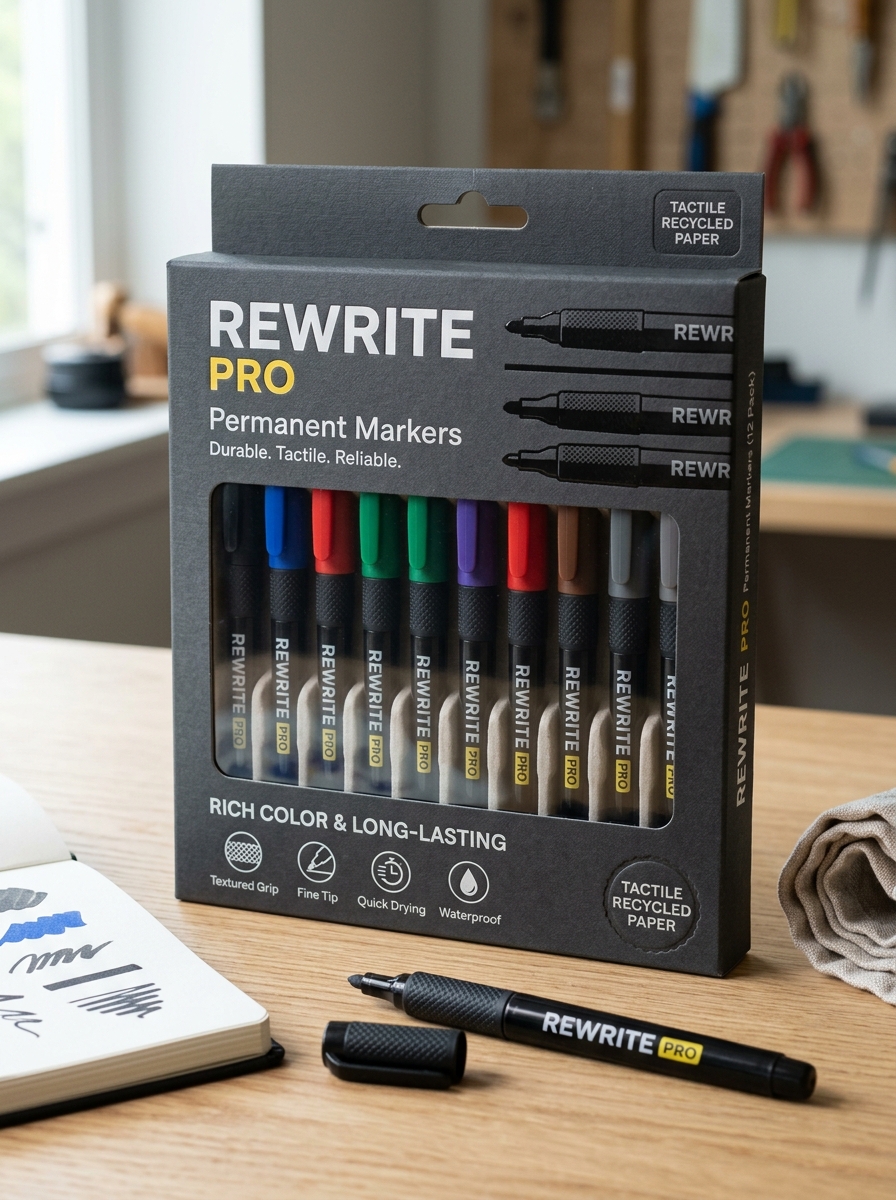
Ergonomic Packaging Shapes for Retail Visibility
In the competitive office supply market, permanent markers utilize ergonomic packaging shapes to maximize retail visibility and consumer appeal. Brands leverage contoured blister packs and triangular sleeves that not only protect the markers but also create a distinctive shelf presence. These innovative designs allow for vertical stacking and easy-access displays, ensuring products stand out in high-traffic stationery aisles.
Beyond aesthetics, ergonomic shapes facilitate better grip during handling and reduce shipping damage. Strategically engineered packaging attracts the eye through unique silhouettes, helping customers quickly identify specialized tips-such as fine, chisel, or bullet points. By integrating form and function, manufacturers enhance the tactile experience before the point of purchase, driving higher conversion rates through superior structural design and enhanced merchandising efficiency.
Sustainability and Eco-Friendly Material Innovations
The stationery industry is revolutionizing permanent markers by prioritizing environmental responsibility. Manufacturers are increasingly replacing traditional petroleum-based plastics with recycled post-consumer resins and bio-based materials like bamboo or recycled paper.
Key advancements in eco-friendly marker technology include:
- Refillable Ink Systems: Design innovations that allow users to replenish ink, significantly reducing single-use plastic waste.
- Non-Toxic Formulas: The shift toward low-VOC (Volatile Organic Compounds) and xylene-free inks to ensure user safety and better air quality.
- Sustainable Packaging: Utilizing FSC-certified cardboard and plastic-free casings.
These material innovations ensure that high-performance, fade-resistant marking meets the demands of a circular economy, offering consumers high-quality tools with a reduced carbon footprint.
Balancing Minimalist Aesthetics with Functional Information
Modern permanent markers are increasingly designed to bridge the gap between sleek, minimalist aesthetics and the necessity of providing clear technical data. For professional artists and industrial users, a marker's visual appeal must not compromise the accessibility of critical ink specifications.
Achieving this balance involves integrating functional information into the barrel design through subtle yet effective methods:
- Typographic Hierarchy: Using clean, sans-serif fonts to display nib sizes and lightfastness ratings without cluttering the surface.
- Color-Coded Indicators: Utilizing discreet rings or caps that provide instant color recognition while maintaining a monochromatic body.
- Iconographic Symbols: Employing universal symbols for surface compatibility (e.g., metal, glass, or plastic) to reduce text density.
By prioritizing a refined visual hierarchy, manufacturers ensure that markers remain professional in appearance while delivering high-performance utility.
Contrast and Boldness Strategies for Shelf Impact
To dominate the competitive stationery aisle, permanent marker packaging leverages high-contrast color palettes and aggressive graphic design. Brands prioritize immediate visibility by pairing dark ink colors with vibrant, high-visibility backgrounds-such as black text on yellow or white on deep blue-to create a sharp "visual pop."
Effective shelf impact is achieved through several key semantic design elements:
- Bold Typography: Using heavy, sans-serif fonts to communicate ink density and durability.
- Visual Hierarchy: Placing oversized icons of tip shapes (chisel or fine point) to provide instant functional clarity.
- Finish Contrast: Employing spot UV gloss on the marker image against a matte box to draw the eye toward the product's silhouette.
By maximizing visual weight, manufacturers signal professional-grade reliability, ensuring their products break through the noise of the retail environment.
Targeting Professional versus Artistic Consumer Demographics
Effective marketing for permanent markers necessitates a dual approach to satisfy distinct user requirements. The professional demographic prioritizes functional utility, seeking industrial-grade tools with fast-drying, smudge-proof ink. These users value durability and high-contrast visibility for labeling equipment, masonry, or plastic in high-stress workplace environments.
In contrast, the artistic demographic focuses on creative versatility and aesthetic output. These consumers demand a diverse color palette, blendable alcohol-based formulas, and specialized nibs like brush or chisel tips. While professionals require permanent identification and weather resistance, artists prioritize archival quality, lightfastness, and precision for illustration. By segmenting these markets, manufacturers can tailor ink chemistry and ergonomic designs to meet the specific demands of heavy-duty industrial tasks versus detailed creative projects.
Protective Coatings and Finishes for Premium Brand Perception
In the competitive stationery market, the physical durability and tactile quality of permanent markers are essential for establishing high-end brand value. Manufacturers utilize advanced protective coatings-such as UV-resistant gloss, sophisticated matte, and ergonomic soft-touch finishes-to elevate the user experience.
These specialized surface treatments do more than provide aesthetic appeal; they protect the marker barrel from chemical solvents, ink stains, and mechanical abrasion. A resilient finish ensures that logos and brand messaging remain crisp and legible throughout the tool's lifespan. By prioritizing these premium finishes, brands signal professional reliability and superior craftsmanship. This focus on protective coatings transforms a simple writing instrument into a durable, high-performance tool, fostering consumer trust and distinguishing the product in a crowded marketplace.
Leave a comment