
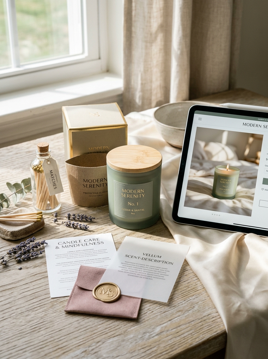
Aromatherapy candle packaging design serves as the essential bridge between a brand's olfactory essence and its visual identity. Beyond mere containment, effective packaging communicates therapeutic benefits through sophisticated brand aesthetics and intentional materiality. By integrating minimalist typography with high-quality textures, designers can evoke the calming or invigorating properties of essential oils before the candle is even lit.
Strategic choices in color palettes and sustainable structural elements allow wellness brands to establish an immediate emotional connection with consumers. This fusion of form and function transforms a functional item into a centerpiece of home decor. Understanding these key concepts is vital for creating a cohesive sensory experience that resonates within the modern market and distinguishes a brand's unique presence through thoughtful, aesthetic storytelling.
Defining Your Brand Identity Through Aromatherapy Packaging
In the competitive aromatherapy candle market, your packaging serves as the visual ambassador of your brand's core values. To establish a distinct identity, every design element-from color psychology to material choice-must resonate with your target audience's desire for wellness. Utilizing minimalist aesthetics can signal purity and calmness, whereas bold, organic textures might suggest an invigorating sensory experience.
Sustainable packaging, such as recyclable glass jars or biodegradable labels, reinforces a commitment to eco-consciousness, a key trait for modern aromatherapy consumers. Furthermore, strategic typography and premium finishes ensure your products stand out on crowded shelves. By aligning your outer packaging with the therapeutic benefits of the essential oils within, you create a cohesive narrative that builds consumer trust and fosters long-term brand loyalty.
Psychology of Color in Scent-Based Visual Design
In aromatherapy candle design, color psychology serves as a visual bridge to the olfactory system. This cross-modal perception ensures that the candle's hue aligns with its therapeutic intent, priming the user for a specific emotional experience.
For example, soft purples and blues are strategically used for lavender or chamomile scents to signal relaxation and stress reduction. In contrast, vibrant yellows and oranges are paired with citrus fragrances to evoke energy and alertness. Earthy greens often represent eucalyptus or pine, reinforcing a sense of grounding and renewal.
By harmonizing visual cues with scent profiles, brands enhance the perceived efficacy of the essential oils. This intentional design strategy creates a cohesive sensory environment, maximizing the psychological benefits of the aromatherapy experience through immediate visual-olfactory recognition.
Typography Choices for Luxury and Wellness Aesthetics
Typography serves as a visual bridge between the scent of an aromatherapy candle and the consumer's emotional response. To achieve a luxury aesthetic, designers often select high-contrast serif fonts. These typefaces evoke a sense of heritage, sophistication, and premium craftsmanship, positioning the product as an upscale indulgence.
In contrast, wellness aesthetics focus on tranquility and clarity. This is best achieved through minimalist sans-serif fonts with generous letter spacing (kerning). Key typographic strategies include:
- Visual Breathing Room: Wide tracking conveys a sense of calm and openness.
- Font Weight: Light or medium weights prevent the design from feeling cluttered or aggressive.
- Harmonious Pairing: Combining a classic serif header with a clean sans-serif body balances tradition with modern holistic values.
Strategic typography ensures that the brand's identity aligns with the therapeutic and opulent nature of the essential oils used.
Sustainable Materiality and Eco-Friendly Packaging Solutions
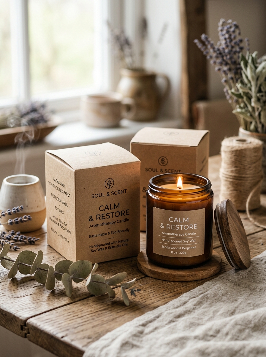
Modern aromatherapy candles prioritize environmental wellness through sustainable materiality. By replacing paraffin with renewable resources like soy wax, beeswax, or coconut wax, these candles ensure a clean, biodegradable burn free from petroleum derivatives. This eco-conscious approach extends to lead-free cotton wicks and FSC-certified wood wicks, which minimize indoor air pollutants and soot.
Complementing the raw materials, eco-friendly packaging solutions focus on a circular economy. Brands utilize recycled glass jars, compostable mailing materials, and plastic-free protective inserts to reduce landfill waste. By opting for soy-based inks and FSC-certified paper labels, the entire product lifecycle remains carbon-neutral. Choosing responsibly sourced aromatherapy products ensures that your relaxation rituals support both personal health and planetary preservation.
Tactile Elements and the Sensory Impact of Texture
In the world of aromatherapy candles, the sensory experience extends far beyond fragrance. Tactile elements-such as the cool smoothness of a glass jar, the earthy grain of a ceramic vessel, or the velvety finish of natural soy wax-play a vital role in grounding the user. These textures transform a simple product into a holistic ritual.
Engaging the sense of touch enhances the therapeutic impact of essential oils. A matte-finished container or an embossed label provides immediate sensory feedback, signaling quality and intention. By incorporating diverse materials like frosted glass, cork lids, or hand-poured botanical inclusions, aromatherapy candles create a multi-sensory environment. This physical interaction deepens the relaxation process, bridging the gap between olfactory delight and tactile comfort for a more profound wellness journey.
Minimalism Versus Maximalism in Candle Label Design
Choosing between minimalism and maximalism for aromatherapy candle labels significantly impacts consumer perception. Minimalist designs utilize clean lines, ample white space, and understated typography. This aesthetic reflects purity and tranquility, signaling that the product contains natural essential oils and promotes a focused, zen-like environment.
In contrast, maximalist labels embrace vibrant color palettes, intricate illustrations, and bold textures. This approach appeals to the senses through visual storytelling, suggesting a rich, complex fragrance profile that transforms a room's energy. While minimalism focuses on the "less is more" philosophy of wellness, maximalism celebrates the expressive, artistic power of scent.
Ultimately, your choice should align with your brand identity. Whether opting for a sleek, modern look or decorative flair, effective candle packaging must communicate the therapeutic benefits and quality of your hand-poured creations.
The Art of the Unboxing Experience for Fragrance Brands
For premium aromatherapy candles, the customer journey begins long before the wick is lit. A curated unboxing experience acts as a multisensory prelude to the therapeutic scents within. Fragrance brands must leverage high-quality packaging to mirror the luxury and purity of their essential oil blends.
Integrating tactile elements like textured paper, sustainable inserts, and personalized notes transforms a simple purchase into a restorative self-care ritual. This attention to detail builds brand loyalty and significantly enhances the perceived value of hand-poured candles. When a package is opened, the initial olfactory greeting should be as sophisticated as the product itself. In a digital-first market, an aesthetically pleasing presentation also drives social media engagement, turning satisfied customers into organic brand ambassadors through viral "unboxing" content.
Strategic Placement of Regulatory and Safety Information
For aromatherapy candles, the strategic placement of regulatory information is vital for both legal compliance and consumer trust. To maintain aesthetic appeal while adhering to CLP or ASTM standards, safety data must be legible and accessible.
- Bottom Labels: Primary fire safety warnings and pictograms are typically placed on the base of the vessel, ensuring permanent access to burning instructions.
- Outer Packaging: Comprehensive allergen disclosures and hazard statements are often printed on the external box to keep the glass container minimalist.
- Side Labels: Discreet wrap-around labels or hang tags provide necessary batch codes and manufacturer contact details.
Correct positioning ensures that users are aware of essential precautions, such as wick trimming and ventilation, without detracting from the sensory experience. This balance of design and safety protects the brand and guarantees a responsible therapeutic environment.
Establishing Visual Consistency Across Scent Collections
Maintaining a cohesive visual identity for your aromatherapy candle brand is essential for building consumer trust and brand recognition. When launching diverse scent collections-ranging from calming lavender to invigorating eucalyptus-consistency in design elements ensures your products are instantly identifiable.
Key strategies for achieving visual harmony include:
- Uniform Packaging: Utilize consistent vessel shapes, lid materials, and label dimensions across all scents.
- Cohesive Typography: Apply a standardized font hierarchy for scent names and therapeutic benefits.
- Harmonious Color Palettes: Use a recurring color language where specific hues represent different scent families while maintaining a shared aesthetic tone.
A unified presentation simplifies the customer's browsing experience and reinforces the premium, therapeutic nature of your aromatherapy line. By aligning these visual cues, you create a curated brand experience that encourages repeat purchases across your entire catalog.
Future Trends in Modern Aromatherapy Vessel Design
The evolution of aromatherapy candle vessels is shifting toward a sophisticated fusion of sustainability and functional aesthetics. Future trends prioritize eco-friendly materials, such as recycled glass, biodegradable ceramics, and hand-poured concrete, moving away from traditional single-use containers.
Key innovations driving the market include:
- Upcyclable Architecture: Jars specifically engineered to be repurposed as luxury planters or home organizers once the wax is consumed.
- Circular Refill Systems: Minimalist, modular designs that allow consumers to swap wax inserts, significantly reducing carbon footprints.
- Tactile Minimalism: Vessels featuring raw, matte textures and organic silhouettes that enhance the grounding sensory experience.
By merging smart technology with artisanal craftsmanship, modern vessel design transforms the standard candle into a permanent piece of sustainable home decor.
Leave a comment