Pressure cooker packaging serves as the critical bridge between engineering excellence and consumer appeal. Beyond providing structural protection, effective design leverages sophisticated aesthetic principles to communicate safety, reliability, and culinary innovation. To stand out, manufacturers must prioritize a cohesive visual brand identity that resonates with the modern home chef.
By integrating high-fidelity imagery, strategic color theory, and ergonomic layout choices, brands can significantly influence consumer perception and drive purchasing decisions at the point of sale. Understanding the synergy between graphic storytelling and tactile experience is essential for establishing a premium market presence. This analysis examines how optimizing packaging design elevates brand equity and fosters trust, ensuring that technical performance is matched by a compelling and professional visual presentation.
The Evolution of Pressure Cooker Packaging in Modern Retail
In the modern retail landscape, pressure cooker packaging has transitioned from basic protective corrugated boxes to sophisticated, multi-functional marketing tools. Initially designed solely for industrial protection, contemporary packaging now emphasizes consumer experience and safety transparency.
Today's designs utilize high-definition imagery and clear iconography to highlight key features like PSI levels, safety locking mechanisms, and smart-tech integrations. With the rise of e-commerce, manufacturers have optimized packaging for "ships in own container" (SIOC) standards, reducing waste while ensuring durability during transit. Furthermore, the shift toward sustainability has led to the use of soy-based inks and biodegradable inserts. This evolution reflects a broader trend: packaging is no longer just a shell, but a vital touchpoint that communicates brand reliability and technological advancement in the competitive kitchenware market.
Defining Visual Brand Identity Through Cookware Design Language
In the competitive appliance market, a pressure cooker's visual brand identity is articulated through a consistent design language. This involves a strategic synthesis of aesthetics and functionality that allows a product to be instantly recognizable. Manufacturers utilize specific silhouettes, signature handle contours, and unique pressure valve geometries to differentiate their brand from competitors.
Key components of cookware design language include:
- Materiality: The use of brushed stainless steel versus high-gloss finishes communicates luxury or industrial durability.
- Ergonomics: Distinctive grip patterns and interface layouts define the user experience and brand reliability.
- Color Palettes: Strategic use of accent colors on locking mechanisms or digital displays reinforces brand cohesion.
Ultimately, these visual cues translate abstract brand values-such as safety, innovation, or tradition-into a physical form that resonates with the consumer's kitchen aesthetic.
Applying Core Aesthetic Principles to Industrial Kitchenware Boxes
Effective packaging for pressure cookers must balance industrial durability with sophisticated visual appeal. By applying core aesthetic principles, manufacturers can transform a standard box into a powerful branding tool that communicates reliability.
Key design strategies include:
- Minimalism: Clean layouts prioritize essential technical data, such as PSI ratings and safety certifications, preventing visual clutter.
- Typography: Bold, sans-serif fonts ensure high readability for professional chefs and home cooks in fast-paced retail environments.
- Color Theory: Utilizing metallic tones or high-contrast palettes evokes the premium quality of stainless steel and industrial strength.
A strong visual hierarchy highlights ergonomic features and safety mechanisms, using high-resolution imagery to bridge the gap between heavy-duty functionality and modern kitchen elegance.
The Impact of High-Resolution Product Photography on Consumer Trust
In the digital marketplace, high-resolution product photography is the primary vehicle for establishing consumer trust. For complex appliances like a pressure cooker, where safety and build quality are paramount, clear imagery allows shoppers to virtually inspect critical components such as safety valves, sealing rings, and heavy-duty stainless steel finishes.
Detailed, zoomable images eliminate ambiguity, providing visual proof of a product's durability and craftsmanship. When a potential buyer can examine the precision of the digital interface or the sturdiness of the locking mechanism, their perceived risk decreases. High-quality visuals signal brand transparency and professionalism, directly influencing the purchasing decision. By showcasing a pressure cooker through professional, high-definition lenses, manufacturers bridge the gap between online browsing and physical reassurance, ensuring customers feel confident in the appliance's performance and safety standards before checkout.
Harmonizing Typography and Color Palettes for Brand Recognition
In the competitive kitchen appliance market, establishing strong brand recognition for pressure cookers requires a strategic blend of typography and color. Visual consistency communicates reliability and safety, which are paramount for high-pressure cooking devices.
Effective branding often pairs bold, industrial sans-serif fonts-suggesting durability and modern engineering-with a purposeful color palette. While metallic finishes like brushed stainless steel signify quality, accent colors like vibrant red can denote heat and power, whereas deep blue suggests precision and control.
When these elements are harmonized across packaging and digital interfaces, they create a cohesive identity. This aesthetic synergy allows consumers to instantly identify a premium pressure cooker brand, fostering trust and distinguishing the product through a professional design that reflects its culinary efficiency and technological sophistication.
Communicating Safety Features and Technical Specifications Visually
Effective visual communication for pressure cookers utilizes clear diagrams, icons, and infographics to translate complex engineering into user-friendly safety protocols. By highlighting essential components like the locking lid mechanism, pressure regulators, and emergency release valves through high-contrast imagery, manufacturers ensure users can verify safety at a glance.
- Exploded View Diagrams: Clarify correct gasket placement and steam vent assembly.
- Standardized Icons: Quickly convey technical specifications such as maximum PSI (Pounds per Square Inch), quart capacity, and induction base compatibility.
- Color-Coded Indicators: Provide immediate, real-time visual feedback on internal pressure levels.
These visual aids bypass language barriers, ensuring that critical technical data-such as material thickness and heat distribution specs-is accessible. This approach promotes safe operation and builds consumer confidence in the appliance's structural integrity.
Strategic Layout and Information Hierarchy for Quick Shelf Scanning
Effective pressure cooker packaging prioritizes a logical information hierarchy to facilitate rapid consumer decision-making. The layout places the brand identity and quart capacity in the primary focal point, utilizing bold, high-contrast typography. Essential technical specifications, such as PSI ratings and safety certifications, must be legible from a distance to establish immediate functional value.
Secondary zones utilize clean iconography to represent diverse cooking modes-such as canning, steaming, or induction compatibility-to reduce cognitive load. By positioning high-resolution product imagery alongside a concise list of Unique Selling Points (USPs), manufacturers guide the shopper's eye from brand recognition to feature verification. This strategic arrangement minimizes "shelf noise," allowing potential buyers to compare safety locking mechanisms and material durability instantly, which significantly optimizes retail conversion rates.
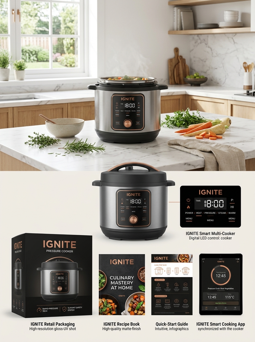
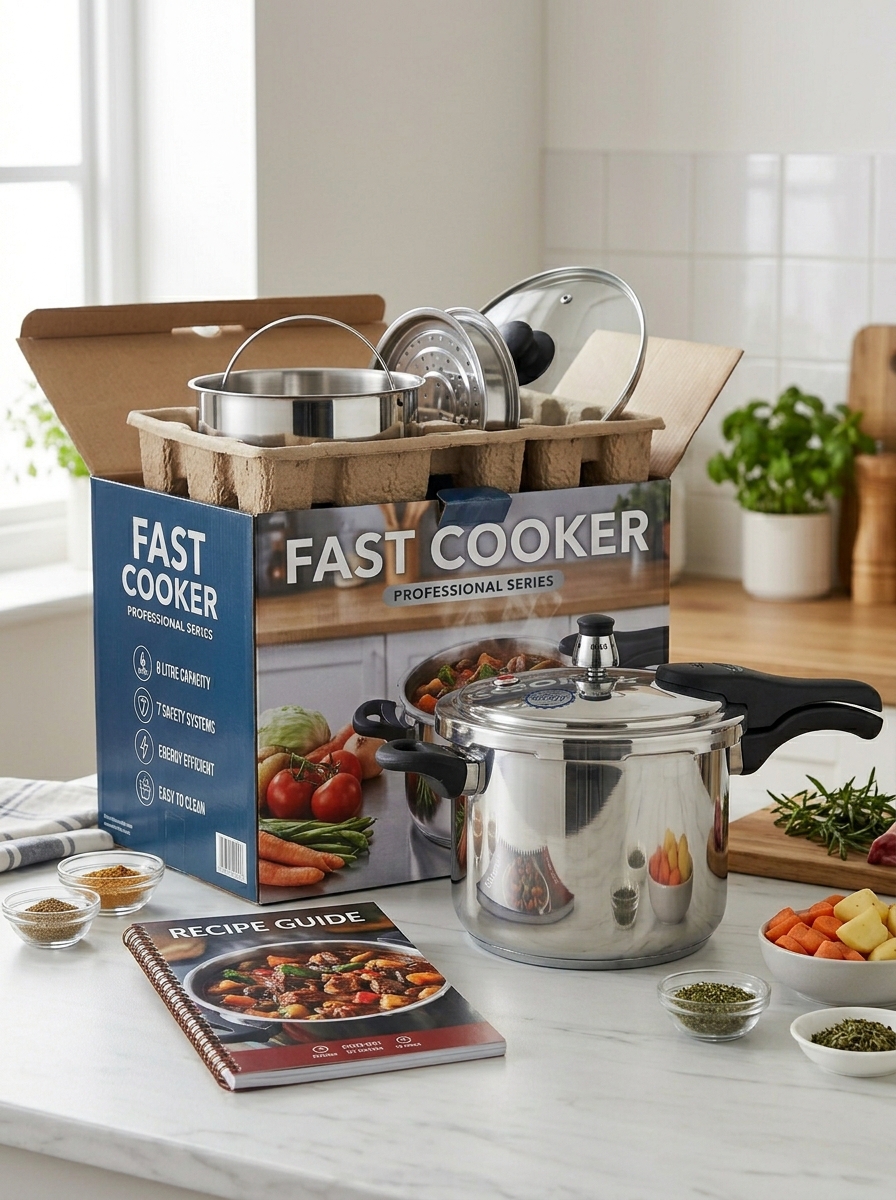
Elevating the Unboxing Experience to Enhance Perceived Value
The unboxing journey for a pressure cooker serves as the critical first touchpoint in the consumer experience. By prioritizing premium packaging design, brands can immediately signal superior product quality and durability.
To maximize perceived value, manufacturers should integrate high-quality protective materials with organized, intuitive layouts. Key elements that enhance this experience include:
- Curated Inserts: Including professional recipe booklets and quick-start guides.
- Functional Accessories: Bundling stainless steel racks or silicone gaskets within the initial reveal.
- Branded Storytelling: Using the inner flaps to communicate safety standards and culinary inspiration.
A seamless transition from box to countertop reduces user friction and reinforces the appliance as a high-end culinary investment, ultimately fostering brand loyalty and positive word-of-mouth.
Integrating Sustainable Materials Without Compromising Premium Aesthetics
Modern pressure cooker manufacturing is evolving to harmonize environmental responsibility with luxury design. By utilizing recycled stainless steel and PFAS-free ceramic coatings, brands reduce their carbon footprint while maintaining the mirror-polished finish consumers expect from high-end kitchenware.
Sustainable innovation extends to ergonomic components, such as handles crafted from bio-based resins or FSC-certified woods. These materials provide exceptional durability and heat resistance without sacrificing the sleek, minimalist silhouette of a premium appliance. This integration ensures that eco-conscious chefs can enjoy high-performance cooking tools that look sophisticated on any stovetop, proving that sustainability is the new hallmark of true luxury in culinary engineering.
Future-Proofing Packaging Design for Digital and Physical Showrooms
Modern pressure cooker packaging must excel in both physical retail environments and digital marketplaces. To future-proof designs, manufacturers are adopting an omni-channel approach that prioritizes high-contrast visual hierarchies and minimalist branding. This ensures that product details remain legible on small smartphone screens while maintaining a premium, tactile presence on store shelves.
Key strategies include integrating interactive elements like QR codes for digital manuals and optimizing structural integrity for e-commerce logistics. By using sustainable, reinforced materials, brands protect the heavy appliance during transit while appealing to eco-conscious consumers. A cohesive design strategy balances bold shelf appeal with the clarity required for digital "hero images," ensuring the pressure cooker stands out in a competitive, multi-platform landscape.
Leave a comment