
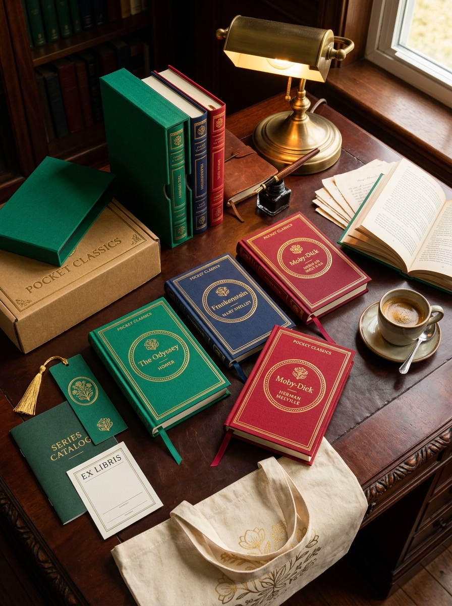
The Bloomsbury Pocket Classics series represents a masterclass in minimalist editorial design, blending historical literary prestige with a clean, contemporary aesthetic. Defining the visual identity of these iconic editions requires a deep understanding of typographic hierarchy and the strategic use of negative space.
To achieve the signature look, designers prioritize high-contrast color palettes and refined serif fonts that evoke a sense of timelessness. This exploration of design principles focuses on the tactile materiality and geometric consistency that transform a standard paperback into a collectible object. By examining the synergy between the bold, monochromatic covers and the portable dimensions, we uncover the essential elements that maintain the collection's status as a benchmark for modern book packaging and visual branding.
Defining the Visual Identity of Bloomsbury Pocket Classics
The visual identity of Bloomsbury Pocket Classics is defined by a sophisticated blend of minimalist aesthetics and bold color theory. Each volume features a striking, monochromatic cover that immediately distinguishes the series from traditional literary editions. Central to this design is the clean, contemporary typography, which provides a modern contrast to the timeless nature of the prose within.
This curated aesthetic focuses on portability and tactile quality, utilizing a compact format and premium paper stock. By maintaining a consistent design language-uniform layouts and a vibrant, yet cohesive palette-Bloomsbury has established a highly recognizable brand. This approach transforms classic literature into stylish, collectible objects. The result is a visually stunning collection that prioritizes both functional design and artistic elegance, successfully redefining the literary canon for modern readers.

The Power of Compact and Portable Dimensions
Bloomsbury Pocket Classics redefine the reading experience through their meticulously designed, compact dimensions. These portable editions are specifically engineered for the modern reader, offering a lightweight alternative to bulky hardcovers without sacrificing legibility or literary integrity.
By prioritizing a pocket-sized format, these books fit seamlessly into small bags or coats, making classic literature accessible during daily commutes, international travel, or brief leisure breaks. This physical accessibility encourages consistent reading habits by removing the burden of heavy volumes.
The power of these dimensions lies in their ergonomic design; they are easy to hold for extended periods, providing a tactile and intimate connection to the text. Whether you are building a coordinated library shelf or reading on the go, these compact editions prove that great stories are most powerful when they are always within reach.
Curating a Sophisticated and Timeless Color Palette
The Bloomsbury Pocket Classics series is defined by a meticulous approach to book design, prioritizing a sophisticated and timeless color palette. Each edition features carefully selected hues-ranging from deep, scholarly indigos to soft, heritage-inspired pastels-that reflect the prestigious nature of the literature inside.
By utilizing a cohesive visual language, these pocket-sized volumes offer more than just portability; they serve as aesthetic objects for collectors. The use of muted tones and high-quality textures ensures that the collection remains visually relevant across decades, transcending modern design trends. This strategic curation emphasizes a premium literary experience, where the harmony between minimalist typography and rich colors creates a distinctive brand identity. Ultimately, the Bloomsbury Pocket Classics palette transforms a personal library into a curated gallery of enduring style and intellectual depth.
Minimalist Typography and Brand Recognition
The Bloomsbury Pocket Classics series is defined by its masterful use of minimalist typography, a key driver of its strong brand recognition. By utilizing clean, sans-serif fonts and generous white space, the series achieves a sophisticated and modern aesthetic that stands out in the crowded literary market.
This deliberate design strategy ensures each volume is instantly identifiable. The consistency of the layout-characterized by centered text and bold, solid-colored covers-creates a cohesive visual identity that appeals to collectors. By stripping away decorative clutter, Bloomsbury focuses on the essential beauty of the book as an object. This "less is more" approach not only enhances legibility but also reinforces the brand's reputation for publishing high-quality, accessible literature in a timeless, iconic format.
Melding Classic Literature with Modern Illustration
Bloomsbury Pocket Classics represent a sophisticated bridge between historical literary excellence and contemporary visual artistry. This curated collection reimagines timeless masterpieces from the world's greatest authors through a modern lens, pairing unabridged texts with striking, fresh cover illustrations.
Designed for portability and aesthetic appeal, these editions transform traditional reading into a tactile, multisensory experience. By integrating bold, artistic designs with iconic narratives, Bloomsbury makes high literature accessible to a new generation of bibliophiles and collectors.
These pocket-sized volumes serve as both functional reading copies and collectible art pieces, ensuring that the emotional depth of the prose is reflected in its outward presentation. Ultimately, the series honors the enduring legacy of the written word while embracing the innovation of modern graphic design, creating a perfect harmony for any modern library.
Tactile Materiality and Premium Paper Selection
Bloomsbury Pocket Classics elevate the reading experience through a rigorous focus on tactile materiality and superior production standards. Each volume is printed on premium, acid-free cream paper, meticulously chosen for its optimal opacity and smooth finish. This high-grade paper selection significantly reduces eye fatigue and prevents ink bleed-through, ensuring clarity for classic typesetting.
The physical design prioritizes a sensory connection; the specific weight and grain of the paper offer a satisfying tactile response, while the durable, soft-touch covers provide a luxury aesthetic. By integrating archival-quality materials into a portable format, Bloomsbury ensures these editions withstand frequent handling. This commitment to material excellence transforms a standard pocket book into a collectible artifact, blending the longevity of traditional bookbinding with modern, ergonomic design for bibliophiles.
Consistency Across the Series for Collector Appeal
The Bloomsbury Pocket Classics are celebrated for their meticulous design, engineered specifically to enhance collector appeal. By maintaining a uniform height, consistent cloth-bound textures, and a harmonious color palette, the series transforms individual literary masterpieces into a cohesive set. This aesthetic consistency ensures that the books look striking when displayed together, creating a "shelfie-ready" library that appeals to modern bibliophiles.
Strategic branding, including matching typography and minimalist cover art, reinforces the identity of the series. For collectors, this visual unity signifies a curated standard of quality. Whether it is a work by Jane Austen or Virginia Woolf, the physical similarities foster a sense of completeness, encouraging readers to acquire the full range. Ultimately, the series bridges the gap between classic literature and premium book design, making it a must-have for home libraries.
The Strategic Use of Negative Space and Layout
The design philosophy of Bloomsbury Pocket Classics centers on visual clarity and aesthetic balance. By expertly employing negative space, these editions avoid the cramped, dense appearance typical of many small-format books. The layout strategy utilizes generous margins and deliberate line spacing to enhance readability and reduce eye strain, ensuring a premium reading experience.
This minimalist approach provides "breathing room" around the typography, allowing the classic prose to remain the primary focus. Strategically using whitespace serves a dual purpose: it elevates the physical book into a sophisticated, modern object while maintaining the prestige of the literary content. Consequently, the layout design transforms these portable editions into luxurious collectibles that prioritize both form and function for the discerning reader.
Balancing Heritage Aesthetics with Contemporary Design
The Bloomsbury Pocket Classics series achieves a masterful fusion of traditional craftsmanship and modern visual appeal. By prioritizing heritage aesthetics, the collection utilizes premium cloth-bound covers, gold foil detailing, and classic ribbon markers that evoke the nostalgic elegance of vintage private libraries.
To remain relevant in a modern landscape, these traditional elements are balanced with contemporary design principles. This is achieved through a bold, curated color palette and clean, minimalist typography that enhances both legibility and shelf-appeal. This strategic blend ensures that each volume is not only a tribute to literary history but also a stylish, portable accessory for the modern reader. By harmonizing old-world durability with a fresh, minimalist artistic direction, Bloomsbury creates a timeless bridge between the past and the present.
Optimizing Shelf Presence and Visual Impact
The Bloomsbury Pocket Classics series is meticulously engineered to maximize shelf presence through a harmonious blend of minimalist aesthetics and tactile quality. By utilizing a uniform height and vibrant, color-coded spines, these editions create a striking visual rhythm when displayed together.
To enhance visual impact, each volume incorporates sophisticated typography and premium finishes, such as foil stamping and textured covers. This strategic design approach appeals to bibliophiles and collectors, transforming classic literature into a decorative statement.
The compact, pocket-sized format reinforces the brand's identity as a premium yet accessible collection. By prioritizing cohesive branding and high-quality production values, Bloomsbury ensures these titles stand out in retail environments, encouraging multi-volume acquisitions and enhancing the overall aesthetic appeal of any personal library.
Leave a comment