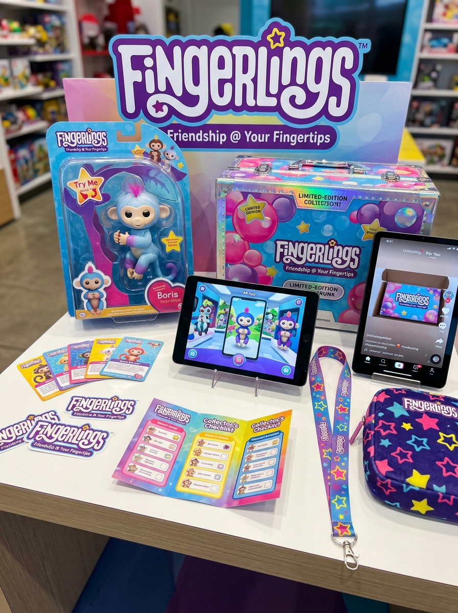
Successful Fingerlings packaging design serves as the primary tactile bridge between an interactive toy and a curious consumer. To capture the whimsical essence of these robotic pets, designers must employ aesthetic principles that balance vibrant color palettes with structural clarity. A well-executed container does more than protect the product; it acts as a visual storyteller that highlights the toy's unique personality and movement through strategic window placement and high-impact graphics.
Developing a creative concept for toy packaging requires a focus on the unboxing experience and shelf presence. By utilizing bold typography and ergonomic shapes, brands can foster an immediate emotional connection. These essential design strategies ensure that every aspect of the display, from material choice to finish, reinforces brand value and delights the target audience from the very first glance.
Understanding the Fingerlings Brand Identity and Target Audience
Fingerlings, developed by WowWee, has established a distinct brand identity centered on the concept of "friendship at your fingertips." These interactive animatronic pets-ranging from monkeys to unicorns-utilize smart sensors to react to touch, motion, and sound. The brand's core values focus on companionship, tactile play, and collectibility, transforming traditional toys into responsive digital companions.
The primary target audience consists of children aged 5 to 10 who are drawn to nurturing play patterns and sensory engagement. Due to their portable size and affordable price point, Fingerlings also appeal to the "kidult" collector market and gift-giving parents. By blending innovative robotics with whimsical designs, the brand successfully captures the imagination of a generation seeking portable, interactive, and emotionally resonant toys.
Vibrant Color Palettes for Maximum Retail Shelf Impact
Fingerlings utilize a strategic array of vibrant color palettes specifically engineered to dominate the toy aisle. By employing high-contrast hues such as electric purple, neon turquoise, and sunset orange, these interactive pets achieve immediate retail shelf impact. This visual strategy ensures that each character-ranging from classic monkeys to mythical unicorns-captures the attention of both children and gift-givers.
The integration of multi-tonal finishes, including ombre gradients and glitter-infused accents, significantly enhances their collectibility and "wow factor." These bold aesthetic choices are designed for on-shelf visibility, ensuring Fingerlings stand out against competitors. By blending trend-driven colors with tactile textures, the brand creates an irresistible sensory appeal that drives impulse purchases and reinforces its position as a leader in the interactive toy market.
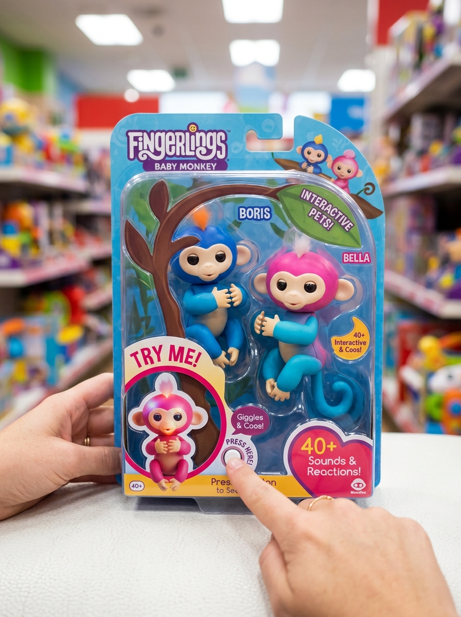
Incorporating Interactive Try Me Features and Window Cutouts
Strategic packaging design is essential for Fingerlings, as the brand's appeal relies heavily on tactile interaction. By integrating "Try Me" features and precision window cutouts, the packaging allows potential buyers to engage with the toy's sensors directly on the retail shelf.
These design elements serve several semantic and functional purposes:
- Sensory Engagement: Cutouts provide physical access to touch sensors, enabling shoppers to trigger lifelike sounds and movements.
- Consumer Trust: Visible window displays showcase the product's quality and mechanical responsiveness before purchase.
- Interactive Marketing: "Try Me" buttons bridge the gap between a static box and the dynamic play experience Fingerlings offer.
By prioritizing accessibility, these interactive features transform passive browsing into an immersive experience, highlighting the unique personality and technological sophistication of these collectible pets.
Playful Typography and Brand Consistency Across Product Lines
The Fingerlings brand identity is anchored by a distinct visual language that communicates fun and interactivity. Central to this strategy is the use of playful typography, featuring rounded, bubbly sans-serif fonts that reflect the toys' tactile nature. These soft, approachable letterforms are designed to resonate with a younger demographic while ensuring high legibility on vibrant packaging.
WowWee maintains strict brand consistency across diverse product expansions, including the original monkeys, Untamed raptors, and mythical unicorns. By utilizing a unified color palette and standardized logo placement, the brand ensures instant recognition on crowded retail shelves. This cohesive design framework bridges different product lines, reinforcing brand equity and encouraging collectibility through a familiar, trusted aesthetic that promises a consistent user experience.
The Art of the Unboxing Experience for Fingerlings Collectors
For Fingerlings collectors, the unboxing experience is a curated ritual of sensory discovery. It begins with the vibrant, windowed packaging designed to showcase each character's unique personality and color palette. Many enthusiasts value the "Try Me" feature, which provides an immediate preview of the toy's interactive sensors and responsive sounds before the seal is even broken.
The tactile sensation of unboxing-releasing the creature to reveal its soft-touch hair and articulated limbs-builds immense anticipation. This process is a cornerstone of toy unboxing culture, where revealing rare glitter editions or limited-run characters generates community engagement. By blending aesthetic presentation with tactile interaction, the reveal transforms a simple purchase into a memorable event, strengthening the emotional connection between the collector and their new robotic companion.
Leveraging Tactile Textures and High Quality Finishes
Fingerlings elevate the interactive toy experience by integrating diverse tactile textures and premium finishes. Each character is meticulously designed with a blend of smooth, soft-touch surfaces and intricate molded details, such as embossed fur or scales, providing a rich sensory experience for children.
The application of high-quality finishes-including vibrant metallic paints, shimmering glitter, and glossy optical sensors-enhances the visual appeal and collectibility of these robotic companions. These sophisticated surface treatments do more than provide aesthetic value; they increase durability and foster a deeper emotional connection through physical touch. By focusing on material quality, Fingerlings ensure a premium feel that distinguishes them in the interactive pet category, making every "friendship at your fingertips" moment both durable and engaging.
Visual Storytelling Through Character Illustration and Graphics
Fingerlings leverage dynamic visual storytelling to bridge the gap between physical play and imaginative narrative. Through detailed character illustration and vibrant graphic design, each interactive pet is imbued with a distinct personality. Designers use expressive facial features and signature color palettes to foster immediate emotional connections with children.
The brand's visual strategy extends beyond the toys themselves, incorporating cohesive digital graphics and illustrative packaging. These elements work together to build a rich, recognizable universe that highlights core themes of friendship and spontaneity. By prioritizing high-quality artistic assets, Fingerlings ensures that every touchpoint-from store shelves to digital screens-tells a compelling story that resonates with its global audience.
Balancing Aesthetic Appeal with Eco-Friendly Packaging Materials
For Fingerlings, packaging is crucial for capturing the vibrant, playful essence of these interactive pets. Balancing aesthetic appeal with eco-friendly materials involves transitioning from traditional plastic blister packs to sustainable alternatives without losing shelf impact.
Manufacturers are now utilizing FSC-certified paperboard and soy-based inks to maintain the brand's signature bright colors. Innovative "open-box" designs and biodegradable windows made from plant-based polymers allow for the essential "try-me" functionality while drastically reducing single-use plastics.
By integrating recyclable packaging structures, Fingerlings can satisfy collector demand for premium unboxing experiences while meeting modern environmental standards. This strategic shift ensures that the charm of these collectible toys remains intact, proving that high-end toy aesthetics and environmental sustainability can coexist effectively in the retail landscape.
Strategic Information Hierarchy for Features and Safety Warnings
Organizing Fingerlings product data requires a strategic balance between engaging features and essential safety protocols. A well-structured hierarchy prioritizes interactive capabilities followed by critical usage warnings to ensure a safe consumer experience.
- Core Features: Highlight sensory technology, including touch sensors, motion detection, and over 70 reactive sounds that define the "friendship at your fingertips" experience.
- Safety Warnings: Clearly delineate mandatory risk disclosures, specifically addressing choking hazards due to small parts and strict battery safety guidelines for button cell maintenance.
- Age Recommendations: Position age-appropriateness (typically 5+) prominently to align consumer expectations with child developmental safety.
This semantic approach ensures that parents and search engines can quickly distinguish between the toy's play value and the necessary precautions for safe operation.
Future Trends in Smart and Interactive Toy Packaging Design
As Fingerlings continue to lead the interactive toy market, packaging design is evolving toward deeper digital integration and sustainability. Future trends prioritize eco-friendly materials like biodegradable molded pulp, reducing the plastic footprint of collectible toys. Additionally, Augmented Reality (AR) is transforming static boxes into immersive portals; by scanning the packaging, children can interact with a virtual version of their Fingerling before the unboxing experience.
Expect to see advanced "try-me" features where capacitive sensors respond through recycled cardboard, alongside modular packaging that converts into a permanent habitat or playset. These innovations focus on circular design and enhanced user experience, ensuring that engagement begins at the point of sale, perfectly aligning with the tech-savvy expectations of modern consumers and the robotics industry.
Leave a comment