Hand cream packaging serves as a vital touchpoint between skincare efficacy and visual brand storytelling. More than a simple container, the design functions as a tactile introduction to the product's sensory experience, influencing consumer perception long before the first application. Mastering the intersection of form and function requires a deep understanding of structural ergonomics, material selection, and sophisticated aesthetic cues.
From minimalist typography that signals purity to premium finishes that evoke luxury, every design element must align with the brand's core identity. To stand out in an evolving marketplace, designers must leverage color psychology and sustainable innovation to create packaging that resonates emotionally with users. Exploring these essential aesthetic principles reveals how thoughtful conceptualization transforms a daily necessity into a coveted lifestyle accessory.
The Role of Sensory Appeal in Hand Cream Design
Sensory appeal is a critical driver in hand cream formulation and consumer satisfaction. Beyond basic hydration, the tactile experience-often referred to as "skin feel"-dictates product success. Designers meticulously calibrate viscosity and absorption rates to ensure a perfect balance between deep nourishment and a non-greasy finish.
The olfactory element also plays a vital role; carefully selected fragrances can evoke positive emotions, provide aromatherapy benefits, or reinforce a sense of clinical cleanliness. Furthermore, the visual consistency and spreadability of the cream signal luxury and efficacy. By optimizing these sensory markers, brands transform a functional skincare task into a premium ritual, significantly enhancing user compliance and long-term brand loyalty. Ultimately, the sensory profile determines how a consumer perceives the product's quality and moisturizing performance.
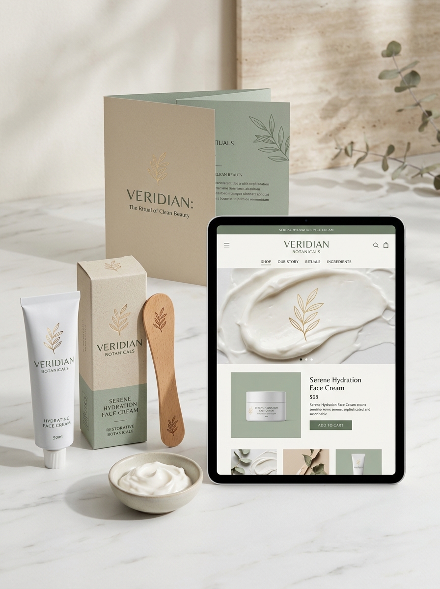
Defining Your Brand Identity Through Visual Elements
In the competitive hand cream market, your visual identity is the first point of contact with consumers. It translates the sensory experience of your product-such as its texture and fragrance-into a compelling brand story. Effective packaging design should reflect your brand's core values, whether that is clinical efficacy or botanical luxury.
Key visual components include color palettes and typography. Soft, muted tones often suggest soothing hydration, while bold graphics can signal energy and modern innovation. Consistent use of these elements across labels and digital marketing establishes brand recognition and trust. By harmonizing your logo, imagery, and material finishes, you create a cohesive identity that resonates with your target audience, turning a basic skincare necessity into an aspirational lifestyle product that stands out on retail shelves.
Color Theory and Emotional Connection in Skincare
In the competitive hand cream market, packaging aesthetics leverage color theory to forge an immediate emotional connection with consumers. Brands strategically utilize specific hues to signal product benefits and influence mood before the cream even touches the skin.
For instance, soft blues and muted lavenders evoke tranquility and deep nighttime hydration, signaling relief for sensitive or cracked skin. In contrast, vibrant citrus tones like orange and yellow suggest energizing properties and daytime vitality. Deep forest greens often represent organic purity and botanical ingredients, building trust through associations with nature.
By aligning visual palettes with sensory expectations, skincare companies enhance the user experience. Understanding these psychological cues allows consumers to select a hand cream that satisfies both their dermatological needs and their desire for emotional well-being through intentional self-care.
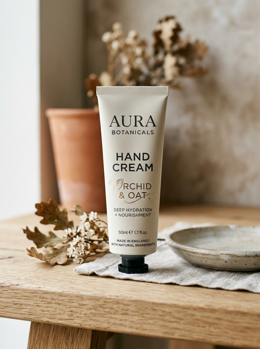
Typography Strategies for Clarity and Elegance
In the skincare industry, typography serves as a vital tool for communicating brand identity and product efficacy. For hand cream packaging, typography strategies must balance aesthetic elegance with functional legibility.
- Font Selection: Luxury hand creams often utilize high-contrast serif fonts to evoke a sense of timelessness, while minimalist brands favor clean sans-serif typefaces for a modern, clinical look.
- Visual Hierarchy: By varying font weights and sizes, brands highlight key benefits-such as "Deep Hydration"-ensuring essential information is processed quickly.
- Legibility on Small Surfaces: Since hand cream tubes offer limited space, generous kerning (letter spacing) and high-contrast color palettes are used to maintain readability on curved packaging.
Ultimately, refined typography reinforces a product's premium feel while ensuring consumers can easily access usage instructions and ingredient lists.
Material Innovation and Tactile Luxury
Modern hand care transcends basic hydration through material innovation, utilizing bio-available ingredients like plant-derived squalane and micro-encapsulated hyaluronic acid. These scientific advancements allow for deep-layer penetration and cellular repair without the heavy, occlusive residue associated with traditional balms.
The essence of tactile luxury lies in the sensory transition from application to absorption. Innovative emulsification techniques create "second-skin" textures that offer a weightless, velvety finish. By balancing lipid-rich nourishment with a non-greasy aesthetic, these formulations provide immediate comfort and long-term skin barrier protection. This synergy of dermatological science and refined texture transforms routine moisturizing into a premium ritual, ensuring the skin feels as sophisticated as it looks.
Ergonomics and the Functionality of Tube Design
The packaging of hand cream is a critical intersection of user experience and product preservation. Ergonomic tube design prioritizes accessibility, often featuring flip-top caps that allow for seamless one-handed operation. This is essential for users seeking immediate relief for dry or chapped skin.
Functionality is further enhanced through material science; flexible laminates and soft-touch plastics provide the necessary squeezability for precise dosage control. This minimizes product waste while protecting the formula from air exposure and oxidation. Key structural elements include:
- Tapered Nozzles: Ensure targeted application and hygienic dispensing.
- Grip-Friendly Shapes: Cylindrical forms that fit comfortably in the palm.
- Travel-Ready Seals: Prevent leaks and maintain internal pressure during transit.
By merging form and function, hand cream tubes ensure the application process is as effortless and restorative as the formula itself.
Sustainability and Eco-Friendly Packaging Solutions
As conscious consumerism grows, the beauty industry is shifting toward sustainable hand cream options. Brands are increasingly adopting eco-friendly packaging solutions, such as recyclable aluminum tubes, post-consumer recycled (PCR) plastics, and biodegradable materials, to significantly reduce environmental impact.
Beyond the container, sustainability involves ethically sourced, plant-based ingredients and waterless formulations that lower carbon emissions during transport. Many innovative brands now offer refillable hand cream systems, allowing consumers to reuse high-quality dispensers and minimize single-use plastic waste.
By choosing products with FSC-certified paper and carbon-neutral shipping practices, you can maintain soft, hydrated skin while supporting a circular economy. Modern hand care now bridges the gap between personal self-care and global environmental responsibility, ensuring your beauty routine is as kind to the planet as it is to your hands.
The Impact of Minimalist versus Maximalist Styles
In the hand cream industry, branding aesthetics significantly influence consumer perception and purchasing behavior. Minimalist hand creams focus on "less is more," often featuring clean typography, neutral palettes, and streamlined ingredient lists. This style appeals to consumers seeking transparency, clinical efficacy, and fragrance-free formulas suitable for sensitive skin.
In contrast, maximalist hand creams embrace vibrant packaging, complex botanical scents, and multi-layered benefits. These products target individuals looking for luxury, sensory indulgence, and artisanal storytelling. While minimalist styles suggest purity and functional reliability, maximalist designs elevate hand care into a premium self-care ritual.
Ultimately, the choice between these styles dictates how a brand communicates its value proposition-whether through the quiet authority of essentialism or the bold expression of luxury and complexity.
Visualizing Ingredients with Botanical Imagery
In the hand cream industry, botanical imagery serves as a vital bridge between scientific formulation and nature's restorative power. By utilizing high-resolution visuals of aloe vera, shea butter, and lavender, brands provide immediate semantic cues regarding the product's benefits and scent profile.
Visual storytelling through macro photography allows consumers to "see" the hydration and nourishment before application. This approach reinforces a natural skincare narrative, helping users quickly identify plant-based ingredients that soothe dry or cracked skin. Effective botanical visualization transforms a standard ingredient list into a sensory experience, fostering consumer trust through transparency. Whether using earthy tones or vibrant floral accents, these images communicate the organic origin of the formula, ensuring the essence of the hand cream-nature's healing touch-is felt instantly.
Building Brand Loyalty Through Consistent Packaging Design
In the competitive skincare market, consistent hand cream packaging is vital for fostering long-term brand loyalty. When consumers can instantly identify a product through its signature color palette, typography, and tube material, it builds a sense of familiarity and trust. Consistency signals professional quality and ensures that the brand remains top-of-mind during the purchasing process.
Key elements for maintaining a cohesive brand identity include:
- Visual Uniformity: Using a synchronized aesthetic across various scents or specialized formulas.
- Tactile Branding: Choosing specific materials, such as aluminum or soft-touch plastic, to create a memorable sensory connection.
- Strategic Logo Placement: Ensuring clear visibility for immediate brand recall on crowded retail shelves.
By delivering a predictable and aesthetically pleasing experience, brands transform a simple moisturizing routine into a loyal consumer habit.
Leave a comment