
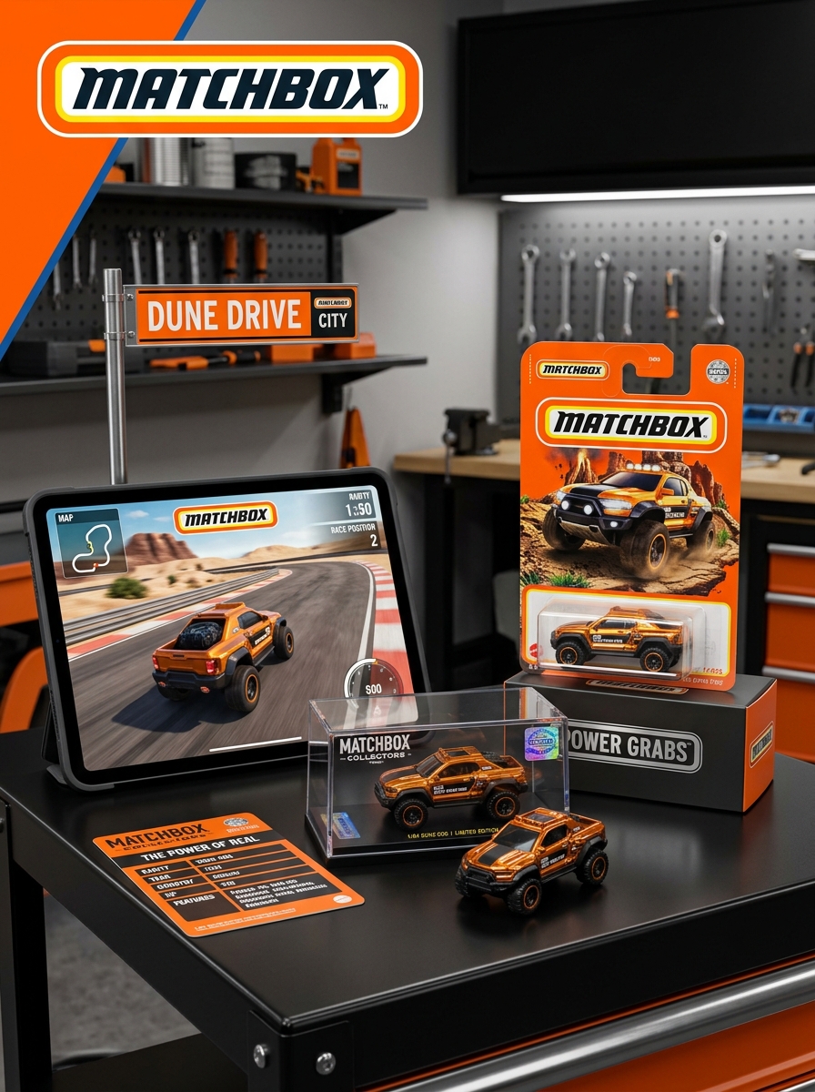
For decades, Matchbox die-cast vehicles have defined the miniature automotive world, not just through their precision engineering but through iconic packaging design that captures the imagination. Understanding the synergy between graphic presentation and collector aesthetics is essential for anyone looking to master the art of die-cast branding and preservation.
From nostalgic "matchbox" style containers to modern blister packs, every visual element-typography, color palettes, and structural integrity-serves a dual purpose: protecting the model and enhancing its shelf presence. This exploration into design concepts examines how strategic aesthetic choices influence market value and resonate with the psychological triggers of long-term hobbyists. By balancing heritage motifs with contemporary visual trends, designers create more than a protective shell; they craft a physical extension of the vehicle's legacy that speaks directly to the collector's heart.
Evolution of the Iconic Matchbox Brand Identity
The Matchbox brand identity originated in 1953 when Lesney Products introduced miniature die-cast vehicles designed to fit inside a matchbox. Initially, the brand's visual language focused on meticulous realism and utilitarian packaging, where the iconic yellow and blue boxes became globally recognized symbols of quality craftsmanship.
Throughout the decades, the identity adapted to market shifts. The 1970 introduction of "Superfast" wheels moved the brand toward high-performance play to compete with Hot Wheels. Despite subsequent ownership transitions-from Lesney to Tyco and finally Mattel-Matchbox has reclaimed its heritage by emphasizing authentic, licensed replicas of real-world vehicles.
Modern Matchbox branding integrates sustainability with nostalgia. By focusing on eco-friendly materials and detailed realism, the brand continues to bridge the gap between vintage collectibility and contemporary play, solidifying its status as a cornerstone of the die-cast toy industry.
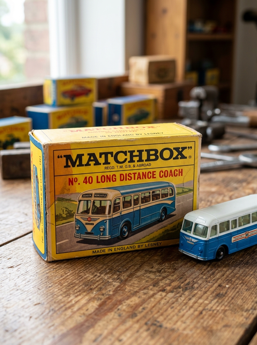
The Legacy of the Original Matchbox Cardboard Box
The original cardboard packaging is the cornerstone of the Matchbox brand identity. Introduced by Lesney Products in 1953, the iconic yellow and blue design was specifically engineered to mimic a real box of matches, providing the die-cast vehicles with their legendary name and unique shelf presence.
This packaging legacy is defined by several key factors:
- Innovation: The "1-75 series" box art featured detailed illustrations that fueled children's imaginations.
- Investment Value: In the collector market, original boxes often hold more value than the cars themselves, as few survived the playrooms of the 1950s and 60s.
- Brand Heritage: The tactile nature of the cardboard box remains a nostalgic symbol of mid-century toy manufacturing.
Today, these boxes are essential artifacts, representing the transition of simple die-cast toys into world-renowned collectibles.
Principles of Visual Storytelling in Card Art Illustration
Visual storytelling in Matchbox card art transforms a 1:64 scale die-cast vehicle into a cinematic protagonist. Illustrators employ dynamic composition and forced perspective to create a sense of motion and scale, making miniature models appear life-sized and powerful.
Key storytelling principles include:
- Contextual Backgrounds: Placing vehicles in rugged off-road terrains or vibrant cityscapes to define their functional identity.
- Action Cues: Utilizing "speed lines," tire smoke, or splashing water to imply high-velocity performance and adventure.
- Lighting and Contrast: Using dramatic highlights to accentuate the specific casting details and realistic paint finishes.
- Emotional Resonance: Leveraging nostalgic color palettes and retro typography to connect with collectors' memories.
By harmonizing these elements, Matchbox packaging creates an immersive narrative that sparks imagination and drives collectibility through artistic excellence.
Analyzing the Color Theory of Die-Cast Packaging
Matchbox cars utilize strategic color palettes to drive brand recognition and emotional resonance. The most iconic element is the signature yellow and orange scheme, which has defined the brand's visual identity for decades. In color psychology, yellow evokes optimism and high visibility, ensuring the product stands out on retail shelves, while orange suggests energy and movement.
Historically, the "matchbox" style box used high-contrast combinations like yellow and blue to enhance legibility at a small scale. Today, die-cast packaging often incorporates dark gradients or metallic finishes to denote premium collector series, signaling exclusivity and higher production value. By balancing vibrant primary colors for children and sophisticated tones for hobbyists, Matchbox leverages color theory to maintain its status as a dominant force in the miniature automotive market.
The Shift from Blister Packs to Sustainable Box Designs
Matchbox is revolutionizing its retail presence by transitioning from traditional plastic blister packs to sustainable, plastic-free box designs. This strategic pivot aligns with Mattel's commitment to utilize 100% recycled, recyclable, or bio-based plastic materials across all products and packaging by 2030.
The new eco-friendly packaging honors the brand's 1953 heritage, reintroducing the iconic cardboard "matchbox" style. By eliminating single-use plastics and transparent acetate windows, Matchbox achieves several environmental milestones:
- Waste Reduction: Minimizing non-recyclable components in landfills.
- Heritage Branding: Reclaiming the classic aesthetic that originally defined the brand.
- Responsible Sourcing: Utilizing FSC-certified materials to ensure forest conservation.
This evolution reflects a modern approach to die-cast collecting, prioritizing environmental stewardship alongside the timeless joy of play and display.
Typography and Branding Elements for Collector Appeal
The visual identity of Matchbox cars is a primary driver for collector value and nostalgia. Key branding elements include the iconic "slanted" typography and the historic Lesney logo, which signify authenticity and specific production eras.
Collectors prioritize several design factors when evaluating die-cast models:
- Wordmark Evolution: Transitions from classic script to bold, modern block fonts help date vintage pieces.
- Packaging Graphics: The "matchbox" shaped logo and vibrant card art enhance shelf appeal and signify market rarity.
- Series Branding: Distinctive typefaces for specialized lines, such as Superfast or Models of Yesteryear, create immediate sub-brand recognition.
Strategic use of these typographic styles maintains the brand's heritage, ensuring that specific release years and limited editions remain easily identifiable for serious enthusiasts.
Display Dynamics and the Psychology of Unboxing
For Matchbox car enthusiasts, the transition from packaging to pedestal is a nuanced ritual. The psychology of unboxing centers on sensory satisfaction-the crisp snap of the blister pack and the cold, tactile weight of the die-cast metal. Collectors often face a psychological tug-of-war between the "mint-in-box" investment value and the visceral joy of physical handling.
Display dynamics further elevate the hobby, transforming individual 1:64 scale models into a curated narrative. Whether utilizing tiered acrylic cases or custom wall racks, the arrangement emphasizes historical accuracy and design evolution. This intentional presentation taps into a sense of order and mastery, where the visual aesthetic of a perfectly aligned fleet provides lasting cognitive rewards long after the initial thrill of the "crack" has faded.
Distinguishing Premium Series Through Packaging Architecture
For die-cast enthusiasts, identifying Matchbox premium series begins with analyzing packaging architecture. While standard mainline cars utilize basic blister cards, premium lines-such as Moving Parts, Collectors, and Working Rigs-employ specific structural cues to signal higher production values.
- Cardstock and Finish: Premium releases often feature heavier gauge cardstock with matte or UV-spot gloss finishes and intricate, character-driven card art.
- Box Integration: High-tier series frequently include a "Power Grab" style box or a protective acrylic case housed within a larger window box, catering to "mint-in-box" collectors.
- Visual Branding: Look for distinct logos, such as the Matchbox Heritage seal or "True Grip" branding, which denotes rubber tires and enhanced detailing.
This tiered packaging serves as a visual shorthand for quality, distinguishing collector-grade models from basic toy shelf inventory through superior materials and display-ready engineering.
The Impact of Packaging Condition on Resale Value
In the Matchbox car secondary market, the condition of the original packaging is a primary determinant of a model's market price. A Mint on Card (MOC) or "New in Box" (NIB) vehicle typically commands a significant premium over loose examples, often doubling or tripling the value.
Collectors scrutinize several specific packaging flaws that can diminish resale potential:
- Blister Integrity: Cracks, dents, or yellowing of the plastic bubble.
- Cardback Quality: Creases, "soft corners," or price tag residue.
- Factory Seals: Intact glue or tape that proves the car has never been handled.
For rare vintage Lesney editions, a pristine original box is frequently more valuable than the car itself. Maintaining original packaging preserves the die-cast's paint and wheels from oxidation, ensuring its status as an investment-grade collectible.
Future Trends in Matchbox Packaging Innovation
The future of Matchbox packaging is defined by a shift toward sustainability and digital integration. As Mattel moves closer to its goal of using 100% recycled, recyclable, or bio-based plastic materials by 2030, collectors are seeing a transition from traditional plastic blister packs to plastic-free paperboard boxes. These eco-friendly designs, similar to the "Power Grabs" series, reduce environmental impact without compromising the protection of the die-cast vehicles.
Beyond sustainability, smart packaging is an emerging trend. Future releases may feature QR codes and Augmented Reality (AR) elements, allowing enthusiasts to unlock digital checklists and interactive content. By combining sustainable materials with modern technology, Matchbox ensures its iconic packaging remains relevant for both nostalgic collectors and a new generation of environmentally conscious fans.
Leave a comment