
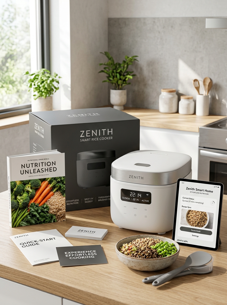
Elevating a kitchen appliance from a functional tool to a lifestyle statement begins with aesthetic rice cooker packaging design. As modern consumers increasingly prioritize home decor harmony, the visual language of small appliance boxing has shifted toward sophisticated, minimalist sensibilities.
To create a compelling shelf presence, designers must master several essential visual elements. This includes the strategic use of muted color palettes, high-fidelity lifestyle photography, and clean, sans-serif typography. These components do more than just provide information; they communicate brand values of simplicity and innovation. By integrating tactile finishes and balanced white space, premium packaging concepts transform a standard utility item into a high-end culinary accessory that resonates with the contemporary buyer's desire for both form and function.
Minimalist Product Photography and High-Definition Hero Shots
Elevating the visual appeal of a modern rice cooker requires a strategic blend of minimalist product photography and high-definition hero shots. These techniques highlight the appliance's sleek silhouette and contemporary aesthetics by utilizing neutral backgrounds that eliminate distractions.
High-resolution imagery captures essential fine details, such as the tactile texture of the digital control panel, the polished finish of the exterior, and the precise fit of the lid. By emphasizing clean lines and premium materials, these professional shots build consumer trust and showcase the product's superior build quality. Semantic-rich visuals ensure that the functional elegance of the rice cooker remains the primary focus, positioning it as a sophisticated centerpiece for the modern kitchen. This visual approach effectively communicates both the efficiency and the lifestyle benefits of the appliance.
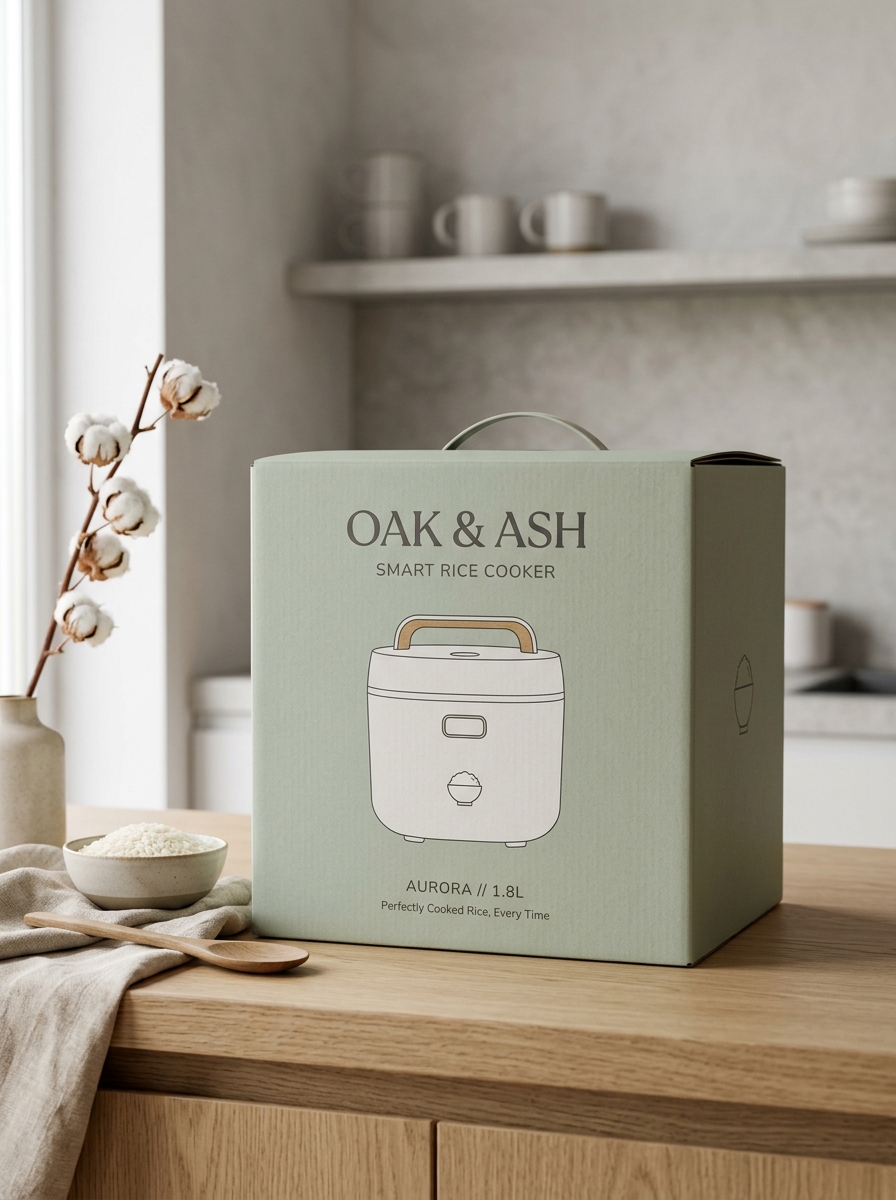
Soft Neutral Color Palettes and Sophisticated Matte Textures
Modern rice cooker design has evolved beyond mere utility, embracing a lifestyle-centric aesthetic that complements contemporary home decor. Manufacturers now prioritize soft neutral color palettes-such as warm creams, muted greys, and earthy tones-allowing these appliances to blend seamlessly into minimalist kitchen environments.
In addition to color, sophisticated matte textures have replaced traditional high-gloss finishes. These matte surfaces offer several key advantages:
- Fingerprint Resistance: Keeps the appliance looking pristine even with frequent daily handling.
- Anti-Glare: Provides a soft, premium look that diffuses kitchen lighting beautifully.
- Tactile Quality: Delivers a high-end, velvet-like feel that enhances the overall user experience.
By combining these subtle colors with refined finishes, the rice cooker becomes a stylish countertop centerpiece rather than just a functional tool.
Modern Sans-Serif Typography for Enhanced Readability
Integrating modern sans-serif typography into rice cooker interfaces and instruction manuals significantly optimizes the user experience. Unlike traditional serif fonts, sans-serif typefaces feature clean, minimalist lines that reduce visual clutter. This design choice is essential for digital LED displays and tactile control panels, ensuring that specific settings-such as "GABA Brown" or "Porridge"-are legible at a glance, even in low-light kitchen environments.
By utilizing fonts with high X-heights and open counters, manufacturers improve accessibility for users of all ages. Clear, geometric letterforms ensure that timing and temperature indicators remain unambiguous, preventing operational errors. Ultimately, streamlined typography bridges the gap between advanced multi-cooker technology and intuitive kitchen utility, making daily meal preparation more efficient and user-friendly.
Strategic White Space and Balanced Layout Composition
Modern rice cooker design prioritizes user experience through strategic white space and a balanced interface layout. By utilizing negative space around digital displays and tactile buttons, manufacturers prevent visual clutter, allowing users to navigate diverse cooking modes-such as brown rice, porridge, or quick cook-with intuitive ease.
A centered control panel creates a sense of symmetry and stability, which is essential for appliance ergonomics. This minimalist approach does more than enhance kitchen aesthetics; it improves functional accessibility and simplifies the cleaning process. A balanced composition ensures that essential indicators, like timers and heat settings, are immediately visible, reducing cognitive load during meal preparation. Integrating these design principles ensures that high-tech kitchen appliances remain visually harmonious and user-friendly within contemporary culinary environments.
Stylized Vector Illustrations of Fresh Ingredients and Grains
Enhance your culinary content with high-quality stylized vector illustrations that showcase the versatility of the modern rice cooker. These clean, digital artworks highlight a variety of staple grains, including long-grain jasmine, nutrient-dense brown rice, and quinoa, rendered with vibrant colors and precise lines.
Beyond grains, these illustrations feature fresh ingredients such as crisp broccoli, sliced carrots, and aromatic ginger, emphasizing the appliance's ability to steam and infuse flavors. Using semantically rich visual representations helps users quickly identify healthy components for one-pot meals. These graphics serve as an intuitive guide for recipe blogs and instruction manuals, celebrating the perfect harmony between fresh produce and expertly cooked grains.
Intuitive Feature Iconography and Smart Function Symbols
Modern rice cookers utilize intuitive iconography to simplify the user experience. These smart function symbols allow users to navigate diverse settings-such as GABA brown rice, porridge, or quick-cook modes-with a single glance. Visual cues like grain silhouettes, steam clouds, and clock faces represent specific grain selections, steaming functions, and delay timers.
Effective interface design ensures that advanced smart rice cookers remain accessible. Common symbols include:
- Grain Variants: Specific icons for white, brown, jasmine, or sushi rice.
- Cooking Modes: Symbols for slow cooking, sautéing, or keep-warm functions.
- Connectivity: Wi-Fi or Bluetooth indicators for mobile app synchronization.
By employing universal symbols, manufacturers eliminate language barriers and reduce the learning curve, ensuring consistent, high-quality results for every meal.
Premium Foil Stamping and Spot UV Finishing Accents
Elevate the visual appeal of high-end kitchen appliances with sophisticated finishing techniques. For premium rice cookers, foil stamping and spot UV accents are essential for creating a luxury brand presence. Foil stamping applies a thin layer of metallic material, such as gold or silver, to logos and decorative borders, providing a brilliant, reflective sheen that signifies superior craftsmanship.
Complementing this, spot UV coating adds a targeted high-gloss finish to specific design elements. This creates a striking tactile contrast against matte surfaces, highlighting key features and branding. These professional finishing touches not only enhance the out-of-box experience but also reinforce the appliance's position as a top-tier product, appealing to discerning consumers who value both high-performance technology and aesthetic elegance.
Lifestyle Imagery Integrating Domestic Kitchen Harmony
Modern rice cookers have evolved beyond mere utility, becoming central figures in domestic kitchen harmony. Lifestyle imagery captures these appliances as sophisticated elements of interior design, blending seamlessly with contemporary aesthetics. By prioritizing sleek lines and intuitive interfaces, the rice cooker complements a balanced home environment.
Integrating high-quality visuals of rice cookers in a lived-in setting emphasizes their role in streamlining meal preparation and fostering family connection. These images evoke a sense of calm efficiency, showing how automated technology reduces kitchen stress while promoting healthy eating habits.
Ultimately, the presence of a rice cooker in lifestyle photography symbolizes the perfect intersection of functional elegance and nutritional wellness, making it an indispensable component of the modern, harmonious household.
Eco-Friendly Branding Elements and Sustainable Material Cues
Modern rice cooker manufacturers are increasingly adopting sustainable branding elements to appeal to eco-conscious consumers. Material cues such as PFAS-free ceramic non-stick coatings and bio-based resins replace traditional plastics, signaling a commitment to health and environmental safety. Brands often utilize earthy, neutral color palettes and minimalist aesthetics to evoke a sense of natural purity.
Key indicators of sustainability include the use of recycled PCR plastics for outer housings and Forest Stewardship Council (FSC) certified bamboo accents. Beyond the appliance itself, eco-friendly branding extends to plastic-free packaging and soy-based ink printing. These semantic markers, combined with high-efficiency induction heating technology that reduces energy consumption, reinforce a brand's dedication to the circular economy and long-term product durability, effectively building trust with shoppers looking for low-impact kitchen solutions.
Cohesive Brand Identity and Structural Information Hierarchy
Establishing a cohesive brand identity for rice cookers ensures consumers recognize quality and reliability across various models. This consistency is maintained through signature design elements, such as minimalist interfaces and ergonomic lid releases, which reinforce brand authority in the small appliance market.
Complementing this identity is a structural information hierarchy, which organizes technical specifications into digestible segments. By prioritizing data, brands guide users through essential features:
- Heating Technology: Highlighting Induction Heating (IH) or Micom sensors.
- Capacity & Versatility: Categorizing cup sizes and multi-grain presets.
- Maintenance: Detailing non-stick coatings and detachable inner lids.
Logical information layering not only enhances user experience but also optimizes semantic relevance, making it easier for consumers to compare performance and make informed purchasing decisions.
Leave a comment