For over eighty years, Little Golden Books have maintained a visual identity that is instantly recognizable across generations. This enduring appeal stems from a meticulous approach to packaging design and a cohesive brand aesthetic. At the heart of its iconic look is the signature metallic gold foil spine, a design choice that transformed affordable children's literature into cherished, collectible keepsakes.
Beyond the gold accents, the brand utilizes sturdy cardboard covers and a standardized trim size to prioritize both durability and accessibility. By blending nostalgic illustrations with functional structural elements, the series exemplifies how strategic design principles establish long-term brand equity. Understanding these core components reveals how the publisher balances traditional charm with modern shelf presence, ensuring each volume remains a timeless staple in household libraries worldwide.
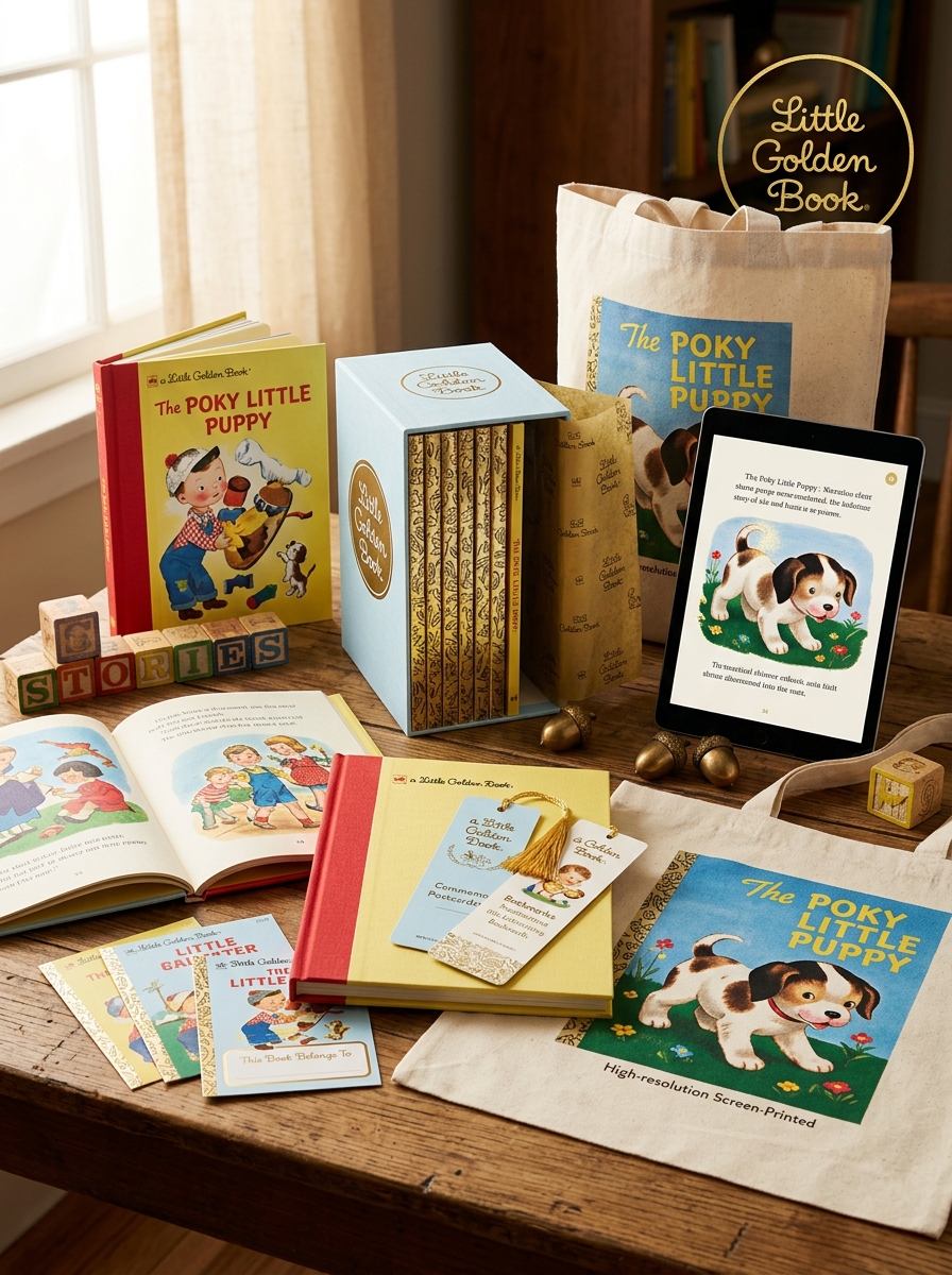
The Iconic Golden Spine and Heritage Binding
The most recognizable feature of a Little Golden Book is its signature golden foil spine. Introduced in 1942, this distinctive metallic tape was more than a decorative flourish; it served as a hallmark of durability and brand identity. This "heritage binding" utilizes sturdy cardboard covers designed to withstand the frequent handling of young readers.
By using affordable yet robust materials, Western Publishing revolutionized the industry, allowing high-quality children's literature to be sold in supermarkets and pharmacies. The shimmering gold spine remains a symbol of accessibility and nostalgia, ensuring the books are easily identifiable on any shelf. Today, this iconic binding style continues to preserve the structural integrity of the stories, maintaining a tradition of quality that has spanned generations of collectors and families worldwide.
Defining the Signature Compact Form Factor
The Little Golden Book is instantly recognizable by its signature compact form factor, a design that revolutionized children's publishing. Measuring approximately 6.5 by 8 inches, these books were specifically engineered to be "child-sized," fitting perfectly in small hands for an intimate reading experience.
The most iconic structural element is the gold-foil spine, which provides both structural durability and a premium aesthetic at an affordable price point. Constructed with sturdy cardboard covers and a standardized 28-to-32-page count, the format allowed for efficient mass production. Launched in 1942, this physical blueprint ensured portability and accessibility, making high-quality illustrated literature available to the general public. Today, the gold-patterned binding remains a universal visual shorthand for nostalgic, durable, and educational early childhood storytelling.
Visual Storytelling Through Classic Illustration Styles
Little Golden Books revolutionized children's literature by making high-quality visual storytelling accessible to every household. The series is defined by its iconic aesthetic, featuring vibrant gouache paintings and whimsical character designs that capture the imagination. Renowned illustrators like Mary Blair, Gustaf Tenggren, and Eloise Wilkin brought sophisticated mid-century modern art styles to the masses, blending fine art techniques with narrative charm.
These classic illustration styles do more than decorate; they provide essential context for early childhood literacy. Through expressive textures and warm color palettes, the artwork creates an immersive emotional world that resonates with young readers. This legacy of "art for the people" helped bridge the gap between commercial publishing and artistic excellence, ensuring that Little Golden Books remain a gold standard in graphic design and children's book history.
Typography and the Timeless Red Logo Placement
The enduring appeal of Little Golden Books lies in their consistent visual branding. The typography typically utilizes bold, approachable sans-serif typefaces designed for readability and warmth. This typographic clarity is anchored by the iconic red logo seal, which has served as a beacon of quality since 1942.
Strategically placed-often in the top left corner or integrated into the famous gold-foil spine-the red logo provides an immediate point of recognition. This precise placement ensures that regardless of the unique illustrator's style, the brand identity remains unified. By balancing vibrant cover art with a standardized logo and font hierarchy, the design creates a sense of nostalgia and trust, making these books instantly identifiable on any shelf and preserving their status as a staple of children's literature.
The Role of the Distinctive Border and Framing Elements
The most recognizable feature of Little Golden Books is the iconic gold foil spine. This distinctive framing element was originally designed to provide a premium aesthetic at an affordable price point. Beyond visual appeal, the metallic spine serves as a powerful branding tool, ensuring instant recognition on crowded bookshelves and creating a sense of "collectibility" for families.
Internally, these books utilize consistent margin structures and decorative borders that frame vibrant illustrations. These elements provide visual continuity across the expansive series, grounding the narrative and making the layout accessible for early learners. By combining structural durability with a signature "treasure-like" appearance, the borders and framing elements established Little Golden Books as a permanent cultural staple in children's literature and publishing history.
Tactile Appeal of Textured Paper and Chipboard Covers
The enduring legacy of Little Golden Books is rooted in their unique physical construction. Beyond the iconic gold foil spine, the tactile appeal of these books stems from the use of heavy chipboard covers and distinctive textured paper. The thick, rigid chipboard provides a sense of durability and quality, making the books easy for small hands to grip and highly resistant to wear.
Many classic editions feature a "linen-finish" or embossed paper texture that offers a sensory experience modern glossy prints often lack. This tactile feedback engages young readers, fostering a deeper connection to the physical storybook. For collectors and parents, the weight of the chipboard and the granular feel of the pages are hallmarks of authenticity, defining a sensory standard in children's publishing that has persisted since 1942.
Color Palette Strategies for Instant Brand Recognition
Little Golden Books utilize a masterful color strategy to maintain high brand equity and shelf visibility. The most critical element is the signature gold foil spine, a metallic yellow hue that serves as an immediate visual anchor. This consistent use of "golden" branding allows consumers to identify the product instantly, even from a distance.
Beyond the spine, the brand employs a vibrant, high-contrast palette of primary colors-bold reds, blues, and yellows. These hues are specifically chosen to stimulate early childhood cognitive development and emotional engagement. By maintaining these specific saturation levels for over eighty years, the publishers trigger nostalgic recognition in parents while remaining visually appealing to children. This cohesive color language ensures that every title feels like part of a unified, trusted collection.
Balancing Nostalgia with Modern Retail Display Standards
For decades, Little Golden Books have been defined by their iconic gold foil spine and uniform dimensions. In the competitive landscape of modern retail, publishers must balance this vintage charm with rigorous merchandising standards. Retailers prioritize scannability, durability, and shelf-ready packaging, which can sometimes clash with the delicate, classic aesthetic of legacy publishing.
To maximize shelf presence, modern displays often utilize tiered shelving and branded endcaps that highlight the series' collectible nature. By integrating contemporary point-of-sale (POS) requirements-such as optimized barcode placement and UV-coated covers-without altering the traditional 6.6" x 8" format, the brand satisfies both nostalgic parents and efficiency-driven retailers. This strategic alignment ensures that the heritage of Little Golden Books remains prominent in high-traffic commercial environments while preserving the tactile experience consumers expect.
The Narrative Power of Front Cover Composition
Little Golden Books utilize masterful cover design to act as a visual prologue for young readers. The composition centers on character-driven imagery and vibrant color palettes that instantly establish a story's emotional tone. By strategically positioning focal points against the iconic gold foil spine, illustrators create a balanced frame that guides the viewer's eye toward the central action or protagonist.
This intentional arrangement does more than just identify a brand; it provides essential narrative cues that spark the imagination before a single page is turned. Through artistic layering and dynamic perspectives, these covers communicate complex themes of adventure and friendship at a glance. This high-level semantic clarity ensures immediate engagement for children while maintaining a timeless aesthetic that appeals to collectors and parents alike.
Maintaining Brand Equity Through Consistent Design Language
Little Golden Books have sustained decades of market dominance by adhering to a rigid yet iconic visual identity. The cornerstone of their brand equity is the signature gold foil spine, a distinctive feature that ensures instant shelf recognition. By maintaining a uniform 6.5-inch by 8-inch physical format and consistent cover typography, the publisher creates an enduring sense of reliability and nostalgia.
This strategic design language serves as a quality hallmark, signaling value to both parents and collectors. Whether a 1940s classic or a modern licensed title, the structural commonalities-sturdy cardstock covers and the recognizable "A Little Golden Book" header-unify the diverse catalog. This consistency reduces consumer friction and strengthens the emotional bond across generations, solidifying the brand's status as a staple in children's literature.
Leave a comment