
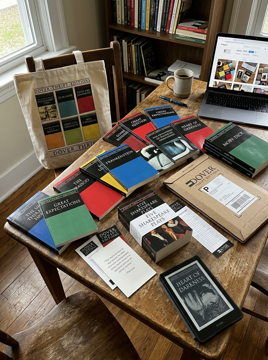
Since their debut, Dover Thrift Editions have redefined the intersection of affordability and visual identity within the publishing industry. By prioritizing a minimalist design philosophy, these editions strip away superfluous ornamentation to focus on the essential power of bold typography and stark, meaningful iconography.
The series' distinctive cover aesthetics represent a deliberate artistic choice that celebrates the enduring nature of classic literature. This analysis explores the core design principles governing the collection, specifically how restricted color palettes and clean, grid-based layouts established a globally recognized brand. By examining the evolution of these covers, we uncover how a commitment to functional minimalism has allowed centuries-old texts to remain visually relevant and accessible to diverse audiences, proving that high-quality literature does not require extravagant packaging to command attention and respect.
The Legacy of Dover Thrift Editions in Book Design
The legacy of Dover Thrift Editions in book design is rooted in the revolutionary concept of functional minimalism. Since their debut in 1990, these editions have challenged publishing norms by prioritizing content over decorative excess. By utilizing slim profiles and durable, acid-free paper, Dover transformed the mass-market paperback from a disposable format into a lasting scholarly resource.
Their iconic cover aesthetics-characterized by centered classical art and distinct borders-created a recognizable visual brand that signifies both intellectual value and accessibility. This design philosophy proved that classic literature could be elegantly packaged without high manufacturing costs. Ultimately, Dover Thrift Editions influenced modern book design by demonstrating that simplicity and affordability are essential tools for the global democratization of knowledge.
Core Philosophy Behind the Minimalist Aesthetic
The core philosophy of Dover Thrift Editions centers on the democratization of literature through radical affordability. By embracing a minimalist aesthetic, Dover prioritizes accessibility over ornamental design. This functional approach intentionally strips away expensive embellishments, such as high-gloss finishes or intricate cover art, to minimize production overhead.
This "no-frills" visual identity reflects a commitment to the intrinsic value of the written word rather than the book as a luxury commodity. By utilizing uniform typography and simple layouts, the series ensures that foundational works of prose, poetry, and drama remain financially accessible to students and lifelong learners. Ultimately, the minimalist design serves a utilitarian purpose: removing economic barriers to education and proving that the true power of a classic lies in its content, not its packaging.
Visual Consistency Across Diverse Literary Genres
Dover Thrift Editions achieve a cohesive brand identity through a standardized design framework that spans poetry, drama, and classic fiction. Despite the vast range of genres, each volume features signature structural elements, such as the iconic color-coded borders-most notably the forest green trim-and uniform serif typography.
By pairing these consistent layouts with curated historical artwork or minimalist illustrations, Dover creates a recognizable "house style." This visual synergy ensures that a collection of disparate titles feels like a unified library. For readers and educators, this aesthetic reliability signals quality and affordability, allowing the diverse content to take center stage while maintaining an unmistakable presence on the bookshelf. This strategic design approach fosters brand loyalty, making the series instantly identifiable across any literary category.
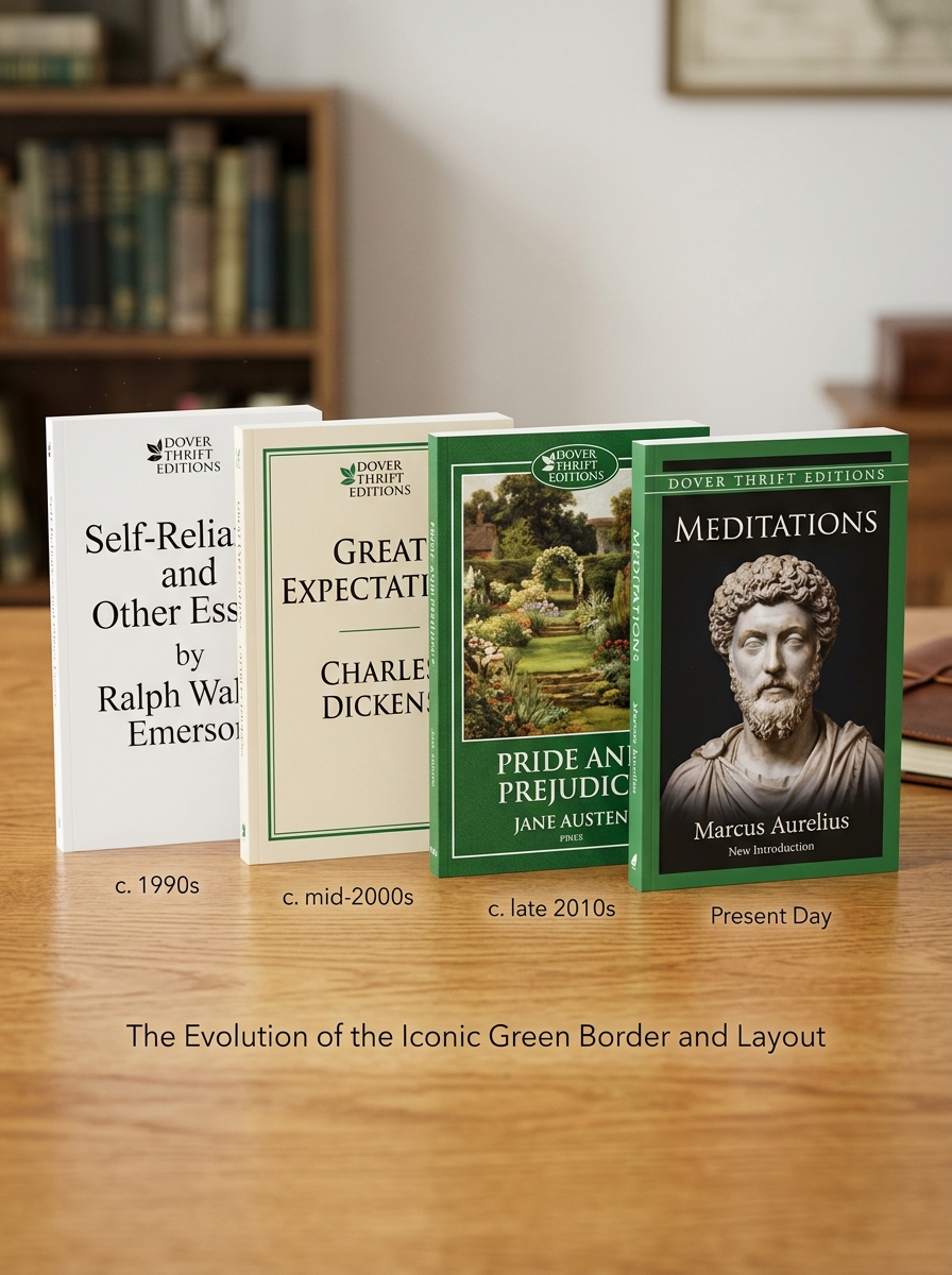
The Evolution of the Iconic Green Border and Layout
Since their debut in 1990, Dover Thrift Editions have become instantly recognizable through their signature green border. This design choice was initially a strategic move to maintain low production costs while establishing a strong brand identity in the classic literature market. The iconic green frame acts as a hallmark of affordability and literary accessibility.
Over the decades, the visual layout has evolved from strictly utilitarian typography to more sophisticated cover art integrated within the classic frame. While the exterior underwent modern refinements to appeal to contemporary readers, the interior layout remains focused on legibility and durability. By balancing minimalist aesthetics with high-quality editorial standards, the evolution of the Dover layout ensures that these timeless works remain a staple for students and collectors worldwide.
Typography Choices for Enhanced Readability and Style
Dover Thrift Editions are renowned for balancing affordability with high-quality presentation. The typography choices are central to this mission, utilizing clean, classic serif typefaces that mirror the era of the literature they contain. These fonts are specifically selected to ensure maximum legibility, even in compact paperback formats.
By optimizing character spacing and line height, Dover ensures that dense classic texts remain accessible and easy on the eyes. This streamlined approach to layout reduces visual fatigue for students and researchers. The intentional use of traditional book fonts provides a timeless aesthetic that honors the source material while maintaining a functional, modern reading experience. Through these deliberate typographic standards, Dover Thrift Editions achieve a professional style that makes great literature available to everyone.
Strategic Use of Color in Series Categorization
Dover Thrift Editions employ a deliberate color-coding system to facilitate rapid genre identification across their extensive library of classic literature. By assigning specific hues to the header banners of each volume, the publisher creates an intuitive visual taxonomy for readers and collectors.
In this strategic framework, green typically signifies works of fiction, blue denotes poetry collections, and yellow or orange distinguishes plays and dramatic works. This consistent design language serves a dual purpose: it enhances the user experience by allowing for efficient browsing in bookstores and reinforces brand recognition. By utilizing these distinct visual cues, Dover maintains a cohesive and professional aesthetic across hundreds of titles, ensuring that their budget-friendly editions remain organized and easily navigable for students, educators, and bibliophiles.
Integrating Public Domain Art into Modern Packaging
Dover Thrift Editions have mastered the art of leveraging public domain assets to create high-value, low-cost book designs. By integrating historical masterpieces and archival illustrations into their cover art, they bridge the gap between 18th-century aesthetics and modern retail demands. This strategic use of public domain art ensures that each volume remains affordable while maintaining a sophisticated visual identity.
Modern packaging for these classics involves pairing high-resolution vintage imagery with clean, contemporary typography. This fusion creates a recognizable brand aesthetic that appeals to both budget-conscious students and collectors. By repurposing heritage works, Dover Thrift Editions maximize the cultural resonance of the content, ensuring the packaging reflects the timeless nature of the literature within. This approach demonstrates how historical artistic resources can be optimized for modern commercial success through thoughtful, semantic design choices.
Economic Efficiency Through Design Optimization
Dover Thrift Editions achieve unparalleled economic efficiency through a rigorous approach to design optimization. By standardizing physical dimensions and employing minimalist cover art, the publisher significantly reduces manufacturing and setup costs. This streamlined production model prioritizes unabridged texts, stripping away expensive editorial additions such as lengthy introductions or premium paper stocks that drive up retail prices.
The interior layouts are engineered for utilitarian functionality, using condensed typography and optimized margins to decrease total page counts without sacrificing legibility. This reduction in material usage translates directly to lower price points for consumers. Through these intentional design constraints, Dover provides high-quality classic literature in a durable, portable format, proving that value-driven publishing is the result of precise industrial engineering and resource management.
Consumer Perception of the Dover Thrift Visual Identity
The consumer perception of Dover Thrift Editions is defined by its minimalist and utilitarian visual identity. Readers and students typically associate the brand's signature "no-frills" aesthetic with affordability and accessibility. By utilizing standardized typography and curated public-domain cover art, the series signals value over luxury, specifically targeting budget-conscious scholars and classic literature enthusiasts.
While some collectors prioritize ornate bindings, the Dover Thrift audience values the consistency and portability of the design. This branding strategy fosters consumer trust; the uniform covers are instantly recognizable on bookstore shelves, representing reliable, unabridged content at a fraction of the cost of competitors. Ultimately, the visual identity successfully positions the series as a practical, democratic gateway to the literary canon, prioritizing content over ornamentation.
Modern Influence of Affordable Minimalist Publishing
Dover Thrift Editions revolutionized the literary marketplace by prioritizing content accessibility over aesthetic excess. This minimalist publishing model demonstrated that high-quality literature could be produced at a fraction of the cost, significantly impacting how public domain classics are distributed today.
By utilizing thin paper, narrow margins, and simple cover designs, Dover established a benchmark for functional publishing. This approach paved the way for modern print-on-demand services and budget-friendly educational resources. The legacy of Dover Thrift Editions is seen in the democratization of knowledge, as their cost-effective strategy forced larger publishers to reconsider pricing for academic staples. Today, this influence persists in the digital age, where the "essential-only" philosophy continues to guide minimalist book design and affordable distribution for students, scholars, and lifelong readers seeking global literary heritage without the premium price tag.
Leave a comment