
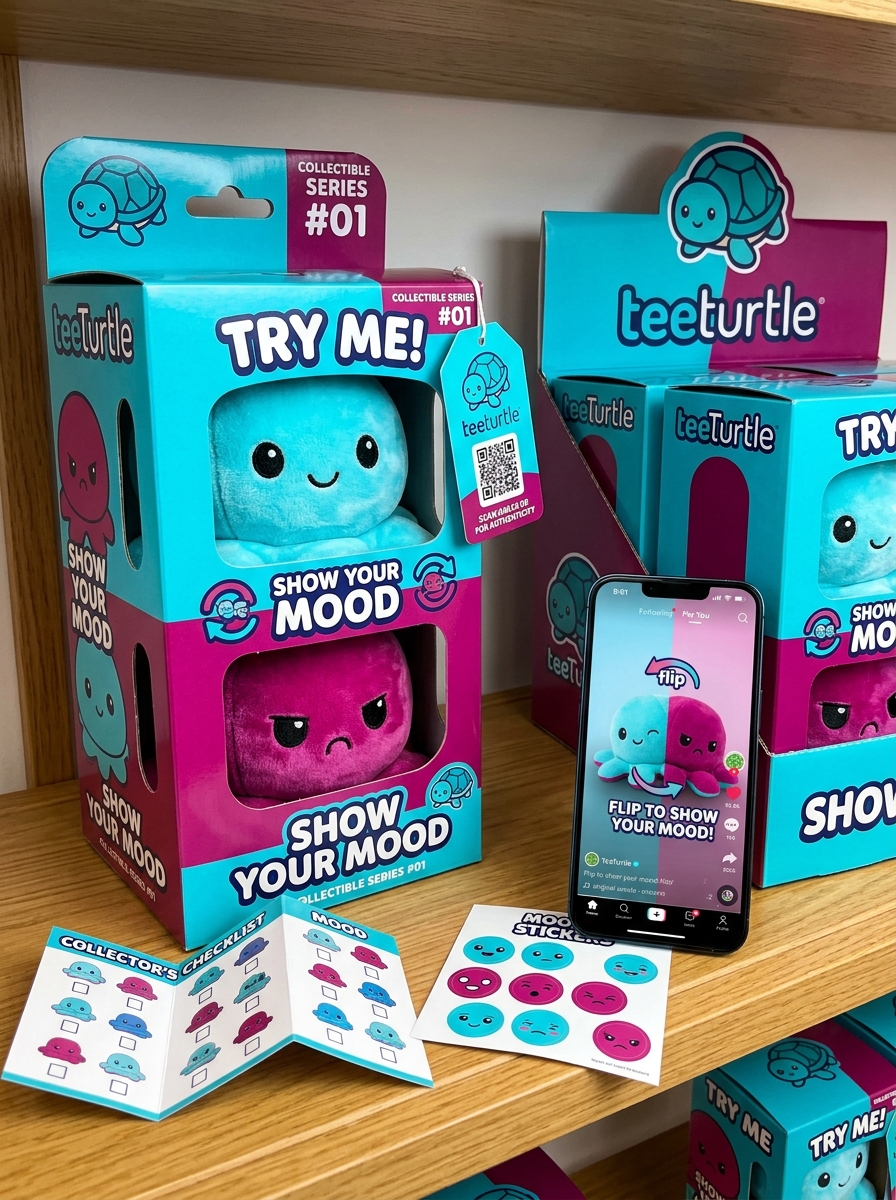
TeeTurtle reversible plushies have redefined the collectible toy market through a unique blend of emotional expression and tactile play. Beyond the plush itself, the packaging design serves as a vital touchpoint, bridging the gap between digital discovery and the physical unboxing experience.
By adhering to rigorous aesthetic standards, TeeTurtle utilizes vibrant color palettes and minimalist geometric structures to highlight the product's dual nature. These visual concepts are strategically engineered to communicate versatility while maintaining a cohesive brand identity. This exploration delves into the artistic frameworks and functional elements that define the brand's presentation, examining how specific design choices enhance shelf presence and consumer engagement.
Understanding these sensory cues reveals the sophisticated engineering behind the packaging, where every graphic and material choice aligns with a global standard of visual excellence and interactive design.
Core Identity and the TeeTurtle Brand Aesthetic
The TeeTurtle Reversible Plushie is defined by a unique fusion of emotional expression and minimalist design. At its core, the brand aesthetic centers on "kawaii" charm, utilizing high-contrast colors and simple geometric shapes to create instantly recognizable characters.
The brand identity is built upon the patented flip design, which allows the plushies to transition between two distinct moods, such as happy and angry. This functionality transforms a standard toy into a functional tool for non-verbal communication and sensory relief.
TeeTurtle's aesthetic strategy leverages soft, high-quality fabrics and vibrant palettes that appeal to collectors of all ages. By focusing on relatable emotions and tactile comfort, the brand has carved a niche in the sensory toy market, blending pop-culture trends with a timeless, expressive appeal.
Visual Communication of the Reversible Flip Mechanic
The TeeTurtle Reversible Plushie utilizes intuitive visual cues to communicate its core "flip" functionality. The design leverages high-contrast color palettes and distinct facial expressions to represent dual emotional states-typically a "happy" side and an "angry" side. This stark visual dichotomy serves as an immediate call to action, encouraging users to interact with the toy's tactile reversible mechanic.
Symmetrically engineered seams ensure the transition between moods is fluid and visually seamless. In digital spaces, this feature is communicated through looping GIFs and step-by-step photography that demonstrate the inversion process. By prioritizing sensory-driven design, TeeTurtle effectively signals the plushie's hidden versatility, allowing the product to convey complex emotional shifts through simple, non-verbal visual storytelling that resonates with a global audience.
Color Theory and Emotional Expression in Packaging
TeeTurtle reversible plushies leverage sophisticated color theory to facilitate immediate emotional expression. The product design and packaging utilize high-contrast color palettes to create a clear visual dichotomy between "happy" and "grumpy" states. For instance, pairing a vibrant pink with a cool teal helps users distinguish emotional shifts at a glance.
This strategic use of the color wheel serves several semantic and psychological functions:
- Visual Communication: Bright, warm tones signify happiness, while darker, cooler tones represent frustration or sadness.
- Non-Verbal Cues: The distinct colors allow children and neurodivergent individuals to communicate feelings without words.
- Brand Identity: Saturated, playful colors ensure the packaging is instantly recognizable on retail shelves.
By aligning specific hues with psychological triggers, TeeTurtle transforms a simple toy into a powerful tool for sensory interaction and emotional storytelling.
Typography and Logo Placement for Brand Recognition
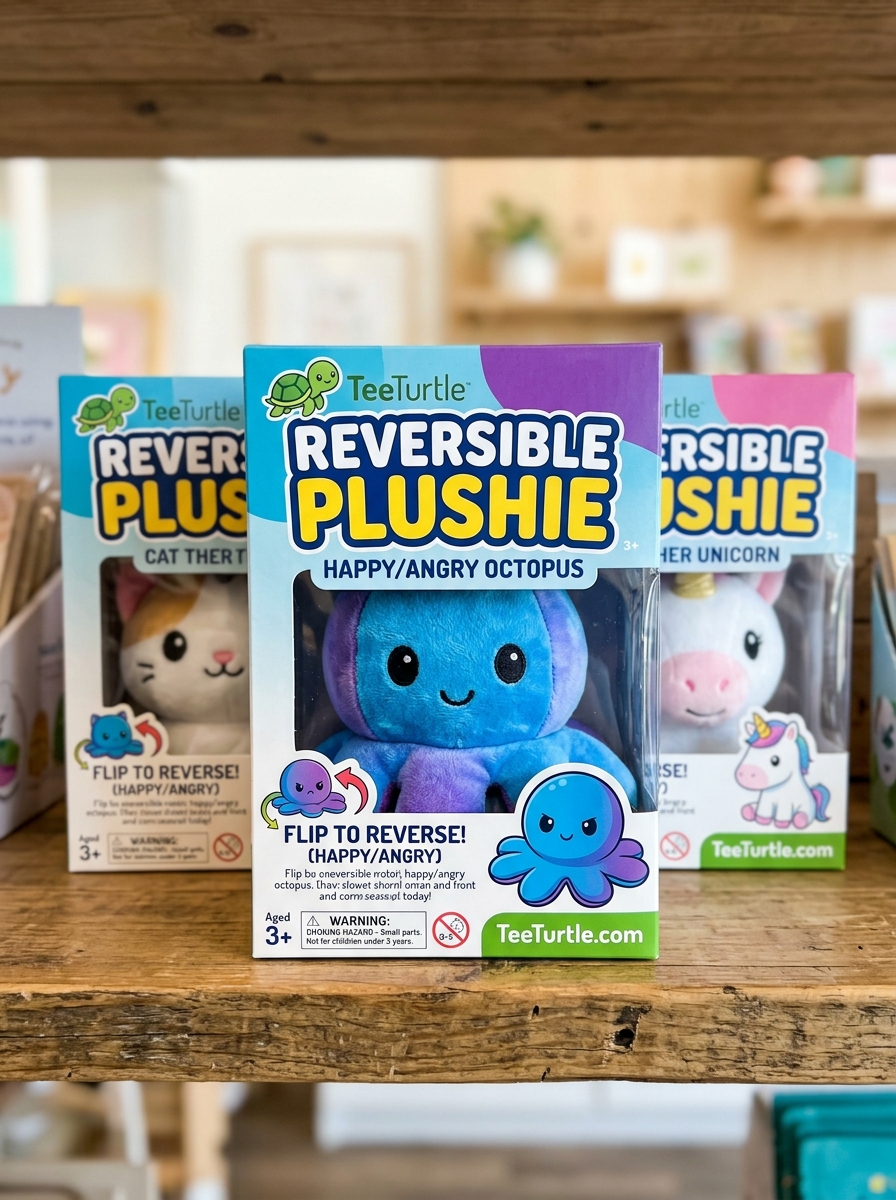
TeeTurtle Reversible Plushies utilize a distinct visual identity to ensure authenticity and consumer trust. The brand's typography features a playful, rounded sans-serif font that mirrors the soft, "kawaii" aesthetic of the plush toys. This approachable lettering is consistently applied across all packaging and digital assets to reinforce brand recall.
Strategic logo placement is a hallmark of genuine TeeTurtle products. Every authentic reversible plushie features a high-quality woven tush tag displaying the iconic turtle emblem and official wordmark. This specific placement allows collectors to easily verify official merchandise in a market crowded with imitations. By maintaining consistent font weights and permanent label positioning, TeeTurtle creates a premium feel that distinguishes its mood-flipping toys as the original innovators in the category.
Die-Cut Window Designs for Tactile Product Visibility
Tee Turtle Reversible Plushies utilize innovative packaging featuring specialized die-cut window designs. This structural choice enhances the retail experience by providing tactile product visibility, allowing customers to feel the ultra-soft, high-quality fabric before purchase.
By incorporating these strategic cut-outs, the packaging invites sensory engagement, showcasing the plushie's signature "flip" functionality and vibrant colors. This design not only highlights the premium craftsmanship of the reversible mood toys but also reduces the need for excess plastic film, aligning with sustainable packaging trends.
For collectors and gift-shoppers, these windows ensure that the iconic expressions of each character-from the original octopus to various animals-are clearly visible, facilitating an immediate emotional connection and making them stand out on crowded retail shelves.
Symbolism and Iconography of Mood Indicators
Tee Turtle reversible plushies utilize distinct iconography to bridge the gap between physical toys and emotional expression. Each plushie features two contrasting personas, typically represented through simplified facial features and color theory. A "happy" side usually displays bright, warm hues and wide-eyed smiles, symbolizing positivity and accessibility.
In contrast, the "moody" flipped side employs downturned mouths and often utilizes darker or complementary colors to signify frustration, sadness, or a need for space. These mood indicators serve as vital non-verbal cues, allowing users to communicate complex feelings without speaking. By leveraging universal symbols of emotion, Tee Turtle has turned a simple textile design into a functional tool for social-emotional signaling and mental health awareness, making it easier for children and adults alike to visualize their internal state.
Material Selection and Texture Integration in Box Design
The packaging for Tee Turtle Reversible Plushies focuses on a tactile experience that mirrors the product's signature sensory appeal. Material selection typically involves high-grade, sustainable cardstock that provides structural integrity while serving as a premium canvas for vibrant, emotional graphics.
To bridge the gap between the soft polyester plush and the rigid container, designers utilize texture integration techniques such as soft-touch lamination. This finish emulates the plushie's velvety feel, creating a cohesive brand experience from the first touch. Additionally, spot UV coatings are often applied to the "happy" and "angry" faces on the box, creating a physical contrast that highlights the reversible nature of the toy. These intentional material choices enhance the unboxing process, ensuring the packaging is as engaging and high-quality as the reversible plush inside.
Unboxing Experience and Consumer Engagement Strategy
The unboxing experience for TeeTurtle Reversible Plushies is engineered for tactile satisfaction and viral shareability. The signature "flip" mechanism provides an immediate sensory "wow" moment, making the product a staple for user-generated content on platforms like TikTok and Instagram.
TeeTurtle's consumer engagement strategy focuses on emotional expression and community building. By positioning these plushies as tools for non-verbal communication, the brand fosters a deep psychological connection with its audience. Key strategic pillars include:
- Social Media Integration: Leveraging "mood flip" trends to drive organic reach.
- Collectibility: Releasing limited-edition characters to encourage brand loyalty.
- Accessibility: Using simple, iconic designs that appeal to all age demographics.
This focus on interactive design ensures that every purchase is not just a toy, but a shareable social experience that reinforces TeeTurtle's market dominance.
Graphic Consistency Across Themed Plush Collections
TeeTurtle Reversible Plushies maintain a distinct visual identity through rigorous graphic consistency across all themed collections. Whether exploring the Spooky Edition, Galaxy Series, or Fruit Collections, each plushie adheres to a specific design language. This includes the iconic large, expressive eyes, rounded chibi silhouettes, and the signature high-contrast emotional expressions that define the patented flip design.
This stylistic uniformity ensures that every new addition feels like a natural extension of the brand. By utilizing consistent embroidery techniques and a curated color palette, TeeTurtle creates a cohesive aesthetic for collectors. This graphic harmony allows fans to build a diverse "mood-flipping" menagerie that looks unified on a shelf, reinforcing brand recognition and the premium quality associated with the original reversible octopus design.
Future Trends in Sustainable Designer Toy Packaging
The designer toy industry, featuring icons like Tee Turtle Reversible Plushies, is rapidly evolving toward eco-conscious presentation. Future trends prioritize plastic-free initiatives, replacing traditional polybags with biodegradable glassine or FSC-certified paper wraps.
Key innovations include the use of soy-based inks and mushroom-based compostable inserts to reduce chemical waste. Furthermore, "frustration-free" packaging is becoming a standard, where the box doubles as a reusable display case or a themed play-set.
By integrating circular economy principles, brands ensure that the unboxing experience is both delightful and environmentally responsible. As consumer demand for sustainability grows, these green packaging solutions will define the next generation of collectible plushies, aligning brand identity with modern ecological values.
Leave a comment