Elevating Uno card game packaging design necessitates a sophisticated balance between vibrant visual storytelling and functional utility. To capture the essence of this global phenomenon, designers must move beyond mere containment, focusing instead on the aesthetic principles that drive immediate brand recognition and emotional resonance.
By applying robust conceptual frameworks-such as color hierarchy, minimalist typography, and geometric consistency-creatives can develop a shelf presence that commands consumer attention. This exploration delves into the intersection of structural integrity and tactile experience, highlighting how strategic design choices influence user engagement and perceived value. Mastering these elements ensures that every deck serves as a powerful extension of the game's legacy, blending iconic imagery with contemporary trends to secure long-term market relevance and superior shelf appeal.
Defining the Iconic Visual Identity of Uno
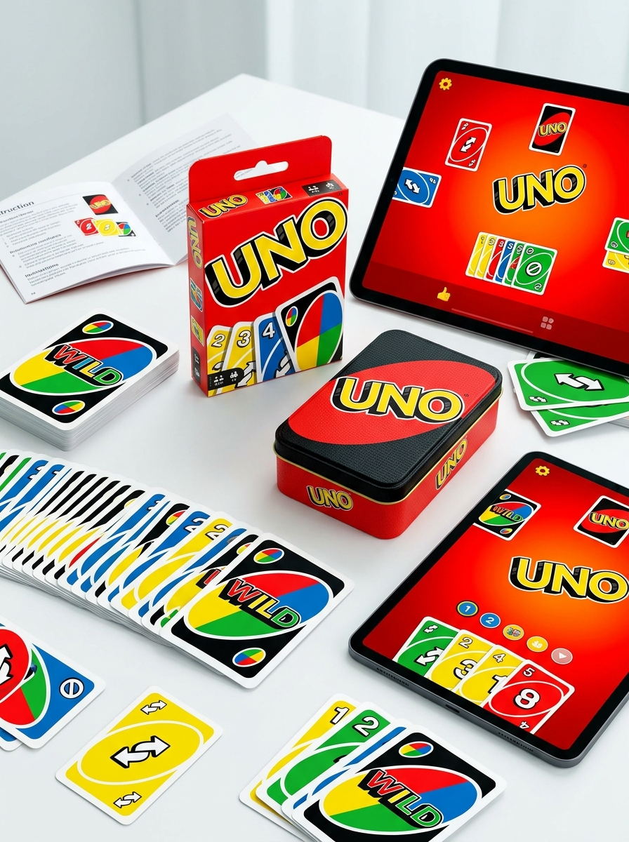
The visual identity of Uno is rooted in its vibrant, high-contrast palette of four primary colors: red, yellow, green, and blue. This striking aesthetic, paired with the iconic tilted oval logo and bold white typography, ensures the game remains instantly recognizable across global markets.
Key to its design language are the universal symbols. Functional icons like the Reverse arrows and Skip signs facilitate language-independent gameplay, while the black-centered Wild cards provide a dramatic visual contrast.
To enhance accessibility, modern editions often incorporate ColorADD graphic codes, allowing color-blind players to identify suits easily. This blend of bold graphics, intuitive iconography, and inclusive design principles defines Uno's legacy as a masterpiece of functional branding in the gaming world.
Core Color Theory and Primary Palette Dominance
The Uno card game utilizes a strategic primary palette consisting of Red, Yellow, Green, and Blue. This selection is rooted in core color theory to ensure maximum visual contrast and immediate recognition during fast-paced gameplay. These four distinct hues minimize cognitive load, allowing players to process suit changes rapidly.
The dominance of this primary palette facilitates the game's fundamental matching mechanic. While Red and Yellow evoke high energy and urgency, Green and Blue provide a balanced visual counterpoint. Furthermore, the inclusion of the multi-colored Wild card acts as a chromatic bridge, integrating all palette elements. By leveraging high-chroma, saturated tones, Uno achieves universal accessibility and functional clarity, ensuring the deck remains intuitive for players across all age groups and lighting conditions.
Typography and Logo Integration Strategies
Successful Uno card game branding relies on the strategic synergy between its iconic logo and functional typography. The primary integration strategy involves using a heavy, custom sans-serif typeface that mirrors the Uno logo's bold, rounded aesthetic. This ensures high legibility and instant brand recognition across physical decks and digital platforms.
Designers employ visual weight consistency by applying thick outlines and drop shadows to both the logo and card numerals, creating a cohesive 3D effect. Furthermore, the integration leverages a strict primary color palette-red, blue, yellow, and green-to unify typographic elements with the central brand mark. By maintaining a dynamic tilt in the logo while keeping functional text stable, the design achieves a balance between high-energy playfulness and essential gameplay clarity.
Establishing Visual Hierarchy for Instant Recognition
In Uno card games, effective visual hierarchy is critical for rapid decision-making. The design prioritizes information so players can identify card values and actions at a glance, ensuring seamless gameplay flow.
- Color Coding: High-contrast shades of red, blue, green, and yellow provide the primary layer of information, allowing for instant suit matching.
- Large-Scale Typography: Bold, oversized numerals centered on the card create a secondary focal point, ensuring legibility even from a distance.
- Functional Iconography: Unique symbols for Skip, Reverse, and Draw cards offer immediate functional cues that transcend language barriers.
By organizing these elements strategically, Uno minimizes cognitive load, making the game accessible and intuitive for players of all ages and skill levels.
Tactile Elements and Material Finish Selection
The sensory experience of an Uno card game is significantly influenced by tactile elements and professional material finishes. Premium decks often utilize a linen finish, which creates a cross-hatch texture that reduces surface tension. This allows for superior shuffling, better grip, and prevents cards from sticking together during intense gameplay.
Material selection also focuses on durability and accessibility. Most Uno cards are printed on high-quality coated cardstock with a UV protection layer to resist moisture and fading. Furthermore, modern editions incorporate tactile innovations such as Braille markings or raised ink patterns. These features ensure the game is inclusive for visually impaired players while providing a high-end, tactile feel. Choosing between a smooth matte finish for glare reduction or a glossy coating for vibrant color pop is essential for balancing aesthetic appeal with functional longevity.
Adapting Design for Themed and Licensed Editions
Uno's versatility is showcased through its numerous themed and licensed editions. When adapting the classic game for franchises like Disney, Star Wars, or Minecraft, the design undergoes strategic transformations to resonate with specific fanbases.
Beyond replacing standard colors with franchise-specific palettes, these editions often introduce unique "Special Action Cards". These cards feature exclusive rules that reflect the theme's lore, such as a custom Wild card that forces opponents to draw based on a character's trait.
These design pivots maintain the core gameplay loop while enhancing collectibility. By integrating iconic imagery and bespoke mechanics, Uno effectively bridges the gap between traditional gaming and pop culture, ensuring the brand remains relevant and engaging across diverse demographics and interests.
Balancing Minimalism with Action-Oriented Graphics
Uno card games masterfully balance minimalism with action-oriented graphics to ensure seamless gameplay. The design features a clean, high-contrast aesthetic using four primary colors, which promotes instant recognition and reduces cognitive load. This minimalist foundation allows the iconography-such as the bold arrows of the Reverse card or the "+2" and "+4" markers-to stand out as clear visual triggers.
By prioritizing symbol-driven design over heavy text, Uno bridges language barriers and enhances accessibility. These dynamic graphics provide immediate feedback, maintaining the game's signature fast-paced rhythm. This strategic blend of simple UI and bold visual cues ensures that players can focus on strategy rather than deciphering complex layouts, making Uno a hallmark of effective user experience design in tabletop gaming.
Enhancing User Experience Through Functional Unboxing
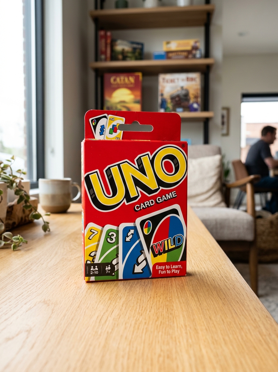
In the world of Uno card games, the unboxing experience serves as the critical first touchpoint for player engagement. Functional unboxing prioritizes intuitive packaging design that facilitates immediate gameplay. By utilizing easy-open tabs and durable, reusable storage containers, manufacturers eliminate the common frustration of torn boxes and misplaced cards.
Effective packaging design focuses on several key user-centric elements:
- Accessibility: Designs that allow players of all ages to quickly access the deck.
- Organization: Internal compartments that keep action cards and numbered sets separated.
- Durability: Materials that double as long-term storage solutions to protect card integrity.
Optimizing the transition from "box to table" enhances the overall user experience, ensuring the focus remains on the competitive fun of Uno. Thoughtful unboxing design reduces setup friction and builds lasting brand loyalty.
Sustainable Innovations in Modern Card Game Packaging
As environmental awareness grows, Uno card games are at the forefront of the shift toward eco-friendly manufacturing. Modern packaging innovations focus on reducing carbon footprints by eliminating single-use plastics and cellophane overwraps. Today, many Uno decks are housed in 100% recyclable paperboard boxes, often sourced from FSC-certified forests to ensure responsible forestry practices.
Beyond the box, sustainable advancements include the use of water-based inks and vegetable-derived coatings, making the cards themselves easier to recycle. These green packaging solutions maintain the durability and vibrant colors fans expect while minimizing waste. By prioritizing renewable materials and plastic-free designs, the brand aligns with global sustainability goals, offering players a guilt-free gaming experience that protects the planet for future generations.
Future Trends in Gamified Structural Design
The structural evolution of Uno card games is shifting toward a seamless blend of physical mechanics and digital innovation. Future trends emphasize hybrid integration, where physical decks utilize augmented reality (AR) to provide interactive tutorials and dynamic visual effects during gameplay.
Key structural advancements include:
- Adaptive Rule Engines: AI-driven apps that suggest custom "House Rules" based on player skill levels to maintain optimal engagement.
- Inclusive Ergonomics: Designing cards with tactile textures and high-contrast palettes to improve accessibility for visually impaired players.
- Eco-Smart Materials: Transitioning to sustainable, high-durability polymers that support long-term playability in various environments.
By prioritizing user-centric architecture, the future of Uno focuses on deepening social connectivity through gamified structures that are both intuitive and technologically enhanced.
Leave a comment