
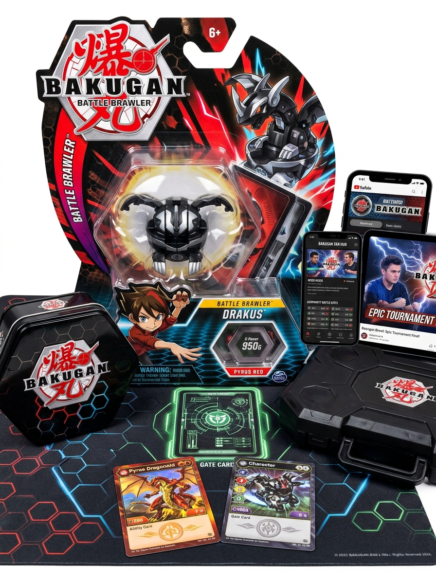
The Bakugan Battle Brawlers packaging design serves as a vital bridge between high-stakes gameplay and shelf-side appeal. Beyond mere containment, these vessels utilize a distinct visual language characterized by high-contrast color palettes, dynamic geometric patterns, and strategic window placements. By prioritizing the unboxing experience, the design emphasizes the transformative nature of the spheres, integrating the tactile excitement of the game directly into its exterior shell.
At its core, the conceptual framework leverages structural innovation and bold branding to resonate with collectors and competitive players alike. Every aesthetic choice-from the metallic foil accents to the iconic hexagonal motifs-functions to reinforce the Bakugan identity. Exploring these essential aesthetics reveals how the packaging acts as a functional extension of the brawling universe, balancing industrial durability with an evocative, high-energy presentation.
Evolution of Bakugan Packaging Aesthetics
The visual identity of Bakugan packaging has undergone a dynamic transformation since its 2007 debut. Initially, the Legacy era utilized circular blister packs characterized by dark red and black motifs, emphasizing the "mysterious sphere" aspect of the toy. These designs relied heavily on hexagonal patterns and simple cardboard backings.
As the franchise evolved through New Vestroia and Gundalian Invaders, the aesthetics became more character-driven, featuring prominent artwork of Dan Kuso and Drago. The 2019 Battle Planet reboot modernized the brand with a vibrant orange and blue palette, sleek typography, and high-fidelity 3D renders. Recent generations have further innovated with eco-friendly materials and open-box displays, prioritizing visibility of the Bakugan's intricate plastic detailing. This evolution reflects a shift from a niche marble game to a high-octane global brand, constantly adapting to contemporary retail trends.
Dynamic Color Palettes and Elemental Branding
In Bakugan Battle Brawlers, dynamic color palettes are fundamental to elemental branding, providing instant visual recognition for players. Each of the six core Attributes is defined by a specific color scheme that dictates the design of the Bakugan spheres, character outfits, and Ability Cards:
- Pyrus: Aggressive reds and oranges representing fire.
- Aquos: Calm blues and teals symbolizing water.
- Subterra: Earthy browns and tans denoting soil.
- Haos: Bright whites and golds signifying light.
- Darkus: Intimidating blacks and purples representing darkness.
- Ventus: Swift greens reflecting the power of wind.
This strategic use of color ensures a cohesive brand identity across the anime, trading card game, and toy line, allowing fans to identify a Bakugan's elemental alignment and gameplay style at a single glance.
Typography and Iconic Logo Integration
The Bakugan Battle Brawlers logo is a masterpiece of action-oriented branding, designed to convey high-energy competition. The typography features custom, heavy block lettering with sharp, angular edges that mirror the mechanical and futuristic nature of the Bakugan spheres. A prominent 3D perspective and metallic sheen give the font weight and a sense of durability.
A key element of this visual identity is the seamless integration of the Bakugan sphere icon, which often replaces or complements central characters in the text. This synergy between bold, aggressive typefaces and symbolic imagery ensures instant brand recognition across anime, trading cards, and toy packaging. The high-contrast color palette of red and yellow further enhances visibility, capturing the intensity of the strategic brawling experience for fans worldwide.
Structural Design and Product Visibility
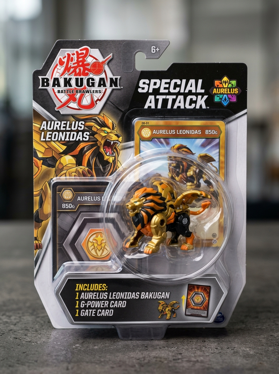
The Bakugan Battle Brawlers toy line is renowned for its sophisticated engineering and clever marketing aesthetics. The structural design centers on a complex internal spring-loaded mechanism housed within a compact sphere. These units utilize high-grade magnets that trigger an automated transformation into monster form upon contact with metallic Gate Cards.
To enhance product visibility, packaging often features transparent "blister" windows, allowing collectors to inspect intricate paint applications and faction symbols. This visibility is vital for identifying rare variants, such as translucent, metallic, or "Diamond" editions. By merging durable polycarbonate materials with visible, high-action functionality, the design ensures that Bakugan are as visually striking on a retail shelf as they are functional during a high-stakes brawl. This synergy between mechanical precision and clear visual branding remains a cornerstone of the franchise's global success.
Action-Oriented Character Art and Photography
In the Bakugan Battle Brawlers universe, action-oriented art and photography are essential for capturing the high-octane energy of Vestroia. Dynamic character art focuses on brawlers like Dan Kuso or Shun Kazami in mid-battle poses, utilizing sharp perspective lines and vibrant attribute colors-such as Pyrus red or Ventus green-to simulate movement and power.
Beyond digital illustration, toy photography has become a cornerstone for fans. By using macro lenses and dramatic LED lighting, photographers transform small plastic spheres into cinematic titans. Capturing a "Bakugan Stand" at the perfect angle highlights the intricate mechanical designs and pop-out features of the figures. This synergy of dynamic illustration and realistic photography bridges the gap between the animated series and physical gameplay, bringing the intense spirit of the brawl to life for the community.
Tactile Elements and Material Composition
The physical appeal of Bakugan Battle Brawlers toys stems from sophisticated mechanical engineering and durable material selection. Primarily manufactured using high-grade ABS plastic, these spheres offer impact resistance and a smooth surface finish optimized for precision rolling.
The tactile experience is defined by several key components:
- Magnetic Triggers: Internal neodymium magnets serve as the primary actuator, releasing internal latches when they contact a metallic Gate Card.
- Spring-Loaded Mechanisms: High-tension metal springs facilitate the "pop-open" transformation, providing instant haptic feedback.
- Weighted Elements: Certain iterations, such as the Heavy Metal or Special Attack series, incorporate zinc alloy or die-cast metal to alter the toy's center of gravity and durability.
This synergy of rigid polymers and reactive metallic parts ensures that each Bakugan is both a functional game piece and a complex kinetic sculpture.
Information Hierarchy and Gameplay Clarity
In Bakugan Battle Brawlers, maintaining a clear information hierarchy is essential for high-stakes strategic decision-making. The game's design prioritizes immediate visual data, such as the printed G-Power on the Bakugan and the color-coded Attribute symbols, ensuring players can assess the board state at a glance.
Gameplay clarity is achieved by separating static stats from dynamic modifiers. While Gate Cards provide the foundational battlefield context, Ability Cards introduce layers of complexity. Effective hierarchy ensures that:
- Primary Stats: G-Power remains the focal point for calculating victory conditions.
- Visual Indicators: Distinct icons for Pyrus, Aquos, and other factions prevent mechanical confusion.
- Resolution Order: Clear text structures on cards dictate the flow of "Chain" effects.
This structured approach minimizes cognitive load, allowing brawlers to focus on tactical timing rather than rule interpretation.
Cultural Influences on Global Packaging Variants
The packaging for Bakugan Battle Brawlers reflects distinct regional marketing strategies driven by local consumer behavior. In Japan, Sega Toys often utilized compact, minimalist designs that prioritized collector appeal, frequently featuring transparent windows to showcase the mechanical intricacies of the spheres. Conversely, Western distributions by Spin Master employed oversized, vibrant blister packs with aggressive action graphics to maximize shelf presence in large-scale retailers.
Beyond aesthetics, cultural regulations necessitate variations in safety iconography and linguistic localization. While North American versions emphasize the "Brawl" through bold typography, international variants often adjust color palettes to align with regional preferences for specific attributes like Pyrus or Haos. These discrepancies highlight how global branding balances a unified identity with localized cultural aesthetics to enhance marketability across diverse demographics.
Modern Sustainability in Toy Box Construction
In the evolution of Bakugan Battle Brawlers, Spin Master has shifted toward eco-conscious packaging to meet global environmental standards. Modern Bakugan toy box construction now prioritizes sustainability by replacing traditional single-use plastics with FSC-certified recycled cardboard and paper-based inserts.
These structural innovations utilize soy-based inks and eliminate plastic windows, significantly reducing the carbon footprint of each Bakugan sphere's distribution. By adopting a "plastic-free" goal, the brand ensures that the packaging is as high-performance as the brawlers themselves, offering durability for retail displays while remaining fully recyclable. This commitment to circular economy principles allows fans to enjoy the thrill of the brawl while supporting environmental conservation and waste reduction in the toy industry.
Collector Psychology and Visual Shelf Appeal
The allure of Bakugan Battle Brawlers is rooted in completionist psychology and the "thrill of the hunt." Collectors are driven by rarity tiers, seeking elusive Translucent, Pearl, or Dual-Attribute variants to complete their sets. This psychological drive is fueled by the satisfaction of organizing Bakugan by G-Power or elemental factions like Pyrus and Darkus.
Visually, Bakugan provide immense shelf appeal through their unique mechanical transformation. The transition from sleek, uniform spheres to intricate, jagged monsters creates a dynamic display. When arranged on magnetic Gate Cards, the vibrant color coordination and complex silhouettes turn a simple toy line into a curated gallery. The contrast between the minimalist closed form and the detailed engineering of an "open" Bakugan makes them standout pieces for any hobbyist's display case.
Leave a comment