Often overlooked in the stationery aisle, eraser packaging design serves as a vital bridge between functional utility and emotional connection. Elevating a simple corrective tool into a premium lifestyle product requires a deep understanding of aesthetic excellence and innovative creative concepts. From minimalist sustainable wrappers to vibrant, character-driven boxes, the visual presentation of an eraser dictates its shelf presence and perceived value.
Mastering this niche design discipline involves blending tactile textures with ergonomic functionality to captivate modern consumers. By prioritizing high-quality materials and unique structural silhouettes, designers can distinguish their products in a crowded marketplace. This exploration into professional stationery branding examines how thoughtful design choices transform everyday office supplies into iconic desktop accessories that inspire creativity and precision.
The Evolution of Modern Eraser Packaging Trends
Modern eraser packaging has shifted from basic plastic films to sophisticated, sustainable designs. Today, leading stationery brands prioritize eco-friendly materials, such as FSC-certified cardboard and biodegradable wraps, to reduce environmental impact. This shift reflects a broader consumer demand for plastic-free alternatives in office and school supplies.
Functionality also drives current trends. Sliding protective sleeves are now standard, designed to prevent graphite smudges and structural breakage during heavy use. Additionally, innovation in ergonomic cases and refillable systems promotes product longevity. Visually, packaging has embraced minimalist aesthetics and vibrant, thematic branding to appeal to both students and professionals. These advancements ensure that the humble eraser remains clean, effective, and visually appealing, combining practical utility with conscious, modern consumerism.
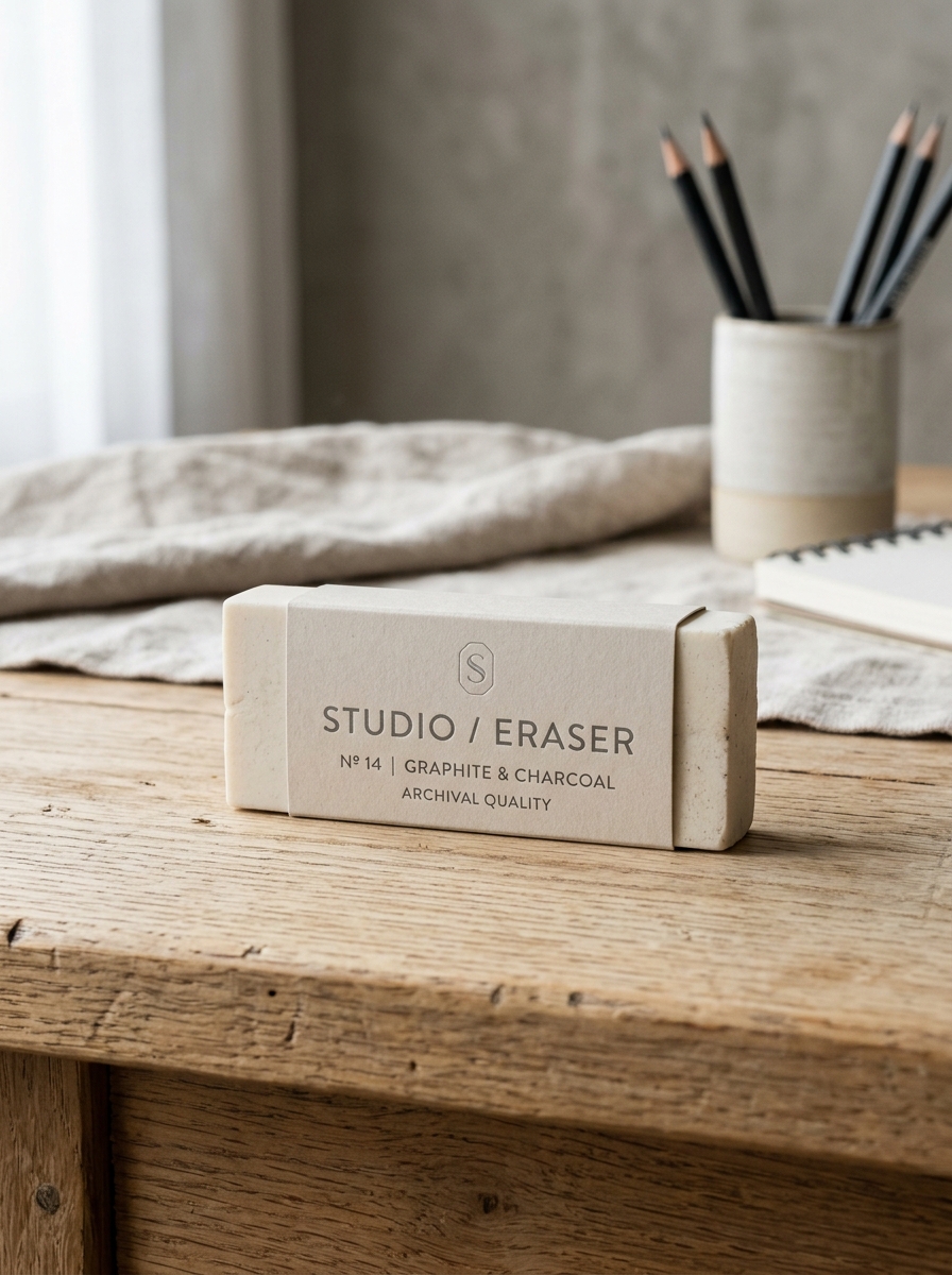
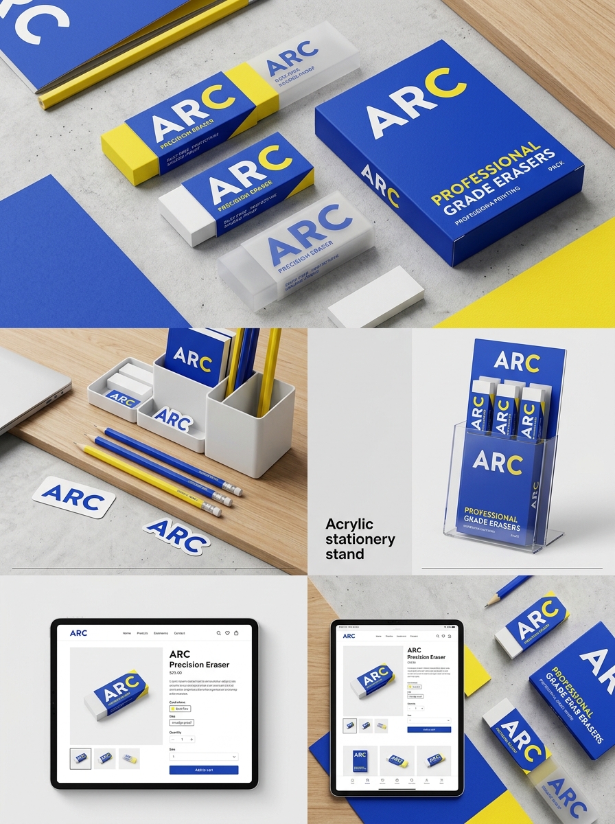
Defining Brand Identity Through Minimalist Sleeve Design
In the stationery industry, minimalist sleeve design is a powerful tool for establishing a distinct brand identity. For erasers, the protective sleeve acts as the primary canvas for visual storytelling. By prioritizing clean lines, purposeful white space, and iconic color palettes, brands signal professional quality and precision.
A minimalist aesthetic removes visual clutter, ensuring that brand logos and signature colors are instantly recognizable to consumers. This design philosophy suggests that the product is efficient and high-performing. Whether it is a classic tri-color block or a monochromatic matte finish, the sleeve transforms a basic utility into a sophisticated tool. Ultimately, minimalist design fosters brand loyalty by associating the product with modern elegance and functional excellence.
Color Psychology and Visual Impact in Stationery Aisles
Color psychology plays a pivotal role in how erasers are marketed and perceived. In crowded stationery aisles, manufacturers use specific hues to trigger emotional responses and signal product utility. For instance, the iconic pink eraser leverages nostalgia and a sense of traditional reliability, making it a staple for school-aged children.
In contrast, white erasers often signify purity, precision, and professional-grade quality, appealing to architects and artists who require a smudge-free finish. Vibrant neon colors are strategically used to capture the attention of younger demographics, turning functional tools into collectible accessories. Furthermore, black erasers are frequently positioned as premium or "luxury" items that maintain a clean appearance even after heavy use. These visual cues create an immediate impact, guiding consumer choice through subconscious associations between color and performance.
Sustainable Materials and Eco-Friendly Packaging Solutions
Modern stationery manufacturing is shifting toward environmental responsibility by prioritizing sustainable materials. Traditional erasers often contain PVC and phthalates, but eco-friendly alternatives utilize natural rubber harvested from renewable sources or recycled synthetic compounds. These PVC-free and latex-free options provide a non-toxic, biodegradable choice for students and professionals alike.
In addition to the product itself, eco-friendly packaging solutions play a crucial role in reducing environmental impact. Manufacturers are increasingly replacing single-use plastics with FSC-certified paper, recycled cardboard sleeves, and compostable wraps. By integrating these green practices, the stationery industry minimizes its carbon footprint and supports a circular economy. Choosing erasers made from sustainable resources ensures high-quality correction performance without compromising ecological integrity.
Ergonomics and Functional Form Factors for Daily Use
Modern erasers prioritize user comfort through specialized form factors designed to reduce hand fatigue during prolonged use. The evolution of eraser design has moved beyond simple blocks to include highly functional shapes tailored for specific tasks.
- Triangular Profiles: These provide a natural, ergonomic grip that prevents the tool from rolling and allows for better finger positioning.
- Pen-style Retractables: Mimicking the feel of a writing instrument, these offer familiar handling and superior precision for detailed corrections.
- Contoured Grips: Many professional-grade erasers feature soft-touch sleeves or curved bodies to minimize physical strain.
- Block and Wedge Shapes: Traditional rectangular forms offer stability for heavy-duty graphite removal across large surface areas.
Selecting the right ergonomic eraser ensures maximum control and accuracy, making them essential tools for artists, students, and professionals alike.
Tailoring Aesthetics for Students Versus Professional Artists
Eraser design varies significantly to meet the specific demands of different users. For students, aesthetics focus on engagement and durability. Manufacturers often produce erasers in vibrant colors, novelty shapes, and ergonomic designs to make schoolwork more interactive. These tools are typically composed of sturdy synthetic rubber or PVC to withstand heavy-handed use.
Conversely, professional artists require tools where form follows function. Professional-grade erasers, such as kneaded or high-polymer varieties, often feature minimalist, neutral aesthetics to prevent visual distraction during the creative process. While student models prioritize fun, artist-centric designs focus on precision and material integrity. These tools are engineered to lift graphite or charcoal without damaging delicate paper fibers or leaving behind oily residues, ensuring archival-quality results.
Innovative Die-Cut Windows and Interactive Packaging Concepts
Modern eraser packaging leverages die-cut windows and interactive designs to significantly elevate consumer engagement. These precision-cut openings allow customers to view vibrant colors, unique textures, and intricate shapes without opening the box, providing a tactile preview that influences purchasing decisions. By showcasing the product's craftsmanship directly, brands establish immediate visual trust and shelf appeal.
Furthermore, interactive packaging concepts-such as sliding mechanisms, pop-up elements, or collectible puzzle boxes-transform a standard stationery item into a multisensory experience. These innovations cater to students and stationery enthusiasts who value aesthetic novelty alongside functionality. By integrating gamified elements and structural creativity, manufacturers differentiate their products in a competitive market, turning functional writing tools into memorable, gift-ready experiences that resonate with a modern, design-conscious audience.
The Role of Typography and Graphic Elements in Shelf Appeal
In the competitive stationery market, the visual design of eraser packaging is vital for capturing consumer attention. Typography serves as a silent communicator; minimalist sans-serif fonts often signal professional precision for artists, while playful, rounded typefaces appeal to students. These typographic choices, combined with vibrant graphic elements, establish a strong brand identity on the shelf.
High-contrast color palettes and bold icons enhance shelf appeal by making products instantly recognizable. Strategic placement of logos and textural graphics can convey a sense of quality or specialized utility, such as "dust-free" or "non-abrasive" features. Ultimately, the synergy between graphic design and legible lettering influences purchasing decisions, transforming a simple utility item into a desirable desk accessory through effective visual storytelling and brand positioning.
Balancing Product Protection with Premium Unboxing Experiences
In the specialty stationery market, erasers require packaging that harmonizes structural integrity with brand storytelling. Protecting these tools from surface scuffs, moisture, and oxidation is essential for maintaining their erasing efficacy. High-quality manufacturers utilize precision-cut inserts and acid-free barriers to ensure the product arrives in pristine condition.
A premium unboxing experience transforms a functional utility into a professional instrument. This balance is achieved through:
- Tactile Materials: Using soft-touch matte cardstock that reflects the eraser's texture.
- Protective Minimalism: Sleek, snug-fit sleeves that prevent breakage without excessive plastic waste.
- Functional Longevity: Designing outer shells that serve as permanent storage to keep the eraser clean during use.
By integrating robust protection with elegant design, brands create a memorable first impression that resonates with artists and professionals alike.
Future Directions in Creative Eraser Product Presentation
The evolution of eraser product presentation is shifting toward immersive, sensory-driven experiences that prioritize both technology and sustainability. Future marketing strategies leverage Augmented Reality (AR), enabling customers to visualize 3D textures and precision performance in a digital workspace before purchasing.
Key innovations in presentation include:
- Sustainable Minimalist Packaging: Utilizing biodegradable materials and plastic-free sleeves to highlight eco-friendly manufacturing.
- Tactile Retail Displays: Interactive stations that allow users to test graphite-lifting efficiency and debris levels across different eraser densities.
- Thematic Storytelling: Positioning erasers as collectible design objects rather than mere consumables through curated, narrative-driven sets.
By integrating interactive technology with eco-conscious design, brands can transform functional stationery into premium lifestyle tools, capturing the interest of professional artists and stationery enthusiasts globally.
Leave a comment