Designing impactful packaging for garden markers requires a strategic balance between rugged outdoor durability and sophisticated retail shelf appeal. Beyond mere containment, effective packaging serves as a vital touchpoint that connects botanical enthusiasts with the functional utility of the product. By prioritizing visual concepts-such as organic color palettes and high-legibility typography-brands can instantly communicate quality and professional reliability.
This analysis explores the essential aesthetic principles that transform standard garden labels into desirable lifestyle accessories. Whether catering to professional horticulturists or home gardeners, understanding the synergy between sustainable materials and graphic clarity is paramount. Mastering these design elements ensures that your product not only protects its contents but also resonates with the natural beauty and organizational needs of the modern garden.
Defining the Visual Narrative of Garden Marker Packaging
The visual narrative of garden marker packaging serves as a vital bridge between branding and consumer utility. Effective design uses storytelling to convey product quality, whether highlighting rustic charm for heirloom herbs or sleek minimalism for modern landscaping. This narrative is established through several key components:
- Material Authenticity: Packaging that showcases the textures of slate, copper, or wood to signal durability.
- Sustainable Graphics: Utilizing earthy tones and eco-friendly materials that resonate with environmentally conscious gardeners.
- Functional Clarity: Clear typography and imagery that help users quickly identify plant labels and their intended use.
By integrating these elements, manufacturers create a cohesive brand experience that stands out on retail shelves. Strategic visual storytelling ensures that markers are perceived as essential aesthetic additions to the garden, rather than just functional tools.
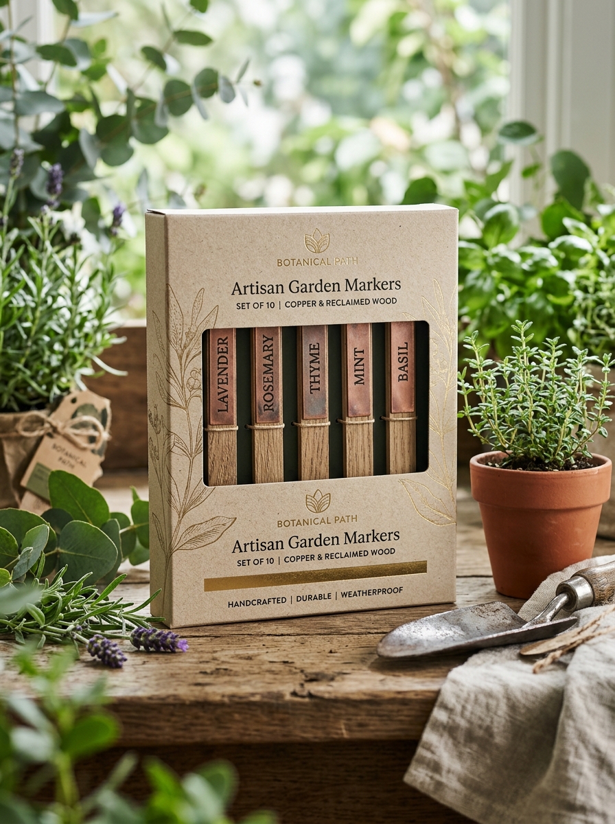
Harmonizing Material Textures with Botanical Aesthetics
Selecting the right garden markers involves more than simple identification; it is about achieving visual synergy between functional elements and natural beauty. To create a cohesive landscape, consider how material textures interact with your plants. For a rustic, integrated look, cedar wood or bamboo markers offer an organic softness that blends seamlessly with lush foliage.
Conversely, natural stone or slate provides a grounded, timeless contrast to vibrant floral blooms. For those seeking a modern edge, weathered steel or copper develops a unique patina over time, echoing the natural life cycle of the garden. By intentionally pairing textures-such as the smoothness of ceramic or the ruggedness of granite-with specific botanical aesthetics, you transform markers into elegant design accents that enhance the overall sensory experience of your outdoor space.
Color Theory for Seasonal and Earth-Tone Branding
Applying color theory to garden markers is essential for creating a cohesive brand identity that resonates with nature enthusiasts. Earth-tone palettes-incorporating shades like sage green, terracotta, and slate gray-establish an organic, professional aesthetic that blends seamlessly into outdoor landscapes. These muted tones provide a sophisticated backdrop that complements plant life without overwhelming the visual environment.
To capture seasonal branding, designers often shift palettes to reflect the garden's lifecycle. Bright pastels evoke the renewal of spring, while deep ambers and burnt oranges align with the harvest feel of autumn. For maximum legibility and shelf appeal, utilizing high-contrast combinations-such as cream lettering on forest green-ensures that functional information remains clear. By strategically selecting hues that mirror the natural world, brands can create a timeless and harmonious experience for every gardener.
Typography Selections for Legibility and Organic Style
Selecting the right typography for garden markers ensures that plant labels remain functional while harmonizing with the natural environment. For maximum legibility, prioritize clean sans-serif fonts or sturdy slab serifs. These styles offer high visibility, ensuring plant names are readable even under harsh sunlight or as the markers weather over time.
To achieve an organic style that complements your landscape, consider these elements:
- Weight and Contrast: Medium-weight fonts provide enough surface area for ink or engraving to stand out against natural textures like slate, wood, or copper.
- Letter Spacing: Increased kerning prevents characters from blurring together on porous surfaces.
- Aesthetic Harmony: Hand-scripted or humanist fonts evoke an artisanal, botanical feel without sacrificing clarity.
By balancing clear letterforms with earthy aesthetics, your botanical signage becomes a seamless extension of your garden's design.
Incorporating Botanical Illustrations and Visual Cues
Integrating botanical illustrations into your garden markers enhances both functionality and aesthetic appeal. Visual cues, such as detailed line drawings or vibrant color-coding, allow for rapid plant identification before seedlings even emerge. This approach is particularly beneficial for beginner gardeners, children, or those with language barriers who may not recognize species by name alone.
By using etched graphics, silhouettes, or waterproof decals, you create a sensory-rich environment that aids navigation. Furthermore, incorporating standardized symbols for sun exposure or water requirements directly onto the markers serves as a functional quick-reference guide. These visual elements bridge the gap between utility and art, ensuring your garden remains organized, accessible, and visually engaging throughout every stage of the growing season.
Strategic Use of Transparency and Product Visibility
In the context of garden markers, strategic transparency and high product visibility are essential for balancing aesthetics with functional organization. Utilizing clear materials, such as UV-resistant acrylic plant labels, allows the natural beauty of the flora to remain the focal point while providing unobtrusive identification. This minimalist approach ensures that essential information-such as botanical names or planting dates-is easily accessible without cluttering the landscape.
Enhanced visibility is further achieved through high-contrast engraving or weather-resistant inks, ensuring legibility across varying lighting conditions. By prioritizing transparent labeling solutions, gardeners can maintain a professional botanical aesthetic. This strategy aids in effective plant management and improves the overall user experience, ensuring every specimen is clearly accounted for within the garden ecosystem while maintaining a clean, modern appearance.
Embracing Sustainable and Eco-Conscious Design Materials
Choosing eco-friendly garden markers is a vital step toward a greener lifestyle. Sustainable design focuses on materials that minimize environmental impact while offering long-term durability in various weather conditions.
- Bamboo: A rapidly renewable resource that is naturally biodegradable and sturdy.
- Recycled Metal: Aluminum or copper tags provide a rustic aesthetic and can be repurposed indefinitely.
- Slate and Stone: These natural elements offer a timeless look without the risk of chemical leaching into the soil.
- FSC-Certified Wood: Supports responsible forest management and carbon sequestration.
By opting for non-toxic and biodegradable labels, gardeners significantly reduce plastic waste. These conscious choices help maintain a healthy garden ecosystem while ensuring your plant identification remains clear and stylish for seasons to come.
Optimizing Information Hierarchy for Rapid Consumer Identification
Effective garden markers utilize a strategic information hierarchy to facilitate instant species recognition. To optimize for rapid consumer identification, prioritize the common plant name using bold, high-contrast typography. This serves as the primary visual anchor, ensuring legibility from a distance.
Secondary data-such as botanical names, hardiness zones, or planting dates-should be scaled down to maintain visual balance. Implementing a consistent layout with the following elements enhances navigation:
- Color-Coding: Use distinct hues to differentiate between herbs, vegetables, and ornamentals.
- Iconography: Incorporate simple symbols for sun exposure and water requirements for quick visual cues.
- Material Contrast: Ensure text color sharply contrasts with marker substrates like slate, bamboo, or metal.
Refining these design layers reduces cognitive load, allowing gardeners and shoppers to identify plants efficiently through clear, scannable data.
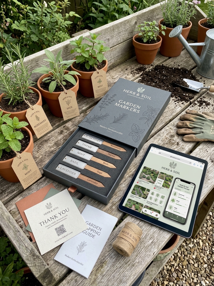
The Role of Tactile Finishes in Premium Packaging Perception
In the competitive market of high-end garden markers, packaging serves as the critical first touchpoint for consumer quality assessment. Tactile finishes, such as soft-touch lamination, embossing, and spot UV, play a pivotal role in establishing a premium brand perception.
When a customer interacts with textured packaging, the sensory feedback communicates craftsmanship and durability-key attributes for long-lasting horticultural tools. For premium markers made of copper, slate, or ceramic, high-gsm cardstock with raised finishes reinforces the product's perceived value. These tactile elements enhance the unboxing experience, transforming a functional gardening accessory into a luxury gift item. By leveraging haptic elements in packaging design, brands effectively justify higher price points and foster a deeper emotional connection with discerning gardeners seeking quality and aesthetics.
Creating Cohesive Brand Identity Across Diverse Product Lines
Establishing a strong presence in the gardening industry requires visual and thematic consistency across varied garden marker collections. Whether offering rustic wooden stakes, elegant copper labels, or modern slate tags, a unified identity relies on consistent typography, color palettes, and logo placement.
Strategic branding ensures that regardless of the material or price point, consumers instantly recognize the manufacturer's commitment to durability and aesthetics. To maintain brand equity, businesses should focus on:
- Unified Packaging: Using similar box designs and sustainable materials.
- Consistent Typography: Applying signature font styles across laser-etched and printed markers.
- Design Language: Maintaining a singular aesthetic, from minimalist modern to vintage botanical styles.
By synchronizing these elements, businesses build consumer trust, encouraging gardeners to transition seamlessly between different product lines while recognizing a signature brand aesthetic.
Leave a comment