Effective digital multimeter packaging design bridges the gap between sophisticated engineering and retail shelf appeal. As essential instruments for electricians and hobbyists, these devices require packaging that communicates precision, safety, and durability at a single glance. Beyond physical protection, the container acts as a primary touchpoint, translating complex technical specifications into accessible visual cues.
This guide explores the aesthetic and conceptual pillars necessary to create high-impact packaging. We analyze how to balance bold industrial branding with regulatory clarity, ensuring your product establishes immediate professional trust. By prioritizing ergonomic layouts and intuitive information hierarchies, manufacturers can enhance the unboxing experience and reinforce brand authority within the high-stakes test and measurement equipment market.
Understanding the Target User Persona for Precision Tools
Identifying the target user persona is essential for selecting the right digital multimeter. Users generally fall into three primary categories: professional electricians, electronics engineers, and DIY hobbyists.
Professional Electricians require rugged, high-safety rated (CAT III/IV) instruments capable of withstand industrial environments. Electronics Engineers, however, prioritize high resolution, True RMS accuracy, and low-current measurement for delicate circuit analysis. Meanwhile, Automotive Technicians look for specialized diagnostic features like frequency and dwell settings.
Key considerations for these personas include:
- Technical proficiency and safety certification needs.
- Environmental demands (field work vs. laboratory bench).
- Specific measurement requirements like capacitance or temperature.
Understanding these profiles ensures the tool's functionality, such as auto-ranging or data logging, aligns perfectly with the user's workflow and precision requirements.
Defining a Professional Visual Identity through Color Theory
In the test and measurement industry, a digital multimeter's visual identity is rooted in psychological associations and functional safety. Color theory is strategically applied to communicate brand reliability and operational clarity. High-visibility hues, such as safety yellow or industrial orange, are global standards that ensure the tool is easily locatable in dim work environments, reinforcing a sense of caution and professional-grade protection.
Beyond visibility, color palettes define brand authority. Darker tones like charcoal or navy suggest durability and precision, while high-contrast accents on rotary dials and input jacks improve ergonomics. By aligning color choices with international safety standards and user intuition, manufacturers create a professional visual identity that builds trust, ensures readability, and distinguishes high-performance diagnostic tools from consumer-grade electronics.
Optimizing Product Photography and Realistic Rendering Placement
Effective visual marketing for a digital multimeter requires a blend of high-resolution product photography and precise 3D rendering. To showcase technical accuracy, capture macro shots of the high-contrast LCD display, selector dial, and gold-plated probes. Use diffused softbox lighting to eliminate harsh glares on the screen while highlighting the ergonomic textures of the shock-resistant rubber casing.
For realistic rendering placement, integrate 3D models into professional environments such as industrial control panels, automotive engine bays, or electronics laboratory benches. This contextual placement helps electricians and engineers visualize the tool's portability and durability in the field. Utilizing shadow mapping and ambient occlusion in renders ensures the device appears naturally grounded within its workspace. Prioritizing sharp focus and realistic textures significantly improves engagement and conversion rates for high-precision testing equipment.

Establishing Clear Information Hierarchy for Technical Specifications
Organizing Digital Multimeter (DMM) specifications through a clear information hierarchy is essential for user safety and operational efficiency. A well-structured layout allows technicians to identify critical performance data at a glance.
- Core Measurement Capabilities: Prioritize primary functions such as AC/DC Voltage, Current, and Resistance ranges.
- Precision and Accuracy: Group resolution details, basic accuracy percentages, and display counts (e.g., 6000-count) to define device sensitivity.
- Safety Compliance: Highlight IEC safety ratings (CAT III/IV) and fuse protection levels to prevent equipment misuse.
- Secondary Features: Categorize auxiliary functions like temperature measurement, NCV detection, and connectivity options lower in the hierarchy.
Semantic HTML structures improve data discoverability, ensuring that high-priority electrical tolerances are accessible to both human operators and search engines.
Selecting Durable Materials for Industrial Product Protection
To ensure longevity in harsh environments, a high-quality digital multimeter must feature a chassis constructed from high-impact materials. Manufacturers typically use ABS (Acrylonitrile Butadiene Styrene) or polycarbonate blends for the main body to provide excellent resistance against chemicals and physical stress.
To mitigate damage from accidental drops, industrial-grade meters incorporate thermoplastic elastomer (TPE) or rubber overmolding. This shock-absorbent layer dissipates kinetic energy, protecting sensitive internal calibration. Additionally, selecting materials that facilitate an IP67 rating ensures the device remains airtight against dust and water ingress.
Engineers also prioritize flame-retardant plastics to meet CAT III and CAT IV safety standards, preventing enclosure failure during high-voltage transients. By integrating these durable materials, the multimeter remains a reliable diagnostic tool capable of withstanding the mechanical and thermal rigors of industrial workspaces.
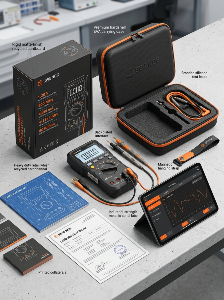
Designing an Intuitive Unboxing Experience and Interior Layout
An intuitive unboxing experience for a digital multimeter (DMM) establishes immediate professional trust and ensures user safety. The interior layout must prioritize logical organization, utilizing precision-cut foam or molded inserts to secure the device and prevent calibration drift during transit.
Key design elements include dedicated, tangle-free compartments for test leads, probes, and alligator clips. A "safety-first" hierarchy ensures the quick-start guide is the first item visible, encouraging users to review voltage ratings before operation.
Strategically recessed slots for accessories-such as thermocouples, spare fuses, and batteries-streamline the workflow for technicians. By optimizing the physical interface and internal geometry, manufacturers protect sensitive electronic circuitry while facilitating a seamless transition from box to field measurement, reflecting the precision and reliability essential for electrical diagnostic tools.
Integrating Essential Safety Symbols and Regulatory Compliance
Professional digital multimeters must feature standardized safety symbols and regulatory markings to ensure operator protection during high-voltage diagnostics. These visual cues allow technicians to verify a tool's safety limits at a glance.
- Measurement Categories (CAT): Ratings like CAT III or CAT IV define the device's ability to withstand transient voltage spikes in specific electrical environments.
- Double Insulation: Indicated by a "square-within-a-square" icon, signifying reinforced protection against electric shock.
- Certification Marks: The CE mark, UL listing, and ETL certification confirm the device meets rigorous international standards, such as IEC 61010.
Integrating these essential symbols ensures the multimeter complies with global safety frameworks, significantly reducing risks like arc flashes and equipment failure in industrial and residential applications.
Leveraging Typography for Readability and Brand Authority
In the precision-driven world of digital multimeters, typography is essential for both data accuracy and professional credibility. Clear, high-contrast digital displays utilize specific font weights to ensure that measurement readings remain legible in low-light or high-glare industrial environments.
To establish brand authority, manufacturers implement consistent typographic hierarchies across device interfaces and technical documentation. Strategic font selection serves several purposes:
- Enhanced Readability: Sans-serif fonts improve the clarity of numerical data and measurement units like Volts, Ohms, and Amps.
- Operational Safety: Distinctive character shapes prevent the misinterpretation of critical electrical values.
- Professional Trust: Polished, uniform typography reinforces the device's status as a high-quality, reliable diagnostic tool.
By optimizing typography, brands enhance the user experience, ensuring technicians can perform complex electrical testing safely and efficiently.
Implementing Sustainable Solutions in Modern Tool Packaging
As environmental responsibility becomes a priority in the electronics industry, digital multimeter manufacturers are revolutionizing their distribution methods. Transitioning away from traditional plastic blister packs, modern brands are adopting sustainable packaging solutions that protect sensitive calibration while reducing waste.
Key eco-friendly advancements include:
- Biodegradable Materials: Utilizing recycled cardboard and molded fiber inserts instead of non-recyclable foams.
- Reduced Carbon Footprint: Streamlined, compact packaging designs optimize shipping space, lowering fuel consumption during transit.
- Non-Toxic Printing: Implementing soy-based or water-based inks for technical specifications and branding.
By integrating these green practices, the digital multimeter market ensures that high-precision diagnostic tools are delivered with a commitment to long-term environmental stewardship and circular economy principles.
Creating Visual Impact for Competitive Retail Environments
In the crowded consumer electronics market, digital multimeters must command attention through strategic packaging and display. Visual impact is achieved by using high-contrast color palettes-typically bold yellows or oranges-that communicate safety and professional reliability. Clear window packaging or high-definition imagery allows shoppers to assess the tool's ergonomic design and build quality immediately.
To optimize for retail conversion, manufacturers prioritize these semantic elements:
- Iconography: Using intuitive symbols for CAT safety ratings and True RMS features.
- High-Resolution Graphics: Showcasing the backlit LCD and interface layout.
- Brand Tiering: Utilizing premium finishes to distinguish professional-grade tools from entry-level models.
By blending technical specifications with clean, modern aesthetics, brands ensure their multimeters stand out on the shelf, facilitating faster purchase decisions in highly competitive retail landscapes.
Leave a comment