Designing packaging for the iconic slinky requires a sophisticated balance between structural engineering and visual storytelling. Because these helical springs are defined by their kinetic movement, the container must provide both coil security and a glimpse into the product's playful nature. This guide delves into the essential concepts of slinky packaging design, focusing on how to prevent tangling while maximizing shelf appeal through strategic material selection.
From implementing durable, high-impact cardboard to mastering minimalist aesthetics or retro-inspired graphics, the right approach bridges the gap between nostalgia and modern retail demands. By understanding the intersection of form and function, designers can create an immersive unboxing experience that highlights the fluid motion of the toy. Explore the core principles of structural integrity and aesthetic harmony necessary to elevate your product and resonate with consumers of all ages.
The Legacy of Slinky Brand Heritage in Modern Design
The Slinky brand represents a pinnacle of mid-century industrial design. Invented accidentally by Richard James in the 1940s, its helical coil structure has transcended its original toy status to become a universal symbol of kinetic movement and minimalist aesthetics.
In modern design, the Slinky legacy manifests through architectural forms that mimic its flexible geometry and product engineering that prioritizes tactile interaction. Its iconic steel and plastic iterations influence contemporary art, lighting fixtures, and ergonomic furniture, proving that functional simplicity remains timeless. By integrating the fundamental principles of physics with playful utility, the Slinky heritage continues to inspire designers seeking to balance form, fluid motion, and nostalgic charm in 21st-century innovation.
Core Color Theory and Iconic Visual Branding
The Slinky maintains a distinct visual identity rooted in material honesty and vibrant contrast. Originally manufactured in high-carbon steel, its silver, metallic sheen represents an industrial aesthetic that emphasizes fluid motion and light reflection. This monochromatic palette ensures the toy's physics remain the focal point of the user experience.
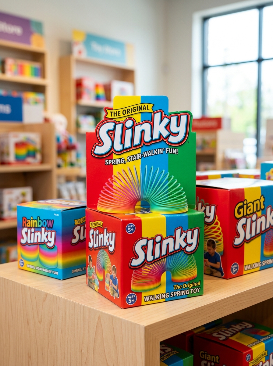
In branding, the transition to plastic iterations introduced chromatic theory via the iconic rainbow gradient. This spectrum serves a dual purpose: enhancing visual tracking during kinetic play and broadening market appeal through high-saturation hues. Complementing the product, Slinky's packaging utilizes a signature primary color scheme-typically bold blues and reds-combined with classic block typography. This strategic visual branding fosters immediate recognition and nostalgic resonance, positioning the Slinky as a timeless staple in global toy design.
Visualizing Kinetic Motion Through Dynamic Graphics
A Slinky serves as a premier physical model for visualizing kinetic motion and wave propagation. When this iconic helical spring "walks" down stairs, it demonstrates the fluid transfer of potential energy into kinetic energy through gravity and tension.
Dynamic graphics and digital simulations enhance this understanding by mapping longitudinal waves and compression patterns. These visual tools illustrate how energy travels through the coils, making complex physics concepts like Hooke's Law and mechanical equilibrium accessible. By isolating the variables of mass and spring constants, dynamic renders provide a clear framework for analyzing the unique oscillating movement that defines the Slinky's behavior in both physical and educational environments.
Typography Strategies for Retro and Contemporary Appeal
Typography is essential in balancing the Slinky's historical legacy with modern marketability. To achieve retro appeal, designers often utilize bold, condensed sans-serifs or heavy slab-serif typefaces that mirror the industrial aesthetic of the 1940s. These tactile fonts evoke nostalgia and emphasize the toy's mechanical durability and post-war heritage.
In contrast, contemporary strategies prioritize fluidity and motion. Modern applications use kinetic typography with rounded edges or elongated letterforms to visually simulate the Slinky's iconic "walking" movement. By pairing classic, high-contrast logotypes with minimalist, airy secondary fonts, brands create a sophisticated visual hierarchy. This strategic blend ensures the brand remains timeless, appealing to adult collectors through vintage charm while attracting new generations with sleek, digital-friendly aesthetics. Effective typography bridges the gap between mid-century nostalgia and 21st-century play.
Material Selection for Structural Integrity and Tactile Feel
The performance of a Slinky depends heavily on its material composition, balancing tensile strength with elasticity. Traditionally, high-carbon steel wire is cold-rolled to create a flat cross-section. This metal choice ensures structural integrity, allowing the coil to withstand repeated stretching while maintaining the "memory" required to snap back. The density of steel provides the necessary inertia for the iconic "walking" motion and a resonant tactile feedback.
Alternatively, plastic Slinkys utilize high-grade thermoplastics. These materials are chosen for their lightweight properties and flexibility, offering a smoother tactile experience that is less prone to permanent kinking. Whether using metal or polymer, the material must possess a specific spring constant to facilitate efficient kinetic energy transfer, ensuring the toy maintains rhythmic momentum and physical durability during play.
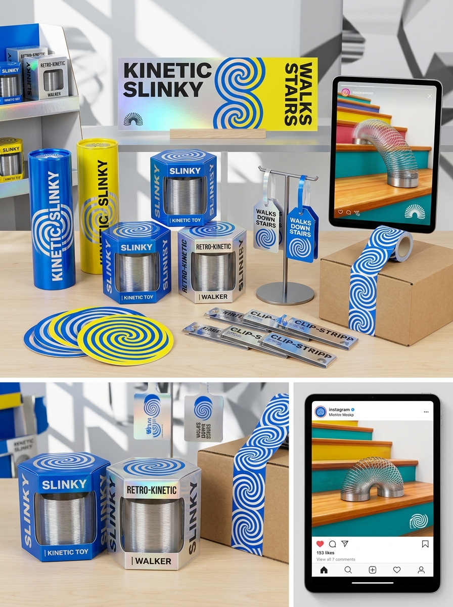
Maximizing Product Visibility with Strategic Window Cutouts
Strategic packaging is vital for the iconic Slinky, where tactile appeal and visual confirmation drive consumer interest. Implementing custom window cutouts in retail boxes allows potential buyers to observe the high-quality steel or vibrant plastic coils directly. This transparency builds immediate brand trust and encourages engagement through a "try-me" experience.
By showcasing the spring's unique texture and flexibility, strategic cutouts highlight the product's durability without compromising the structural integrity of the packaging. From a retail marketing perspective, these visual portals differentiate the Slinky from competitors on crowded shelves. Semantic optimization focuses on clear product presentation, ensuring the Slinky's kinetic potential is the primary selling point. This approach significantly boosts conversion rates by satisfying the customer's need to verify the product's quality before purchase.
Balancing Information Hierarchy and Minimalist Aesthetics
The Slinky represents a masterclass in minimalist industrial design, consisting of a single, continuous helical coil. To market such a deceptively simple object, designers must balance visual minimalism with a clear information hierarchy that explains its complex physics.
Effective packaging and documentation prioritize the Slinky's iconic silhouette while systematically organizing technical details. This hierarchy typically includes:
- Visual Hook: The graceful, kinetic form of the coiled steel.
- Functional Logic: Brief explanations of longitudinal wave tension and gravity.
- Brand Authority: Highlighting its 1943 heritage and "Made in the USA" status.
By utilizing negative space and clean typography, the Slinky maintains its aesthetic purity without sacrificing the essential data required for consumer trust. This balance ensures that the toy remains an accessible, intuitive icon of scientific play.
Sustainability and Eco-Conscious Packaging Materials
Modern Slinky manufacturing increasingly prioritizes environmental responsibility through sustainable materials and ethical production. Original metal Slinkys are inherently eco-friendly, crafted from high-quality steel that is 100% recyclable and exceptionally durable, significantly reducing landfill waste compared to short-lived disposable toys.
To further minimize their ecological footprint, leading brands are transitioning to eco-conscious packaging solutions. This evolution includes utilizing FSC-certified recycled cardboard, biodegradable soy-based inks, and eliminating single-use plastic windows. By adopting plastic-free shipping containers and minimalist designs, the Slinky industry aligns with global conservation efforts. Choosing these sustainably packaged toys ensures that the iconic walking spring remains a timeless, low-impact choice for environmentally conscious consumers seeking durable, recyclable, and plastic-free play options.
Optimizing the Sensory Unboxing Experience for Consumers
The unboxing process for a Slinky is a pivotal multisensory touchpoint that defines consumer satisfaction. To optimize this experience, manufacturers prioritize tactile feedback and auditory triggers. High-grade carbon steel or precision-molded plastic should offer an immediate sense of weight and durability upon first contact.
The iconic "clacking" sound produced by the shifting coils provides instant auditory gratification, reinforcing the product's nostalgic value. Packaging design further enhances this by using open-faced boxes, allowing for immediate interaction with the spring's kinetic tension. By showcasing the fluid motion and metallic shimmer through strategic presentation, brands create a memorable sensory journey. This intentional focus on haptic and acoustic quality ensures that the moment of extraction translates into a premium brand perception.
Future Trends in Interactive and Digital-Integrated Design
The evolution of the Slinky is moving toward the fusion of traditional kinetic motion with digital innovation. Future designs are expected to incorporate Augmented Reality (AR), allowing users to visualize physics principles like longitudinal waves through smartphone interfaces as the coil moves.
Emerging trends also highlight smart materials and embedded sensors that track velocity and tension. These advancements transform the classic toy into an interactive STEM tool, capable of syncing with apps to gamify physical activity or compose generative music based on spring compression. By integrating Internet of Things (IoT) connectivity, the next generation of Slinkys will bridge the gap between tactile play and virtual feedback, ensuring this 1940s icon remains a cornerstone of interactive design in a tech-driven era.
Leave a comment