Elevating Maldon sea salt flakes packaging requires a sophisticated balance between culinary heritage and contemporary premium aesthetics. As artisanal products move to the forefront of the gourmet market, the visual and tactile presentation of these iconic crystals serves as a primary differentiator for luxury branding. This exploration delves into innovative design concepts that prioritize minimalist elegance, sustainable materials, and sensory-driven structural solutions.
By focusing on high-end finishes and functional design, brands can transform a staple ingredient into a centerpiece of culinary craft. Mastering the nuances of artisan salt packaging ensures maximum shelf appeal while reinforcing the perceived value of the hand-harvested flakes within. Discover how strategic graphic elements and structural integrity converge to define the modern gold standard in food packaging innovation and consumer experience.
The Heritage of Maldon Sea Salt Packaging
Since 1882, Maldon Sea Salt Flakes have been synonymous with quality, a reputation reflected in their iconic packaging. The brand's aesthetic preserves a legacy of artisanal craftsmanship, featuring the distinctive green and white box that professional chefs and home cooks recognize worldwide. A central element of this heritage is the Royal Warrant, granted in 2012 by HM Queen Elizabeth II, symbolizing its status as a staple in the royal household.
The packaging design emphasizes the unique pyramid-shaped flakes harvested by the Osborne family for four generations. By maintaining its classic typography and clean visual identity, Maldon honors its Essex roots while ensuring the product remains a timeless symbol of culinary excellence. This consistent branding bridges the gap between traditional salt harvesting and modern gourmet standards.
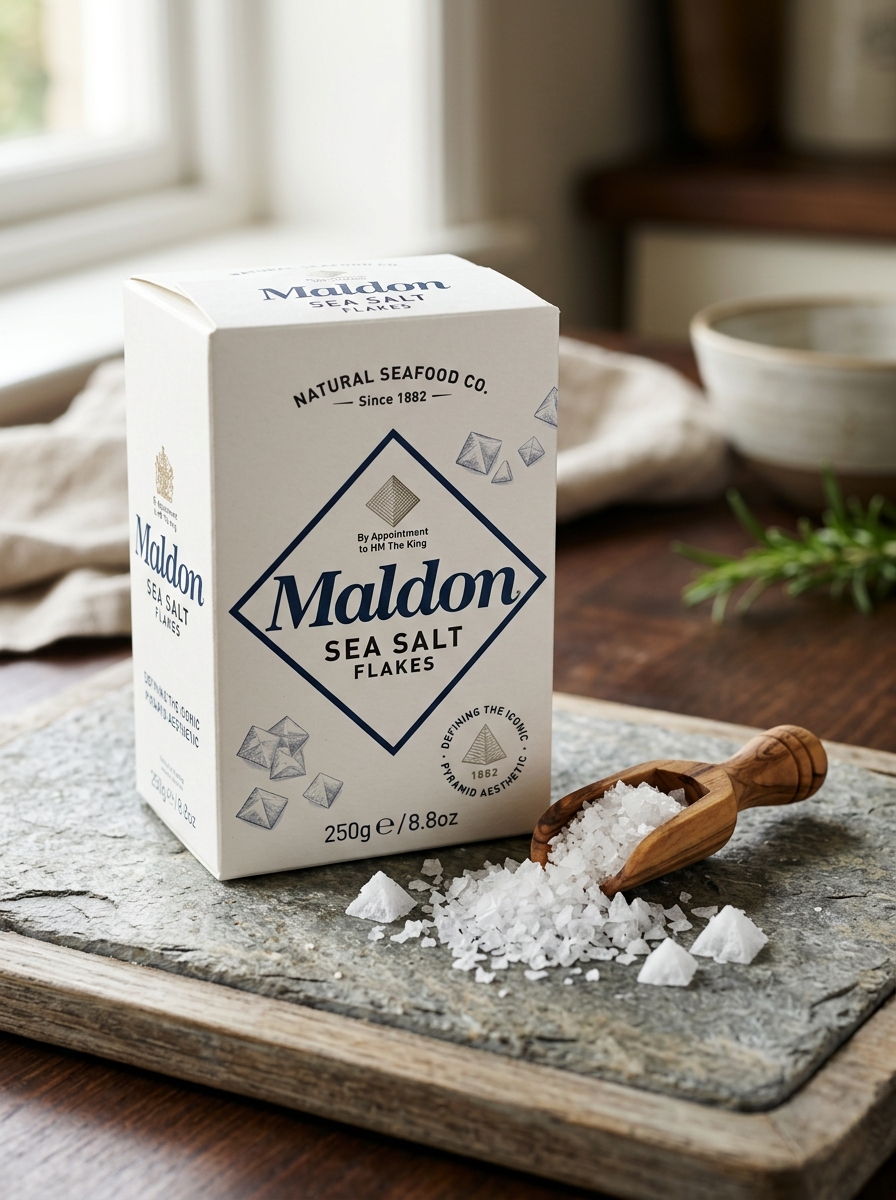
Defining the Iconic Pyramid Aesthetic
Maldon Sea Salt is globally recognized for its distinct, hand-harvested pyramid flakes. This unique geometric structure is the result of a traditional artisanal process where seawater is heated in large open pans until salt crystals naturally form into hollow, four-sided pyramids.
This iconic aesthetic serves a vital culinary purpose beyond visual appeal. The delicate, paper-thin walls of the pyramid provide a signature tactile crunch and a clean, briny intensity. Unlike dense granulated salt, these flakes offer a rapid solubility that allows them to melt instantly on the tongue, enhancing the flavor of both sweet and savory dishes. By maintaining these centuries-old harvesting techniques, Maldon ensures each crystal delivers the perfect balance of texture and purity that has made it a staple in professional kitchens worldwide.
Color Psychology and Brand Recognition
Maldon Sea Salt Flakes are instantly identifiable by their iconic soft green packaging, a strategic choice rooted in color psychology. This specific shade evokes feelings of nature, heritage, and purity, perfectly aligning with the brand's traditional harvesting methods in Essex. In a competitive market, this "Maldon Green" serves as a powerful visual shorthand for artisanal quality and sustainability.
The visual contrast between the calming green box and the brilliant white, pyramid crystals reinforces a premium sensory experience. This consistent branding fosters high brand recognition, ensuring the product stands out on retail shelves and kitchen counters. By leveraging colors that signal freshness and authenticity, Maldon builds consumer trust and maintains its status as the definitive choice for culinary professionals and home cooks globally.
Minimalist Design Strategies for Premium Salt
Maldon Sea Salt Flakes utilizes a minimalist design philosophy to reinforce its position as a premium culinary staple. The packaging prioritizes clean typography and significant whitespace, which semantically signals purity, transparency, and sophistication to the consumer. By focusing on the distinctive brand heritage and the iconic pyramid shape of the flakes, the design avoids unnecessary visual noise.
This "less is more" approach leverages visual hierarchy to highlight the artisan quality of the hand-harvested salt. For high-end pantry goods, minimalist aesthetics serve as a powerful non-verbal cue for luxury and brand authority. By stripping away cluttered graphics, Maldon allows the product's reputation for texture and flavor to remain the central focus, appealing to professional chefs and home gourmets who value authentic craftsmanship.
Typography Choices for Artisanal Branding
For a heritage brand like Maldon Sea Salt, typography is essential in communicating craftsmanship and premium quality. The brand utilizes a sophisticated serif typeface to anchor its identity, evoking a sense of history and timeless elegance that dates back to 1882. This choice reflects the artisanal, hand-harvested nature of the flakes, positioning the product as an authentic culinary staple.
To balance tradition with modern appeal, clean sans-serif fonts are often employed for secondary information. This minimalist approach ensures legibility and reinforces the purity of the natural ingredients. By combining classic letterforms with strategic hierarchy, the typography creates a luxury aesthetic that resonates with gourmet chefs and home cooks alike, ensuring the brand remains a recognizable icon of excellence on the shelf.
Material Innovation and Sustainable Packaging
Maldon Sea Salt Flakes continues to lead the artisan salt industry by integrating material innovation with ecological responsibility. To reduce its environmental footprint, the brand has transitioned to 100% recyclable cardboard packaging sourced from FSC-certified forests. This shift ensures that the iconic pyramid crystals are housed in materials that support responsible forestry and circular economy principles.
Beyond the outer box, Maldon focuses on minimizing single-use plastics within its supply chain. By optimizing the weight of their containers and improving the sustainability of inner liners, they maintain product freshness and food safety while lowering carbon emissions. This commitment to sustainable packaging reflects a balance between preserving a 140-year-old harvesting heritage and adopting modern, eco-friendly solutions that protect the planet for future generations.
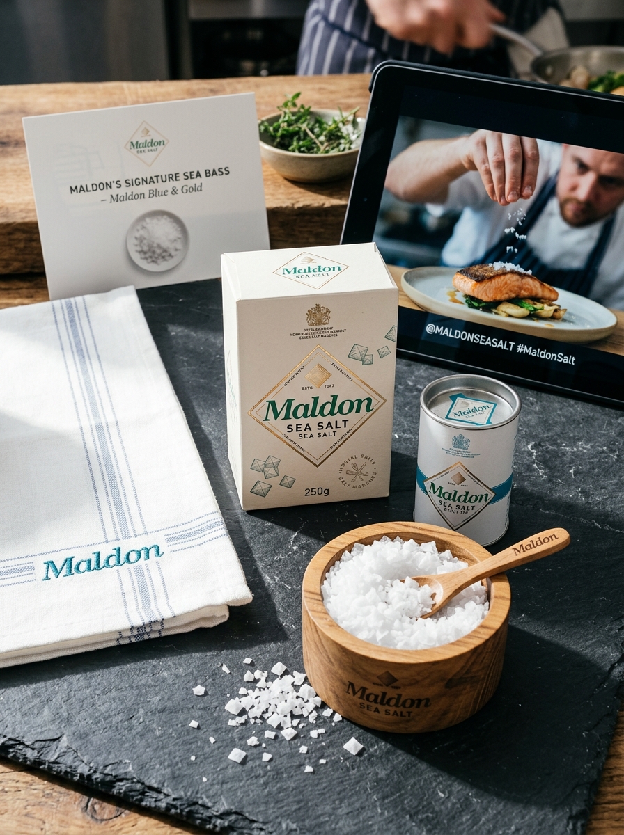
Enhancing the Consumer Unboxing Experience
The unboxing of Maldon Sea Salt Flakes is a sensory introduction to a legacy of culinary excellence. For the home chef, the journey begins with the tactile feel of the premium, sustainably sourced packaging. The iconic white and green aesthetic signals heritage and purity, while the clear branding highlights the hand-harvested nature of the flakes.
Upon opening, the visual reveal of the unique pyramid-shaped crystals creates an immediate connection to the artisan craftsmanship that has defined the brand since 1882. This deliberate presentation protects the delicate structure of the salt, ensuring every flake arrives intact. By blending functional protection with luxury brand storytelling, Maldon transforms a simple pantry essential into an immersive gourmet experience, building immediate consumer trust and anticipation for the first pinch.
Shelf Presence and Competitive Visual Identity
Maldon Sea Salt Flakes command retail authority through a minimalist yet iconic visual identity that defines the premium seasoning category. The brand's signature ivory packaging, featuring elegant green typography and the Royal Warrant, communicates heritage and artisanal quality instantly to consumers.
To maintain a competitive edge, Maldon utilizes a high-contrast design that stands out against the cluttered aesthetics of standard table salts. Key visual drivers include:
- Pyramid Geometry: Structural imagery reflecting the unique, handcrafted crystal shape.
- Heritage Branding: Timeless logo application signaling reliability and prestige since 1882.
- Tactile Appeal: Premium box finishes that enhance the consumer's sensory experience on-shelf.
By balancing tradition with modern simplicity, Maldon ensures instant brand recognition, positioning itself as an essential luxury for both professional chefs and home cooks.
Digital Integration and Modern Design Trends
Maldon Sea Salt Flakes seamlessly bridge artisanal heritage with modern design trends. The brand has evolved its visual identity to embrace minimalist packaging and clean typography, aligning with the contemporary aesthetic preferences of high-end culinary spaces. This strategic design shift optimizes the product for digital integration, making the iconic pyramid flakes a centerpiece in viral food photography and social media content.
Beyond aesthetics, Maldon utilizes digital platforms to enhance storytelling, connecting modern consumers to its traditional harvesting process through immersive online experiences. By balancing a 140-year legacy with a sleek, mobile-responsive brand presence, Maldon ensures its sea salt remains the premium choice for the tech-savvy epicurean. This synergy of heritage quality and digital-first branding maintains its relevance in an increasingly visual and connected global marketplace.
Evolving the Brand Legacy Through Design
For over 140 years, Maldon Sea Salt Flakes has remained a global symbol of culinary excellence. Evolving the brand legacy through design requires a sophisticated balance between honoring its 1882 heritage and embracing contemporary aesthetics. The visual identity remains anchored in the unique, hand-harvested pyramid shape of the crystals, a geometric hallmark that signifies artisanal quality.
Modern packaging refinements focus on clean typography and the iconic green color palette, enhancing shelf standout while maintaining a premium feel. By integrating sustainable materials and minimalist graphics, Maldon speaks to the eco-conscious professional chef and home cook alike. This strategic design evolution ensures that while the salt remains "the same since 1882," its presentation continues to inspire a new generation of gastronomic enthusiasts through purposeful, heritage-driven storytelling.
Leave a comment