
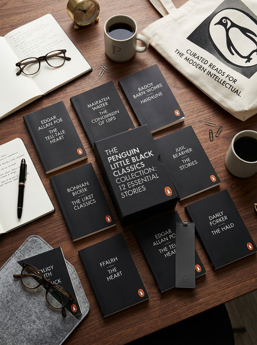
The Penguin Little Black Classics represent a masterclass in editorial minimalism, stripping away the noise of contemporary book marketing to favor a stark, authoritative design language. Launched to celebrate Penguin's 80th anniversary, these pocket-sized volumes utilize a strictly monochromatic palette and a disciplined typographic grid.
By prioritizing negative space and the iconic Penguin branding, the series achieves a timeless sophistication that resonates with modern collectors. Mastering this aesthetic requires an analysis of how limited visual assets can amplify brand recognition. From the tactile matte finish to the elegant use of the Sabon typeface, every element serves the larger goal of accessibility without compromising on prestige. This exploration into the series' packaging reveals how reductive design principles can transform a diverse literary catalog into a unified, globally recognized collection.
The Heritage of Penguin Series Design Evolution
The Penguin Little Black Classics represent a sophisticated milestone in the brand's storied design history. Launched to celebrate Penguin's 80th anniversary, these pocket-sized volumes draw direct inspiration from the minimalist aesthetic pioneered by Jan Tschichold and Edward Young. By utilizing a stark monochrome palette, the series honors the modernist tradition of accessibility and clarity.
The evolution of Penguin series design emphasizes a functional "tri-band" legacy, stripping away ornate imagery to focus on typography and brand identity. Using the iconic Gill Sans font and the classic penguin logo, the Little Black Classics bridge the gap between historical heritage and contemporary publishing. This design evolution ensures that high-quality literature remains portable, affordable, and visually timeless, reinforcing Penguin's commitment to democratizing the world's greatest written works through superior graphic standards.
Defining the Minimalist Aesthetic of Little Black Classics
The Penguin Little Black Classics are defined by a striking monochromatic palette that prioritizes functional elegance. Launched to celebrate Penguin's 80th anniversary, these pocket-sized volumes utilize a minimalist design featuring a stark black cover, a crisp white spine, and clean, centered typography.
By stripping away ornate illustrations and complex jacket art, the series emphasizes the purity of the written word. This "less is more" approach utilizes a standardized layout and the iconic penguin logo to create a cohesive, instantly recognizable brand identity. The uniform, slim format reflects the brevity of the literature within-ranging from ancient Japanese poetry to radical Victorian essays. This aesthetic choice ensures maximum portability and affordability while maintaining a sophisticated, timeless look that appeals to modern bibliophiles and collectors.
The Strategic Use of the Monochromatic Color Palette
The Penguin Little Black Classics utilize a monochromatic color palette to achieve a sophisticated, minimalist aesthetic. This strategic design choice differentiates the series from vibrantly colored modern publications, emphasizing the timeless nature of the curated literary content.
By employing a stark black-and-white scheme, Penguin creates a cohesive brand identity that is instantly recognizable. This high-contrast visual language serves several primary purposes:
- Brand Recognition: It establishes a unified, collectible look across hundreds of diverse titles.
- Cost-Efficiency: Minimalist printing supports the series' goal of keeping pocket-sized literature affordable.
- Editorial Focus: The absence of color strips away distractions, signaling a focus on the raw power of the prose.
Ultimately, this monochromatic strategy pays homage to historical typography while providing a sleek, modern profile that appeals to contemporary collectors.
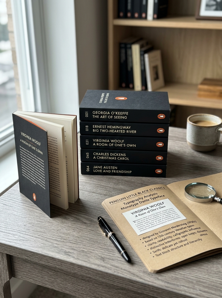
Typography Analysis of the Monotype Dante Typeface
The Penguin Little Black Classics utilize the Monotype Dante typeface to achieve a perfect balance between historical elegance and modern legibility. Designed by Giovanni Mardersteig and originally cut by Charles Malin, Dante is a humanistic serif typeface celebrated for its refined, scholarly aesthetic.
In the context of this series, Dante's technical characteristics offer several functional advantages:
- High Legibility: Its vertical stress and open counters ensure that text remains readable even at the smaller point sizes required for pocket-sized books.
- Humanistic Influence: The typeface features subtle, hand-crafted terminals that evoke 15th-century Venetian traditions, grounding the diverse literary collection in a timeless tradition.
- Precision: The crispness of the Monotype digital revival complements the minimalist black-and-white cover designs, reinforcing Penguin's commitment to high-quality book production.
Grid Systems and Geometric Layout Principles
The Penguin Little Black Classics utilize a sophisticated grid system that reflects the brand's storied typographic heritage. Each cover is designed using a rigid geometric layout, dividing the space into horizontal bands that ensure mathematical consistency across the entire series.
By adhering to a strict grid, the design achieves a minimalist aesthetic where white space and black blocks are perfectly balanced. The typography is typically centered, creating a formal visual hierarchy that prioritizes the author and title. This structural discipline, inspired by Jan Tschichold's modernism, allows for instant brand recognition.
The precise placement of the iconic Penguin logo and the uniform border widths demonstrate how geometric principles can create a cohesive identity for a vast collection, proving that standardized layouts enhance both clarity and elegance in book design.
The Functional Appeal of the Pocket Sized Format
The Penguin Little Black Classics series revolutionizes reading through its ultra-portable design. Measuring approximately 11cm by 16cm, these pocket-sized editions offer unparalleled convenience for modern readers. The lightweight, slim format allows literary enthusiasts to carry masterpieces by authors like Chekhov, Sappho, and Dickens anywhere-from daily commutes to long-distance travel.
Beyond portability, the reduced dimensions make classic works approachable, encouraging readers to explore diverse genres without the intimidation of a heavy volume. This functional design bridges the gap between high literature and busy lifestyles. The iconic minimalist aesthetic ensures they are not only practical but also highly collectible. By prioritizing a "read anywhere" philosophy, Penguin makes quality literature tactile, accessible, and perfectly suited for the palm of your hand.
Materiality and the Tactile Experience of Matte Finishes
The Penguin Little Black Classics series distinguishes itself through a deliberate focus on materiality. Eschewing the high-gloss coatings of mass-market paperbacks, these editions feature a signature matte finish that provides a sophisticated, velvety texture. This specific tactile quality invites a more intimate physical engagement with the text, enhancing the overall sensory experience of reading classic literature.
The slim, lightweight profile of each volume complements the soft-touch covers, emphasizing "pocketability" and accessibility. By prioritizing a refined hand-feel, Penguin transforms the book from a mere vessel for information into a curated design object. This tactile experience bridges the gap between modern minimalism and timeless content, making the collection a favorite for bibliophiles who value the physical sensation of paper and print in a digital age.
Visual Hierarchy and Strategic Branding Placement
The Penguin Little Black Classics employ a masterful visual hierarchy designed for instant recognition. By utilizing a high-contrast, monochrome color palette, the series achieves a minimalist aesthetic that stands out in crowded retail environments. The layout follows a strict grid: the series title sits at the top, while the author and work title occupy the central focal point, ensuring a clear reading order.
Strategic branding is anchored by the iconic Penguin logo, positioned consistently at the bottom. This placement serves as a "seal of quality," reinforcing brand authority. The uniform design across all titles creates a powerful collective identity, turning individual books into parts of a cohesive, collectible set. This strategic repetition reinforces the brand's heritage while focusing the viewer's attention on the purity of the literary content.
Decoding the Success of Global Design Consistency
The Penguin Little Black Classics series exemplifies how global design consistency builds an iconic brand identity. By utilizing a minimalist, monochromatic aesthetic, Penguin Books created a unified visual language that transcends linguistic and geographic barriers. Each pocket-sized volume features the signature stark black spine and classic white typography, ensuring instant recognition on any bookshelf worldwide.
This strategic uniformity fosters collectibility and brand trust. The repetitive design elements-such as the centered Penguin logo and clean sans-serif fonts-transform individual titles into a cohesive set. By stripping away complex cover art, the focus shifts to the curation of world-class literature, proving that high-impact, consistent branding can drive both commercial success and cultural prestige. This approach demonstrates that a strong, repeatable design framework is essential for maintaining global market dominance in the publishing industry.
Applying Minimalist Lessons to Modern Publishing Trends
The Penguin Little Black Classics series serves as a strategic blueprint for modern publishing by prioritizing minimalist design and curated brevity. In a marketplace saturated with high-sensory digital content, these pocket-sized editions prove that stripped-back aesthetics-specifically the iconic monochromatic covers-can drive significant consumer engagement and brand loyalty.
Modern publishers are adopting these lessons by focusing on "snackable" literature and standardized formats that reduce production costs while increasing "Instagrammable" collectibility. This trend reflects a shift toward functional minimalism, where the physical book acts as a distraction-free artifact. By removing decorative excess, publishers align with contemporary desires for portability and intentional consumption, proving that high-quality, affordable classics remain highly relevant in a fast-paced, digital-first world.
Leave a comment