The Puffin Little Books series serves as a definitive benchmark in miniature publishing, blending nostalgic charm with a sophisticated aesthetic identity. Understanding the success of this collection requires an exploration of the meticulous packaging design that transforms standard children's literature into a cherished collectible. By prioritizing tactile quality and visual cohesion, these editions create an immediate emotional connection with both young readers and adult bibliophiles.
From the iconic orange branding to the curated minimalist typography, every design element serves a strategic purpose in modern brand storytelling. This analysis delves into the structural engineering and artistic choices-such as vibrant cover illustrations and consistent visual language-that define the brand's enduring appeal. Discover how these compact volumes maintain a premium feel while honoring a legacy of accessible, high-quality storytelling.
The Legacy and Visual Evolution of Puffin Little Books
The legacy of Puffin Little Books began in 1940, originating from Noel Carrington's vision to provide children with affordable, high-quality non-fiction. Originally known as Puffin Picture Books, these publications revolutionized the industry by combining educational content with striking visual storytelling.
The visual evolution of the series is marked by its early use of autolithography, which gave the illustrations a vibrant, textured quality that was rare for wartime era mass production. Over the decades, the design shifted from instructional, realistic sketches to more diverse, contemporary artistic styles.
Today, the iconic orange branding and curated typography represent a significant milestone in graphic design history. This evolution reflects changing pedagogical trends while maintaining a commitment to the aesthetic excellence that makes Puffin a cornerstone of children's literature and a favorite for collectors worldwide.
Defining the Aesthetic Appeal of the Compact Format
The Puffin Little Books series celebrates the enduring charm of miniature literature. By shrinking beloved children's classics into a pocket-sized format, these editions offer a unique tactile experience that appeals to both young readers and adult collectors. The aesthetic allure lies in their precision; each volume maintains high-quality production values, featuring iconic cover art and readable typography within a condensed frame.
This compact design transforms traditional storytelling into a portable, collectible treasure. The aesthetic appeal is driven by the physical intimacy of the small scale, making the books feel like personal keepsakes. For the Puffin brand, this format reinforces a sense of nostalgia while providing an accessible entry point into literary masterpieces. Ultimately, the "little" format proves that great stories don't require large canvases to leave a lasting visual and emotional impression.
Strategic Use of the Iconic Puffin Brand Identity
The Puffin Little Books series strategically leverages the global heritage of the Puffin brand to establish immediate trust and credibility with parents, caregivers, and educators. By prominently featuring the iconic puffin logo, the series signals a commitment to high-quality, age-appropriate storytelling and early childhood development.
This brand identity utilizes a cohesive visual language-integrating bold typography and vibrant color palettes-to ensure shelf standout in a competitive market. Strategically, the "Little" sub-brand bridges the gap between the nostalgia of classic literature and the practical needs of modern toddlers. By maintaining consistent brand markers, Penguin Random House fosters long-term loyalty, positioning these introductory texts as a gateway into the broader Puffin literary ecosystem. This alignment ensures the brand remains synonymous with excellence in children's publishing.
Color Theory and Palette Selection for Early Readers
In the Puffin Little Books series, color theory is a fundamental tool for supporting early childhood cognitive development. Publishers utilize strategic palette selection to engage toddlers and preschoolers without causing overstimulation. High-contrast color combinations, such as bold primary colors paired with neutral tones, are specifically chosen to improve visual tracking and help children distinguish between shapes and text.
By leveraging color psychology, these books create an optimal learning environment. Warm hues like soft yellows and oranges stimulate curiosity and energy, while soothing blues and greens promote focus and calm. This intentional application of color ensures that the visual narrative reinforces the educational content, making literacy milestones more accessible. Each palette in the Puffin Little Books collection is curated to foster emotional resonance, ensuring a captivating and age-appropriate reading experience for young minds.
Typography and Font Selection for Whimsical Storytelling
In the Puffin Little Books series, typography serves as a bridge between visual art and verbal narrative. To enhance whimsical storytelling, font selection focuses on legibility and personality, ensuring young readers remain engaged.
Key typographic strategies include:
- Friendly Serifs: Utilizing rounded, approachable typefaces that mimic the warmth of traditional storybooks.
- Dynamic Hierarchy: Using varying font weights to emphasize rhythmic language and "read-aloud" cues.
- Organic Spacing: Generous leading and kerning to prevent visual crowding, aiding early literacy development.
By blending playful character shapes with clean, accessible layouts, the typography in Puffin Little Books reinforces the magical atmosphere of the prose. This intentional design ensures that every word contributes to the sense of wonder, making the reading experience both intuitive and enchanting for children.
Artistic Synergy Between Classic and Contemporary Illustration
Puffin Little Books represent a masterful blend of heritage and modern innovation. This collection achieves a unique artistic synergy by pairing the timeless narratives of classic children's literature with the fresh, dynamic styles of contemporary illustrators. This intentional design bridge ensures that iconic stories remain relevant for today's visually-driven young readers.
By integrating traditional motifs with modern palettes and digital techniques, these books honor the Puffin legacy while pushing the boundaries of visual storytelling. The result is a cohesive aesthetic that appeals to nostalgic collectors and new audiences alike. Through this harmonious approach, Puffin Little Books celebrate the evolution of book design, proving that classic themes can be revitalized through modern artistic expression without losing their original soul.
Tactile Elements and Material Quality in Book Production
Puffin Little Books are expertly crafted to support early childhood development through superior tactile elements and high-quality construction. These books prioritize sensory engagement, incorporating features such as die-cut shapes, embossed textures, and matte-finish sturdy pages that encourage fine motor skill development in young readers.
The material quality focuses on durability and safety, utilizing non-toxic, heavy-duty paperboard designed to withstand frequent handling by toddlers. By employing reinforced bindings and rounded corners, the production process ensures both longevity and child-friendly ergonomics. This commitment to premium book production enhances the sensory-motor experience, making each Puffin Little Book a resilient tool for early literacy. Integrating diverse textures and high-GSM materials ensures that the books remain a staple for tactile learning and interactive storytelling.
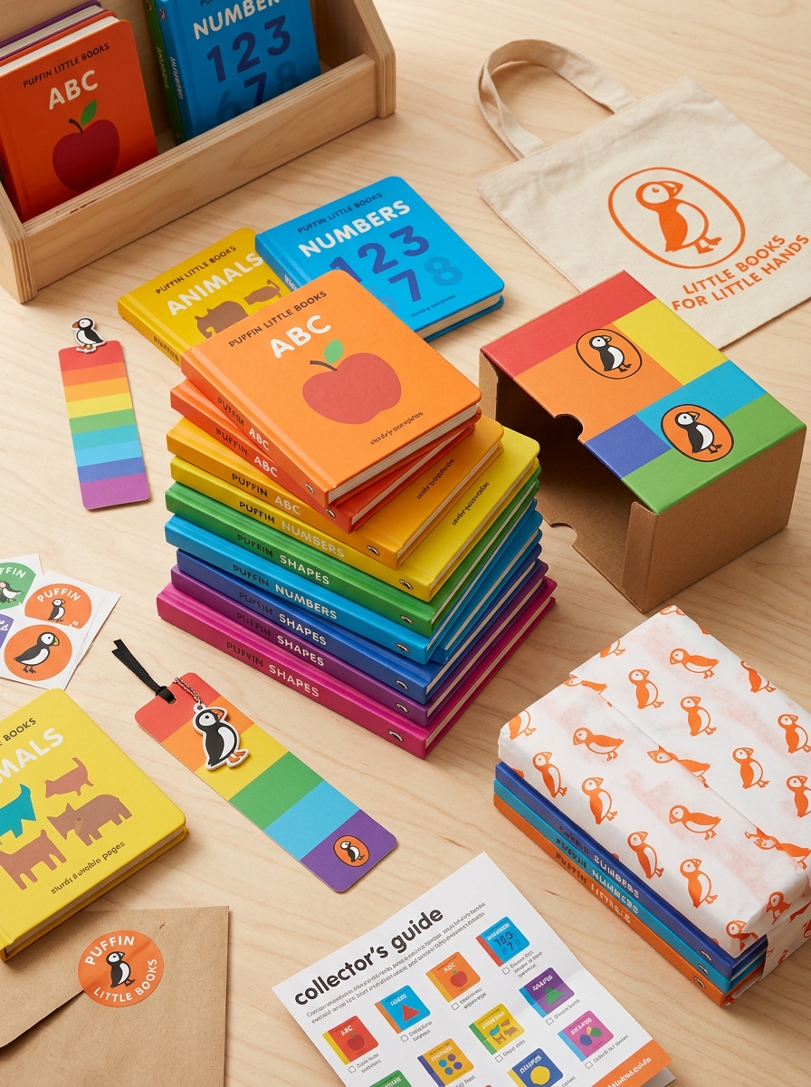
Designing for Durability and the Collector's Experience
Puffin Little Books are meticulously engineered to balance aesthetic charm with rugged resilience. Unlike standard paperbacks, these editions feature robust hardcover bindings and premium paper stock, ensuring they withstand the enthusiastic handling of young readers while maintaining their structural integrity over time.
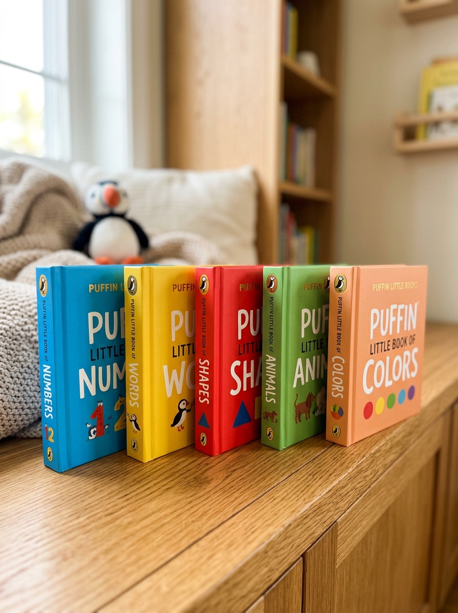
For the dedicated collector, the series offers a visually cohesive experience. The iconic orange spines and uniform dimensions create a striking, rhythmic display on bookshelves. This tactile appeal, combined with classic cover art, transforms the collection into a curated gallery of children's literature.
By prioritizing both physical longevity and design consistency, Puffin ensures that each volume remains a cherished heirloom. This focus on premium production value caters to bibliophiles who appreciate the physical artistry of bookmaking as much as the timeless stories contained within.
Cohesive Series Branding and Shelf Presence Strategy
The Puffin Little Books series leverages a strategic visual identity designed to capture the attention of parents and early learners. By utilizing a consistent trim size, a vibrant color palette, and the iconic Puffin logo, Penguin Random House ensures instant brand recognition. This cohesive branding transforms individual titles into a collectible set, encouraging repeat purchases through a unified aesthetic.
To maximize shelf presence, the series employs a "billboard effect" where spines align to create a high-impact block in retail environments. This strategy distinguishes the books from competitors on crowded shelves. By combining minimalist typography with bold, high-contrast imagery, the series maintains a professional yet playful look. This deliberate design approach reinforces the brand's authority in early childhood education while ensuring the books are as visually appealing as they are functional.
Future Trends in Sustainable and Innovative Packaging Design
The evolution of packaging for Puffin Little Books centers on ecological integrity and functional innovation. As the publishing industry pivots toward a circular economy, several key trends are shaping the future of book production:
- Plastic-Free Materials: Transitioning to FSC-certified recycled paper and eliminating synthetic laminates to ensure 100% recyclability.
- Eco-Friendly Inks: Utilizing soy-based and vegetable-based inks to reduce chemical runoff and enhance compostability.
- Minimalist Design: Engineering compact, lightweight formats that reduce raw material consumption and optimize carbon-efficient shipping.
- Interactive Longevity: Designing packaging that doubles as collectible displays, encouraging reuse rather than disposal.
By integrating these sustainable practices, Puffin Little Books aligns high-quality children's storytelling with responsible manufacturing. These innovations ensure that the physical joy of reading remains environmentally conscious for the next generation of readers.
Leave a comment