
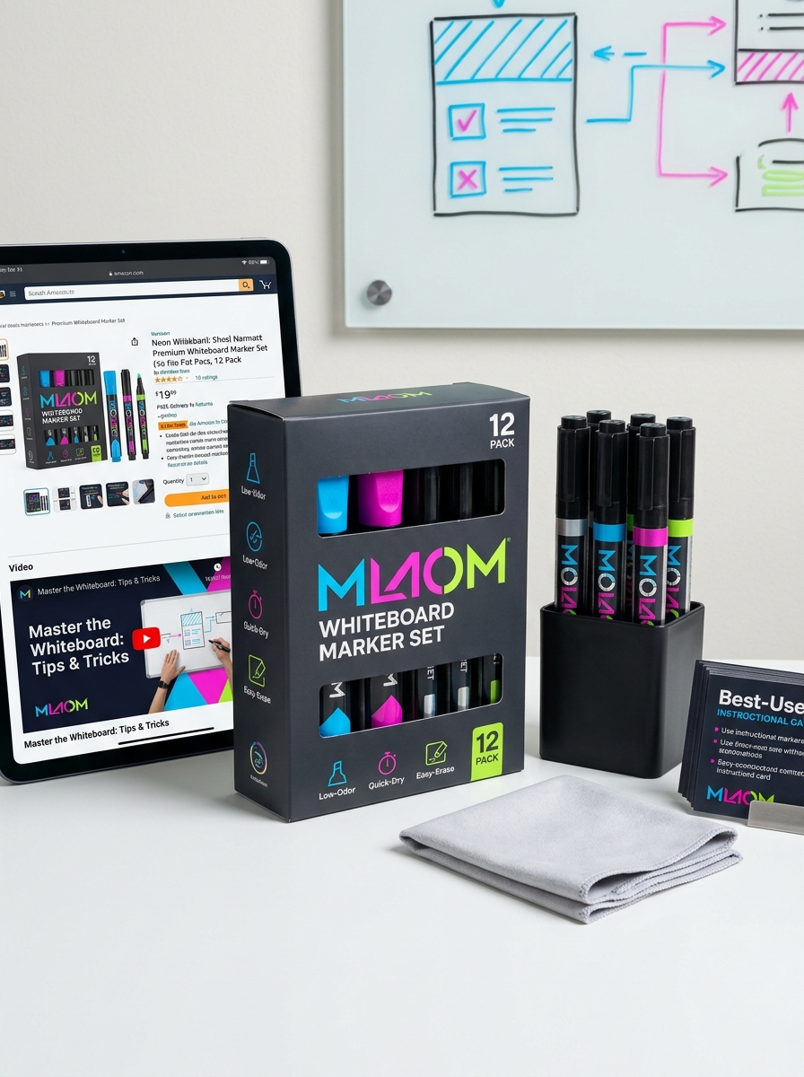
Effective dry erase marker packaging design serves as a critical touchpoint for brand identity and consumer engagement. Beyond mere containment, the visual presentation of stationery products must balance aesthetic principles with functional clarity to capture attention in retail environments. By leveraging sophisticated visual concepts-such as strategic color theory, minimalist typography, and transparent window elements-manufacturers can communicate product quality and utility instantaneously.
Optimizing the interface of a marker box involves a deep understanding of graphic hierarchy and shelf presence. Modern design strategies prioritize clean layouts that resonate with educators, corporate professionals, and artists alike. This exploration delves into how integrating premium finishes and cohesive branding elements can transform standard office supplies into high-appeal consumer goods, driving both brand loyalty and purchasing intent through superior packaging aesthetics and purposeful design execution.
The Evolution of Dry Erase Marker Packaging Aesthetics
The visual identity of dry erase marker packaging has undergone a significant transformation, shifting from utilitarian industrial designs to sophisticated retail presentations. Early packaging focused primarily on bulk functionality, often featuring plain cardboard and basic labeling. As markers became staples in classrooms and boardrooms, branding evolved to incorporate vibrant color palettes and transparent windows, allowing consumers to easily identify ink shades.
Contemporary aesthetics now prioritize minimalist design and ergonomic shelf appeal. Modern packaging frequently utilizes high-contrast typography, matte finishes, and sustainable materials to align with eco-conscious consumer trends. This evolution reflects a broader shift in the stationery industry, where visual branding and structural design are leveraged to differentiate premium products. Today, the packaging serves as a vital touchpoint, balancing professional sophistication with functional clarity to enhance the overall user experience.
Harnessing Color Psychology to Signal Ink Vibrancy
Manufacturers of dry erase markers strategically leverage color psychology to influence consumer perception of ink vibrancy and performance. By utilizing high-saturation pigments and color-matched barrel designs, brands signal visual "boldness" before the marker even touches a whiteboard. For example, deep blues and rich blacks are psychologically associated with authority and clarity, while neon hues evoke creativity and innovation.
Optimizing these visual cues ensures that users anticipate a high-contrast writing experience. This alignment between external aesthetics and internal ink chemistry is crucial for visibility in professional and educational settings. When a marker's packaging reflects its high pigment load, it reinforces user trust in the product's ability to deliver legible, streak-free communication that effectively captures and holds an audience's attention.
Prioritizing Visual Clarity through Transparent Window Elements
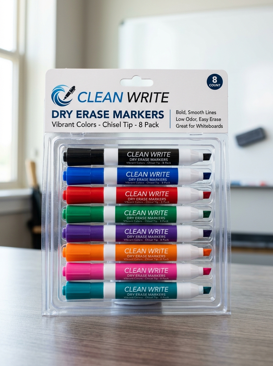
In the design of modern dry erase markers, transparent window elements serve as a critical functional innovation. These integrated ink indicators allow users to monitor remaining fluid levels at a glance, effectively eliminating the guesswork often associated with opaque marker barrels. By providing real-time visibility into the ink reservoir, these clear gauges ensure that educators and professionals are never caught off guard by a fading marker during vital presentations or classroom sessions.
This emphasis on visual clarity enhances workflow efficiency and prevents the frustration of interrupted communication. Whether utilizing chisel or bullet tips, markers with transparent windows offer a reliable user experience, ensuring bold, consistent lines on whiteboards. Prioritizing this design feature not only reduces waste by encouraging full use of the ink supply but also ensures peak performance for high-stakes collaborative environments.
Typography and Hierarchy for Instant Product Recognition
In the competitive dry erase marker market, effective typography is essential for shelf standout and user efficiency. Manufacturers employ a clear visual hierarchy to communicate vital product attributes instantly.
Key elements of semantic typographic design include:
- Primary Branding: Large, bold typefaces establish immediate brand authority and trust.
- Functional Clarity: High-contrast fonts clearly denote nib sizes-such as chisel, fine, or bullet-and specific ink properties like "low-odor" or "non-toxic."
- Color Identification: Descriptive text paired with color-matched caps helps users select the correct hue without hesitation.
By prioritizing legibility and font weighting, brands ensure that professional and educational users can identify the specific tools they need for whiteboards or glass surfaces at a single glance, streamlining both the purchasing and usage experience.
Balancing Minimalist Design with Functional Instruction
Modern dry erase markers increasingly adopt a minimalist design to fit the sleek aesthetic of contemporary workspaces. However, visual simplicity must not compromise usability. Manufacturers achieve this balance by integrating essential functional instructions through subtle, intuitive cues.
Effective marker design utilizes specific elements to guide the user:
- Visual Indicators: Color-coded caps and plugs provide instant identification of ink shades without excessive labeling.
- Iconography: Small, universal symbols communicate storage requirements-such as horizontal placement-to maintain optimal ink flow.
- Tactile Feedback: Ergonomic barrel shapes signify grip points, ensuring comfort during extended whiteboarding sessions.
By prioritizing high-contrast typography for safety warnings and nib sizes, brands ensure that performance and safety remain at the forefront, proving that minimalism and instructional clarity can coexist seamlessly.
Material Selection and the Impact of Tactile Finishes
In the production of dry erase markers, material selection is critical for both durability and user experience. Manufacturers typically utilize high-grade polypropylene for marker barrels to ensure chemical resistance and prevent ink evaporation. However, the integration of tactile finishes represents a significant advancement in ergonomic design.
Tactile enhancements, such as rubberized grips or matte textures, provide several functional benefits:
- Enhanced Control: Non-slip surfaces offer better precision when writing on slick whiteboards.
- Reduced Fatigue: Ergonomic finishes minimize hand strain during extended brainstorming sessions or classroom lectures.
- Durability: Specialized coatings protect the barrel from scratches and wear.
By prioritizing high-quality polymers and intentional surface textures, brands can significantly improve the writing comfort and professional performance of their markers.
Designing for Diverse Markets from Classrooms to Boardrooms
Manufacturers engineer dry erase markers to meet the distinct functional requirements of various professional and educational environments. In classrooms, the design focus prioritizes safety and durability. Key features include non-toxic, low-odor ink certifications and sturdy, pressure-resistant nibs capable of withstanding heavy daily use by students and educators.
Conversely, boardroom applications demand precision and professional aesthetics. These markers often feature sleek ergonomic barrels, fine-point tips for detailed data mapping, and high-pigment formulas optimized for visibility during corporate presentations. Advanced innovations, such as liquid ink systems and ghost-resistant technology, ensure clear communication across whiteboards and glass surfaces alike. By tailoring nib shapes and ink chemistry to specific user needs, designers ensure these tools facilitate seamless collaboration in any setting.
Cohesive Branding Across Marker Sets and Multipacks
Establishing a unified visual identity for dry erase markers is essential for brand recognition and consumer trust. Whether purchasing a single pen or a 24-count multipack, users expect consistent design elements. This cohesive branding involves synchronized logo placement, uniform barrel aesthetics, and standardized color-coded caps across all product tiers.
For manufacturers, maintaining a consistent brand language helps professional environments, such as schools and offices, manage inventory more effectively. High-quality packaging that mirrors the marker's design reinforces a premium feel. Furthermore, semantic consistency in labeling ensures that key specifications, such as "low odor" or "chisel tip," are easily identifiable across various sets. By prioritizing a seamless brand experience, companies foster loyalty, ensuring customers can intuitively select their preferred writing tools regardless of the pack size or retail configuration.
Sustainable Packaging Solutions for Eco-Conscious Consumers
As environmental awareness grows, the stationery industry is pivoting toward sustainable dry erase marker options. Traditional plastic blister packs are being replaced by recycled paperboard and FSC-certified cardboard boxes, which are both biodegradable and easily recyclable.
Eco-conscious consumers now prioritize brands that offer plastic-free packaging and bulk refill systems. Refillable marker sets significantly reduce single-use waste by allowing users to reuse the plastic barrels multiple times. By selecting markers housed in compostable or minimalist packaging, offices and classrooms can drastically lower their carbon footprint. These green initiatives, combined with low-odor, non-toxic ink formulas, ensure that high-performance writing tools align with modern eco-friendly standards, supporting a circular economy and a cleaner planet.
Integrating Structural Innovation and Ergonomic Display
Modern dry erase markers represent a synergy between advanced engineering and user-centric design. Structural innovation focuses on ink delivery systems, utilizing pressurized barrels and high-porosity nibs to ensure consistent, skip-free writing. These mechanical advancements prevent premature drying and enhance the longevity of the marker under heavy professional use.
Simultaneously, ergonomic display features prioritize comfort and visibility. Contoured barrels reduce hand fatigue during long presentations, while high-pigment ink formulations ensure maximum legibility across large rooms. Many contemporary designs also integrate functional elements like magnetic caps and built-in erasers, streamlining the creative workflow. By merging these structural and ergonomic enhancements, manufacturers provide a professional-grade tool that optimizes both tactile performance and visual clarity in educational and corporate environments.
Leave a comment