
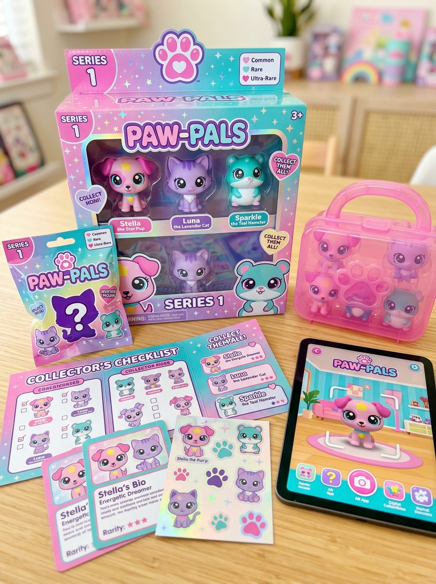
Developing LPS figure packaging requires a sophisticated blend of nostalgic charm and modern aesthetic principles. Beyond simple containment, effective design functions as a tactile extension of the collectible universe, bridging the gap between a physical product and its community. By implementing rigorous visual concept standards, designers ensure that every package communicates brand legacy through curated color palettes, dynamic typography, and strategic structural layouts.
These standards prioritize both shelf visibility and artistic integrity, utilizing transparent windows and layered graphics to accentuate the figure's unique personality. Understanding the intersection of graphic communication and consumer psychology is essential for maintaining the enduring allure of the Littlest Pet Shop brand. This analysis examines the technical and stylistic mandates that define professional toy packaging, illustrating how specific design choices cultivate an immediate emotional resonance with global collectors.
The Core Identity of Littlest Pet Shop Visual Branding
The visual branding of Littlest Pet Shop (LPS) figures is defined by a unique "chibi" aesthetic that prioritizes emotional appeal and collectibility. Central to this identity are the iconic oversized bobbleheads and large, expressive "doe-eyes" featuring distinct pupil shapes. These stylized proportions distinguish LPS from realistic animal figurines, creating an instantly recognizable silhouette that appeals to both children and adult hobbyists.
Key semantic elements of the brand's visual language include:
- Distinctive Eye Graphics: Unique patterns and "shines" that often signify a pet's personality or rarity.
- Generation-Specific Marks: The evolution of the pink paw print logo and varying plastic finishes (matte, glitter, or flocked).
- Whimsical Color Palettes: A move away from natural tones toward vibrant, imaginative colors.
This cohesive design DNA ensures that whether a figure is a vintage Kenner original or a modern Hasbro release, it retains the whimsical charm essential to the LPS brand ecosystem.
Color Theory and Palette Selection for Pet Personality
In the world of LPS pet shop figures, color theory is a vital tool for communicating character traits without words. Designers and customizers select specific palettes to evoke immediate emotional responses and define a pet's temperament:
- Pastels: Soft pinks, lavenders, and mints signify "Sweet" or "Shy" personalities, suggesting gentleness and grace.
- Vibrant Hues: Bold reds, electric blues, and neon yellows represent "Spunky," "Energetic," or "Adventurous" pets.
- Natural Earth Tones: Tans, browns, and muted greys create a "Calm" or "Realistic" aesthetic, grounded in nature.
Using complementary colors-such as bright teal eyes against copper fur-enhances the figure's expressiveness and "sparkle." By mastering these color harmonies, collectors can instantly recognize a figure's unique soul and story through its visual identity.
Typographic Hierarchies and Font Selection Standards
In the digital landscape of Littlest Pet Shop (LPS) collecting, establishing a clear typographic hierarchy is vital for data accessibility. Font selection standards for LPS branding typically prioritize playful, rounded sans-serif typefaces that reflect the toy line's friendly aesthetic while maintaining high legibility for younger audiences and collectors.
A well-structured hierarchy organizes information as follows:
- Primary Headers: Used for identifying pet species or generation numbers (e.g., G2 Shorthair Cats).
- Secondary Headers: Utilized for rarity statuses, set names, or release years.
- Body Content: Detailed descriptions of paint variants, mold numbers, and eye shapes.
Adhering to these typographic standards ensures that vast LPS databases remain scannable, allowing enthusiasts to efficiently distinguish between vintage Kenner eras and modern Hasbro releases through consistent visual cues.
Iconography and Graphic Element Integration
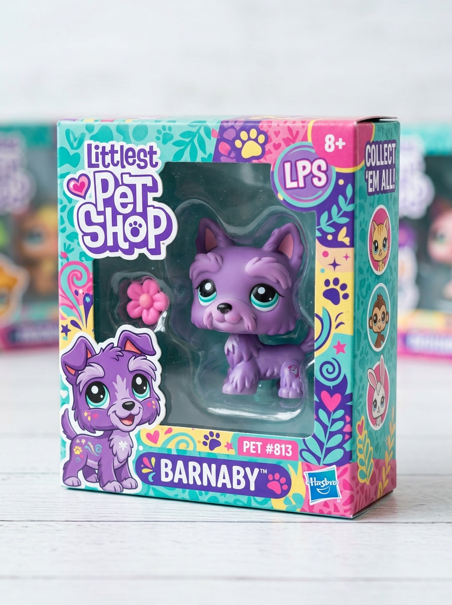
The visual identity of Littlest Pet Shop (LPS) figures is defined by sophisticated iconography that aids in collector identification and brand storytelling. A primary graphic element is the eye symbol-such as flowers, diamonds, or snowflakes-found in "Generation 2" pets, which denotes specific personality traits and rarity.
These graphic details are seamlessly integrated into the mold, alongside the iconic paw print logo and varied base designs, such as the classic magnetic "pink" or "grey" foot. Such integrated elements serve as essential markers for distinguishing authentic vintage models from modern iterations. By blending these visual cues with the physical sculpt, Hasbro established a cohesive design language that enhances the aesthetic appeal and collectible value of every LPS figure within the secondary market.
Structural Engineering and the Unboxing Experience
The appeal of Littlest Pet Shop (LPS) figures stems from a sophisticated blend of structural engineering and tactile design. At the core of every authentic figure is the iconic bobble-head mechanism, which utilizes a precision-engineered internal spring and neck peg system to provide signature movement. This mechanical consistency is vital for collectors who value the "thump" and fluid motion unique to the brand.
The unboxing experience is meticulously crafted through durable PVC construction and secure packaging. Whether housed in classic blister packs or modern blind boxes, the internal structural supports prevent warping of delicate features like ears and tails. For enthusiasts, the weight distribution and smooth finish of the plastic offer immediate sensory confirmation of quality. This synergy between mechanical durability and aesthetic design ensures that every unboxing delivers a high-quality, collectible-grade toy ready for display or play.
Product Visibility and Window Display Optimization
Maximizing the visual appeal of Littlest Pet Shop (LPS) figures in window displays is crucial for attracting avid collectors and casual buyers. Effective optimization focuses on strategic placement and lighting to highlight the unique charm of these miniature pets.
- Tiered Arrangements: Use acrylic risers to create height variation, ensuring that smaller Generation 2 pets are not obscured by larger playsets or accessories.
- Thematic Grouping: Organize figures by series or rarity-such as Great Danes, Collies, or Shorthair Cats-to create a cohesive and professional narrative.
- Lighting Precision: Utilize soft LED spotlights to accentuate the classic "bobble" movement and glossy eye finishes while avoiding UV-related paint fading.
- Focal Points: Place high-demand or "holy grail" LPS figures at eye level to immediately capture interest and drive engagement.
Clear, unobstructed views allow collectors to verify authenticity marks and paint quality, significantly increasing product desirability.
Character Classification through Thematic Background Art
In the world of Littlest Pet Shop (LPS) collecting, thematic background art serves as a primary tool for character classification. Each pet figure is typically released with specific card art that depicts a unique environment, such as urban cityscapes, lush tropical jungles, or frosty polar landscapes. These visual motifs allow collectors to categorize pets into distinct ecological groups or series "vibes."
Semantic identification relies on these artistic cues-icons, color palettes, and scenery-to distinguish between generations and special editions. Whether it is the Woodland series or the Pet Pairs collection, the background art provides essential context for the figure's origin. For serious hobbyists, mastering these thematic backgrounds is key to accurately indexing rare figures and completing sets based on their original illustrative storytelling.
Collector Appeal versus Play-Oriented Visual Cues
Littlest Pet Shop (LPS) figures bridge the gap between high-value collectibles and engaging toys through distinct design elements. Collector appeal typically hinges on rarity, specific "generations" (notably Generation 2), and unique identifiers like authentic stamps, matte finishes, or specialized eye paint such as glitter or glass eyes. These markers signify market value and historical significance within the hobby.
Conversely, play-oriented visual cues focus on tactile interaction and storytelling. Features such as the iconic bobblehead movement, colored magnetic paws for playset interaction, and vibrant, stylized palettes are designed to stimulate imaginative play. While collectors prize pristine condition and mold variants, younger users prioritize durability and expressive facial features. Understanding these visual distinctions is essential for identifying rare vintage pieces versus mass-market play sets in the secondary LPS market.
Evolution of LPS Packaging Aesthetics through Generations
Littlest Pet Shop (LPS) packaging has undergone significant transformations since its 1990s debut. Original Kenner designs featured classic card-back styles, transitioning into Hasbro's iconic Generation 2 aesthetic. This "Golden Era" defined the brand with vibrant pink and teal palettes, rounded plastic bubble shells, and prominent bobble-head displays.
As LPS evolved into Generation 3 and beyond, packaging shifted toward stylized artwork and eco-friendly cardboard designs. Modern G7 releases by Basic Fun! pay homage to nostalgic roots while integrating contemporary durability standards. Each generational shift reflects changing toy market trends-from collector-focused window boxes to blind bag mystery packs. These aesthetic changes serve as vital markers for collectors, signaling specific toy eras and authenticity in the thriving secondhand market for LPS pet shop figures.
Brand Consistency and Global Recognition Frameworks
Littlest Pet Shop (LPS) maintains market dominance through rigid brand consistency and strategic global recognition frameworks. The core of its identity lies in the aesthetic DNA of the figures-specifically the iconic bobble-head movement and large, expressive eyes. These standardized design elements ensure immediate identification across international markets.
The framework includes a systematic numbering convention and generational cycles (G1 to G7), which streamline collector cataloging and reinforce authenticity. By maintaining uniform packaging aesthetics and logo placement, the brand fosters high consumer trust and collector value.
This cohesive visual language allows LPS to transcend linguistic barriers, securing its status as a premier collectible. Such frameworks are essential for sustaining long-term brand equity and ensuring the global longevity of the pet shop franchise.
Leave a comment