The packaging design for The Little Prince Pocket Edition represents a delicate convergence of functional portability and profound philosophical storytelling. To encapsulate Antoine de Saint-Exupéry's timeless narrative within a compact form, designers must prioritize an aesthetic that mirrors the book's core tenets: simplicity, wonder, and the invisible essence of things.
This analysis explores the conceptual frameworks and material choices that elevate a protective sleeve into a tactile extension of the reader's journey. By examining the use of minimalist typography, sustainable paper stock, and iconic watercolor motifs, we uncover how modern packaging honors the literary legacy of the 1943 classic. Beyond mere utility, these design insights reveal how a palm-sized edition maintains its emotional weight through thoughtful visual metaphors and sensory engagement, ensuring the Prince's star-traveling wisdom remains accessible and enchanting for contemporary collectors.
Defining the Visual Philosophy of The Little Prince Pocket Edition
The visual philosophy of The Little Prince Pocket Edition is rooted in the seamless marriage of minimalist design and Antoine de Saint-Exupéry's iconic original watercolors. This edition prioritizes a "less is more" aesthetic, ensuring that the naive yet profound illustrations remain the focal point. By utilizing a compact, portable format, the visual layout emphasizes the intimacy of the story.
Central to this philosophy is the preservation of the author's whimsical sketches, which translate complex existential themes into accessible, evocative imagery. The deliberate use of white space and delicate line work mirrors the narrative's focus on seeing with the heart. This pocket-sized approach transforms the book into a personal talisman, maintaining the timeless charm and philosophical depth of the original masterpiece while making its ethereal beauty accessible for modern, on-the-go reading.
The Role of Minimalism in Reinterpreting Saint-Exupéry's Universe
The Little Prince Pocket Edition utilizes minimalism to mirror the core philosophy of Antoine de Saint-Exupéry's work. By stripping away bulky formatting, this compact edition emphasizes the narrative's famous mantra: "What is essential is invisible to the eye."
Minimalist design reinterprets this cosmic universe by focusing on the raw emotion of the original watercolor illustrations against clean, white space. This intentional lack of visual clutter allows readers to focus on the poignant dialogue and the Prince's solitary journey across asteroids. The portability of a pocket edition transforms the book into a personal talisman, reinforcing the story's intimacy. In this condensed form, the simplicity of the layout reflects the innocence of the protagonist, proving that profound existential truths resonate most deeply when presented without unnecessary adornment.
Curating a Timeless Color Palette for Literary Nostalgia
The color palette of The Little Prince Pocket Edition is meticulously selected to evoke profound literary nostalgia. By blending the iconic golden yellow of the Prince's hair and stars with a deep, contemplative midnight blue, the design honors Antoine de Saint-Exupéry's original watercolors.
These primary tones are softened by delicate rose pinks and earthy sand hues, reflecting the story's themes of innocence and ephemeral beauty. This specific color harmony creates a tactile sense of wonder, making the compact format feel like a cherished relic. Such intentionality in design ensures that this edition resonates with lifelong fans while introducing new readers to the whimsical, melancholic atmosphere of this timeless masterpiece.
Typography and Layout Strategies for Compact Readability
Designing a pocket edition of The Little Prince requires balancing extreme portability with high legibility. To optimize the reading experience in a condensed format, publishers employ specific typographic enhancements:
- Font Selection: High x-height serif typefaces are utilized to maintain character definition and clarity at smaller point sizes.
- Leading and Spacing: Generous line spacing (leading) prevents text crowding, allowing the eye to track lines effortlessly across narrow measures.
- Marginal Integrity: Carefully calculated gutters ensure text doesn't disappear into the spine, while outer margins accommodate thumb placement without obscuring the prose.
Furthermore, the use of high-opacity, lightweight paper minimizes ink bleed-through. These layout strategies ensure that Saint-Exupéry's whimsical narrative and iconic illustrations remain crisp and immersive, regardless of the book's diminutive physical scale.
The Importance of Tactile Materiality in Small-Scale Packaging
For The Little Prince Pocket Edition, tactile materiality is essential in creating a profound connection between the reader and the narrative. Small-scale packaging demands a sensory approach where paper weight and surface texture compensate for reduced physical dimensions. By utilizing premium materials, publishers ensure that the portable format retains the dignity of Antoine de Saint-Exupéry's masterpiece.
The physical feel of a textured cover or high-opacity paper enhances the user experience, transforming a simple book into a cherished artifact. In small-scale design, every tactile detail-from the flexibility of the spine to the grain of the page-serves to ground the ethereal themes of the story. This emphasis on materiality ensures that the "essential," while invisible to the eye, is tangibly felt, reinforcing the emotional resonance and perceived value of the edition.
Integrating Iconic Illustrations with Modern Graphic Design
The Little Prince Pocket Edition represents a sophisticated fusion of 20th-century heritage and contemporary publishing standards. By utilizing Antoine de Saint-Exupéry's original watercolor illustrations, this edition maintains the emotional core of the story while applying modern minimalist graphic design to improve portability and visual clarity.
Modern layout techniques emphasize negative space and clean typography, allowing iconic symbols-such as the desert fox and the baobabs-to serve as focal points. Digital restoration processes ensure that the delicate line work and soft color palettes remain crisp on a smaller scale. This strategic integration of timeless artwork and professional book design creates a tactile, aesthetically pleasing experience that resonates with both long-time collectors and new readers discovering the prince's journey.
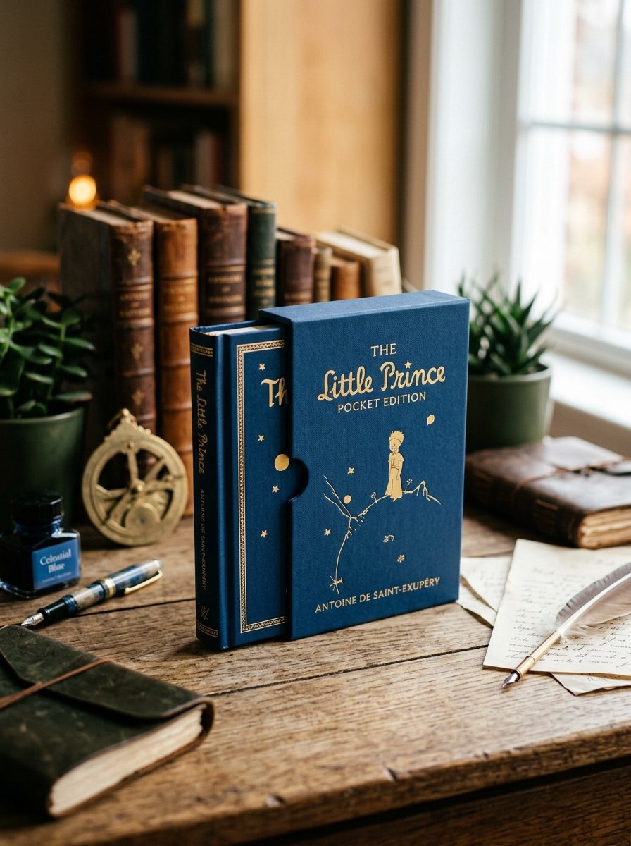
Engineering the Perfect Portable Form Factor for Collectors
The Little Prince Pocket Edition is a masterclass in bookbinding engineering, specifically designed for bibliophiles who demand both portability and durability. Creating the ideal form factor involves utilizing high-opacity, low-GSM paper to reduce bulk without compromising the clarity of Antoine de Saint-Exupéry's iconic watercolor illustrations.
To ensure a premium feel, these editions often feature Smyth-sewn bindings, which allow the book to lay flat and resist spine cracking during frequent travel. The exterior is typically finished with reinforced cloth or soft-touch matte lamination to protect against environmental wear. By optimizing typography and margin ratios for a smaller scale, publishers maintain high readability. This meticulous attention to structural integrity and aesthetic detail ensures the pocket edition remains a resilient, collectible artifact that preserves the profound wisdom of the original text in a travel-friendly size.
Capturing Emotional Resonance through Subtle Structural Details
The Little Prince Pocket Edition achieves profound emotional resonance through its intentional physical design. Its compact dimensions foster a sense of intimacy, mirroring the delicate nature of the Prince himself. By utilizing high-quality cream paper and a minimalist layout, the edition allows Antoine de Saint-Exupéry's iconic watercolors to breathe, enhancing the story's melancholic yet hopeful atmosphere.
These subtle structural choices reflect the book's core philosophy: "What is essential is invisible to the eye." The portable format strips away unnecessary bulk, focusing the reader's attention on the transformative bond between the pilot and the Prince. Every detail-from the weight of the cardstock to the typography-is meticulously calibrated to invite quiet reflection, making this edition a tactile sanctuary that deepens the reader's connection to the narrative's timeless wisdom.
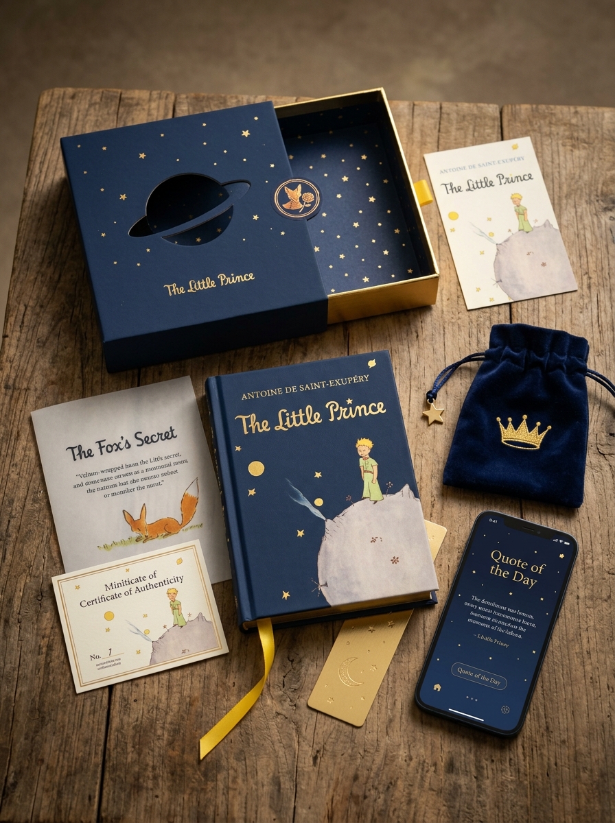
The Art of the Unboxing Experience for Global Audiences
The Little Prince Pocket Edition provides a premium unboxing experience specifically designed to captivate global book lovers. This process transcends language barriers by focusing on a sensory journey that begins the moment the package is opened.
For international collectors, the tactile quality of the edition-featuring textured covers, gold-foil accents, and Saint-Exupéry's iconic illustrations-creates an immediate emotional bond. This meticulous attention to detail ensures that the unboxing experience feels like discovering a hidden treasure, making it a highly shareable moment for social media audiences worldwide.
By blending timeless aesthetics with high-quality craftsmanship, publishers ensure this pocket edition resonates across diverse cultures. It transforms a simple purchase into a memorable gift or a cherished collector's item, reinforcing the universal appeal of this literary masterpiece.
Sustaining the Legacy of The Little Prince in Contemporary Design
Modern iterations of The Little Prince Pocket Edition bridge the gap between mid-century nostalgia and 21st-century aesthetics. By integrating minimalist typography with Antoine de Saint-Exupéry's iconic original illustrations, contemporary designers ensure the novella's philosophical depth remains visually accessible to a new generation of readers.
Today's design approach prioritizes both portability and tactile quality. Using durable, premium paper stocks and ergonomic formats, these editions honor the book's legacy of "essential" beauty-reflecting the core tenet that what is truly important is invisible to the eye. This intentional design strategy preserves the artistic integrity of the work while adapting its timeless wisdom for a mobile world, ensuring the spirit of the little prince continues to thrive through thoughtful, modern craftsmanship.
Leave a comment