Since its debut in 1958, the Thames & Hudson World of Art series has served as a definitive pillar of accessible art history. Beyond the depth of its scholarly contributions, the series is globally recognized for its distinct visual identity and cohesive branding. This exploration decodes the evolution of its packaging aesthetic, examining how the interplay of typography, layout, and cover art creates a timeless allure for readers and collectors.
We analyze the structural design elements-from the iconic black spines to modern minimalist updates-that maintain the brand's authority. By investigating the relationship between book design and art history, we uncover how Thames & Hudson balances heritage with contemporary trends. Understanding this design language reveals why the series remains an essential benchmark for visual literacy and bibliophilic excellence across the globe.
The Legacy and Evolution of the World of Art Series
Since its debut in 1958, Thames & Hudson's World of Art series has served as a definitive resource for art history, democratizing access to high-level scholarship. Originally recognized for its iconic black-framed covers and authoritative texts, the collection has documented every facet of visual culture, from ancient civilizations to contemporary movements.
The evolution into the World of Art Pocket format represents a modern transformation of this heritage. These redesigned editions maintain the series' rigorous academic standards while introducing a portable, reader-friendly layout. By combining updated research with high-quality illustrations in a compact size, Thames & Hudson ensures that its legacy of accessible education continues to inspire a new generation of students, collectors, and art enthusiasts worldwide.
The Pentagram Relaunch and Modern Design Philosophy
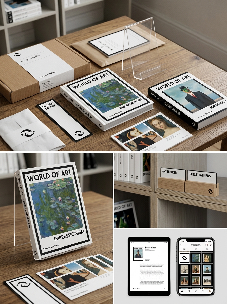
The recent relaunch of the Thames & Hudson World of Art series by the prestigious design agency Pentagram marks a significant evolution in contemporary publishing. This redesign, led by partner Luke Hayman, successfully balances the series' scholarly heritage with a modern design philosophy tailored for a global, mobile audience.
Central to this visual overhaul is the refinement of the iconic "T&H" cartouche and the implementation of a rigorous grid system. The use of the Gerstner-Programm typeface provides a clean, functional aesthetic that enhances readability across the compact, pocket-sized format. By utilizing a vibrant, color-coded system to categorize art movements, the Pentagram relaunch ensures the collection remains an accessible, authoritative resource for modern readers and collectors.
Decoding the Iconic Black Frame and Visual Grid
The Thames & Hudson World of Art series is defined by its signature black frame and rigorous visual grid. This design serves a dual purpose: it acts as a consistent architectural "window" that unifies thousands of diverse titles while ensuring the cover art remains the central focal point.
The grid system, rooted in modernist design principles, provides a structured layout optimized for the pocket-sized format. This mathematical approach balances typography with high-quality imagery, facilitating clarity and readability. By maintaining a uniform border and precise spatial alignment, the series achieves a sense of authority and timelessness. For readers and collectors, the black frame is a hallmark of quality that signifies a curated journey through art history, making these volumes instantly recognizable worldwide.
Typography and Minimalist Branding Essentials
The Thames & Hudson World of Art pocket series serves as a benchmark for minimalist branding and functional graphic design. Central to its visual identity is the disciplined use of typography, typically featuring clean, sans-serif typefaces that ensure legibility across small formats. This minimalist approach emphasizes clarity, allowing the subject matter to remain the primary focus while maintaining a sophisticated aesthetic.
Key elements of this branding strategy include:
- Consistent Grids: A structured layout that harmonizes text and imagery.
- Typographic Hierarchy: Clear distinctions between titles and body text to guide the reader.
- Strategic White Space: Enhancing breathability and modern appeal.
By stripping away superfluous ornamentation, the series achieves a timeless look that signals both academic authority and accessibility, essential for a global art library.
The Art of the Cover Image Selection
The Thames & Hudson World of Art pocket series is globally recognized for its meticulous approach to cover design. Selecting the perfect image is a curated process that balances historical significance with visual impact. Each cover acts as a visual manifesto, offering a definitive glimpse into the artistic movement, specific artist, or cultural period explored within the text.
By utilizing iconic masterpieces and high-quality reproductions, the series creates an immediate connection between the reader and the subject matter. The synergy between the artwork and the series' signature minimalist layout transforms every volume into a collectible item. This thoughtful selection ensures that the cover image is not merely decorative; it serves as a critical pedagogical tool that summarizes the art history contained inside, upholding the brand's legacy of excellence.
Materiality and the Tactile Experience of Pocket Editions
The Thames & Hudson World of Art pocket editions redefine the relationship between the reader and art history through physical materiality. These compact volumes prioritize a sensory experience that digital formats cannot replicate. Each book features high-quality paper stock and premium printing techniques that ensure color accuracy and tonal depth.
The tactile experience is characterized by durable, soft-touch covers and a balanced weight, making them both portable and permanent. This focus on craftsmanship transforms the book into a collectible object. By emphasizing the physical presence of the printed page, these editions invite intimate engagement, allowing readers to feel the texture of the paper while exploring global visual culture. The compact format ensures that scholarly expertise is not only accessible but also physically satisfying to hold and navigate.
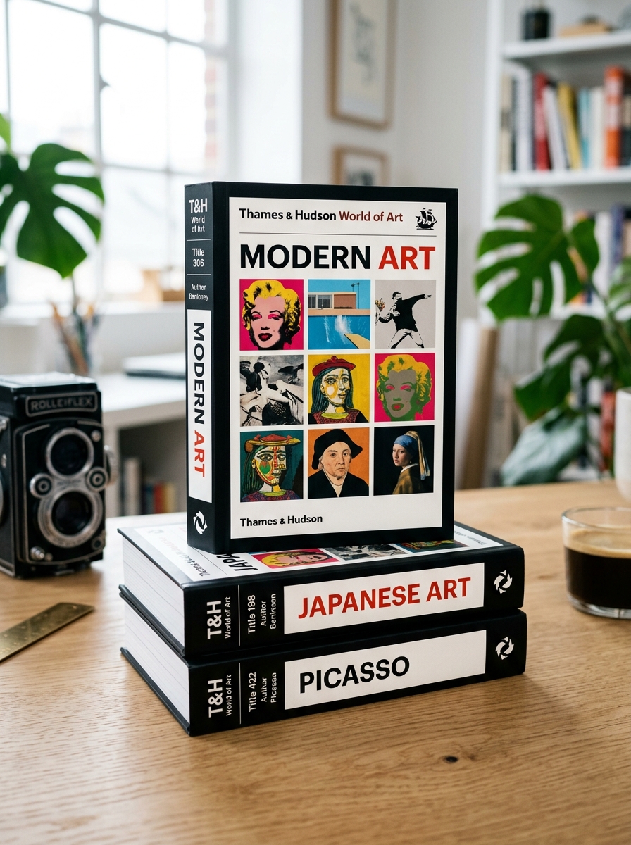
Color Coding and Genre Categorization Systems
The Thames & Hudson World of Art series utilizes a sophisticated color-coding system to organize its extensive library of art history and culture. This visual taxonomy allows collectors and students to instantly identify genres and subjects by the specific hue of the spine and cover branding.
- Blue: Represents general art history, movements, and periods.
- Green: Focuses on architecture, design, and decorative arts.
- Orange/Yellow: Dedicated to monographs on individual artists.
- Pink/Red: Covers specialized themes, photography, and contemporary art.
This systematic approach enhances navigability within the World of Art Pocket editions, ensuring the series remains a structured and accessible reference. By categorizing complex subjects into distinct visual streams, Thames & Hudson maintains a cohesive brand identity while simplifying the discovery of specific artistic disciplines.
Balancing Classic Heritage with Contemporary Minimalist Aesthetics
The Thames & Hudson World of Art series masterfully bridges its sixty-year legacy with modern design principles. By evolving its iconic visual identity, the collection honors its heritage as a definitive resource for art history while embracing a sleek, minimalist aesthetic. The pocket editions exemplify this synergy, featuring sophisticated typography and clean cover layouts that resonate with contemporary sensibilities.
This strategic redesign ensures that authoritative scholarship remains accessible and visually compelling for a new generation of enthusiasts. The integration of high-quality production values with refined, understated branding preserves the series' prestige while adapting to the functional demands of modern readers. Ultimately, this aesthetic evolution reaffirms the series' position as an enduring cultural staple that feels both timeless and perfectly curated for the 21st-century bookshelf.
Shelf Presence and the Collector's Visual Harmony
The Thames & Hudson World of Art pocket series is renowned not only for its scholarly depth but also for its iconic aesthetic appeal. For bibliophiles, the concept of "shelf presence" is achieved through the series' signature design language. Each volume features a uniform height and a clean, modernist layout that creates a cohesive visual harmony when displayed.
The distinctive spine design, characterized by the recognizable logo and elegant typography, transforms a personal library into a curated gallery of art history. This intentional branding ensures that whether a collector owns five titles or fifty, the books maintain a seamless, sophisticated look. The pocket-sized format balances portability with a premium feel, making the collection a decorative statement of intellectual curiosity and a testament to the enduring legacy of world-class book design.
The Global Impact of Thames & Hudson Packaging Design
The Thames & Hudson World of Art Pocket series has redefined art publishing through its iconic and minimalist packaging design. By prioritizing portability alongside high-quality production, the series effectively democratized art history for a global audience. The instantly recognizable visual identity-characterized by its clean typography and the signature dolphin logo-serves as a universal hallmark of scholarly authority and aesthetic value.
This cohesive branding strategy allows the World of Art volumes to transcend cultural barriers, making them a staple in libraries and bookstores worldwide. The "pocket" format's durable yet elegant design has transformed expensive art monographs into accessible, collectible objects. Consequently, Thames & Hudson's packaging design has successfully bridged the gap between academic excellence and public accessibility, influencing how visual culture is consumed globally.
Leave a comment