Embracing the Danish art of hygge requires more than just visual appeal; it demands a sensory journey through thoughtful packaging design. When crafting "Little Books," the aesthetic must prioritize warmth, simplicity, and tactile intimacy. Mastering this niche involves blending minimalist Scandinavian principles with cozy textures that invite the reader to slow down and savor the moment.
From soft-touch matte finishes and earthy color palettes to sustainable materials that feel organic in the hand, every element should evoke a sense of sanctuary. By understanding the core aesthetic concepts of hygge-contentment, presence, and comfort-designers can transform standard book packaging into a soulful, multisensory experience. This exploration delves into the essential techniques for achieving that quintessential glow, ensuring your small-scale publications resonate deeply with an audience seeking tranquility and mindfulness.
The Essence of Hygge in Modern Packaging Design
The essence of Hygge in modern packaging design focuses on creating an immediate emotional connection through simplicity, warmth, and comfort. For Hygge Little Books, packaging serves as a tactile extension of the reading experience. Designers achieve this by utilizing soft-touch finishes, muted earth tones, and sustainable materials that reflect a commitment to mindful living.
Semantic design elements include clean, minimalist typography and functional layouts that reduce visual noise. This approach prioritizes the unboxing process as a ritual of calm and coziness. By integrating organic textures and high-quality craftsmanship, the packaging communicates authenticity and well-being. Ultimately, Hygge-inspired design transforms a physical product into a sensory experience, encouraging consumers to slow down and embrace the quiet joy found within curated literary collections.
Defining the Aesthetic Principles of the Little Books Series
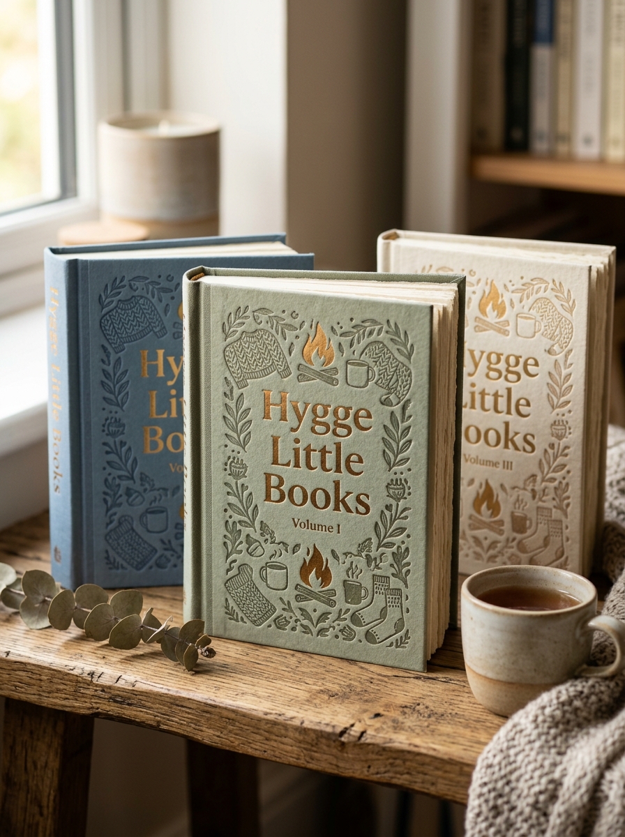
The Little Books series embodies Scandinavian design principles through a deliberate blend of minimalism and tactile warmth. A primary aesthetic pillar is the compact, hardcover format, engineered to feel both intimate and substantial. These volumes utilize matte finishes and high-quality paper to enhance the sensory "hygge" experience, making the physical act of reading a comfort in itself.
Visually, the series is characterized by folk-art inspired illustrations, muted color palettes, and clean typography. Each cover acts as a decorative object, often featuring symmetrical patterns and traditional Nordic motifs. Internally, the use of generous white space and charming infographics ensures the layout remains uncluttered and calming. By harmonizing functional simplicity with artisanal beauty, the series transforms lifestyle advice into a collectible aesthetic experience that mirrors the cozy philosophy within.
Curating a Warm and Muted Color Palette
The visual essence of Hygge Little Books is rooted in serenity and comfort. To achieve this aesthetic, curating a warm and muted color palette is essential. This approach avoids overstimulation, favoring soft, desaturated tones that evoke a sense of "coziness" and peace.
Focus on an organic spectrum inspired by the natural world, incorporating:
- Soft Neutrals: Creamy whites, oatmeal, and dove gray.
- Earthy Hues: Dusty terracotta, sage green, and warm sand.
- Deep Accents: Charcoal and slate for subtle, grounding contrast.
These low-saturation colors work harmoniously to reflect soft lighting and tactile textures. By prioritizing a gentle color story, you create an inviting atmosphere that encourages mindfulness and relaxation, perfectly capturing the hygge spirit within every page.
The Role of Tactile Textures and Premium Paper Quality
In the world of Hygge Little Books, the physical sensation of reading is as vital as the written content. The intentional integration of tactile textures and premium paper quality serves to ground the reader in the present moment, fostering a deep sense of mindfulness and hygge.
High-grade, heavyweight paper provides a substantial feel and a velvet-smooth finish that minimizes glare, while embossed or linen-textured covers invite a sensory connection. These artisanal details transform a standard book into a therapeutic object, encouraging a slower, more deliberate pace. By prioritizing craftsmanship, these editions turn the simple act of turning a page into a meditative experience, bridging the gap between aesthetic beauty and emotional comfort in an increasingly digital age.
Minimalist Typography for a Cozy Reading Experience
In the world of Hygge Little Books, the visual presentation is as essential as the narrative. Our commitment to minimalist typography ensures that every page invites relaxation and mindfulness. By utilizing clean, sans-serif fonts and generous white space, we eliminate visual clutter, allowing readers to immerse themselves fully in the content without distraction.
This intentional design approach mirrors the Danish concept of hygge-creating a warm, inviting atmosphere through simplicity. High readability and balanced line spacing reduce eye strain, making these books the perfect companions for a quiet evening. Embracing a "less is more" philosophy, our typography transforms reading into a soothing ritual that celebrates the beauty of understated elegance and quiet comfort.
Integrating Nordic-Inspired Illustrations and Motifs
Incorporating Nordic-inspired illustrations is vital for capturing the authentic essence of the Hygge Little Books series. These visual motifs transcend simple decoration, serving as a sensory bridge to Scandinavian cultural values. By weaving in minimalist line art, hand-drawn botanical sketches, and traditional folk patterns, these books evoke a profound sense of tranquility and "hygge."
These artistic elements emphasize the connection between nature and the home, mirroring the series' focus on mindful living. Symbolic imagery-such as stylized evergreens, woodland creatures, and cozy domestic icons-creates a cohesive visual narrative that complements the calming prose. Utilizing a muted, earthen color palette ensures visual harmony, transforming each volume into a tactile sanctuary. Ultimately, these motifs enrich the reader's experience, making each book a beautiful, Scandi-inspired artifact that embodies comfort and simplicity.
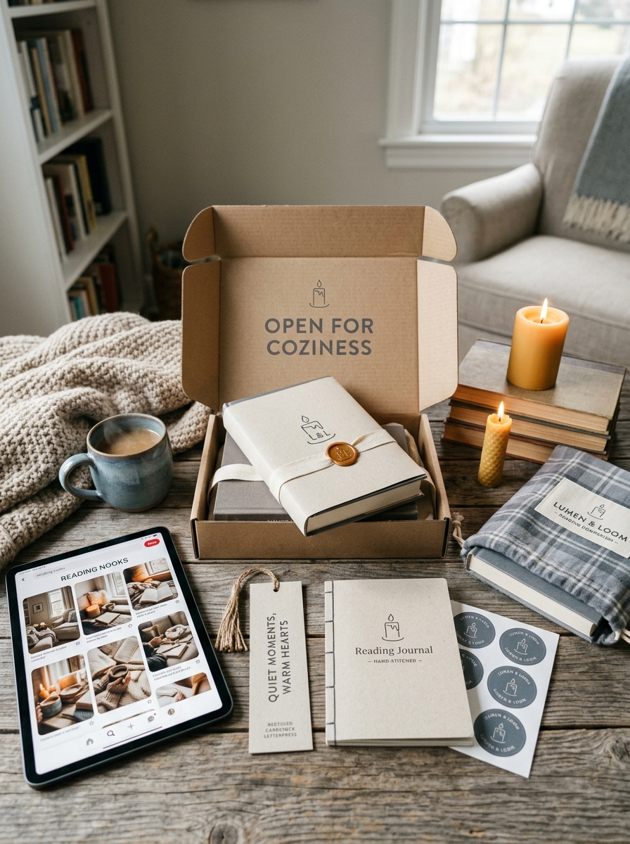
Designing the Perfect Sensory Unboxing Journey
At Hygge Little Books, the experience begins the moment your package arrives. We design each unboxing journey to be a mindful ritual that engages the senses, reflecting the Danish philosophy of comfort and presence.
- Tactile: Premium, textured recycled packaging that feels warm and substantial to the touch.
- Visual: A minimalist aesthetic featuring soft, earthy tones and clean typography to soothe the eyes.
- Olfactory: The subtle, nostalgic scent of high-quality, FSC-certified paper and eco-friendly inks.
By meticulously layering these sensory elements, we transform a simple delivery into an emotional connection. This intentional design ensures that before you even turn the first page, you are already immersed in a state of hygge and serenity, making every book arrival a celebrated moment of slow living.
Sustainable Materials for Mindful Gift Packaging
At Hygge Little Books, we believe the art of gifting should reflect the tranquility and mindfulness found within our stories. Choosing sustainable materials for gift packaging ensures that your cozy gesture remains kind to the planet.
Opt for recycled FSC-certified paper or reusable fabric wraps, such as organic cotton, to create a beautiful, plastic-free aesthetic. Enhance the sensory experience by securing parcels with natural hemp twine or jute ribbon instead of synthetic tapes.
To add a final touch of hygge, incorporate compostable elements like dried lavender, pressed ferns, or cinnamon sticks. These eco-friendly choices reduce waste while elevating the unboxing process into a soulful, tactile moment that honors both the recipient and the environment.
Building Brand Consistency Across a Mini Book Collection
Establishing brand consistency within the Hygge Little Books series is essential for creating a cohesive reader experience. To achieve visual harmony, publishers must implement a unified color palette-typically featuring warm, muted tones-and consistent typography that evokes a sense of calm and simplicity.
Beyond aesthetics, maintaining standardized dimensions and high-quality tactile finishes ensures the collection feels like a premium, collectible set. Recurring design motifs, such as specific illustration styles and strategic logo placement, strengthen brand recognition across different volumes. By prioritizing these elements, the series builds a recognizable identity that resonates with the core values of comfort and mindfulness, encouraging readers to collect the entire mini book library.
Evoking Emotional Comfort Through Visual Storytelling
Hygge Little Books utilize visual storytelling to cultivate an immediate sense of sanctuary. By integrating soft color palettes, minimalist illustrations, and warm photography, these publications transcend traditional reading experiences. They serve as sensory anchors, inviting readers into the heart of "hygge"-the Danish art of cozy contentment and well-being.
Every visual element, from the flickering glow of a candle to rustic nature scenes, is intentionally curated to lower stress and foster emotional warmth. This artistic approach bridges the gap between aesthetic beauty and psychological peace. Through thoughtful layout and evocative imagery, these books design an atmosphere of safety and belonging. Ultimately, they act as essential tools for mindful living, using visual narratives to ground the spirit and provide a restorative escape into domestic comfort.
Leave a comment