Exceptional notepad packaging design transforms a simple utility into a premium tactile experience. Within the stationery industry, the first physical interaction a customer has with a brand occurs through its exterior presentation. To capture the true essence of creative stationery aesthetics, designers must master the balance between functional protection and compelling visual storytelling.
Effective packaging utilizes high-quality textures, sustainable materials, and intentional typography to elevate the perceived value of the product. By focusing on core principles such as structural integrity and brand cohesion, creators can successfully resonate with design-conscious consumers. This guide examines the essential elements that define modern notepad packaging, highlighting how thoughtful design choices influence consumer perception and enhance the unboxing ritual for enthusiasts who value both form and function.
Defining the Role of Packaging in Stationery Branding
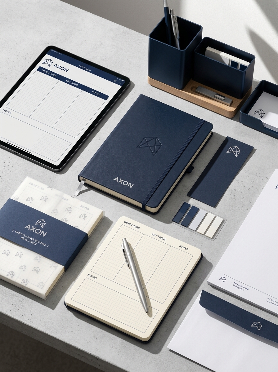
In the competitive world of stationery branding, packaging serves as the critical first touchpoint between a brand and its audience. For custom notepads, packaging is not merely a protective layer; it is a powerful marketing tool that communicates brand identity and core values. Whether utilizing sustainable materials or premium rigid boxes, the choice of substrate reinforces the product's perceived quality and professional positioning.
Effective packaging enhances the unboxing experience, transforming a functional office tool into a luxury lifestyle item. By integrating consistent logos, tactile finishes, and unique structural designs, brands can differentiate their products on retail shelves. Ultimately, strategic packaging design bridges the gap between utility and emotional connection, fostering customer loyalty and elevating the overall stationery presentation.
Aligning Visual Identity with Notepad Purpose
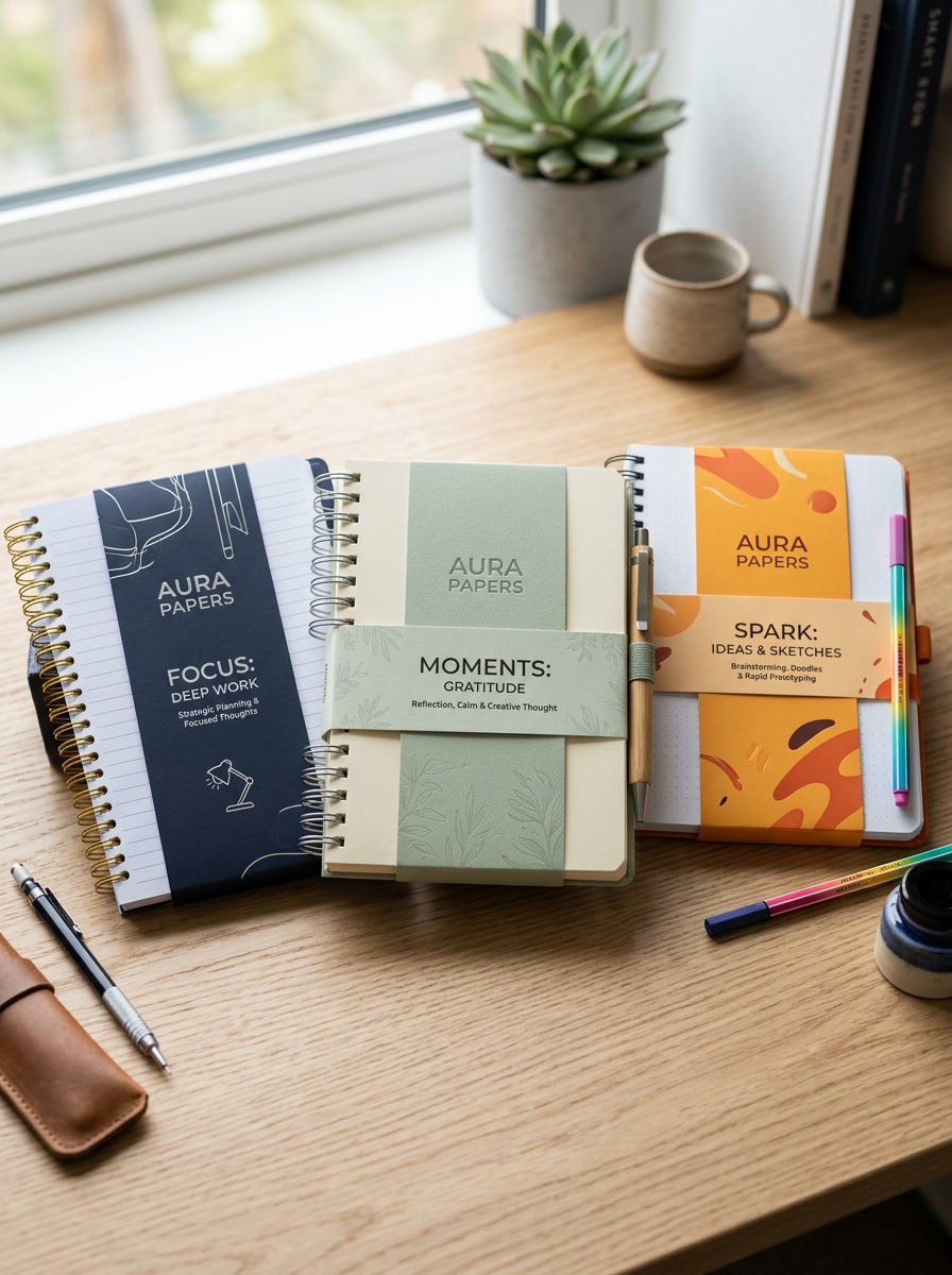
Effective notepad design requires a strategic balance between aesthetics and functionality. To maximize impact, the visual identity must reflect the notepad's intended use. For corporate environments, a minimalist layout with a prominent company logo and professional typography reinforces brand authority. Conversely, creative journals benefit from vibrant colors and expressive artistic elements.
To optimize your notepad's impact, consider these alignment factors:
- Brand Consistency: Use brand-specific color palettes and logos to ensure immediate recognition.
- Functional Layout: Choose grid, lined, or blank styles based on whether the user is sketching, coding, or note-taking.
- Material Selection: Select paper textures that complement the brand's positioning, from premium weighted stocks to eco-friendly recycled options.
By synchronizing design with purpose, notepads transition from simple stationery to powerful communication tools that resonate with the target audience.
Selecting Materials for Durability and Tactile Appeal
Choosing high-quality materials is essential for crafting a notepad that balances longevity with a premium sensory experience. For the interior pages, prioritize high GSM (grams per square meter) paper to ensure opacity and prevent ink bleed-through. Utilizing acid-free paper is critical for archival durability, ensuring your notes do not yellow or degrade over time.
The cover material significantly dictates the tactile appeal and protection level. Options such as genuine leather, vegan PU, or heavy-duty linen offer a sophisticated grip and resilience against daily wear. Furthermore, the choice of binding-whether wire-o for flexibility or case-bound for a professional look-impacts how the notepad lays flat. By selecting superior textures and weights, you transform a standard stationery item into a durable, high-performance tool for productivity.
Embracing Sustainability and Eco-Friendly Substrates
Modern notepads are evolving beyond simple utility to become pillars of environmental responsibility. By prioritizing eco-friendly substrates, manufacturers are significantly reducing the ecological footprint of stationery products. Utilizing recycled paper and FSC-certified stocks ensures that every page supports responsible forestry practices and biodiversity.
Beyond traditional paper, innovative materials like bamboo, hemp, and post-consumer waste are becoming standard sustainable stationery options. These biodegradable substrates offer a high-quality tactile experience while minimizing chemical processing and carbon emissions. Choosing green notepads allows businesses and individuals to align their daily note-taking with global conservation efforts. By selecting products made from renewable resources, you contribute to a circular economy, ensuring that your professional tools reflect a commitment to a healthier planet.
Mastering Color Theory and Typographic Hierarchy
Effective notepad design balances aesthetics and utility through color theory and typographic hierarchy. Selecting the right color palette is essential for organization; for instance, using high-contrast colors for headers or task boxes improves scannability. Warm tones can stimulate creativity, while cool tones promote focus and calm during note-taking.
Complementing color, a structured typographic hierarchy guides the reader's eye across the page. By utilizing varying font weights, sizes, and styles, you distinguish between primary titles, subheadings, and body text. This visual ladder reduces cognitive load, making information easier to process. Whether designing custom business stationery or personal journals, prioritizing these design principles ensures your notepads are not only visually appealing but also optimized for maximum readability and functional productivity.
Incorporating Specialty Finishes and Decorative Textures
Elevating custom notepads into premium branding tools requires the strategic application of specialty finishes and tactile textures. Professional techniques like foil stamping and spot UV coating add visual depth and a luxurious shimmer that immediately catches the light. For a sophisticated, three-dimensional feel, embossing or debossing can be used to highlight logos and key contact information.
Beyond visual flair, the choice of paper texture significantly impacts the user experience. Selecting stocks with linen, felt, or eggshell finishes provides a distinctive hand-feel that reinforces brand quality. By integrating these high-end decorative elements, you transform a utilitarian stationery item into a memorable sensory product. These finishes not only enhance aesthetic appeal but also increase the perceived value and professional impact of your promotional materials.
Designing Functional Structures for Protection and Portability
Modern notepad design prioritizes the balance between structural integrity and ease of transport. To ensure long-term protection, high-quality notebooks often feature durable covers made from heavy-weight cardstock, rigid chipboard, or water-resistant synthetic materials. These external shields prevent page curling and protect internal data from environmental wear.
For enhanced portability, manufacturers focus on several key engineering elements:
- Binding Styles: Spiral and wire-o bindings allow for a 360-degree fold, while lay-flat thread sewing ensures a stable writing surface on the go.
- Security Features: Elastic enclosures and integrated pen loops keep the notepad compact and secure during transit.
- Optimized Dimensions: Slim profiles and lightweight paper stocks maximize storage efficiency in bags or pockets without sacrificing writing space.
By integrating these functional components, a notepad becomes a reliable tool for capturing ideas in any professional or creative environment.
Curating an Immersive Unboxing Experience for Enthusiasts
For dedicated stationery lovers, receiving a new notepad is more than a purchase; it is a tactile ceremony. An immersive unboxing experience bridges the gap between utility and luxury, turning a simple tool into a creative ritual. By focusing on premium presentation, brands signal the superior quality of the high-grade paper and craftsmanship found within.
Essential elements for a memorable unboxing experience include:
- Sensory Branding: Utilizing textured wraps, wax seals, or vellum inserts that appeal to the sense of touch.
- Protective Elegance: Using custom-fitted cardstock sleeves that prevent corner dings while maintaining a sophisticated aesthetic.
- Discovery Details: Including minimalist inserts that explain the paper's weight, tooth, and fountain-pen compatibility.
This meticulous attention to detail honors the enthusiast's passion, transforming the act of opening a notepad into an inspiring prelude to the creative process.
Strategic Placement of Product Information and Branding
Strategic branding on custom notepads is essential for maintaining long-term visibility. To optimize impact, place primary logos in the header where they are immediately visible during use. Contact details, website URLs, and taglines are most effective when positioned in the footer, providing a professional finish without infringing on the functional writing space.
For enhanced brand recall, consider subtle watermarked logos in the center of the page. This "ghosting" technique ensures your brand remains present even as the user writes. Additionally, incorporating QR codes or social media handles in the margins can bridge the gap between physical stationery and digital platforms. A well-balanced layout ensures that every sheet serves as a constant, non-intrusive advertisement for your business.
Future Trends in Creative Notepad Packaging Design
The landscape of notepad packaging design is shifting toward sustainability and enhanced user interaction. Future trends prioritize eco-friendly materials, such as biodegradable cornstarch inserts and FSC-certified recycled cardstock, reducing the environmental footprint of stationery products.
Innovation is also seen in multifunctional packaging, where the outer box transforms into a permanent desktop organizer or a sturdy writing stand. Visually, brands are moving toward minimalist aesthetics paired with tactile finishes like haptic embossing and soft-touch foiling to create a premium sensory experience.
Furthermore, the integration of smart technology-such as QR codes leading to digital templates or augmented reality tutorials-bridges the gap between analog note-taking and digital productivity. These creative designs ensure that packaging serves as a valuable extension of the product rather than mere disposable waste.
Leave a comment