
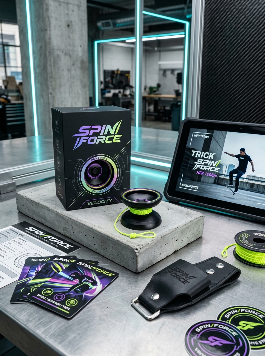
Capturing the kinetic energy of a high-performance yo-yo requires more than just a sturdy container; it demands a sophisticated fusion of functional engineering and striking visual aesthetics. Within the skill toy market, packaging serves as the primary touchpoint between a brand's identity and a collector's first impression. A successful design must harmonize structural integrity with vibrant graphics that reflect the specific playstyle and personality of the toy inside.
Strategic elements such as die-cut windows, which reveal precision-machined hardware, and intentional color palettes, which signal modern performance or nostalgic charm, are essential for shelf appeal. By focusing on the tactile unboxing experience and cohesive typography, manufacturers can transform a simple purchase into a premium brand experience. Mastering these design fundamentals ensures that a product resonates deeply with both casual players and dedicated enthusiasts.
The Evolution of Yo-Yo Packaging Aesthetics
The visual history of yo-yo packaging reflects significant shifts in toy marketing and consumer culture. In the early 20th century, packaging was primarily functional, featuring simple cardboard boxes with basic typography. As the 1950s approached, brands like Duncan revolutionized the industry with vibrant, color-coded displays designed for maximum shelf appeal.
With the rise of professional-grade metal yo-yos, modern packaging has transitioned into a premium unboxing experience. Contemporary boutique manufacturers prioritize minimalist aesthetics, matte finishes, and high-concept graphic art that appeals to adult collectors. This evolution from utilitarian containers to artistic collectibles highlights the yo-yo's transformation from a simple childhood toy into a precision-engineered skill tool. Today, strategic branding and sophisticated packaging design are essential for enhancing marketability and maintaining collector value within the global community.
Defining Brand Identity Through Color and Graphics
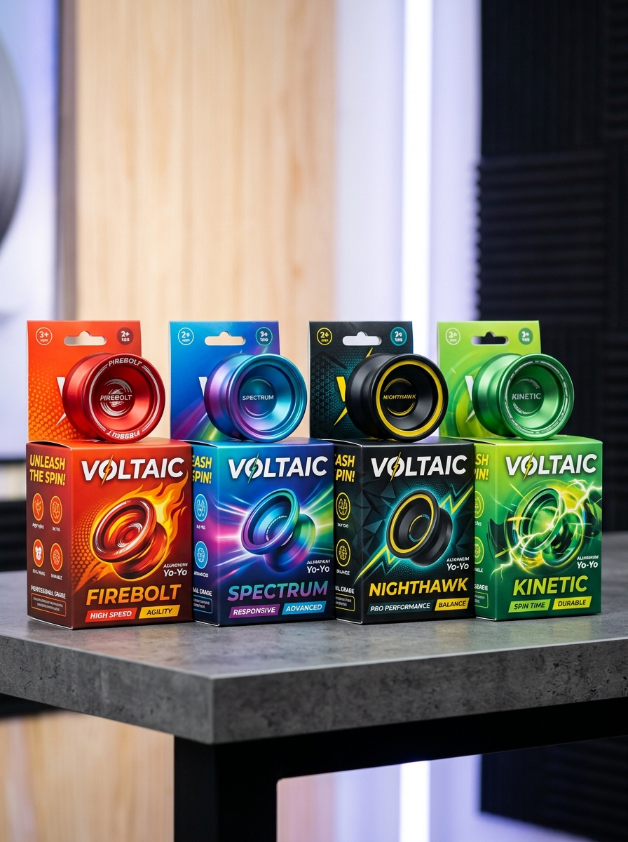
In the competitive yo-yo market, establishing a distinct brand identity is vital for recognition. Manufacturers utilize strategic color palettes and intricate visual graphics to differentiate their high-performance models. Premium metal yo-yos often showcase advanced anodization techniques, such as splash patterns, acid washes, and gradients, which become signature styles for specific companies.
Beyond color, laser-engraved logos and custom side-cap artwork serve as essential hallmarks of authenticity. These design elements communicate a brand's narrative-ranging from sleek, minimalist aesthetics to bold, competition-ready energy. By maintaining a consistent visual language, yo-yo brands cultivate collector loyalty and increase the market value of their hardware. Ultimately, these artistic choices transform functional skill toys into recognizable icons within the global throwing community.
The Importance of High-Visibility Product Windows
In the competitive world of modern yo-yos, visual appeal is paramount. High-visibility product windows serve a critical role in retail packaging by allowing enthusiasts to inspect the intricate details of a throw before purchasing. Whether it is a vibrant anodized splash, a sleek bi-metal rim, or a unique organic profile, transparency builds immediate consumer trust.
Strategically placed windows showcase the yo-yo's precision engineering and finish quality, reducing the need for customers to handle the delicate hardware. By highlighting the aesthetic craftsmanship of a model, brands can trigger impulse buys and ensure collectors receive the exact colorway they desire. In a hobby driven by both aesthetics and performance, clear packaging bridges the gap between the display shelf and the player's hand.
Typography and Readability for Technical Specifications
When documenting yo-yo specifications, precision is vital for players evaluating performance. Technical data-such as diameter, width, weight, and gap width-must be presented with high readability to facilitate quick comparisons between different models.
To optimize legibility, consider these typographic best practices:
- Monospaced Fonts: Using monospaced fonts for numerical values ensures that decimal points align, making it easier to compare weight (measured in grams) and dimensions (measured in millimeters).
- Visual Hierarchy: Use bold labels for attributes like bearing size and response system to guide the reader's eye through the technical sheet.
- White Space: Sufficient line height and padding between specifications prevent "clutter," reducing cognitive load for enthusiasts analyzing complex rim-weight distributions.
Utilizing semantic HTML structures ensures these critical metrics remain accessible to all users across various devices.
Material Selection for Durability and Retail Protection
Selecting the right materials is vital for yo-yo longevity and marketability. Manufacturers prioritize aircraft-grade aluminum (6061 or 7075) for its superior strength-to-weight ratio and impact resistance. These alloys ensure that precision-engineered rims withstand high-speed collisions without warping. For entry-level models, polycarbonate plastics offer high-impact durability, essential for beginners learning foundational tricks.
From a retail perspective, surface integrity is paramount. Advanced anodization processes create a hardened outer layer that resists scratches and environmental corrosion, maintaining a "mint" aesthetic on store shelves. Additionally, robust material choices prevent stripping in the axle housing, significantly reducing retail returns. By combining structural resilience with protective finishes, brands ensure their products remain durable for players and pristine for the commercial marketplace.
Incorporating Kinetic Imagery and Action Photography
Capturing the high-velocity energy of modern yo-yoing requires specialized action photography techniques. To effectively showcase complex tricks like "lacerations" or "suicides," photographers must master kinetic imagery by balancing shutter speeds to illustrate movement.
Using a fast shutter speed freezes the yo-yo in mid-air, highlighting precise string tension and technical gaps essential for high-level play. Conversely, incorporating purposeful motion blur emphasizes the fluid momentum and circular paths characteristic of advanced freestyle routines. High-quality visuals that focus on the contrast between the spinning yo-yo and the player's focus provide a professional aesthetic. By integrating these dynamic shots, creators can translate the physical intensity of 1A through 5A maneuvers into a compelling visual narrative that resonates with the global yo-yo community and enhances digital engagement.
The Role of Sustainable and Eco-Friendly Materials
In the modern yo-yo industry, sustainability has become a vital focus for manufacturers and enthusiasts alike. This shift toward eco-friendly materials aims to reduce the environmental footprint of production while maintaining the high-performance standards required for complex string tricks.
Key innovations include the use of recycled polymers and bioplastics, which offer the durability of traditional plastics without the same ecological cost. Additionally, many brands are returning to high-quality FSC-certified wood, such as maple or bamboo, providing a biodegradable alternative with a classic, organic feel. Even precision metal models now frequently utilize recycled aluminum to minimize mining impact.
By prioritizing sustainable manufacturing, the yo-yo community promotes environmental stewardship. Choosing eco-conscious gear ensures the hobby remains responsible, appealing to a new generation of "throwers" who value both technical precision and the planet.
Creating a Premium Unboxing Experience for Collectors
For modern yo-yo collectors, the initial reveal is as vital as the performance of the throw itself. A premium unboxing experience transforms a high-end return top into a prestigious gallery piece. Manufacturers utilize specific elements to satisfy enthusiast expectations and enhance perceived value:
- Custom Housing: High-density foam inserts protect the anodized finish and laser-engraved details from damage.
- Provenance and Authenticity: Numbered certificates, holographic seals, and designer signatures verify the rarity of limited-edition releases.
- Boutique Accessories: Including premium polyester strings, spare ceramic bearings, and microfiber cleaning cloths adds immediate utility.
- Tactile Packaging: Heavy-gauge cardstock and magnetic closures provide a sensory experience that mirrors the precision engineering of the yo-yo.
By prioritizing visual storytelling and physical protection, brands ensure that the collector's journey begins with a memorable, high-quality first impression.
Strategic Placement of Performance Ratings and Skill Levels
Optimizing yo-yo product pages requires the strategic placement of performance ratings and skill levels to enhance user navigation and SEO. By positioning technical specifications-such as gap width, bearing type, and weight-prominently above the fold, retailers cater to advanced players seeking specific play styles like 1A or 5A.
Simultaneously, clearly defining skill levels (Beginner, Intermediate, Pro) helps align with consumer search intent. Integrating these attributes into metadata and faceted navigation improves crawlability for long-tail keywords like "best unresponsive yo-yos." Placing these details near the call-to-action reduces purchase friction, ensuring customers select a throw matching their proficiency. This semantic approach reduces bounce rates and boosts conversion metrics for both competition-grade equipment and entry-level models.
Consistency Across Product Lines for Brand Recognition
In the competitive yo-yo market, establishing a cohesive visual and functional identity is essential for long-term brand recognition. Whether a manufacturer produces entry-level plastic loopers or high-end bimetal competition throws, maintaining design consistency helps players instantly identify the brand. This involves uniform logo placement, signature colorways, and recognizable structural silhouettes, such as specific rim weights or hub designs.
When a brand ensures that its aesthetic language and quality standards remain stable across various product tiers, it fosters consumer trust and reliability. For enthusiasts, a consistent feel and finish signify professional craftsmanship. By aligning packaging and performance characteristics, yo-yo companies transform individual products into a unified brand story, strengthening loyalty and ensuring their lineup stands out in a crowded marketplace.
Leave a comment