Effective packaging design for organic chia seeds transcends simple containment; it serves as a critical touchpoint between nutritional integrity and consumer trust. To resonate in the modern wellness market, brands must harmonize fundamental design principles with raw visual aesthetics that emphasize purity and sustainability.
This analysis explores how earthy color palettes, strategic typography, and tactile structural elements create a cohesive brand narrative. By prioritizing minimalist aesthetics and functional clarity, designers can effectively communicate the superfood's health benefits while ensuring immediate shelf appeal. From transparent windows that highlight seed quality to eco-friendly materials that align with organic values, mastering these visual elements is essential for establishing a credible and inviting presence in the health food industry.
The Essence of Organic Brand Identity in Chia Packaging
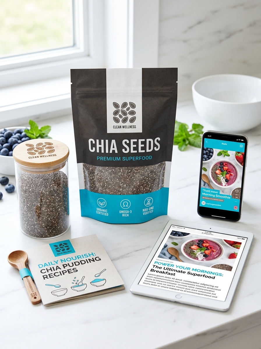
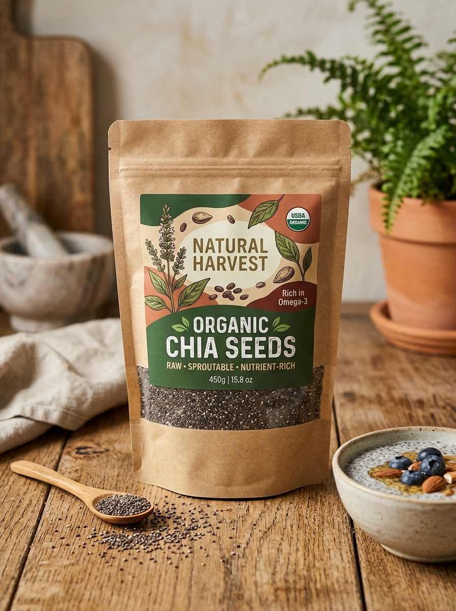
Establishing a cohesive brand identity for organic chia seeds requires a visual language that communicates purity and health. Packaging serves as the primary touchpoint for consumers, where minimalist designs and earthy color palettes signal a commitment to natural quality. By utilizing eco-friendly materials and matte finishes, brands reinforce their dedication to sustainability-a core value for the organic market.
Transparency is vital; incorporating clear windows allows the raw quality of the seeds to speak for itself. Furthermore, prominent placement of USDA Organic and non-GMO certifications builds immediate consumer trust. Effective packaging doesn't just protect the superfood; it tells a story of ethical sourcing and nutritional integrity, fostering a deep connection with health-conscious shoppers seeking authenticity in every purchase.
Selecting Sustainable and Eco Friendly Materials for Superfoods
When sourcing organic chia seeds, sustainability must extend beyond the field to the materials used in processing and packaging. Selecting eco-friendly materials, such as biodegradable pouches or recyclable glass, is vital for maintaining the purity of these nutrient-dense superfoods while minimizing environmental impact.
Eco-conscious brands prioritize plastic-free packaging and non-toxic, plant-based inks to ensure that the organic integrity of the seeds remains untainted. By choosing materials with a low carbon footprint, suppliers support regenerative farming practices and biodiversity. This holistic approach to sustainability ensures that every serving of chia seeds contributes to a circular economy, protecting both the consumer's health and the planet's future. Investing in sustainable materials is a hallmark of premium, ethically sourced superfoods.
Earthy Color Palettes and Their Psychological Impact on Consumers
In the branding of organic chia seeds, earthy color palettes-ranging from mossy greens to muted browns-serve as powerful psychological triggers. These tones immediately signal purity, sustainability, and health to the conscious consumer. Because chia seeds are marketed as a raw, nutrient-dense superfood, using colors found in nature reinforces the product's origin and lack of synthetic additives.
Psychologically, earthy palettes foster feelings of trust and stability. When consumers encounter these organic hues, their brains associate the product with transparency and environmental responsibility. This visual strategy reduces "choice paralysis" by creating an emotional bond based on perceived quality. Ultimately, these grounded aesthetics validate the consumer's desire for wholesome nutrition, making earthy tones essential for successfully positioning organic chia seeds in a competitive wellness market.
Modern Typography for Clarity and Health Consciousness
In the competitive market for organic chia seeds, modern typography serves as a bridge between nutritional science and consumer trust. Clean, sans-serif typefaces enhance readability, allowing health-conscious shoppers to quickly identify essential benefits such as high omega-3 fatty acids, fiber, and protein content.
Minimalist font choices reflect the purity of the superfood, mirroring the "clean label" movement. By prioritizing visual hierarchy and generous spacing, brands communicate transparency and professional authority. This design strategy ensures that critical certifications-like non-GMO and USDA Organic status-are immediately accessible. Ultimately, thoughtful typography transforms packaging into a functional wellness resource, aligning perfectly with the values of modern, health-oriented lifestyles.
Leveraging Transparency to Showcase Natural Product Quality
Transparency is the cornerstone of premium organic chia seeds. By providing clear traceability from sustainable farms to the final package, brands demonstrate a commitment to purity and nutritional integrity. Authentic quality is verified through visible USDA Organic certification and Non-GMO Project verification, ensuring the seeds are cultivated without synthetic pesticides or fertilizers.
Showcasing sourcing details allows consumers to verify the potency of vital nutrients, including Omega-3 fatty acids, antioxidants, and dietary fiber. Openly sharing third-party lab results for purity and heavy metal testing further builds consumer trust. When manufacturers prioritize supply chain visibility, it confirms that the natural superfood maintains its functional benefits, delivering a clean, high-quality product that aligns with health-conscious lifestyles and rigorous food safety standards.
Strategic Placement of Organic Certifications and Nutritional Data
For organic chia seeds, the strategic placement of trust signals is vital for driving conversions. Highlighting the USDA Organic seal and Non-GMO certifications prominently ensures immediate brand authority and quality assurance. Consumers seeking premium superfoods prioritize transparency; therefore, these badges should be positioned "above the fold" on digital storefronts or on the primary display panel of physical packaging.
Equally important is the accessible presentation of a detailed nutritional profile. Key data points that influence purchasing decisions include:
- High Omega-3 fatty acid content
- Rich dietary fiber levels
- Essential plant-based proteins and antioxidants
Situating these facts near the call-to-action validates the product's health benefits and justifies price points. This semantic layout builds consumer confidence, effectively communicating the functional superiority of organic chia seeds.
Minimalist Aesthetics for a Premium Health Focused Look
Our organic chia seeds leverage minimalist aesthetics to embody a premium, health-focused identity. This design philosophy emphasizes purity and transparency, using clean typography and intentional white space to highlight the raw quality of the superfood. By removing unnecessary visual clutter, the natural richness and texture of the seeds become the focal point, signaling high nutritional value to discerning consumers.
A minimalist approach reflects the essence of a clean-label lifestyle. It communicates a commitment to organic integrity and functional wellness without the distractions of traditional marketing. For health enthusiasts, this elegant simplicity suggests a product that is both sophisticated and authentic. By prioritizing a refined visual language, our chia seeds transition from a basic ingredient to an essential, high-end wellness staple that resonates with modern dietary values.
Tactile Elements and Textured Finishes in Package Design
For organic chia seeds, tactile package design serves as a vital sensory bridge between the consumer and the raw, natural product. Utilizing textured finishes-such as matte coatings, soft-touch laminates, or grainy spot UV-mimics the physical sensation of the seeds themselves, signaling authenticity.
Embossing health claims or brand logos adds a premium, artisanal dimension that reinforces brand trust and shelf appeal. Furthermore, incorporating sustainable materials like kraft paper or fibrous textures aligns the physical packaging with the eco-conscious values of the organic market. These tactile cues do more than enhance aesthetics; they create a sensory experience that communicates high quality and environmental responsibility, helping the product stand out in a competitive superfood landscape.
Functional Structural Design for Freshness and Usability
Our organic chia seeds are housed in a functional structural design specifically engineered to preserve nutritional integrity. To maintain peak freshness, the packaging utilizes a multi-layer, UV-protective barrier that shields delicate Omega-3 fatty acids from light exposure and oxidation.
For maximum usability, each pack features a heavy-duty resealable zipper, ensuring an airtight seal that prevents moisture ingress and clumping after every use. The ergonomic stand-up pouch provides a stable base for mess-free scooping and efficient pantry storage.
Crafted from food-grade, BPA-free materials, this design prioritizes food safety and extended shelf life. By combining advanced barrier technology with user-centric features, we ensure our chia seeds remain potent, crunchy, and convenient for your daily wellness routine.
Harmonizing Visual Storytelling with Ethical Sourcing Values
Visual storytelling serves as a powerful bridge between organic chia seeds and conscious consumers. By documenting the journey from sustainable, fair-trade farms to the final package, brands communicate their dedication to ethical sourcing and radical transparency. High-quality imagery of Salvia hispanica harvests and eco-friendly processing techniques highlights a deep-seated commitment to environmental stewardship.
When digital narratives align with core values like non-GMO certification and pesticide-free cultivation, they foster profound consumer trust. This semantic harmony ensures that the nutrient-dense profile of the superfood is matched by its positive social impact. Showcasing the real people and regenerative landscapes behind the seeds transforms a simple ingredient into a compelling narrative of global wellness and sustainable agriculture.
Leave a comment