Elevating a gourmet product begins long before the first taste. For black truffle oil, the bottle serves as the ultimate brand ambassador. Mastering luxury packaging design requires a meticulous harmony between opulence and functionality, ensuring that every visual element reflects the rarity of the liquid gold within.
This exploration delves into how high-end materials, minimalist typography, and sophisticated color palettes forge a compelling brand identity. By prioritizing sensory appeal and artisanal craftsmanship, producers can transform a simple glass vessel into a symbol of culinary prestige. Understanding the intersection of heritage and modern design is essential for captivating discerning consumers and establishing a dominant shelf presence. Discover the core principles of premium aesthetics that ensure your product commands the attention it deserves.
Defining the Visual Language of High-End Truffle Oils
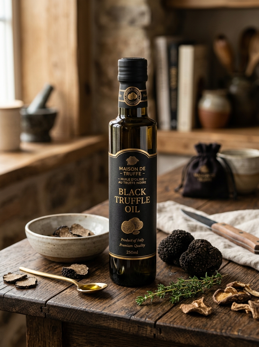
The visual language of premium black truffle oil is defined by its clarity, color, and sophisticated packaging. High-quality oils typically exhibit a vibrant, golden-amber hue, signaling the use of superior extra virgin olive oil as a base. Authenticity is often visually confirmed by the presence of Tuber melanosporum (black truffle) sediments at the bottom of the vessel, serving as a hallmark of artisan craftsmanship.
Beyond the liquid, the luxury aesthetic is reinforced through dark, UV-tinted glass bottles designed to protect the oil's volatile aromatic profile from light degradation. Minimalist labels featuring elegant typography and metallic accents further communicate a sense of culinary prestige. This deliberate design strategy ensures that the product resonates with discerning chefs seeking artisanal quality and gourmet refinement in their professional pantry.
The Psychology of Color in Luxury Condiment Branding
In the competitive market of black truffle oil, branding experts utilize color psychology to communicate prestige and sensory depth. The dominant use of black in packaging serves a dual purpose: it mirrors the rare Tuber melanosporum itself while symbolizing mystery, elegance, and high-end exclusivity. This visual weight signals to consumers that the product is a gourmet investment rather than a basic pantry staple.
To reinforce the "liquid gold" status of premium infusions, designers frequently incorporate metallic gold foil or deep ochre accents. These highlights evoke a sense of wealth and superior quality. Furthermore, muted earthy tones like deep brown or forest green are often used to ground the brand, emphasizing the organic, subterranean origin of the harvest. Together, these semantic color choices build a narrative of authenticity, justifying the premium price point of luxury truffle products.
Selecting Premium Materials for Sustainable Gourmet Glassware
Preserving the intense, earthy aroma of black truffle oil requires specialized housing. When selecting materials for gourmet glassware, we prioritize recyclable dark amber or violet glass. These materials are chosen for their superior UV-filtering capabilities, which prevent photo-oxidation and protect the volatile aromatic compounds that give truffle oil its value.
To ensure sustainability, our vessels utilize lead-free, food-grade borosilicate or high-density soda-lime glass. These materials are non-porous and chemically inert, ensuring no metallic leaching compromises the oil's delicate flavor profile. By choosing durable, infinitely recyclable glass over single-use plastics, we maintain a low carbon footprint while providing a luxury storage solution that guarantees the long-term freshness and potency of premium truffle infusions.
Typography and Logo Placement for Instant Brand Authority
Establishing brand authority for premium black truffle oil requires a meticulous approach to visual hierarchy. Typography serves as the silent ambassador of quality; utilizing classic serif fonts evokes a sense of heritage and artisanal craftsmanship, while minimalist sans-serif typefaces project modern sophistication. For high-end culinary products, font weight and spacing must ensure legibility against dark glass or golden oil textures.
Strategic logo placement is equally critical. Positioning the brand mark at the visual center or the upper third of the label draws immediate attention, fostering consumer trust and instant recognition. By aligning elegant lettering with prominent branding, producers signal a commitment to excellence. This synergy between typeface and positioning transforms a standard bottle into a symbol of gourmet luxury, effectively commanding premium shelf space and consumer loyalty.
Minimalist Label Design Principles for Elite Culinary Products
For high-end ingredients like black truffle oil, minimalist label design is essential to convey luxury and authenticity. By prioritizing "less is more," brands can signal premium quality through understated elegance. Key semantic design principles include:
- Negative Space: Utilizing ample white space to create visual breathing room, allowing the product name to stand out.
- Refined Typography: Employing clean, high-contrast fonts that reflect the sophisticated nature of gourmet oils.
- Tactile Finishes: Using gold foil, embossing, or matte textures to provide a sensory experience that aligns with the product's elite status.
- Strategic Color Palettes: Implementing monochromatic or earthy tones that evoke the natural origin of the black truffle.
This minimalist approach ensures that the packaging mirrors the purity and intense flavor profile of the oil, appealing directly to discerning culinary enthusiasts.
The Art of Haptic Feedback through Textured Finishes
In the luxury market of black truffle oil, the consumer experience begins with the first touch. High-end producers utilize haptic feedback through premium packaging to communicate the quality of the Tuber melanosporum extracts held within. By applying textured finishes-such as soft-touch coatings, embossed gold foil, or linen-textured labels-brands create a tactile bridge between the product and the gourmet enthusiast.
These sensory details are more than aesthetic; they evoke the earthy, rugged provenance of wild truffles. When a bottle feels substantial and textured, it reinforces a perception of artisanal craftsmanship and authenticity. This sensory marketing strategy ensures that the physical handling of the bottle matches the complex, umami-rich profile of the oil, elevating the overall brand narrative and justifying its status as a premium culinary staple.
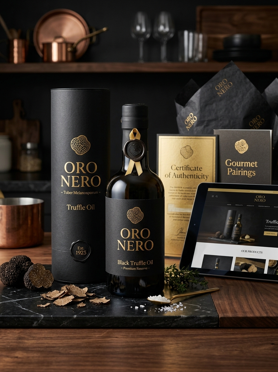
Curating an Unforgettable Unboxing Experience for Collectors
For discerning collectors of black truffle oil, the culinary journey begins well before the first drizzle. A premium unboxing experience serves as a critical hallmark of quality, bridging the gap between artisanal craftsmanship and gastronomic luxury. To captivate enthusiasts, packaging must prioritize both aesthetic elegance and the preservation of delicate Tuber melanosporum aromatic compounds.
Utilizing UV-protected glass, airtight wax seals, and custom-molded inserts ensures the oil remains shielded from light and oxidation while conveying exclusivity. The sensory transition-from the weight of a textured, embossed box to the immediate release of a deep, musky aroma-confirms the product's authenticity. By integrating detailed provenance certificates and sophisticated design, brands transform this kitchen essential into a prized collectible, satisfying the high expectations of the modern gourmet connoisseur.
Communicating Heritage and Terroir through Graphic Storytelling
Black truffle oil is more than a culinary luxury; it is a product of deep heritage and unique terroir. To bridge the gap between the mysterious forest floor and the consumer, brands utilize graphic storytelling. This visual narrative approach uses intricate illustrations and vintage-inspired design to communicate the specific environmental conditions-soil, climate, and oak symbiosis-that define the Tuber melanosporum.
By integrating maps of limestone-rich regions and depictions of traditional truffle hunts, packaging transforms into a medium for education and brand authenticity. These graphic elements emphasize provenance, ensuring consumers understand the legacy behind every drop. Ultimately, visual storytelling honors the artisanal roots of black truffle oil, elevating it from a simple condiment to a celebrated artifact of local culture and natural excellence.
Balancing Regulatory Compliance with Aesthetic Sophistication
In the premium black truffle oil market, manufacturers must navigate the intersection of regulatory compliance and high-end brand identity. Achieving culinary excellence requires strict adherence to international labeling standards, ensuring a clear distinction between natural infusions and synthetic aromas, such as 2,4-dithiapentane.
Aesthetic sophistication is achieved through minimalist packaging and evocative storytelling that reinforces the product's gourmet status. By integrating FDA-compliant ingredient disclosures with luxury design, brands maintain consumer transparency without sacrificing the visual allure expected by epicureans.
This strategic synergy ensures that premium truffle oils meet rigorous traceability and food safety protocols while remaining a centerpiece of sophisticated kitchens. Ultimately, balancing legal precision with artistic presentation fosters trust and sustains the prestige of the black truffle industry.
Evolving the Brand Identity for Future Luxury Market Trends
To remain competitive in the high-end culinary sector, black truffle oil brands must align with shifting consumer values. The future of luxury branding focuses on sustainability, transparency, and minimalist aesthetics. Modern epicureans prioritize artisanal provenance and ethical sourcing over ostentatious packaging.
By leveraging digital storytelling and blockchain traceability, brands can provide verifiable proof of the Tuber melanosporum origin, fostering deep consumer trust. Additionally, evolving brand identity involves a move toward "quiet luxury"-clean label designs that emphasize the purity of the ingredients. As the global palate becomes more sophisticated, positioning black truffle oil as a versatile, eco-conscious lifestyle choice rather than a mere kitchen indulgence will be key to capturing the next generation of luxury market share.
Leave a comment