
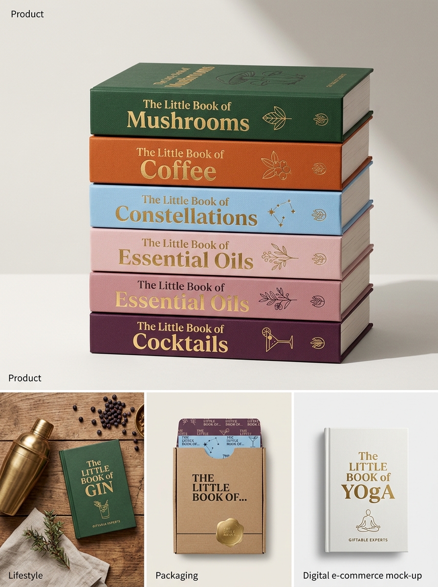
The Hardie Grant Little Books series represents a sophisticated intersection of boutique publishing and high-impact visual storytelling. Within this compact format, packaging design transcends utility, transforming each volume into a collectible sensory experience. Successful execution relies on a delicate balance between tactile luxury and conceptual clarity, ensuring the physical form mirrors the curated content within.
These guidelines detail the core aesthetic principles that define the series, focusing on minimalist typography, rich textural finishes, and cohesive thematic color palettes. By adhering to these rigorous standards, designers ensure that every title maintains the brand's signature elegance. Exploring these parameters reveals how specific material choices and intentional layouts create a unified identity that resonates with modern readers and gift-givers alike, making every "Little Book" a masterpiece of functional art.
The Hardie Grant Little Books Brand Identity and Philosophy
Hardie Grant's "Little Books" series embodies a commitment to high-quality, design-led independent publishing. The brand identity is defined by its compact, giftable format, blending sophisticated aesthetics with expert-led content. This imprint focuses on diverse lifestyle subjects-ranging from spirits and gastronomy to mindfulness and pop culture-distilling vast knowledge into accessible, pocket-sized treasures.
The core philosophy centers on the "art of the gift," where every book serves as a tactile, beautifully produced object. By prioritizing artisanal production values and inclusive voices, Hardie Grant ensures each title provides both practical insight and visual inspiration. These books are curated for a modern audience that values authenticity and craftsmanship, making the Little Books series a global staple for collectors and gift-givers seeking meaningful, bite-sized expertise.
Defining the Signature Compact Format and Scale
The Hardie Grant Little Books series is renowned for its iconic signature compact format, a design choice that prioritizes portability without compromising on premium quality. These volumes typically feature a handheld scale, often measuring approximately 120mm x 150mm, making them the perfect size for gifting or bedside reading.
This deliberate scale creates a tactile, intimate experience for the reader. By utilizing a diminutive hardback structure, Hardie Grant transforms curated lifestyle content-ranging from spirits and style to mindfulness-into collectible art objects. The small-scale dimensions are complemented by high-production values, such as textured covers and vibrant illustrations. This unique format ensures that while the books are physically small, they maintain a significant presence on a bookshelf, serving as both an accessible reference and a sophisticated decorative element in modern homes.
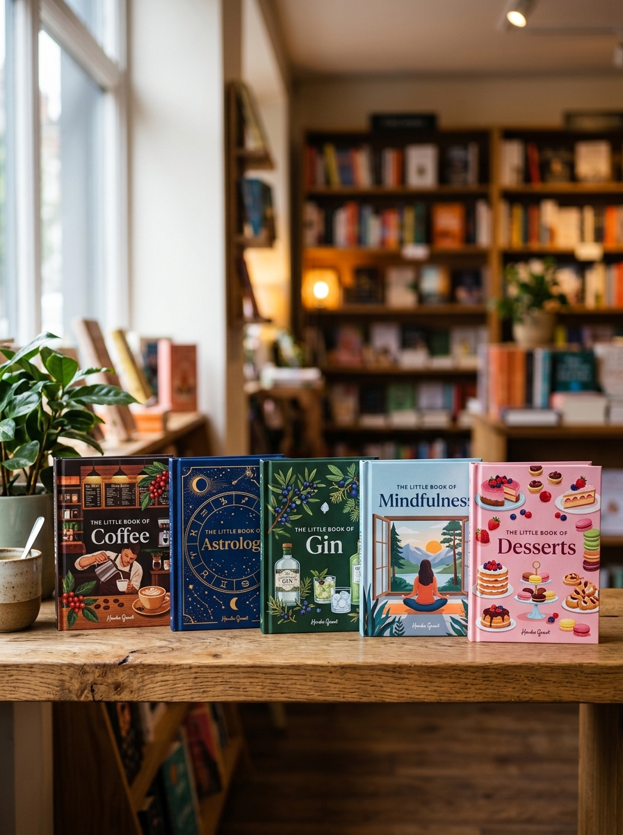
Visual Storytelling Through Iconic Cover Illustrations
The Hardie Grant Little Books series is internationally recognized for its distinctive visual identity. In this collection, cover illustrations are not merely decorative; they are a vital component of the narrative. Each book features bespoke artwork designed to encapsulate the essence of its subject, ranging from high fashion and cinema to spirits and cultural history.
By utilizing a sophisticated blend of minimalist aesthetics, bold typography, and vibrant color palettes, these iconic covers create an immediate emotional connection. This deliberate approach to visual storytelling transforms compact reference guides into highly collectible art pieces. The curated imagery reinforces the premium quality of the series, ensuring that every title serves as a stylish statement piece. These illustrations bridge the gap between literature and art, making the series a favorite for bibliophiles and design enthusiasts globally.
Color Palette Strategy for Series Cohesion and Appeal
The Hardie Grant Little Books series employs a strategic color palette designed to maximize visual impact and brand uniformity. By utilizing a spectrum of bold, saturated hues, the publisher ensures each title functions as a vibrant standalone gift while contributing to a cohesive "rainbow" effect on retail shelves.
This color-blocking approach serves as a powerful merchandising tool, encouraging collectibility and cross-category appeal. Whether focusing on cocktails, mindfulness, or cuisine, the consistent use of high-contrast tones and premium finishes-such as gold foiling-creates a recognizable, high-end aesthetic. This deliberate selection of pigments attracts impulse buyers and reinforces the series' identity as a curated library of stylish knowledge. Through this disciplined application of color, Hardie Grant achieves a perfect balance between individual book personality and holistic series synergy.
Typography Standards for Premium Book Packaging
Hardie Grant Little Books exemplifies excellence in publishing through meticulous typography standards specifically designed for premium book packaging. Each title utilizes a curated selection of typefaces that balance classic elegance with modern readability, ensuring the text complements the high-end tactile finish of the "Little Books" series.
To maintain a luxury aesthetic, our typographic framework emphasizes:
- Optical Sizing: Typefaces are adjusted for clarity within compact dimensions.
- Visual Hierarchy: Sophisticated use of font weights and scales to guide the reader effortlessly.
- Harmonious Kerning: Precise letter-spacing that reflects the brand's artisanal quality.
These standards ensure that every volume serves as both an informative guide and a decorative object. By prioritizing typographic precision, Hardie Grant reinforces its commitment to delivering giftable, collectible, and visually stunning literary experiences.
Material Selection and Tactile Texture Guidelines
For Hardie Grant Little Books, material selection is central to creating a premium, giftable sensory experience. Our guidelines prioritize sensory engagement, durability, and sustainable sourcing. Each volume utilizes high-quality, FSC-certified paper stocks to ensure environmental responsibility without compromising on opacity or texture.
Tactile appeal is engineered through sophisticated finishing techniques that elevate the physical object. Key standards include:
- Premium Cover Stocks: Utilization of textured cloth, matte lamination, or soft-touch finishes.
- Embellishments: Precision debossing, embossing, and foil stamping to create depth and physical contrast.
- Paper Weight: High-gsm interior pages that provide a substantial, luxurious "hand-feel" during use.
By adhering to these rigorous material benchmarks, we ensure every publication functions as both an insightful resource and a collectible design object.
Balancing Minimalism with Essential Information Architecture
Hardie Grant Little Books exemplify the delicate intersection of minimalist design and information architecture (IA). In these compact editions, the challenge lies in maintaining functional clarity within a restricted physical footprint. By prioritizing a clean visual hierarchy, the series ensures that core content-ranging from culinary recipes to lifestyle insights-remains highly accessible and easy to digest.
Effective IA in this context involves streamlining navigation through concise indexing, deliberate typography, and intuitive layouts. This strategic approach minimizes cognitive load by removing superfluous elements, focusing instead on the high-value data required by the reader. The result is a curated user experience that balances aesthetic simplicity with structural integrity, proving that small-scale publishing can deliver high-density information without compromising on readability or giftable appeal.
Optimizing Shelf Presence and Retail Visibility
The Hardie Grant Little Books series is meticulously designed to command attention in competitive retail environments. To maximize shelf presence, these titles utilize high-quality tactile finishes and a signature compact aesthetic that signals premium value to the gift market.
Optimizing visibility involves strategic merchandising; their uniform size makes them ideal for specialized point-of-sale (POS) displays and impulse-buy zones. By grouping these books by category-such as culinary arts, wellness, or spirits-retailers can create high-impact visual blocks that encourage multi-copy sales and collectibility.
Semantic search patterns highlight the importance of giftability and collectible appeal. Leveraging the brand's iconic design language ensures that despite their small footprint, they achieve significant retail standout, driving customer engagement and increasing basket value through curated, eye-catching shelf arrangements.
Enhancing the Gifting Experience and Unboxing Value
Hardie Grant Little Books are meticulously crafted to elevate the art of thoughtful gifting. These compact, curated volumes serve as premium keepsakes, blending high-quality editorial content with stunning aesthetic design. By prioritizing tactile finishes-such as textured paper stocks, foil stamping, and vibrant illustrations-each book offers significant unboxing value that resonates with consumers seeking meaningful, small-scale gestures.
Whether used as a standalone token or a charming accompaniment to a larger gift set, these books transform a simple purchase into a memorable sensory experience. Their collectible nature and diverse range of topics-from culinary arts and wellness to pop culture-ensure a personalized touch. By focusing on physical beauty and niche interests, Hardie Grant enhances the perceived value of physical media, making every "little book" a significant statement in the modern gifting market.
Maintaining Design Consistency Across Diverse Subject Matter
The Hardie Grant Little Books series exemplifies how a unified visual identity can bridge disparate topics ranging from mixology and gastronomy to mindfulness. To achieve design consistency across such diverse subject matter, the series utilizes a standardized pocket-sized format and a signature aesthetic framework.
By employing a consistent grid system and curated typography, Hardie Grant ensures immediate brand recognition. Each title features high-quality finishes and distinctive cover illustrations that, while tailored to the specific theme, adhere to established publishing standards. This strategic approach allows the collection to feel like a cohesive set, encouraging collectability. The balance of rigid structural elements with flexible thematic art ensures that whether a book covers "Gin" or "Zen," it remains an unmistakable part of the iconic Little Books library.
Leave a comment