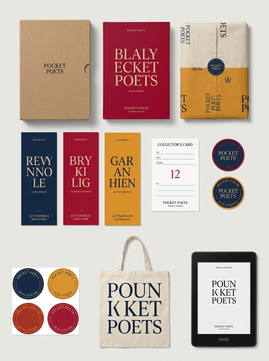
The Pocket Poets Series represents a seminal shift in book production, where minimalist aesthetics meet radical accessibility. Established by City Lights Publishers, the series' iconic packaging design functions as a visual manifesto for the literary avant-garde. By prioritizing a stark monochrome palette and bold, sans-serif typography, the series transcends traditional publishing boundaries to create a portable, democratic medium for modern poetry.
Analyzing the core design principles reveals how these small-format volumes achieved such profound cultural resonance. From the intentional use of negative space to the tactile quality of the cardstock covers, every element serves a central concept: making high-level literature both physically and intellectually approachable. This exploration into the series' visual identity highlights the enduring power of functional, concept-driven design in the world of independent publishing.
The Legacy of the City Lights Pocket Poets Series
Launched by Lawrence Ferlinghetti in 1955, the City Lights Pocket Poets Series revolutionized American literature by making avant-garde poetry affordable and portable. This iconic series became the primary vehicle for the Beat Generation, most notably publishing Allen Ginsberg's "Howl" in 1956.
The legacy of the series is defined by its commitment to free speech and democratic access to art. By surviving a landmark obscenity trial, it paved the way for modern artistic expression and challenged censorship laws. Its recognizable black-and-white aesthetic remains a global symbol of countercultural defiance. Today, the Pocket Poets Series continues to influence independent publishing, proving that small-format books can drive massive cultural shifts and sustain a vital dialogue on social justice and the human experience.

The Core Philosophy of Portability and Accessibility
The Pocket Poets Series, launched by Lawrence Ferlinghetti at City Lights, was founded on the radical premise that high-quality poetry should be both affordable and physically accessible. Its core philosophy sought to democratize literature, moving poetry out of exclusive academic circles and into the hands of the general public.
By utilizing a pocket-sized format, the series transformed books into portable tools for social and cultural change. These compact volumes were intentionally designed to fit into a garment pocket, encouraging reading in transit and public spaces. This commitment to low-cost production and small-scale design ensured that groundbreaking works, such as Allen Ginsberg's "Howl," reached a diverse, global audience. Ultimately, the series redefined the book as a democratic object, proving that profound artistic expression thrives when economic and physical barriers to entry are removed.
Mastering the Minimalist Black and White Aesthetic
The Pocket Poets Series, pioneered by City Lights, remains a definitive example of minimalist book design. This iconic black and white aesthetic, originally envisioned by Lawrence Ferlinghetti, utilizes high-contrast visuals to create a timeless and professional brand identity. By eschewing complex illustrations, the series prioritizes the raw power of the written word and clean typography.
To master this minimalist approach, the design focuses on several key semantic elements:
- Stark Contrast: Using a limited palette to ensure readability and instant recognition.
- Functional Portability: A small form factor that emphasizes utilitarian beauty over decorative excess.
- Typographic Hierarchy: Bold, clear fonts that guide the reader's eye without distraction.
This minimalist philosophy ensures that the poetry remains the central focus, proving that simplicity often yields the most profound literary impact.
The Role of Typography in Iconic Cover Design
The Pocket Poets Series, launched by City Lights Publishers, revolutionized literary packaging through its minimalist and utilitarian aesthetic. Central to its enduring legacy is the strategic use of typography, which prioritizes bold, high-contrast black-and-white layouts over traditional illustrations. By utilizing stark sans-serif and serif fonts framed within distinctive borders, the series created an instantly recognizable brand identity.
This typographic approach, most notably seen on Allen Ginsberg's Howl and Other Poems, democratized poetry by making it appear modern, portable, and accessible. The clean spatial arrangement and consistent font weights served as a visual manifesto for the Beat Generation, emphasizing the raw power of the written word. Ultimately, the series demonstrates how purposeful type selection can define a countercultural movement and transform a small-format book into a timeless design icon.
Materiality and the Tactile Experience of Small Books
The Pocket Poets Series, pioneered by Lawrence Ferlinghetti at City Lights, redefined the materiality of modern literature. By utilizing a compact, 4-by-6-inch format, these editions prioritized portability and accessibility over the prestige of traditional hardcovers. The tactile experience is defined by lightweight cardstock and slim profiles, engineered to fit seamlessly into a reader's pocket or palm.
This deliberate small-book design transformed poetry from a static, library-bound medium into a dynamic, everyday companion. Semantically, the physical nature of these volumes reflects a democratic ethos; they were meant to be handled, carried, and shared in cafes rather than preserved on high shelves. This intimate scale fostered a unique sensory connection between the reader and the text, making radical voices like the Beat Generation feel personal, mobile, and subversive.
Consistency and Variation Within the Series Framework
The City Lights Pocket Poets Series is defined by a strategic tension between structural uniformity and editorial diversity. Consistency is maintained through the series' iconic "pocket-sized" paperback format, affordable pricing, and sequential numbering. This standardized design, originally featuring a minimalist black-and-white aesthetic, established a recognizable brand that democratized avant-garde literature.
Within this rigid framework, Lawrence Ferlinghetti introduced significant variation. While the physical template remained constant, the content spanned a vast spectrum of poetic movements-from the raw energy of the Beat Generation to international surrealism and political dissent. This balance allowed the series to evolve as a cohesive collection while providing a flexible platform for global voices. By anchoring radical experimentation within a familiar physical identity, City Lights ensured that the series remained both a historical landmark and a living vessel for poetic innovation.
Reflecting the Beat Generation Through Visual Identity
The Pocket Poets Series, launched by Lawrence Ferlinghetti at City Lights, utilized a distinct visual language to mirror the Beat Generation's countercultural ethos. The iconic black-and-white, minimalist cover designs-most famously associated with Allen Ginsberg's Howl and Other Poems-rejected the ornate academic standards of 1950s publishing.
This visual identity prioritized accessibility and portability, transforming radical poetry into a handheld tool for social dissent. The stark typography and modest "pocket-sized" format signaled a DIY, underground sensibility that resonated with the movement's focus on spontaneity and rebellion. By stripping away visual excess, the series' design emphasized the raw power of the spoken word, solidifying its status as a permanent symbol of the democratization of art and the enduring spirit of the San Francisco Renaissance.
The Intersection of Functionalism and Counterculture Art
The Pocket Poets Series, launched by Lawrence Ferlinghetti at City Lights Bookstore, represents a pivotal fusion of functionalist design and radical expression. By utilizing a small, standardized paperback format, the series prioritized utilitarian accessibility-a hallmark of functionalism-to dismantle the elitist barriers of traditional hardbound publishing.
This "pocket-sized" utility transformed high art into a portable tool for the Beat Generation and subsequent counterculture movements. The minimalist, low-cost production allowed provocative works like Allen Ginsberg's Howl to circulate rapidly among the masses. In this context, functionalism served as a catalyst for social change; the physical design of the books facilitated the democratic distribution of revolutionary ideas. Consequently, the series proves that minimalist aesthetic constraints can effectively amplify the reach and impact of avant-garde, anti-establishment literature.
Modern Iterations and Contemporary Design Evolution
The Pocket Poets Series, curated by City Lights Publishers, continues to balance its historic identity with modern aesthetic refinements. While the iconic black-and-white cover scheme remains a symbol of counterculture, contemporary iterations have evolved to incorporate advanced typography and high-quality sustainable paper stocks.
Recent volumes demonstrate a sophisticated design evolution that enhances readability for a 21st-century audience while preserving the original "pocket-sized" portability. These modern updates ensure that the series remains physically accessible and visually relevant without losing the raw, avant-garde spirit established in the 1950s. By integrating subtle graphic improvements and refined layouts, the series bridges the gap between its radical heritage and the requirements of the contemporary independent publishing landscape, ensuring its legacy persists in the digital age.
The Lasting Impact of Pocket Poets on Book Packaging
The Pocket Poets Series, launched by Lawrence Ferlinghetti at City Lights, revolutionized book packaging by prioritizing accessibility and portability. Its signature small-trim size and minimalist black-and-white aesthetic proved that high-quality literature did not require expensive hardcovers. This design philosophy effectively democratized poetry, transforming it from an elite luxury into a portable tool for the counterculture.
By utilizing inexpensive materials and a distinct, consistent visual brand, the series heavily influenced the modern trade paperback movement. It demonstrated that iconic cover art and standardized formatting could build lasting brand recognition while keeping production costs low. Today, the legacy of the Pocket Poets remains a definitive blueprint for publishers aiming to combine aesthetic elegance with functional durability, ensuring profound verse remains accessible to every reader.
Leave a comment