
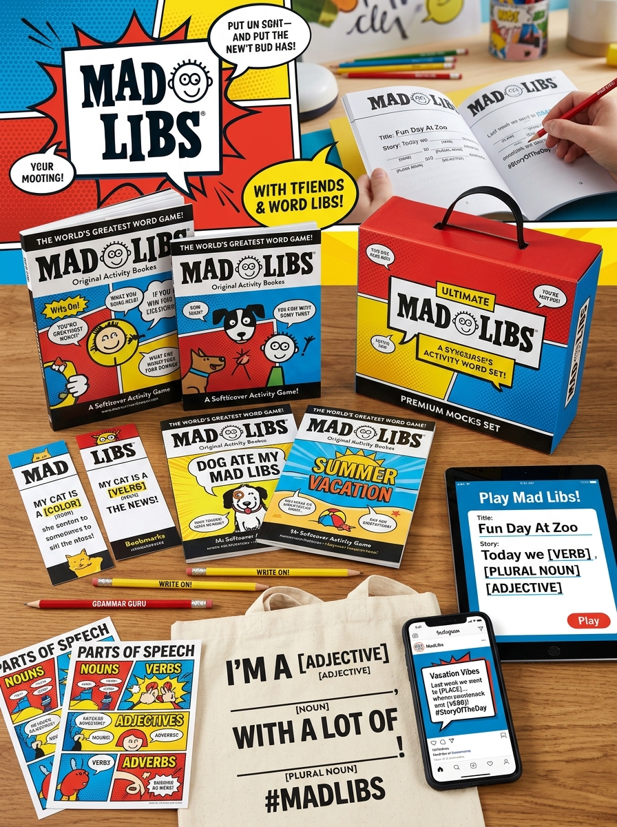
Elevating Mad Libs book packaging requires a strategic fusion of nostalgia and modern visual aesthetics. As an iconic staple of interactive media, the physical presentation of these word-game books must bridge the gap between playful humor and professional shelf appeal. Successful creative design concepts go beyond basic layouts, integrating bold typography, vibrant color palettes, and tactile finishes that invite immediate engagement.
Understanding the nuances of visual storytelling in book design ensures that every edition resonates with its target audience, from nostalgic adults to imaginative children. By mastering the balance between functional utility and artistic expression, creators can develop a compelling brand identity that thrives in the publishing marketplace. This exploration delves into the essential elements of high-impact packaging and the aesthetic principles that drive consumer curiosity and brand loyalty.
The Evolution of Mad Libs Visual Identity and Brand Heritage
Since its 1958 debut by Leonard Stern and Roger Price, Mad Libs has maintained a powerful brand heritage rooted in minimalist design and creative play. The visual identity is defined by its iconic, slightly irregular blocky logo and the classic portable tablet format that fits perfectly in a back pocket.
Originally featuring simple line art on pastel cardstock covers, the brand's aesthetic has evolved to incorporate vibrant, high-contrast colors and licensed themes. However, the core "fill-in-the-blank" internal layout remains largely unchanged, preserving its nostalgic appeal. This visual consistency has allowed Mad Libs to transition from a niche party game to a staple of children's literacy. By balancing mid-century graphic roots with modern pop-culture collaborations, Mad Libs preserves its heritage while remaining a recognizable leader in interactive humor for new generations.
Defining Target Demographics Through Strategic Cover Illustrations
Mad Libs utilizes intentional cover design to effectively segment its diverse audience. For younger children, publishers employ vibrant color palettes, whimsical characters, and bold typography to signal age-appropriate, lighthearted humor. These visual cues ensure immediate shelf recognition for parents and educators.
Conversely, editions targeting adults often feature minimalist aesthetics or retro styling to leverage brand nostalgia. Strategic illustrations also incorporate licensed imagery from popular franchises-such as Star Wars or Disney-to capture specific fanbases through visual association. By aligning illustration styles with demographic-specific expectations, Mad Libs creates a non-verbal marketing bridge. This strategy ensures that consumers can instantly identify which product suits their cognitive level and cultural interests, successfully maximizing market reach across multiple generations.
The Anatomy of an Iconic Mad Libs Visual Hierarchy
The visual hierarchy of a Mad Libs page is a masterclass in functional design, engineered to balance narrative flow with interactive play. At the apex sits the bold, blocky brand logo and story title, typically set in vibrant colors to establish a whimsical tone.
The primary scan path follows a clean, sans-serif body text, punctuated by the most critical element: the underscored blank space. These blanks create immediate visual focal points, signaled by their horizontal weight. Beneath each line, a secondary typographic layer-tiny, italicized grammatical prompts like (noun) or (adjective)-provides essential metadata without cluttering the story. This structured contrast between stable text and empty fields ensures the user's eye moves seamlessly from prompt to completion, maintaining the game's characteristic pace.
Color Theory and Palette Selection for Maximum Shelf Impact
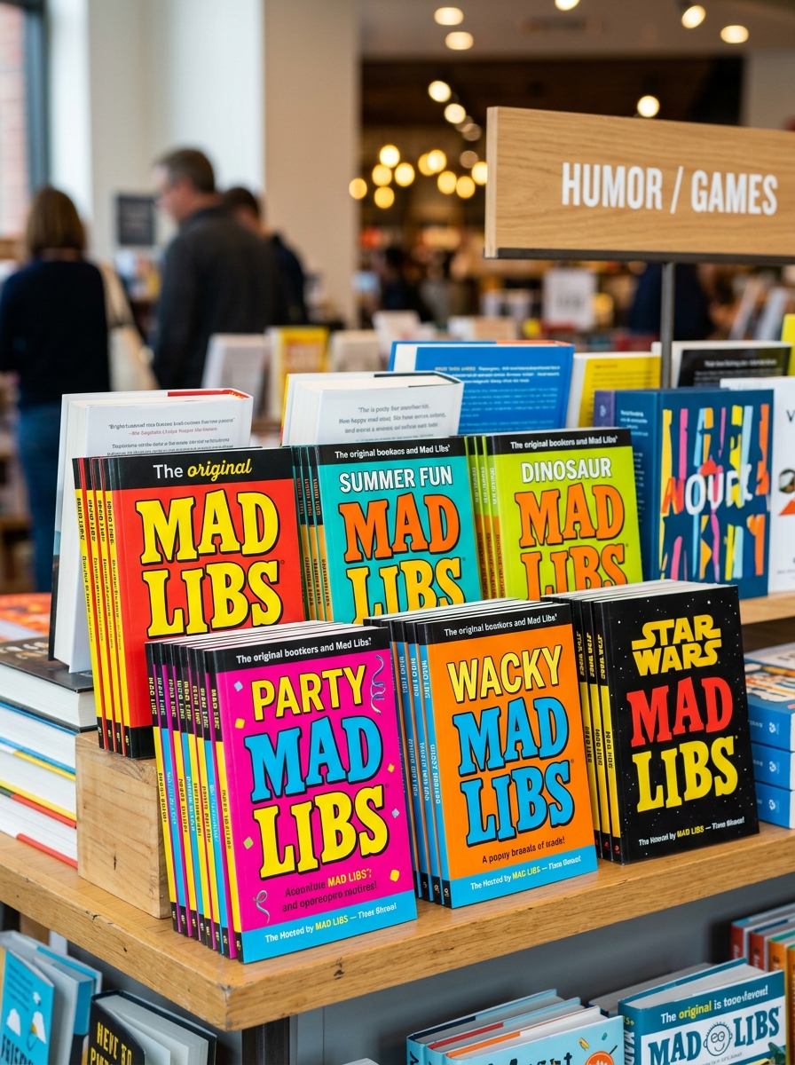
Mad Libs books leverage high-contrast color theory to command attention on crowded retail shelves. By utilizing a primary-heavy palette-dominated by saturated yellows, vibrant reds, and deep blues-the branding triggers psychological associations with playfulness, energy, and accessibility.
To achieve maximum shelf impact, designers focus on several core strategies:
- Visual Saliency: High-saturation hues ensure the compact pads are not overshadowed by larger volumes.
- Complementary Contrast: Pairing bold cover backgrounds with crisp white borders creates a "pop" effect that guides the eye toward the iconic logo.
- Brand Consistency: Maintaining a unified color language across various editions builds instant consumer recognition and encourages collectibility.
Strategic palette selection transforms these pocket-sized books into high-visibility landmarks, specifically optimized for impulse buys and long-term brand recall in high-traffic bookstores.
Typography Trends for Playful and Readable Book Layouts
Designing Mad Libs books requires a strategic balance between whimsical aesthetics and functional clarity. Current typography trends focus on enhancing the interactive experience through high-readability layouts. Designers are increasingly using rounded sans-serif fonts to create a friendly, approachable tone that resonates with younger audiences.
To optimize for both engagement and legibility, modern layouts utilize the following elements:
- Distinctive Display Type: Bold, comic-style headers add energy to the page.
- Emphasis on Blanks: Using monospaced or underlined fonts for word categories like [NOUN] or [VERB] ensures these prompts stand out.
- Generous White Space: Increased leading and kerning prevent the playful text from becoming cluttered.
By blending handwritten scripts for instructions with clean body text, publishers create a semantic hierarchy that guides the reader effortlessly through the "fill-in-the-blank" gameplay.
Incorporating Interactive Features into Physical Packaging Design
Mad Libs books leverage interactive packaging to transform static literature into a tactile experience. By integrating structural features such as die-cut windows and specialized coatings, publishers can showcase the signature "fill-in-the-blank" gameplay directly on the shelf.
Key strategies for enhancing consumer engagement through design include:
- Tactile Finishes: Using spot UV or embossing to draw attention to word categories like "Nouns" or "Adjectives."
- Utility-Driven Design: Incorporating spiral bindings or elastic closures to facilitate "on-the-go" play and durability.
- Phygital Elements: Placing QR codes on the back cover to bridge the gap between physical paper games and digital expansion packs.
These physical design innovations turn a standard book into a dynamic product, fostering immediate interaction and reinforcing the brand's playful identity.
Designing Themed Collections for Pop Culture and Seasonal Trends
Designing Mad Libs books for pop culture and seasonal trends is a strategic process that ensures the brand remains culturally relevant. Publishers leverage licensed properties-including blockbuster films, hit streaming series, and gaming icons-to create niche word-game experiences that resonate with specific fanbases.
Effective themed collections focus on two primary areas:
- Seasonal Relevance: Releasing holiday-specific editions for Christmas, Halloween, or Summer Vacations to tap into peak retail cycles.
- Niche Integration: Tailoring "fill-in-the-blank" prompts with specialized vocabulary and references that mirror the tone of the licensed trend.
By merging the classic phrasal template with contemporary media trends, Mad Libs maintains its appeal as both a nostalgic pastime and a modern interactive gift. This approach drives collectability and strengthens engagement across diverse age groups.
Balancing Nostalgic Aesthetics with Modern Graphic Design
Modern Mad Libs editions successfully bridge the gap between retro charm and contemporary visual standards. To preserve their nostalgic identity, designers maintain signature elements like the iconic bold typography and the classic landscape notepad format. These visual cues evoke immediate brand recognition for generations of fans.
Simultaneously, modern graphic design principles are applied to enhance legibility and shelf appeal. Today's iterations utilize cleaner layouts, vibrant color palettes, and high-quality vector illustrations that replace dated imagery. By balancing whitespace with playful graphics, the brand ensures its analog roots remain relevant in a digital age. This hybrid approach honors the legacy of the word game while providing a fresh, engaging aesthetic for new readers, proving that vintage branding can thrive through thoughtful modernization.
Material Selection and Structural Design for Portability and Durability
Mad Libs books are engineered for tactile longevity and high-use environments. To ensure durability, publishers typically utilize a heavy-duty cardstock for the cover, which protects the interior pages from wear during travel. The interior paper is selected for its absorbent, uncoated texture, specifically chosen to prevent ink smearing and bleed-through from various writing instruments.
The structural design prioritizes portability, often featuring a compact 5x8 inch trim size that fits easily into backpacks or glove compartments. Most editions incorporate perforated pages, allowing for easy removal without damaging the binding. This functional design is supported by either saddle-stitch or perfect binding, providing a flat writing surface essential for on-the-go play. These material choices ensure the books remain intact through repeated handling in classrooms, cars, and airplanes.
Optimizing Packaging for Digital Retail and Physical Display Success
Packaging for Mad Libs books must balance digital visibility with physical shelf appeal. In e-commerce, covers require bold typography and high-contrast colors to ensure the iconic logo remains legible in small digital thumbnails. Leveraging SEO-friendly metadata and clear imagery helps capture mobile shoppers and improves search ranking.
For brick-and-mortar success, physical packaging benefits from tactile finishes like spot UV or embossing, which emphasize the brand's interactive nature. Optimizing spine real estate is critical for visibility in crowded retail aisles. By harmonizing digital assets with tangible design elements, publishers can enhance brand recognition and drive conversion across all sales channels. This dual-strategy approach ensures that whether a customer is browsing a screen or a store shelf, the playful essence of the world's greatest word game is immediately impactful.
Leave a comment