
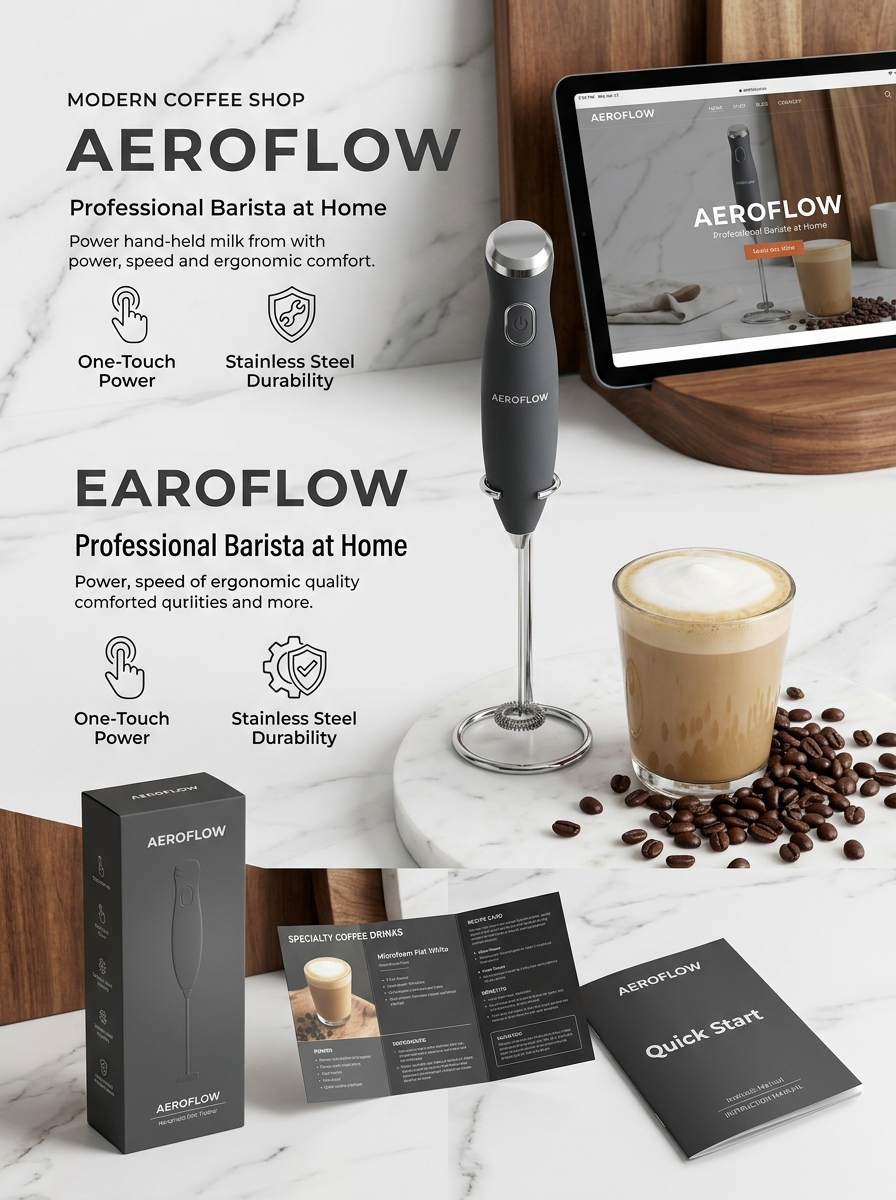
Designing effective packaging for handheld milk frothers requires a strategic fusion of functional clarity and visual sophistication. As the home-barista movement continues to expand, the exterior box serves as the primary touchpoint, communicating the promise of velvety textures and professional-grade lattes before the consumer even unboxes the device.
To successfully capture market attention, designers must prioritize aesthetic harmony and conceptual storytelling. This involves leveraging high-resolution imagery, minimalist typography, and tactile finishes that reflect the product's internal precision. By mastering these essential design principles, brands can create an immersive unboxing experience that resonates with coffee enthusiasts, ensuring their product achieves superior shelf presence and high perceived value through thoughtful, user-centric presentation.
Defining the Aesthetic for Modern Kitchen Gadgets
The modern handheld milk frother has evolved from a simple utility tool into a statement piece for the contemporary coffee station. Today's design aesthetic prioritizes minimalism and ergonomic functionality, featuring sleek profiles, matte finishes, and brushed stainless steel accents that blend seamlessly with high-end appliances.
Beyond visual appeal, the aesthetic is defined by a "less is more" philosophy. Cordless designs and streamlined silhouettes eliminate kitchen clutter, while intuitive one-touch buttons provide a sophisticated user experience. These gadgets reflect a broader trend in interior design where professional-grade performance meets residential elegance. By balancing lightweight portability with premium materials, the handheld frother serves as a functional accessory that enhances both the barista-quality foam and the overall visual harmony of the modern kitchen environment.
The Psychology of Color in Coffee Accessory Packaging
Color psychology significantly influences how consumers perceive the quality and function of a handheld milk frother. Manufacturers strategically select packaging hues to align with target audience emotions. For example, matte black or brushed silver packaging often communicates professional-grade durability and high-tech precision, appealing to serious home baristas.
Conversely, vibrant tones like emerald green or sunset orange evoke energy and creativity, suggesting a modern, fast-paced lifestyle. Soft pastels are frequently used to emphasize the "cozy morning ritual," promoting a sense of calm and comfort. By utilizing these visual cues, brands enhance the shelf appeal of coffee accessories, signaling whether a product is a luxury investment or a fun, functional addition to a kitchen. Understanding these semantic color associations helps consumers subconsciously identify which frother fits their personal aesthetic and coffee-making goals.
Visual Hierarchy and Essential Product Information
Establishing a clear visual hierarchy for a handheld milk frother ensures customers quickly identify core performance metrics. Prioritize essential data such as motor speed (typically 19,000+ RPM) and material quality, specifically 304 stainless steel, to signal durability and efficiency.
To optimize user comprehension, group secondary features logically using semantic structures:
- Power Source: Detail battery requirements (AA) or USB-C rechargeable capabilities.
- Ergonomics: Highlight lightweight, non-slip handles designed for comfort.
- Maintenance: Emphasize "easy-to-clean" whisks and rust-resistant components.
Organizing these specifications from primary utility to convenience features guides the buyer's journey. This logical flow highlights the frother's ability to create barista-quality foam in seconds while reinforcing practical benefits like storage stands, ensuring all critical information is accessible and scannable.
Material Selection for Durability and Sustainability
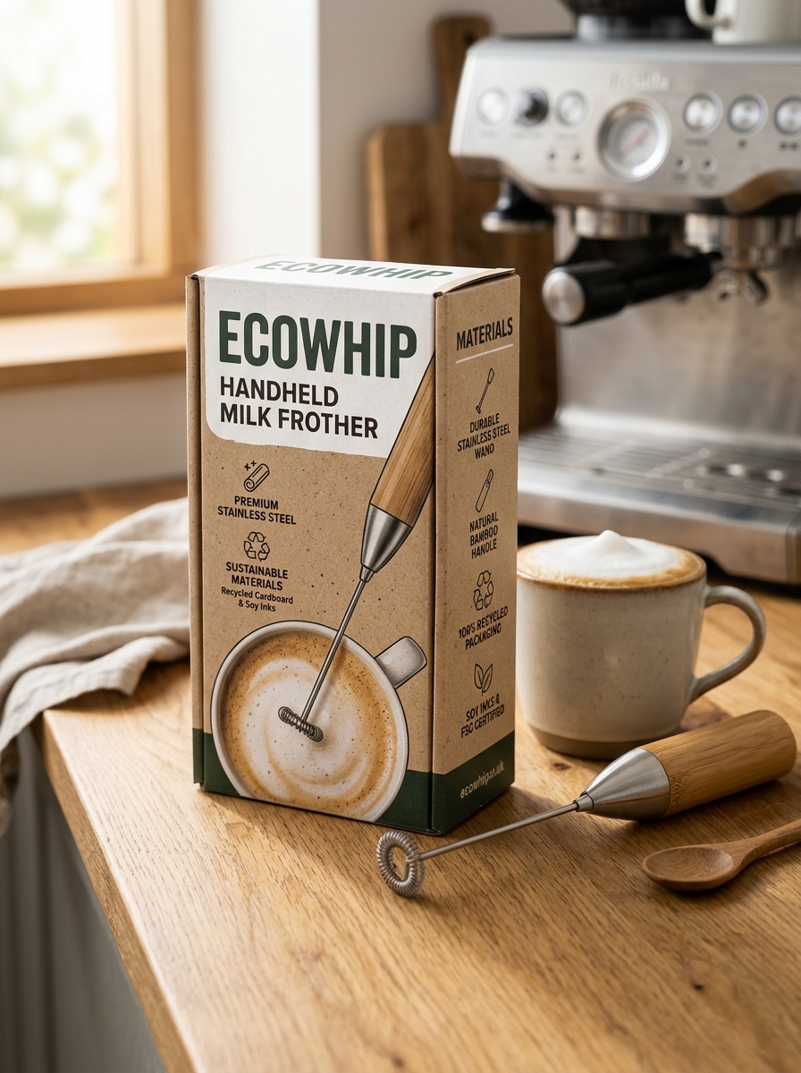
Choosing a handheld milk frother constructed from high-quality materials ensures both long-term performance and environmental responsibility. Most premium models feature a whisk made of 304 food-grade stainless steel, which provides exceptional resistance to rust and corrosion while maintaining hygiene standards.
For the exterior, manufacturers often utilize BPA-free ABS plastic or lightweight aluminum to balance ergonomic comfort with structural integrity. From a sustainability standpoint, a durable design significantly reduces electronic waste by extending the product's lifecycle. By prioritizing robust internal motors and recyclable components, consumers can enjoy barista-quality foam while minimizing their ecological footprint. Investing in a well-built, metal-accented frother is an eco-conscious alternative to low-quality, disposable versions that contribute to landfill waste.
The Art of High-Resolution Product Photography
Capturing a handheld milk frother through high-resolution product photography is vital for showcasing build quality and performance. To effectively market these kitchen tools, photographers focus on highlighting the sleek stainless steel finishes and the intricate coils of the whisking head. Using macro photography allows consumers to see the fine details of the ergonomic handle and the power button placement.
Proper lighting is crucial to minimize glare on metallic surfaces while accentuating the velvety texture of the microfoam created. High-definition images help bridge the gap between online browsing and the tactile experience, building buyer confidence. By utilizing a shallow depth of field, the frother remains the central focus, emphasizing its portability and professional-grade construction. Semantic optimization through clear visuals and descriptive alt-text ensures the product resonates with coffee enthusiasts and professional baristas alike.
Typography that Communicates Quality and Simplicity
In the design of a premium handheld milk frother, typography serves as a visual bridge between functionality and elegance. Selecting clean, minimalist typefaces communicates a sense of modern simplicity, reflecting the tool's intuitive one-touch operation.
High-contrast, legible fonts on packaging and the device body reinforce brand authority and perceived product durability. By avoiding cluttered decorative scripts, the branding aligns with the minimalist aesthetic favored by coffee enthusiasts. This intentional use of whitespace and refined lettering ensures that the user perceives the frother as a high-quality kitchen essential, emphasizing ease of use and professional-grade performance in every cup of foam.
Enhancing the Unboxing Experience for Enthusiasts
For coffee aficionados, the journey to a perfect latte starts the moment the package arrives. A premium handheld milk frother deserves an unboxing experience that mirrors its performance. Brands that prioritize high-quality, sustainable packaging create an immediate sense of value and professional craft.
A superior unboxing experience for a barista-grade frother often includes:
- Custom-fit protective inserts to ensure the whisk remains perfectly aligned.
- A sleek, ergonomic storage stand that enhances kitchen aesthetics.
- Quick-start guides and recipe booklets for creative foam art.
By focusing on tactile sensations and visual appeal, manufacturers turn a simple utility tool into a lifestyle accessory. This meticulous attention to detail builds brand loyalty among enthusiasts, ensuring they feel equipped to create café-quality microfoam from the very first use.
Strategic Branding for Competitive Retail Shelves
In the crowded kitchenware market, handheld milk frothers require strategic branding to capture consumer attention and dominate retail shelves. Success depends on packaging design that communicates both premium quality and functional utility at a glance. Brands must leverage high-contrast typography and minimalist aesthetics to signal a professional-grade "home barista" experience.
To optimize shelf presence, manufacturers should focus on these semantic-rich elements:
- Value Proposition: Clearly highlighting motor power, battery efficiency, and ergonomic design.
- Lifestyle Alignment: Using imagery that connects the device to daily coffee rituals and self-care.
- Tactile Appeal: Utilizing matte finishes or embossed textures to differentiate the product from generic competitors.
By aligning brand identity with the convenience of café-quality foam, a handheld milk frother transforms from a simple gadget into an essential lifestyle upgrade for coffee enthusiasts.
Protecting the Whisk Through Structural Integrity
The longevity of a handheld milk frother depends heavily on the structural integrity of its whisk assembly. Engineering a durable frother involves using premium materials, such as food-grade 304 stainless steel, which provides the necessary rigidity to withstand high-speed rotations without bending or warping.
A reinforced connection between the motor shaft and the whisk is critical for maintaining alignment. This robust construction minimizes vibration and prevents the "wobble" effect that often leads to mechanical failure. By prioritizing mechanical stability and a shock-resistant frame, the delicate wire coils remain protected even during vigorous cleaning or accidental drops. Ultimately, superior build quality ensures that the whisk retains its shape, delivering consistent aeration and creamy foam for hundreds of uses, securing the device's place as a reliable kitchen essential.
Innovative Concepts in Minimalist Design Trends
Modern handheld milk frothers are redefining kitchen aesthetics through minimalist design trends that prioritize both form and function. Innovative concepts focus on sleek, cylindrical silhouettes and ergonomic grips, utilizing premium materials like brushed stainless steel and soft-touch matte finishes. These designs eliminate visual clutter by integrating single-button interfaces and hidden battery compartments, perfectly aligning with the "less is more" philosophy.
Beyond appearance, minimalism in frother technology emphasizes space-saving efficiency. Compact, cordless builds and slimline storage stands ensure these tools fit seamlessly into high-end, clutter-free coffee stations. By blending silent motor engineering with clean architectural lines, the latest handheld frothers serve as sophisticated statement pieces. This evolution in design ensures that professional-grade latte art tools complement the modern home's interior while delivering powerful, consistent performance.
Leave a comment