
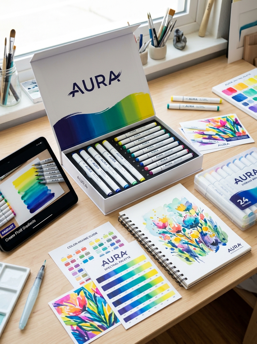
Effective packaging for water-soluble markers transcends mere containment; it serves as a critical bridge between artistic potential and consumer intent. To master the aesthetics and concept design of these creative tools, designers must prioritize visual clarity and sensory engagement.
Highlighting the unique properties of water-based ink through vibrant color palettes and ergonomic structures ensures the product resonates with both professional illustrators and hobbyists. By integrating functional elements with innovative storytelling, brands can elevate the user experience from the first point of contact. This exploration delves into the fundamental principles-ranging from material transparency to thematic consistency-that define high-impact marker packaging in a visual-centric retail landscape.
Defining Visual Identity for Water Soluble Art Media
The visual identity of water-soluble markers is defined by a unique hybridity, bridging the gap between precise graphic illustration and fluid watercolor painting. These tools utilize water-based pigments that reactivate upon contact with moisture, allowing artists to transform sharp, controlled strokes into soft, atmospheric gradients.
A core characteristic of this medium is the "bloom" effect, where colors bleed and blend organically across the paper. This creates a distinct aesthetic marked by vibrant saturation and translucent layering. By adjusting water ratios, creators can achieve a diverse range of textures-from crisp linework to ethereal washes. This versatility establishes a visual language of adaptability, enabling professional watercolor effects with the portability of a pen. Ultimately, their identity lies in the seamless transition from defined graphic marks to expressive, painterly depth.
Color Theory and Palette Selection in Marker Packaging
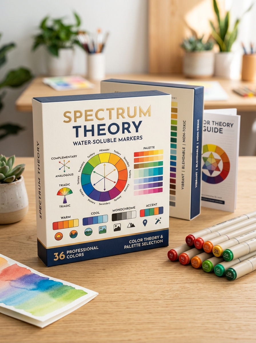
Effective water-soluble marker sets are built upon foundational color theory to enhance artistic versatility. Manufacturers strategically curate palettes using the color wheel, ensuring that each set provides a balanced mix of primary, secondary, and tertiary hues. This thoughtful selection allows for seamless blending and layering, which is critical when reactive pigments meet water.
Packaging often categorizes markers into analogous, complementary, or monochromatic schemes. This organization helps artists identify harmonious color transitions quickly. By grouping warm or cool tones together, brands simplify the process of creating professional gradients and depth. High-quality palette selection ensures that when colors are diluted, they maintain clarity rather than becoming muddy. Understanding these visual arrangements helps consumers choose the right tools for specific techniques, such as watercolor-style illustrations or hand lettering.
Balancing Minimalism with Information Hierarchy
When designing or labeling water-soluble markers, manufacturers must balance minimalism with a clear information hierarchy. Artists require immediate access to technical data-such as pigment lightfastness, nib variety, and washability-without being overwhelmed by cluttered packaging.
A strategic layout ensures that the most critical details are prioritized for the user:
- Visual Indicators: Using color-coded caps and swatches for instant identification.
- Functional Icons: Minimalist symbols representing tip styles like brush, chisel, or fine-point.
- Technical Specs: Clear typography for acid-free or non-toxic certifications.
By streamlining these elements, the design reflects the fluid nature of the medium. This approach allows professional illustrators and hobbyists to quickly evaluate blending capabilities and watercolor effects, ensuring the product is both aesthetically pleasing and functionally informative for creative workflows.
Sustainable Material Choices for Eco Conscious Artists
Choosing sustainable water-soluble markers is an essential step for reducing the environmental impact of your creative practice. Eco-conscious artists should prioritize markers featuring non-toxic, water-based inks, which eliminate the harmful volatile organic compounds (VOCs) often found in traditional solvent-based pens.
To further minimize plastic waste, look for markers constructed with barrels made from recycled plastics or renewable materials. Refillable ink systems and replaceable nibs are vital features of sustainable design, significantly extending the life of the tool and keeping disposable casings out of landfills. Many professional-grade brands now offer ethical sourcing and biodegradable packaging options. By selecting these environmentally friendly alternatives, you can achieve vibrant, blendable watercolor effects while supporting a circular economy and protecting the planet.
Ergonomic Case Design and Structural Integrity
The ergonomic case design of water-soluble markers is engineered to maximize user comfort and artistic precision. Many professional-grade markers feature triangular or hexagonal barrels, which provide a natural, non-slip grip that reduces hand fatigue during long drawing sessions. These specific shapes also offer the practical benefit of preventing markers from rolling off work surfaces.
Beyond comfort, structural integrity is crucial for preserving ink quality. High-quality casings are typically molded from durable, impact-resistant plastics like polypropylene. This robust construction protects the internal fiber core and prevents cracking. Furthermore, advanced airtight cap seals are essential to maintain the moisture levels of water-based pigments, preventing premature drying and ensuring a consistent ink flow. A well-built marker case guarantees longevity, protecting the artist's investment and ensuring reliable performance across various techniques.
The Role of Transparency and Visual Product Access
In the context of water-soluble markers, transparency is a dual-purpose feature that influences both functionality and the creative process. Visual product access, often achieved through transparent barrels or clear-window packaging, allows artists to monitor ink levels in real-time. This ensures that projects are never interrupted by an unexpected loss of pigment.
Furthermore, the transparency of the ink itself is a hallmark of high-quality water-based markers. Unlike opaque alternatives, these translucent dyes allow for layering, blending, and glazing. Visual clarity enables artists to see the paper grain and previous strokes through the ink, facilitating smooth, watercolor-like gradients.
By providing clear visual access to the product's color and volume, manufacturers empower users to make informed decisions during the artistic workflow, ensuring precise color matching and efficient tool management.
Integrating Brand Storytelling into Concept Illustrations
Integrating brand storytelling into concept illustrations using water-soluble markers transforms technical sketches into emotive narratives. These versatile tools allow designers to blend vibrant pigments with fluid washes, mirroring a brand's evolution and organic growth. By manipulating transparency and texture, artists can emphasize specific brand values-such as transparency or creativity-within a single visual frame.
Concept illustrations serve as a vital touchpoint for a brand's visual identity. Utilizing water-soluble markers adds a tactile, human element that digital mediums often lack. This approach fosters a deeper emotional connection with the audience, making the brand story feel more authentic and accessible. Whether through soft gradients or bold, defined strokes, these markers provide the expressive range needed to communicate complex brand histories and future visions effectively.
Typography Strategies for Clear Communication and Legibility
Effective typography with water-soluble markers requires a strategic balance between ink flow and structural clarity. Because these markers feature fluid, water-based pigments, selecting the right letterforms is vital for maintaining professional legibility.
- Simplified Letterforms: Opt for sans-serif or open block styles. This prevents ink bleed from obscuring delicate serifs or complex decorative strokes.
- Intentional Spacing: Increase kerning (letter-spacing) and leading. Providing extra room prevents characters from "filling in" as the ink settles into the substrate.
- Stroke Variation: Leverage the marker's nib-such as a chisel or brush tip-to establish a visual hierarchy. Use bold, thick strokes for headings and thinner, controlled lines for body text.
- Contrast: Choose high-pigment colors that offer sharp contrast against the surface to ensure readability from a distance.
These strategies ensure that charts, labels, and creative projects remain communicative and clear.
Target Audience Customization from Beginners to Professionals
Water-soluble markers serve as a versatile medium, bridging the gap between traditional drawing and watercolor painting. For beginners, these markers offer an intuitive, mess-free introduction to color theory and blending. Their forgiving nature allows novice artists to experiment with fluid effects using simple brushes or refillable water pens.
As skills evolve, intermediate hobbyists leverage the markers' layering capabilities for intricate bullet journaling and mixed-media projects. For professional artists, high-performance markers provide lightfast pigments and dual-tip precision. These professional-grade tools ensure archival quality and seamless integration with technical illustrations.
By adjusting pigment density and nib durability, manufacturers ensure that whether you are a student or a gallery artist, water-soluble markers deliver the specific control and fluidity required for every stage of the creative journey.
Enhancing the Consumer Journey Through Unboxing Innovation
In the competitive water-soluble markers market, the consumer journey begins long before the first stroke of color. Innovative packaging transforms a standard unboxing into a premium sensory experience that builds immediate brand authority. For artists and hobbyists, the transition from opening a box to creating art should be seamless and inspiring.
Strategic unboxing innovation-such as integrated swatch cards, reusable storage cases, and eco-friendly materials-adds functional value beyond the product itself. By prioritizing tactile design and organized layouts, manufacturers reduce "time-to-creativity," directly impacting customer satisfaction. Elevating this initial physical touchpoint encourages social sharing and reinforces the quality of the pigments within. Ultimately, thoughtful packaging design ensures that these markers are perceived as essential creative tools, fostering long-term brand loyalty through a superior first impression.
Leave a comment