Effective adhesive bandage packaging design bridges the critical gap between medical utility and consumer appeal. Beyond simple containment, a strategic visual identity communicates reliability and care during moments of minor injury. By applying refined aesthetic principles-including balanced typography, intuitive color coding, and minimalist graphics-manufacturers can enhance shelf presence and simplify the user's selection process.
This optimization focuses on creating a cohesive brand narrative that fosters consumer trust while ensuring essential medical information remains highly accessible. Understanding the synergy between structural integrity and graphic communication is vital for brands aiming to differentiate their first-aid solutions. A well-executed design transforms a basic healthcare commodity into a premium brand experience, reinforcing the perception of quality and safety in the medical supplies market.
The Intersection of Healthcare Aesthetics and Packaging Functionality
Modern adhesive bandages represent a vital synergy between visual design and medical utility. Healthcare aesthetics focus on building consumer trust through clean branding and inclusive options, such as diverse skin-tone palettes or kid-friendly patterns that encourage patient compliance.
However, visual appeal must align with packaging functionality. Superior medical packaging ensures sterility via tamper-evident seals and ergonomic, easy-peel tabs for rapid application during emergencies. The intersection of these elements is found in "usability design," where color-coded systems and clear typography help users instantly distinguish between waterproof, flexible fabric, or hypoallergenic materials.
By integrating professional aesthetics with high-performance protective barriers, manufacturers create first-aid solutions that are both medically effective and intuitive to use, ultimately enhancing the healing experience and consumer satisfaction.
Psychological Influence of Color Theory in Wound Care Design
Color theory significantly impacts patient perception and the healing process in wound care. Adhesive bandages are intentionally designed using specific palettes to trigger desired psychological responses. Neutral, skin-toned bandages prioritize discretion, allowing injuries to blend in and reducing social anxiety for the user.
Conversely, pediatric bandages utilize vibrant primary colors and playful patterns as a form of distraction therapy. This shifts a child's focus from pain to decoration, fostering a positive association with recovery. In professional environments, high-visibility blue is standard for the food industry to ensure safety, while white evokes feelings of sterility and cleanliness. By leveraging color psychology, manufacturers can improve patient compliance, reduce the stigma of visible injuries, and enhance the overall emotional well-being of the individual during the recovery process.
Typography and Information Hierarchy for Consumer Clarity
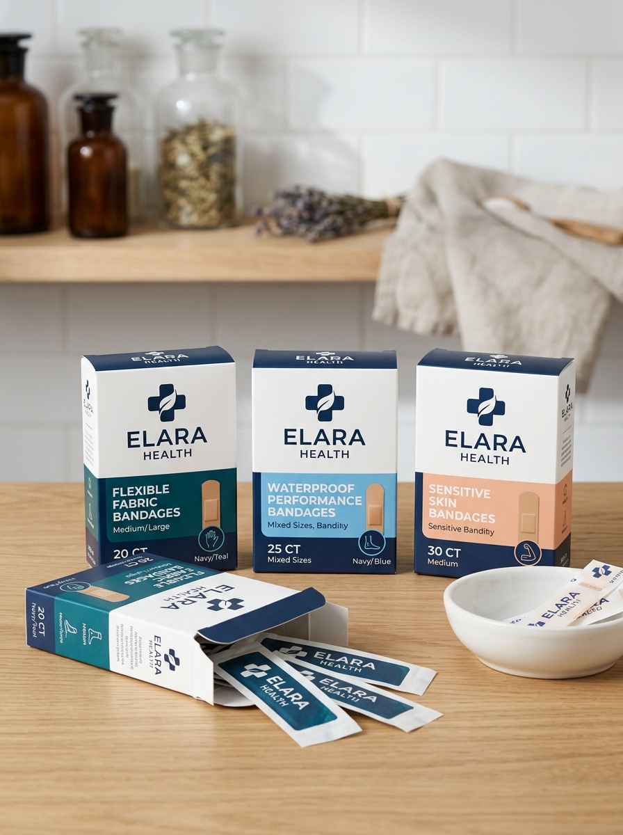
Effective packaging for adhesive bandages relies on a strategic information hierarchy to ensure rapid identification during minor medical emergencies. Typography plays a critical role; bold, high-contrast sans-serif typefaces are typically utilized for maximum legibility under stress.
To optimize consumer clarity, data is organized into three primary levels:
- Primary Level: Large headers define the material type, such as "Flexible Fabric" or "Waterproof."
- Secondary Level: Bandage dimensions (e.g., 1" x 3") and specific features like "Latex-Free" are highlighted for quick scanning.
- Tertiary Level: Quantity counts and detailed instructions are placed in a supporting visual tier.
By utilizing consistent font weights and 1:1 scale visual icons, manufacturers reduce cognitive load. This structured approach allows users to select the correct protective dressing with speed and confidence when treatment is most urgent.
Establishing Brand Authority Through Consistent Visual Identity
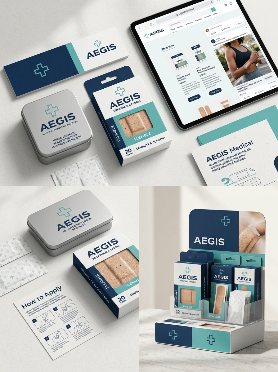
In the competitive medical supply market, adhesive bandages must convey immediate reliability. Establishing brand authority begins with a consistent visual identity that fosters consumer trust and professional recognition. A cohesive design language-utilizing uniform color palettes, distinctive logos, and clear typography-signals high manufacturing standards and safety.
When packaging remains consistent across various product lines, such as waterproof, fabric, or sensitive skin strips, it reinforces brand recall. Consumers facing minor injuries often reach for familiar labels they perceive as "medical-grade." By maintaining visual continuity across retail shelves and digital storefronts, manufacturers differentiate their first-aid products from generic alternatives. Ultimately, a strong visual strategy ensures that a brand remains the preferred choice for effective wound care and infection prevention.
Balancing Clinical Professionalism with Approachable Graphic Elements
In the adhesive bandage market, visual identity must bridge the gap between medical efficacy and consumer comfort. Clinical professionalism is established through structured layouts, minimalist color schemes, and clear certification symbols that signal sterile, hospital-grade quality. This builds essential trust that the product will effectively protect a wound from infection.
Conversely, approachable graphic elements-such as rounded typography, vibrant accents, or empathetic iconography-soften the clinical edge. This is particularly vital for pediatric care, where intimidating medical packaging can increase patient anxiety. By harmonizing technical precision with user-friendly design, manufacturers create a product that feels both authoritative and gentle. This strategic balance ensures that while the bandage is perceived as a serious healthcare tool, it remains an accessible, everyday essential for any home first-aid kit.
The Role of Materiality and Sustainable Texture in Brand Perception
In the modern first-aid market, the materiality of adhesive bandages is a critical driver of brand identity. As consumers shift away from traditional plastics, the integration of sustainable textures-such as organic bamboo, charcoal-infused fibers, and biodegradable cotton-has become essential. These materials do more than provide clinical protection; they communicate a brand's commitment to environmental responsibility and skin health.
The tactile experience of a premium, eco-friendly substrate improves brand perception by signaling quality and innovation. Bandages that offer a breathable, cloth-like feel over a synthetic "plastic" finish are often perceived as more hypoallergenic and superior for wound healing. By prioritizing sustainable materiality, manufacturers align their products with the values of conscious consumers, transforming a simple commodity into a high-trust wellness essential.
Strategic Use of Minimalist Imagery and Product Visualization
In the medical supplies market, adhesive bandages leverage minimalist imagery to communicate hygiene, safety, and clinical precision. By utilizing clean product visualization, brands focus on the essential features of wound care, such as breathability, material flexibility, and 360-degree seals. This minimalist approach removes visual clutter, allowing consumers to immediately grasp the product's technical advantages.
High-fidelity 3D renders and macro photography showcase the intricate texture of hypoallergenic adhesives and the non-stick properties of absorbent pads. This visual clarity builds consumer trust by highlighting how the bandage integrates with various skin tones for "invisible protection." Strategically simplified graphics guide users toward selecting the correct size and shape, ensuring that first-aid solutions are both aesthetically professional and functionally intuitive for rapid healing.
Adapting Design Language for Diverse Age Demographics
Adhesive bandage design transcends mere functionality, employing specific visual and structural languages to meet age-related needs. For pediatric care, manufacturers utilize vibrant colors and licensed characters to provide "distraction therapy," transforming a medical necessity into a playful accessory that mitigates childhood trauma.
In contrast, adult-centric designs prioritize professional aesthetics and performance, featuring neutral skin tones and transparent films for discreet protection. For the geriatric demographic, design language shifts toward ergonomic accessibility and skin safety. This includes high-contrast packaging for better visibility, easy-to-grip tabs for those with limited dexterity, and gentle, silicone-based adhesives formulated for fragile, thinning skin.
By tailoring material flexibility, adhesive strength, and visual cues, bandage manufacturers ensure that wound care remains both functional and psychologically supportive across the entire human lifespan.
Structural Innovation and the Ergonomics of Medical Packaging
Modern adhesive bandages have evolved through structural innovations that prioritize both sterile integrity and user accessibility. The ergonomics of medical packaging are essential for ensuring that dressings can be applied quickly and safely, even in high-stress situations or with limited dexterity.
Key advancements in packaging design include:
- Easy-Peel Technology: Intuitive pull-tabs and wrapper geometry allow for one-handed opening, minimizing the risk of accidental contamination.
- Barrier Integrity: Advanced medical-grade films provide a moisture-resistant environment that preserves adhesive longevity and sterility.
- Application Flow: Optimized folding sequences ensure the absorbent wound pad remains untouched until it is secured.
These ergonomic refinements bridge the gap between clinical efficacy and practical first-aid, ensuring wound care products are efficient, hygienic, and accessible for all users.
Future Trends in Digitally Integrated Bandage Identity Systems
The evolution of wound care is pivoting toward smart technology. Digitally integrated bandage identity systems utilize embedded NFC tags, RFID sensors, and QR codes to transform traditional adhesive strips into advanced diagnostic tools.
Future trends emphasize biosensor integration to monitor physiological markers such as pH levels, moisture, and temperature. By transmitting real-time data to mobile applications, these systems facilitate precision monitoring of chronic wounds and early detection of infection. Additionally, automated alerts notify caregivers when a dressing change is required, improving clinical outcomes.
Furthermore, blockchain-backed identity tracking ensures supply chain integrity and authenticates medical products. As telehealth expands, these smart bandages serve as critical components in remote patient monitoring, offering a seamless bridge between physical dressings and digital health records for personalized wound management.
Leave a comment