
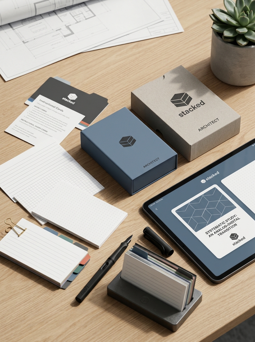
Elevating index card packaging requires a sophisticated blend of structural integrity and visual storytelling. While often viewed as a basic utility, the presentation of organizational tools significantly influences consumer perception and brand value. By prioritizing premium materials and minimalist aesthetics, designers can transform standard containers into tactile experiences that resonate with both professionals and creative enthusiasts.
This guide explores essential packaging design concepts and aesthetic guidelines, focusing on sustainable material selection, ergonomic structural engineering, and modern finishing techniques. Discover how deliberate color palettes, innovative closure mechanisms, and refined typography converge to create a product that is as durable as it is visually compelling. Mastering these elements ensures your stationery packaging stands out through functional elegance and superior craftsmanship.
Defining the Modern Index Card Aesthetic
The modern index card aesthetic marks a shift from utilitarian office supplies to premium analog productivity tools. This design language prioritizes minimalism and high-tactile quality. Key characteristics include the use of heavyweight, fountain-pen-friendly cardstock with high GSM ratings to ensure durability and prevent ink feathering.
Visually, the modern aesthetic favors clean layouts, often replacing traditional bold rulings with subtle dot grids, light-gray lines, or expansive blank space. Color palettes have evolved from basic neon assortments to sophisticated muted tones and crisp architectural whites.
This evolution caters to practitioners of the Zettelkasten method and creative thinkers who value a "less is more" philosophy. By blending functional durability with a refined visual appeal, the modern index card serves as a versatile medium for intentional, screen-free knowledge management and archival-quality note-taking.
Material Innovation and Sustainable Substrates
The evolution of index cards focuses on balancing durability with environmental responsibility. Manufacturers are shifting from traditional virgin wood pulp to sustainable substrates that reduce ecological footprints without compromising structural integrity.
Key innovations in material science for stationery include:
- Recycled Post-Consumer Fiber: Utilizing high-percentage recycled content to minimize deforestation and energy consumption.
- Alternative Grass Fibers: Incorporating fast-growing, renewable resources like bamboo or sugarcane bagasse.
- Stone Paper: A tree-free substrate made from calcium carbonate, providing waterproof and tear-resistant properties.
- FSC-Certified Stocks: Ensuring raw materials originate from responsibly managed forests.
These eco-friendly index cards often feature acid-free chemistry and soy-based inks, ensuring archival longevity and biodegradability. By adopting these material advancements, users achieve organized workflows while supporting a circular economy.
Typography and Hierarchical Brand Identity
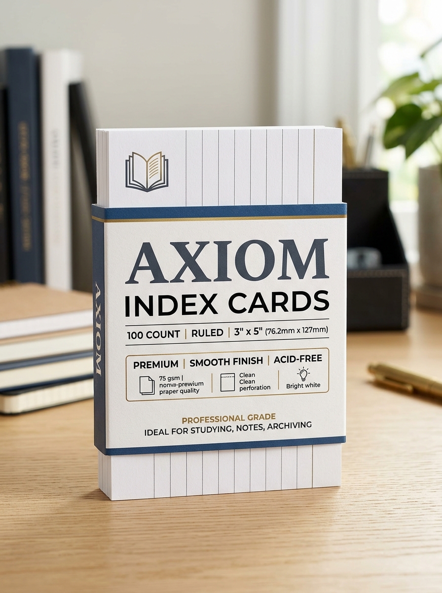
In the context of index card design, typography serves as the foundation for a structured brand identity. Establishing a clear visual hierarchy is essential for small-format media, ensuring that the most critical information is immediately accessible. By strategically varying font weights, sizes, and line heights, brands can direct the viewer's attention to primary headings or essential data points.
A cohesive typographic system reinforces brand recognition and professionalism. Utilizing clean, high-legibility typefaces improves scanability, which is vital for the functional nature of index cards. Whether used for internal organization or client-facing collateral, maintaining hierarchical consistency ensures that messaging remains organized and authoritative, effectively turning a simple card into a powerful brand touchpoint.
Strategic Color Palettes for Functional Categorization
Implementing a strategic color palette transforms standard index cards into a powerful visual retrieval system. Functional categorization uses color-coding to group related information, significantly reducing the cognitive load required to locate specific data within a dense deck.
- Subject Differentiation: Assign distinct hues to separate academic subjects, project themes, or departments.
- Priority Status: Utilize high-contrast colors like red for urgent deadlines and cool blues for long-term reference.
- Data Hierarchy: Organize primary concepts on neon-colored cards and supporting details on subtle pastel shades.
This systematic approach leverages the brain's rapid visual processing capabilities. By creating an intuitive "at-a-glance" structure, users can navigate large volumes of information more efficiently, making colored index cards essential for effective study habits, research, and project management.
Structural Integrity and Durable Housing Solutions
The structural integrity of index cards is defined by their weight and fiber density. High-quality cards, typically measured in points or GSM (grams per square meter), are engineered to resist curling, fraying, and tearing during frequent handling. This physical resilience ensures that vital information remains legible and the cards remain compatible with mechanical sorting systems.
For long-term preservation, durable housing solutions are essential. Utilizing archival-grade storage, such as acid-free flip-top boxes, heavy-duty polypropylene cases, or reinforced metal cabinets, protects cardstock from environmental degradation. These protective enclosures mitigate risks from moisture, dust, and UV exposure. By combining robust card construction with professional-grade housing, users ensure the organizational longevity and physical stability of their analog data systems.
Tactile Enhancements and Premium Special Finishes
Modern index cards transcend basic utility through sophisticated tactile enhancements and premium finishes. Manufacturers now incorporate specialized textures such as linen weaves, soft-touch lamination, and embossed borders to provide a superior sensory experience. These finishes do more than improve aesthetics; they enhance durability and provide a better grip during high-stakes presentations.
Premium options often include spot UV coating for highlighting specific sections or matte aqueous finishes to reduce glare and prevent fingerprint smudges. By utilizing high-GSM cardstock with these specialty treatments, index cards become professional-grade tools suitable for executive summaries, archival cataloging, and high-end flashcards. These tactile upgrades ensure that your organizational tools are as resilient as they are visually striking, offering a professional edge in both academic and corporate environments.
Transparency Techniques and Visual Product Exposure
In organizational systems, transparency techniques involving index cards focus on maximizing information accessibility. By utilizing clear poly sleeves or translucent dividers, users can protect physical cards while ensuring data remains visible and scannable at a glance. This method reduces the need for constant handling, preserving the longevity of the cards.
Visual product exposure applies these principles to retail or inventory management. Index cards serve as high-visibility labels that highlight key product features, pricing, or specifications. When strategically placed within clear displays, they create a professional presentation that facilitates rapid information retrieval. By prioritizing visual clarity through bold typography and clean layouts, index cards become powerful tools for enhancing product discovery and streamlining organizational workflows.
Minimalist Layouts for Professional Market Appeal
Minimalist index card layouts prioritize functional clarity and aesthetic sophistication to meet the demands of modern professionals. By stripping away non-essential design elements, these cards leverage white space to reduce cognitive load, allowing users to focus entirely on their content. High-end professional cards often feature subtle dot grids or light-grey rulings that provide structure without visual clutter.
Key attributes of minimalist layouts include:
- Premium Stock: Heavyweight paper that prevents ink bleed-through and ensures durability.
- Understated Typography: Clean, sans-serif fonts that enhance readability and professional presentation.
- Versatile Formatting: Adaptable designs that accommodate both structured project management and freeform creative ideation.
This streamlined approach appeals to executives and designers who value efficiency, organization, and a distraction-free environment for their physical data management tools.
Ergonomic Considerations for Accessibility and Storage
Optimizing index card systems requires a balance between physical handling and efficient retrieval. From an ergonomic standpoint, standard sizes like 3x5 and 4x6 inches are ideal for tactile manipulation and manual sorting. To enhance accessibility, users should implement color-coded dividers and high-contrast ink to improve legibility and reduce cognitive load during search tasks.
Effective storage solutions, such as tiered filing boxes or rotary card files, ensure cards remain upright and visible. Proper spacing within containers is crucial; overcrowded boxes can cause physical strain or damage cards during browsing. By prioritizing a "fingertip-ready" layout, these analog tools remain highly accessible for individuals with varying motor skills, ensuring that data management is both sustainable and physically intuitive for long-term use.
The Unboxing Experience as a Brand Extension
For premium index cards, the unboxing experience transforms a basic commodity into a sophisticated professional tool. High-quality packaging serves as a physical brand extension, signaling durability and craftsmanship before the user even touches the paper. When a customer opens a rigid, well-designed box, the tactile sensation of heavy-weight stock and precision-cut edges reinforces a commitment to quality.
Strategic packaging often incorporates functional elements, such as reusable storage cases or integrated dividers, which provide long-term utility. By treating index cards as essential stationery rather than disposable office supplies, brands foster an emotional connection with writers and organizers. This attention to detail ensures that the initial interaction reflects the organizational clarity and creative potential the product is designed to facilitate.
Leave a comment