Beyond mere protection, ballpoint pen packaging serves as a critical touchpoint between brand identity and consumer perception. In a marketplace saturated with writing instruments, the strategic integration of aesthetic principles and visual concepts is essential for achieving meaningful product differentiation.
Optimizing packaging design requires a sophisticated blend of color theory, typography, and tactile finishes to elevate a standard tool into a premium experience. By focusing on minimalist geometry and ergonomic visual cues, designers can enhance shelf appeal while communicating a brand's core values. This exploration delves into the structural and artistic frameworks that transform functional containers into powerful marketing assets, ensuring every pen makes a lasting first impression on the modern writer.
The Role of Packaging in Modern Stationery Market Positioning
In the competitive ballpoint pen industry, packaging serves as a critical differentiator for brand positioning. Beyond merely protecting the writing instrument, strategic packaging communicates perceived value and quality. For premium ballpoint pens, high-end boxes and minimalist aesthetics elevate the product to a luxury gift status, justifying higher price points.
Conversely, the use of sustainable, plastic-free materials signals environmental responsibility, appealing to the growing demographic of eco-conscious consumers. Modern stationery brands leverage visual storytelling through unique typography and color palettes to establish a distinct identity on crowded retail shelves. By aligning structural design with consumer psychology, packaging transforms a functional ballpoint pen into a lifestyle accessory. This tactile unboxing experience is essential for fostering brand loyalty and securing a competitive edge in the global stationery market.
Defining Visual Identity Through Ballpoint Pen Brand Narratives
A brand's narrative is fundamental in shaping the visual identity of ballpoint pens. By weaving stories of precision engineering and timeless heritage, manufacturers transform a simple writing instrument into a symbol of professional status or creative expression.
Design elements such as ergonomic silhouettes, premium material choices-ranging from sleek aerospace-grade metals to classic resins-and signature clip styles serve as vital visual touchpoints. Whether a narrative emphasizes rugged reliability for everyday utility or artisanal craftsmanship for luxury gifting, these stories guide the aesthetic evolution of the product.
Ultimately, effective brand storytelling ensures that a ballpoint pen is perceived as a reliable extension of the user's personal style. This strategic alignment between brand narrative and physical design fosters long-term consumer loyalty and distinct market differentiation.
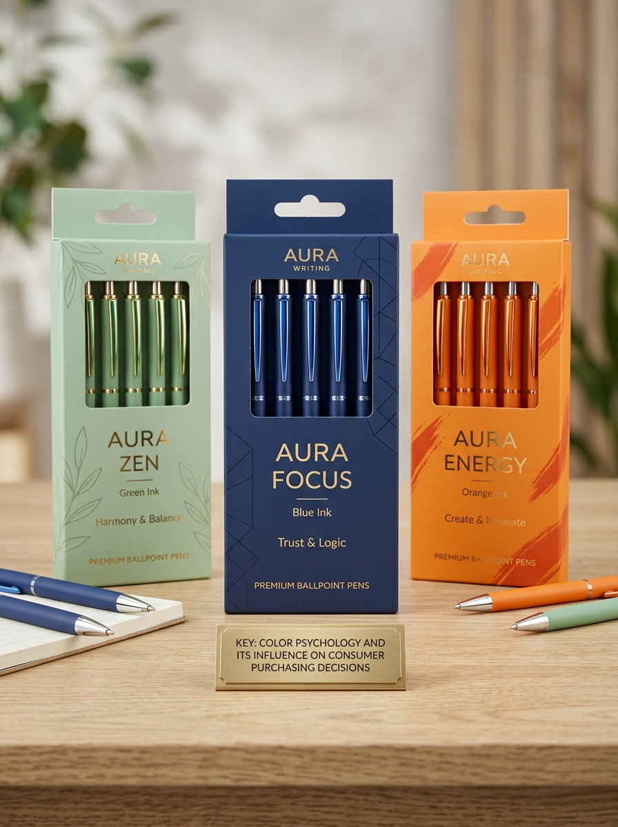
Color Psychology and Its Influence on Consumer Purchasing Decisions
Color psychology plays a pivotal role in how consumers select ballpoint pens, as visual stimuli trigger immediate emotional associations. The color of a pen's barrel and its ink can dictate its perceived utility and value. For example, blue ballpoint pens are often associated with trust, logic, and professional reliability, making them the preferred choice for official documentation.
In contrast, vibrant colors like red or neon green evoke creativity and urgency, appealing to students and artists. Luxury writing instruments frequently employ metallic finishes or deep matte blacks to signify authority, sophistication, and status. By strategically selecting palettes, manufacturers influence purchasing behavior, transforming a simple writing tool into a reflection of the user's personality or professional identity. Understanding these psychological cues is essential for brands looking to capture specific market segments.
Material Selection as a Foundation for Brand Perception
In the ballpoint pen industry, material selection is a primary driver of brand identity and consumer value. The choice of casing materials-ranging from high-grade stainless steel and brass to lightweight ABS plastics-directly informs a user's tactile experience and perceived quality. Premium brands often utilize heavy-duty alloys or lacquered finishes to communicate luxury, durability, and professional prestige.
Conversely, brands focused on accessibility or environmental impact may prioritize recycled polymers or biodegradable materials to align with sustainability goals. The weight, balance, and surface texture provided by these materials serve as a non-verbal language that defines a product's market position. By strategically selecting components, manufacturers ensure the physical pen reflects their broader brand narrative, whether it targets the executive boardroom or the mass-market consumer.
Typography Strategies for Enhanced Legibility and Professionalism
In the context of ballpoint pens, typography refers to the manual execution of letterforms. Achieving a professional aesthetic requires mastering the specific delivery system of oil-based ink. Unlike liquid ink pens, ballpoints demand consistent pressure to ensure stroke uniformity and avoid skipping.
To enhance legibility, writers should implement the following strategies:
- Baseline Discipline: Maintaining a straight horizontal alignment mirrors digital typesetting and projects authority.
- Spatial Kerning: Increasing the white space between characters prevents the thick ink from blurring together.
- Angle Optimization: Holding the pen at a 45 to 60-degree angle minimizes "gooping" and promotes clean, sharp lines.
By selecting a medium 1.0mm tip for bold strokes or a fine 0.5mm tip for detailed notations, users can tailor their handwriting typography to suit professional documentation and formal correspondence.
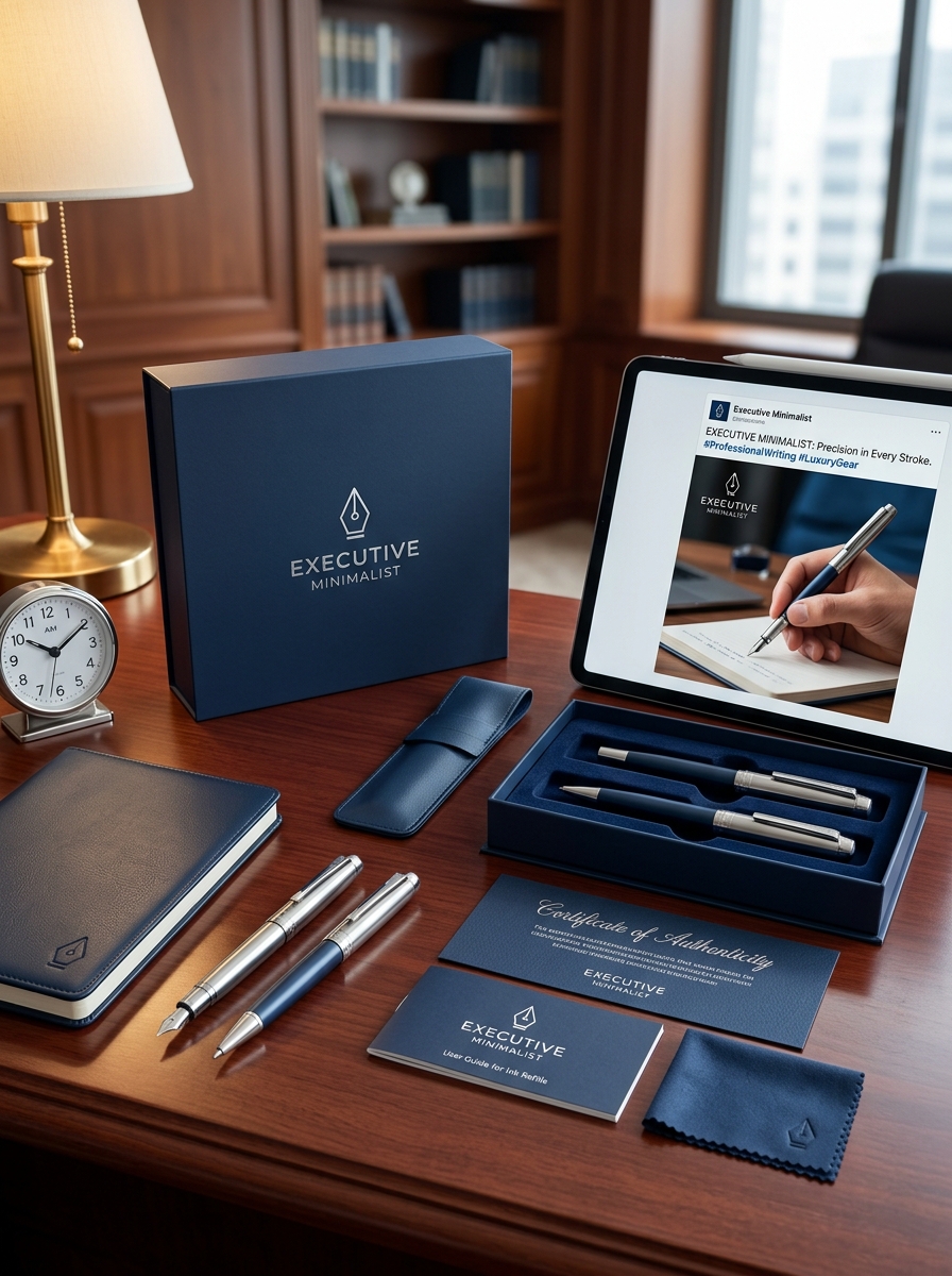
Balancing Functional Protection with Aesthetic Unboxing Experiences
In the competitive ballpoint pen market, packaging serves a dual purpose: safeguarding delicate internal ink delivery systems and creating a memorable brand moment. Effective functional protection involves rigid outer shells and precision-cut foam inserts that prevent tip damage, ink leakage, or barrel scratches during transit.
Simultaneously, the aesthetic unboxing experience transforms a simple stationery purchase into a luxury event. By utilizing premium textured papers, magnetic closures, and minimalist layouts, manufacturers highlight the pen's sleek contours and ergonomic design. This synergy between durable housing and visual storytelling ensures the product arrives in pristine condition while building emotional resonance with the consumer. Striking this balance is essential for brands looking to differentiate high-quality writing instruments through tactile and visual sophistication.
Leveraging Transparency and Die-Cut Windows for Product Visibility
In the competitive stationery market, ballpoint pen packaging must prioritize visual communication. Utilizing transparent materials and precision die-cut windows significantly enhances shelf appeal and product visibility. These design features allow consumers to verify ink colors, barrel aesthetics, and ergonomic grip textures instantly.
By showcasing the physical pen, brands build immediate consumer trust and reduce purchase uncertainty. Die-cut windows are particularly effective for highlighting premium finishes or specialized click mechanisms, inviting a tactile connection without compromising package integrity. For high-quality ballpoint pens, this transparency serves as a silent salesperson, emphasizing engineering quality and sleek design.
Strategically placed cut-outs ensure that unique selling points-such as ink level indicators or metallic accents-are front and center, ultimately driving higher conversion rates in busy retail environments.
Information Hierarchy and Technical Specification Placement
Effective digital presentation for ballpoint pens requires a logical information hierarchy that prioritizes user intent. Primary details-such as brand, ink type (oil-based vs. hybrid), and point size (e.g., 0.7mm)-should occupy the highest visual level to ensure immediate product identification.
Technical specifications are most effective when placed below the primary marketing copy. Utilizing structured formats like definition lists or tables enhances scannability and SEO. Key data points to include in these lower-tier sections are:
- Refill Compatibility: Standard G2 or proprietary formats.
- Barrel Material: High-grade polymers, stainless steel, or aluminum.
- Mechanism Type: Retractable (click) vs. capped designs.
- Ergonomics: Grip diameter and weight distribution metrics.
This strategic placement ensures that technical enthusiasts find necessary data without obstructing the general consumer's experience.
Integrating Sustainability and Eco-Friendly Material Trends
The ballpoint pen industry is undergoing a significant transformation by prioritizing sustainability and circular design. Manufacturers are increasingly moving away from virgin plastics, instead utilizing recycled polymers, biodegradable bio-plastics, and renewable resources like bamboo or FSC-certified wood.
A major trend focuses on refillable systems and high-capacity ink cartridges, which drastically reduce single-use plastic waste and lower the carbon footprint of writing instruments. By combining eco-friendly materials with durable construction, brands are meeting the rising consumer demand for environmentally conscious stationery. These advancements ensure that high-quality writing performance is maintained while supporting global efforts to minimize landfill contributions and promote resource efficiency within the office supplies sector.
Elevating Brand Authority Through Premium Finishing Techniques
In the competitive stationery landscape, high-quality finishes transform a standard ballpoint pen into a powerful symbol of professional prestige. Utilizing advanced finishing techniques allows companies to communicate brand authority and a commitment to excellence.
Key premium treatments include:
- Laser Engraving: Provides a permanent, high-precision mark that outlasts traditional printing.
- PVD Coating: Offers superior durability and a sophisticated, modern metallic aesthetic.
- Soft-Touch Lacquering: Enhances the tactile experience, providing a luxurious, velvet-like grip.
- Electroplating: Incorporates precious metal accents, such as gold or chrome, for an executive feel.
By selecting these sophisticated surface applications, brands elevate the perceived value of their writing instruments, ensuring a lasting impression of reliability and luxury with every stroke.
Leave a comment