St. Patrick's Day packaging design offers a vibrant opportunity for brands to connect with consumers through seasonal storytelling. Beyond the standard shamrock, effective holiday branding requires a thoughtful approach to aesthetic concepts that evoke the spirit of the Emerald Isle.
To elevate your product's shelf appeal, it is essential to master specific visual tips, such as balancing a rich green color palette with sophisticated gold foils and heritage-inspired typography. Integrating traditional Irish motifs with modern design principles allows a brand to create a cohesive and festive identity. By focusing on high-quality textures and culturally resonant imagery, businesses can craft limited-edition packaging that drives engagement and celebrates this global occasion with authenticity and style.
The Evolution of St. Patrick's Day Visual Branding
St. Patrick's Day visual branding has transitioned from somber religious roots to a vibrant, global commercial identity. Originally, the holiday was associated with St. Patrick's Blue; however, the color palette shifted to green during the 18th century to reflect Irish nationalism and the "Emerald Isle."
The iconography has also expanded significantly. The shamrock, once a symbol of the Holy Trinity, is now a universal logo for Irish heritage. Modern branding incorporates playful elements like leprechauns and pots of gold, largely influenced by 20th-century American marketing. Today, visual identity focuses on "greening" initiatives and digital engagement. From traditional Celtic typography to sleek, minimalist motifs used by global beverage brands, the evolution reflects a balance between honoring cultural heritage and driving mass-market appeal in a digital-first world.
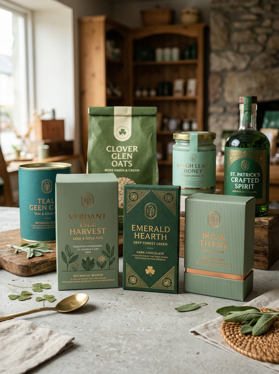
Exploring Green Color Palettes Beyond Emerald
While emerald is the iconic hallmark of St. Patrick's Day, diversifying your color scheme can breathe new life into holiday visuals. Moving beyond a single traditional shade allows for more sophisticated, modern, and nature-inspired aesthetics.
- Sage and Moss: These muted, earthy tones reflect the rugged Irish countryside, offering a calm and organic atmosphere.
- Mint and Seafoam: Brighter, cooler pastels provide a fresh, contemporary take on spring festivities and digital branding.
- Forest and Juniper: Deep, moody greens add a layer of luxury and timeless elegance to seasonal decor.
- Chartreuse and Lime: For high-energy designs, these vibrant, yellow-leaning greens create a playful and bold impact.
By experimenting with these varied green palettes, you can honor the spirit of the Emerald Isle while maintaining a unique, professionally curated look that stands out from the crowd.
Incorporating Celtic Knots and Traditional Iconography
Integrating Celtic knots and traditional iconography into St. Patrick's Day celebrations offers a profound connection to Irish heritage. The Celtic knot, characterized by its interlacing paths with no visible beginning or end, symbolizes eternity and the interconnectedness of life and spirituality. These intricate designs are hallmarks of authentic Gaelic craftsmanship.
In addition to knots, icons like the shamrock-historically used to explain the Holy Trinity-and the Brian Boru harp serve as powerful national symbols. Incorporating the Celtic cross or Claddagh motifs further enriches the visual narrative of the holiday. By utilizing these meaningful symbols in decorations, apparel, or digital media, you honor centuries of Irish folklore and history, transforming modern festivities into a respectful tribute to cultural identity and ancient tradition.
Typography Trends for Authentic Irish Design
Achieving an authentic St. Patrick's Day aesthetic requires a strategic balance between historical reverence and modern clarity. Insular scripts and Uncial fonts, inspired by the Book of Kells, remain the gold standard for traditional Irish branding. These typefaces evoke a sense of heritage and ancient craftsmanship through their unique, rounded calligraphic forms.
Current trends favor pairing these ornate, traditional styles with minimalist sans-serif typefaces to ensure legibility across digital platforms. Designers are also utilizing slab serifs with subtle Celtic knotwork motifs to add texture without visual clutter. To elevate the design, high-contrast typography in deep forest greens and metallic golds is preferred over neon palettes. By integrating these specific typographic elements, creators can ensure their Irish-themed projects feel culturally resonant, sophisticated, and professionally polished.
Using Texture and Foil to Mimic Gold Accents
To capture the festive spirit of St. Patrick's Day, incorporating realistic gold accents is essential for representing the legendary pot of gold. Using metallic foils and textured finishes adds physical depth and a premium feel to holiday crafts, invitations, and home decor.
Gold leaf application creates an authentic, weathered shimmer on shamrocks or leprechaun hats, while embossing powders provide a tactile, raised surface that catches the light. For digital designs, layering "noise" textures and metallic gradients can simulate the glint of real bullion. By combining these techniques, you can elevate standard green motifs with the opulent glow of Irish folklore, ensuring your St. Paddy's Day projects shine with sophisticated, multi-dimensional golden highlights.
Balancing Modern Minimalism with Folklore Elements
Achieving a sophisticated St. Patrick's Day aesthetic involves harmonizing sleek, modern minimalism with traditional Irish folklore. Rather than relying on cluttered decorations, focus on a refined color palette featuring deep emerald, sage, and crisp white.
Integrate symbolic elements like shamrocks or Celtic knots through subtle textures and clean-lined geometry. A singular brass accent can thoughtfully represent the legendary "pot of gold" without disrupting a minimalist layout. By favoring natural materials like linen and light wood, you ground the whimsical aspects of leprechaun lore in contemporary design. This balanced approach honors cultural heritage while maintaining a spacious, curated feel, proving that festive celebrations can be both meaningful and understated.
Sustainability Considerations for Seasonal Packaging
During St. Patrick's Day celebrations, the demand for themed products often leads to an increase in single-use plastic and non-recyclable waste. To minimize environmental impact, brands should prioritize eco-friendly seasonal packaging solutions. This includes utilizing FSC-certified paper, biodegradable materials, and soy-based inks that facilitate easier recycling processes.
Designers should focus on circular economy principles by avoiding mixed-material laminates that are difficult to process in standard waste streams. Opting for minimalist designs reduces raw material consumption while maintaining festive appeal. By implementing sustainable packaging, businesses can honor Irish heritage responsibly. Choosing compostable or reusable containers ensures your holiday promotions are truly "green," enhancing brand reputation among environmentally conscious consumers and reducing the carbon footprint of seasonal retail trends.
Visual Storytelling Through Festive Illustrations
Visual storytelling during St. Patrick's Day utilizes vibrant illustrations to bridge the gap between ancient Irish folklore and modern celebrations. By incorporating iconic symbols such as shamrocks, leprechauns, and pots of gold, designers craft a narrative that resonates with themes of luck, heritage, and community.
These festive graphics are essential for digital marketing and social media engagement. High-quality St. Patrick's Day illustrations leverage a palette of emerald greens and shimmering gold to evoke immediate cultural recognition. Through detailed Celtic knots and whimsical character designs, visual artists communicate the "Spirit of the Emerald Isle" effectively, creating an immersive experience that goes beyond simple decoration to tell a meaningful story of celebration and tradition.
Strategic Placement of Interactive Packaging Features
To capitalize on the festive spirit of St. Patrick's Day, brands must strategically position interactive elements to maximize consumer engagement. Placing QR codes or AR markers near high-visibility festive motifs, such as shamrocks or "pot of gold" illustrations, ensures they catch the shopper's eye immediately.
Effective placement strategies include:
- Front-of-Pack Access: Position scannable "luck-of-the-Irish" games on the primary display panel for instant shelf-side interaction.
- Hidden Rewards: Utilize peel-and-reveal tabs on the base or interior to simulate a treasure hunt experience.
- Social Integration: Place custom hashtags and handles near the opening flap to encourage unboxing shares.
By optimizing these touchpoints, marketers transform seasonal packaging into a digital gateway, driving brand loyalty and social media buzz throughout the holiday celebrations.
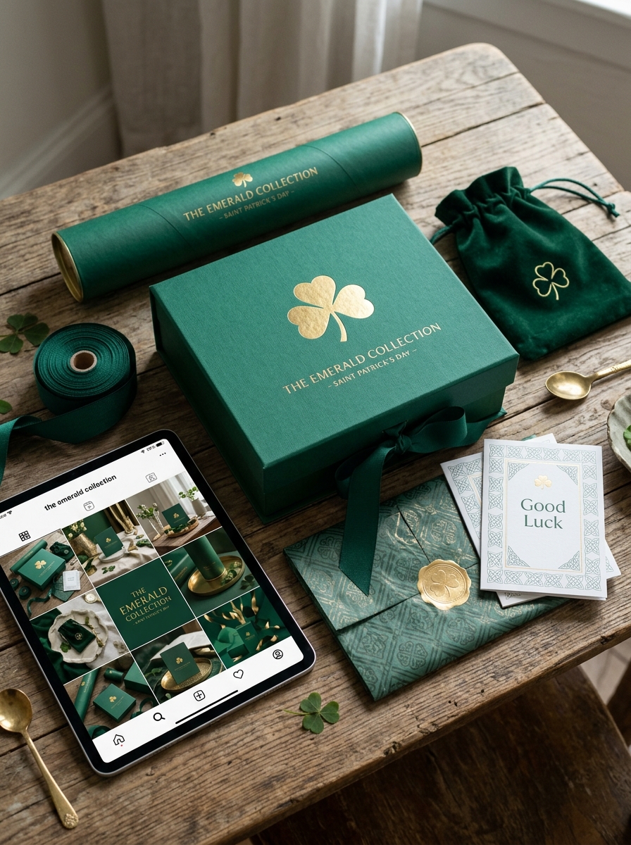
Designing for High Shelf Impact and Unboxing Experiences
Creating effective St. Patrick's Day packaging requires a strategic blend of vibrant aesthetics and tactile engagement. To achieve maximum shelf impact, designers should leverage a palette of emerald greens and metallic gold foils that resonate with the holiday's festive spirit. Incorporating thematic elements like embossed shamrocks or Celtic motifs ensures the product captures consumer attention in a crowded retail environment.
The consumer journey culminates in the unboxing experience. Brands can elevate this moment by using:
- Themed internal printing and brand storytelling.
- Custom structural inserts for a premium, secure feel.
- Sustainable materials that reflect modern consumer values.
By focusing on these multi-sensory details, brands foster an emotional connection that encourages social sharing and builds seasonal loyalty through a memorable "luck of the Irish" experience.
Leave a comment