
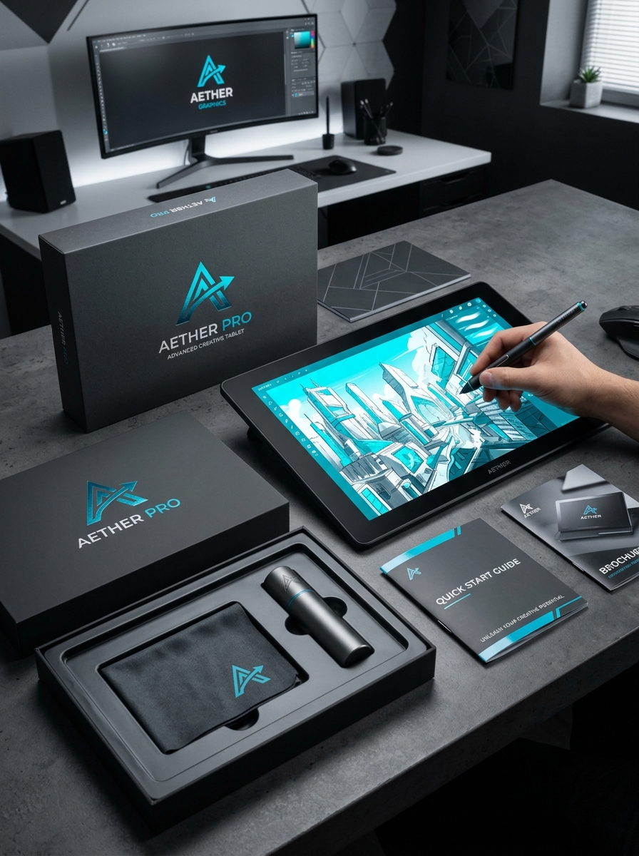
Graphic tablet packaging serves as the definitive first impression for digital creators, acting as a vital bridge between high-tech hardware and artistic potential. To capture the attention of a discerning audience, designers must prioritize a harmonious balance between tactile quality and visual storytelling. The unboxing ritual should reflect the precision of the stylus and tablet within, utilizing minimalist aesthetics and structural ingenuity to inspire the user from the moment of contact.
Mastering the essential principles of this niche involves more than surface-level graphics. It requires a deep integration of functional ergonomics, sustainable material selection, and conceptual alignment with the creative workflow. By focusing on these core pillars, manufacturers can transform a standard retail container into a premium asset that resonates with the professional artist's lifestyle and elevates the perceived value of the technology inside.
The Role of Packaging in the Digital Creative Ecosystem
In the graphic tablet industry, packaging is far more than a logistical necessity; it is a vital component of the hardware lifecycle. For professional digitizers and pressure-sensitive stylus pens, specialized packaging ensures structural integrity, protecting delicate internal sensors from electrostatic discharge and physical impact during transit.
Beyond protection, the packaging contributes to the unboxing experience, which builds brand loyalty among digital artists. Modern manufacturers now prioritize eco-friendly materials and sustainable designs to reduce the carbon footprint within the creative tech ecosystem. Furthermore, high-quality boxes often serve as long-term storage solutions for peripheral accessories like replacement nibs, drawing gloves, and cables. By blending functional engineering with aesthetic appeal, packaging preserves the technical precision required for high-level digital illustration and 3D modeling.
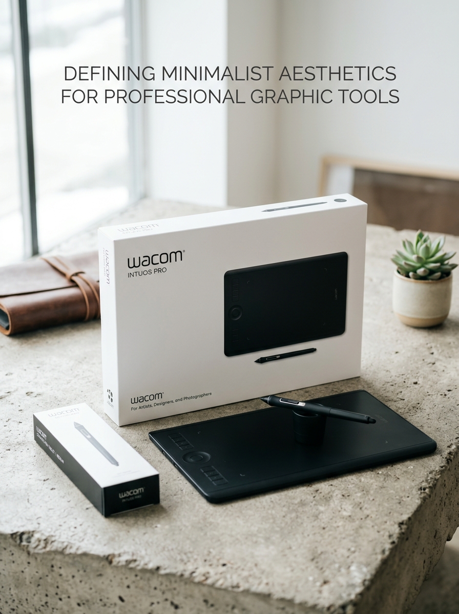
Defining Minimalist Aesthetics for Professional Graphic Tools
In the evolution of graphic tablets, minimalist aesthetics prioritize functionality over ornamentation. Professional-grade tools leverage clean lines, slim profiles, and matte finishes to eliminate visual distractions, allowing artists to maintain focus entirely on their digital workspace.
A minimalist approach integrates ergonomic design with intuitive interfaces. By reducing physical clutter-such as excessive shortcut keys or bulky bezels-manufacturers create a seamless tactile connection between the stylus and the surface. This design philosophy ensures that the hardware acts as a natural extension of the creator's hand, enhancing workflow efficiency and precision. For professionals, a minimalist tablet represents the perfect harmony of sophisticated technology and understated elegance, stripping away the unnecessary to empower the creative process and improve long-term comfort.
Psychological Impact of Color Palettes on Creative Consumers
The color palette of a graphic tablet-encompassing both its physical design and software interface-profoundly influences a creator's psychological state and productivity. For professional artists, neutral tones like charcoal, slate, or silver provide a non-distracting environment, minimizing visual fatigue and ensuring objective color perception during high-stakes editing.
Conversely, specific color accents can stimulate different cognitive responses. Cool blues often promote a sense of calm and sustained focus, ideal for technical illustration, while warmer hues can evoke passion and creative spontaneity. Understanding these psychological triggers allows manufacturers to design hardware that resonates with a user's emotional needs. Ultimately, the aesthetic choices of a tablet help creative consumers curate a workspace that enhances mood, reduces stress, and fosters a deeper connection to their digital art.
The Art of the Unboxing Experience for Tablet Hardware
For digital artists, the unboxing experience of a graphic tablet serves as the critical bridge between purchase and creation. Leading manufacturers design packaging that reflects the precision of the high-performance hardware inside. This sensory journey is engineered to build anticipation and reinforce brand value through tactile materials and thoughtful presentation.
A semantically optimized unboxing focuses on three pillars:
- Functional Layout: Logical placement of the stylus, cables, and nibs minimizes setup friction for the user.
- Device Protection: Using anti-static sleeves and recessed compartments ensures the sensitive digitizer surface remains pristine.
- Sustainable Design: Modern tablet brands increasingly utilize recyclable paper pulp and soy-based inks to align with creator values.
Ultimately, a premium unboxing transforms a peripheral into a professional investment, streamlining the transition from opening the box to the first digital brushstroke.
Structural Integrity and High-End Material Selection
Premium graphic tablets are engineered for durability and precision through meticulous material selection. High-end models typically feature a chassis constructed from aircraft-grade aluminum or magnesium alloys, providing a lightweight yet rigid frame that prevents flexing during high-pressure drawing sessions. This structural integrity ensures a stable, consistent surface essential for professional digital artistry.
The active drawing area often utilizes chemically etched anti-glare glass or specialized textured laminates. These materials are chosen for their superior scratch resistance and tactile feedback, mimicking the natural friction of pen-on-paper. Furthermore, internal components are reinforced to protect the sensitive digitizer layers from mechanical stress. By prioritizing professional-grade hardware and metallic finishes, manufacturers deliver robust devices that withstand the rigors of daily studio use while maintaining a sleek, ergonomic profile.
Visual Hierarchy and Brand Positioning on Retail Boxes
Graphic tablet packaging leverages visual hierarchy to instantly communicate value and technical capability. Manufacturers prioritize high-resolution imagery of the stylus and active drawing area, guiding the consumer's eye toward the product's tactile potential. Brand positioning is achieved through specific aesthetic choices: minimalist, matte finishes often signal professional-grade tools, while vibrant, spec-heavy layouts target hobbyists and students.
- Focal Point: Large product shots emphasize sleek industrial design and ergonomics.
- Information Layering: Key specifications, such as pressure sensitivity levels and software compatibility, are positioned for rapid scanning.
- Trust Signals: Prominent brand logos and "Pro" or "Artist" designations reinforce market authority.
Effective retail box design transforms technical hardware into an aspirational creative experience, distinguishing premium manufacturers from budget alternatives through deliberate spatial arrangement and typography.
Typography and Technical Specifications for Information Clarity
In the realm of graphic tablets, the synergy between typography and technical specifications is essential for professional precision. Clear visual communication within device interfaces and manuals ensures that artists can accurately interpret complex data such as pressure sensitivity levels and tilt recognition.
Technical clarity is maintained through standardized metrics that define hardware performance:
- LPI (Lines Per Inch): Defines the tablet's resolution and stroke detail.
- Report Rate (PPS/RPS): Measures how frequently the tablet communicates pen position to the computer, affecting lag.
- Color Accuracy: Specifications like NTSC, sRGB, or Adobe RGB coverage dictate visual fidelity.
Optimizing how these specifications are presented-using legible typefaces and structured layouts-minimizes cognitive load. For professionals, this transparency in technical documentation is vital for calibrating tools to meet specific creative industry standards.
Sustainable Design Principles in Electronic Device Packaging
Modern graphic tablets are increasingly embracing eco-friendly initiatives through sustainable packaging. Manufacturers are replacing traditional plastics with biodegradable materials and FSC-certified cardboard. Key principles include minimizing package volume to optimize shipping density, which significantly reduces the carbon footprint of global distribution.
To further enhance sustainability, brands use soy-based inks for printing and replace protective plastic sleeves with compostable alternatives. For graphic tablet components like the stylus and cables, molded paper pulp inserts offer robust protection without the environmental impact of expanded polystyrene (EPS). By prioritizing circular economy practices, the digital art industry ensures that unboxing experiences are both premium and environmentally responsible, appealing to conscious creators worldwide.
Tactile Finishes and the Sensory Connection to Artistry
In digital illustration, the physical interaction between the stylus and the tablet surface is paramount. Tactile finishes, such as matte textures and chemically etched glass, are designed to replicate the organic resistance of pen-on-paper. This deliberate friction provides essential sensory feedback, allowing artists to achieve greater precision and control over their brushstrokes.
Without a textured surface, a stylus often slides across smooth glass, leading to jittery lines and decreased accuracy. By integrating a paper-like feel, graphic tablets foster a stronger sensory connection, enhancing muscle memory and reducing hand fatigue. This tactile engagement transforms the digital medium into a more intuitive canvas, bridging the gap between traditional techniques and modern technology for a more immersive creative experience.
Future Trends in Graphic Tablet Packaging Innovation
The future of graphic tablet packaging is shifting toward sustainability and enhanced user utility. Manufacturers are increasingly adopting eco-friendly materials, such as biodegradable molded pulp and FSC-certified recycled cardboard, to minimize environmental footprints.
Key innovation trends include:
- Minimalist Design: Reducing overall box dimensions to optimize shipping efficiency and lower carbon emissions.
- Multifunctional Packaging: Designing boxes that transform into permanent tablet stands or protective carrying cases.
- Digital Integration: Replacing bulky paper manuals with QR codes that link to dynamic setup videos and driver downloads.
- Plastic-Free Inserts: Utilizing precision-cut corrugated buffers instead of traditional plastic foams.
These advancements ensure that the unboxing experience for digital artists is not only premium but also aligns with global environmental standards and circular economy principles.
Leave a comment