
In the specialized field of industrial metrology, the perceived value of a precision instrument begins the moment it is unboxed. Dial indicator packaging design represents a critical intersection of structural engineering and visual storytelling, where the primary goal is to mirror the accuracy of the tool within. Effective branding for high-precision equipment moves beyond simple protection; it utilizes aesthetic concepts that communicate reliability and technical excellence.
By prioritizing minimalist layouts, premium tactile finishes, and high-density protective inserts, manufacturers can establish a cohesive brand identity that resonates with discerning professionals. This exploration delves into how strategic design choices-from sophisticated color palettes to ergonomic casing-transform standard measuring tools into prestigious industry benchmarks. Mastering the visual language of precision tool branding ensures that excellence is communicated clearly before the first measurement is ever taken.
The Role of Visual Identity in Precision Tool Branding
In the metrology industry, the visual identity of a dial indicator is a critical hallmark of its engineering pedigree. Beyond simple aesthetics, branding encompasses the color schemes, dial face typography, and ergonomic form factors that signal precision and reliability to professionals.
A cohesive visual strategy allows manufacturers to establish instant recognition on the shop floor. Distinctive needle designs and high-contrast scales are not merely functional; they represent a brand's commitment to readability and accuracy. For engineers, a familiar visual language-such as specific color-coding for metric versus imperial units-builds trust and reduces operational errors. Ultimately, a strong visual identity transforms a standard measuring instrument into a symbol of quality, ensuring that the tool is perceived as a premium, high-performance asset in any precision manufacturing environment.
Aesthetic Principles for High Accuracy Measuring Instruments
In the design of dial indicators, aesthetics are deeply intertwined with functional ergonomics. For high-accuracy measuring instruments, visual principles prioritize clarity, reducing the risk of human error during precision inspections.
- Visual Clarity and Contrast: High-contrast faces, typically black graduations on white or yellow backgrounds, ensure immediate readability. Non-reflective, anti-glare crystals are essential for consistent viewing under various lighting conditions.
- Functional Minimalism: A clean layout removes distractions, focusing the user's attention on the pointer and scale. This "form follows function" approach minimizes cognitive load.
- Symmetry and Precision: Uniformly spaced intervals and finely tapered needles help eliminate parallax errors, reinforcing the instrument's perceived and actual reliability.
- Material Excellence: Satin chrome finishes provide a professional look while resisting corrosion and reducing distracting reflections.
Ultimately, these aesthetic choices enhance metrological performance and user confidence in precision manufacturing environments.
Structural Integrity Meets Premium Packaging Design
In the world of precision metrology, a dial indicator must possess exceptional structural integrity to ensure repeatable accuracy. Engineered with hardened stainless steel components and shock-resistant movements, these instruments are built to withstand rigorous industrial environments without compromising their delicate internal gear mechanisms.
Complementing this robust build is premium packaging design. High-end storage cases featuring custom-molded inserts provide critical protection against vibration and moisture, preserving the tool's calibration during transit. This fusion of durable engineering and sophisticated presentation not only safeguards the instrument's lifespan but also reflects the high standards required for professional machining and quality control. By prioritizing both internal strength and external security, manufacturers deliver a measuring tool that remains calibrated and ready for high-tolerance inspections.
Material Selection for Protecting Sensitive Internal Components
The precision of a dial indicator depends on the durability of its internal gears, racks, and springs. To safeguard these sensitive mechanisms, manufacturers prioritize materials that balance rigidity with wear resistance. Hardened stainless steel is typically used for the spindle and rack to prevent bending and surface degradation during repetitive measurements.
Internally, brass or bronze gears are selected for their natural lubricity and corrosion resistance, ensuring smooth transmission of motion. High-end indicators often incorporate synthetic ruby bearings at critical pivot points to eliminate friction-induced errors and minimize mechanical wear. Furthermore, the outer housing-often made from anodized aluminum or chrome-plated zinc-acts as a robust shield against impacts. To prevent the ingress of dust and coolants, nitrile rubber (Buna-N) seals are frequently employed, maintaining the instrument's metrological integrity in demanding industrial environments.
The Psychology of Color and Typography in Industrial Branding
In the realm of precision measurement, the visual identity of a dial indicator communicates reliability before a single measurement is taken. Manufacturers utilize color psychology to establish trust; deep blues signify technical stability, while high-contrast black and yellow schemes align with industrial safety standards.
Typography is equally critical for functional branding. Modern, sans-serif typefaces are prioritized for their high legibility and "clean" engineering aesthetic. Bold, geometric lettering suggests structural durability and mechanical precision, mirroring the tool's internal accuracy.
By harmonizing these design elements, brands create a professional visual language that reassures technicians of a tool's quality. This strategic use of visual communication ensures that a dial indicator's external appearance reflects its internal engineering excellence and high-stakes performance capabilities.
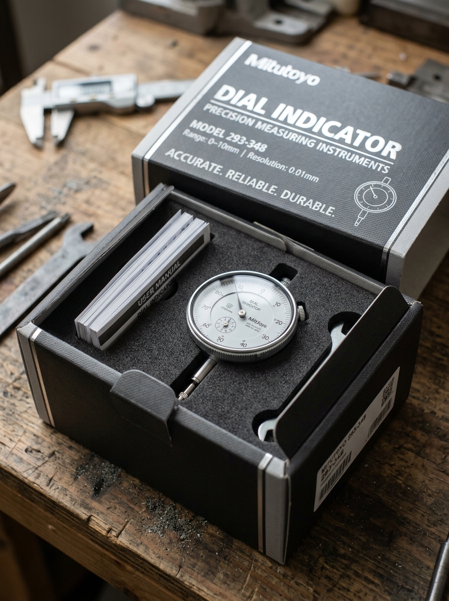
Enhancing the Unboxing Experience for Professional Machinists
For a professional machinist, unboxing a high-precision dial indicator is a critical first step in quality assurance. A premium experience begins with a rugged, custom-fitted storage case that prevents transit-related misalignment.
- Calibration Documentation: Inclusion of NIST-traceable certificates ensures immediate measurement confidence.
- Protective Packaging: High-density foam inserts safeguard the sensitive internal gears and plunger.
- Functional Accessories: Providing interchangeable contact points and mounting hardware adds immediate value.
The tactile feedback of a smooth-acting spindle and the visual clarity of the anti-glare crystal reflect the tool's engineering excellence. By focusing on these semantic details, manufacturers demonstrate a commitment to the durability and accuracy required for rigorous workshop environments, ensuring the instrument is job-ready from the moment it is opened.
Integrating Technical Specifications into Graphic Layouts
Effective graphic layouts for dial indicators must balance aesthetic clarity with precise technical data. Integrating specifications such as graduation intervals (e.g., 0.01mm), measuring range, and accuracy requires a structured visual hierarchy. Designers should utilize callouts or leader lines to link numeric values directly to physical components like the dial face, bezel, or plunger.
To optimize readability, use consistent typography for tolerance limits and mounting diameters. High-quality vector illustrations paired with indexed data tables allow users to quickly identify model variations. Key metrics-including repeatability and hysteresis-should be placed prominently near the primary product image. By strategically aligning technical specifications with visual elements, the layout becomes a functional tool for precise tool selection and calibration reference in industrial catalogs and technical manuals.
Sustainable Solutions for Durable Measurement Tool Cases
Protecting a precision dial indicator requires a robust housing that balances mechanical durability with environmental responsibility. Modern manufacturers are pivoting toward sustainable solutions for measurement tool cases, utilizing high-density recycled polymers and bio-based composites that offer superior impact resistance.
These eco-friendly storage options ensure that sensitive metrology instruments remain shielded from moisture, dust, and vibration. By choosing cases engineered for longevity and recyclability, professionals can safeguard their precision equipment while reducing industrial plastic waste. A durable, sustainably sourced case not only preserves the calibration integrity of the dial indicator but also supports a circular economy in precision engineering. Investing in high-quality, green protective gear is a vital step toward sustainable quality control and long-term instrument reliability.
Minimalism and Professionalism in Modern Tool Packaging
Modern dial indicator packaging has transitioned from bulky, cluttered boxes to sleek, minimalist designs that reflect professional-grade precision. This shift emphasizes functional aesthetics, using clean typography and high-quality materials to signal reliability and accuracy.
In the realm of metrology, first impressions matter. Professional packaging often features custom-fitted foam inserts or durable hard-shell cases that protect the sensitive internal gears and crystal faces of the instrument. By stripping away unnecessary visual noise, manufacturers highlight the tool's durability and sophisticated engineering.
For technicians and engineers, this minimalist approach ensures that essential information, such as graduation scales and tolerance ranges, remains the primary focus. High-performance packaging serves a dual purpose: it secures the instrument during transit and reinforces the brand's commitment to industrial excellence and high-quality craftsmanship.
Elevating Market Position Through Strategic Design Concepts
In the competitive metrology industry, dial indicators must evolve beyond basic functionality to secure a dominant market position. Strategic design concepts focus on enhancing precision measurement through ergonomic improvements and advanced material selection.
By integrating features such as shock-proof mechanisms, high-contrast scales, and digital connectivity for real-time data logging, manufacturers address the rigorous demands of modern machining and aerospace engineering. Key design pillars include:
- Precision Engineering: Utilizing hardened stainless steel components for long-term accuracy.
- User-Centric Design: Improving readability and tactile feedback to reduce operator error.
- Technological Innovation: Incorporating wireless data output to align with Industry 4.0 standards.
These design-driven enhancements improve metrological accuracy and build brand authority, ensuring a superior competitive edge in the global industrial market.
Leave a comment