
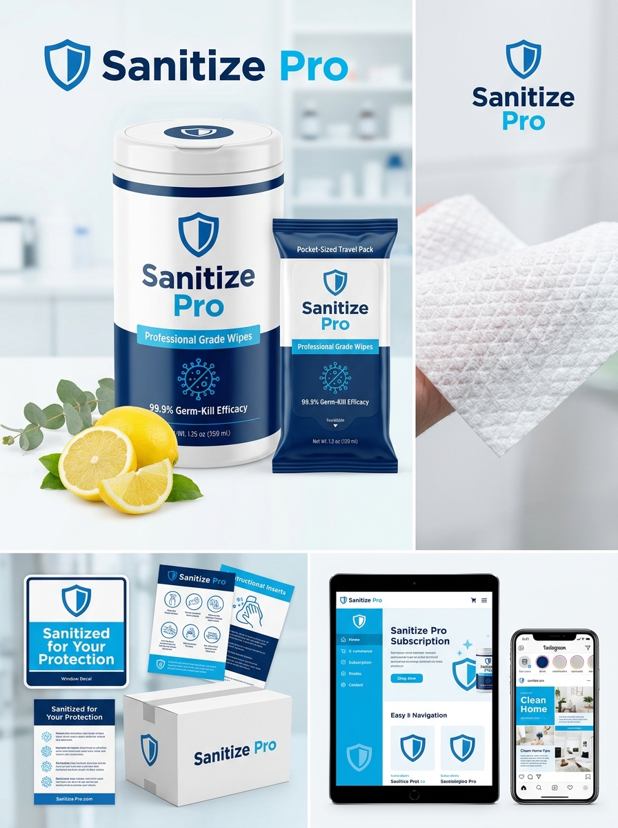
Effective disinfecting wipes packaging must strike a precise balance between regulatory compliance and shelf-appeal. As hygiene remains a top consumer priority, the visual presentation of sanitizing products serves as a critical indicator of safety, reliability, and efficacy. Designing these containers requires more than just aesthetics; it demands a functional approach to color psychology, legible typography, and durable material selection to ensure product longevity.
To succeed in the modern hygiene sector, brands must implement visual best practices that communicate trust instantly. This guide explores essential design concepts-from moisture-locking closures to bold, clean graphics-that help products stand out. By prioritizing user-centric design and functional integrity, manufacturers can create packaging that not only protects the active ingredients but also strengthens brand authority through superior packaging aesthetics and clarity.
Defining the Visual Identity of Modern Hygiene Brands
The visual identity of modern disinfecting wipes brands has evolved from purely clinical aesthetics to a sophisticated balance of efficacy and lifestyle integration. Today's hygiene branding utilizes clean, sans-serif typography and a color palette dominated by crisp whites, deep blues, and botanical greens to communicate safety and freshness.
Key design elements often include iconographic symbols-such as shields, medical crosses, or "99.9% effective" badges-to provide immediate reassurance of germ-killing power. Furthermore, minimalist packaging allows these products to blend seamlessly into contemporary home and office environments. By combining high-contrast functional messaging with sleek, eco-conscious imagery, modern brands establish professional trust while appealing to health-conscious consumers. This strategic visual approach ensures that sanitizing products are perceived as both powerful household tools and essential lifestyle accessories.
Establishing a Clear Information Hierarchy for Safety
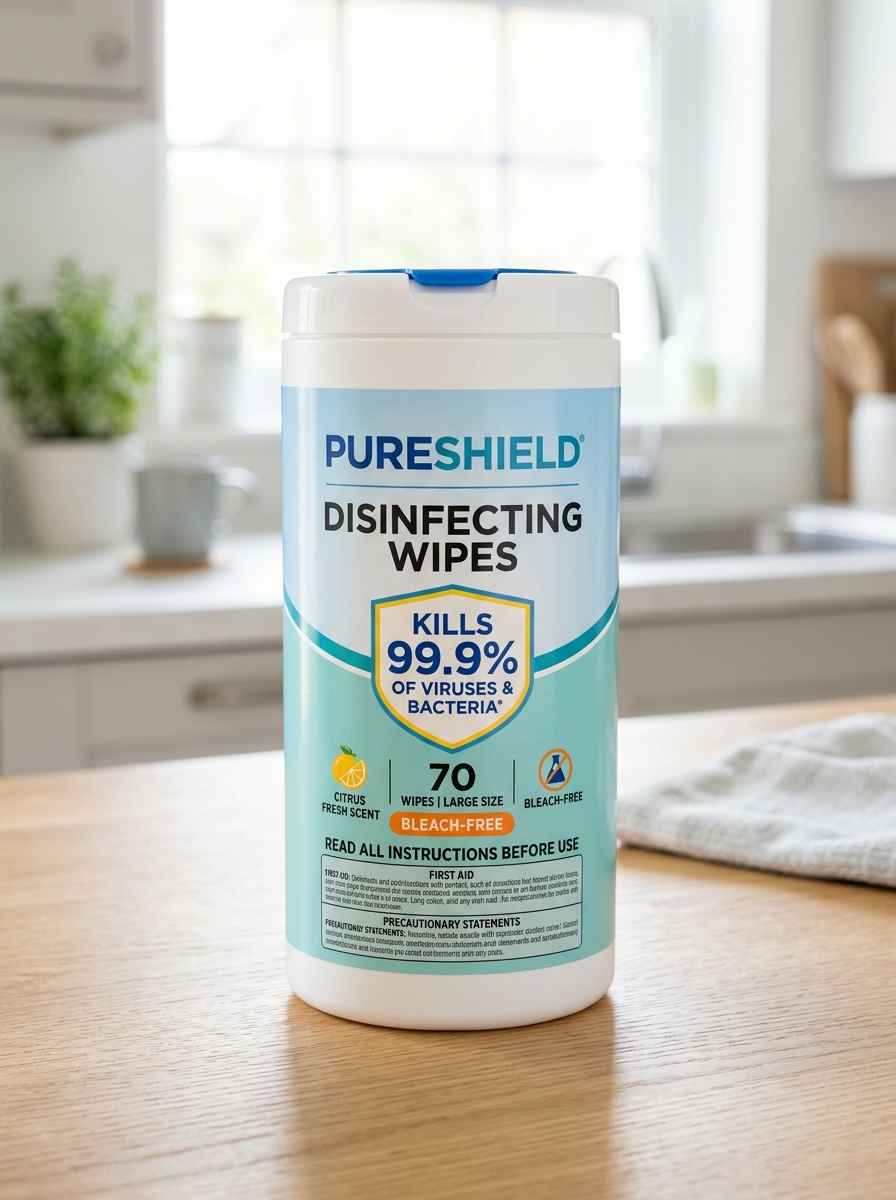
Effective communication on disinfecting wipes packaging relies on a structured information hierarchy. Prioritizing safety data ensures users quickly identify critical usage protocols to prevent chemical misuse and accidental exposure.
- Primary Warnings: High-visibility placement of EPA registration numbers and "Keep Out of Reach of Children" (KOROC) statements.
- Operational Instructions: Clear contact times (dwell time) required for effective pathogen neutralization on non-porous surfaces.
- Precautionary Statements: Distinct sections for hazard identification, first aid, and surface compatibility.
By organizing labels with semantic headings and bulleted lists, manufacturers reduce cognitive load. This approach ensures that essential safety precautions and disposal methods are immediately accessible, maximizing the efficacy of the disinfectant while ensuring user protection in clinical and domestic environments.
Color Psychology and Consumer Trust in Disinfectants
The visual identity of disinfecting wipes plays a critical role in establishing consumer confidence. Color psychology heavily influences purchasing decisions, as specific hues evoke subconscious associations with cleanliness and safety.
White remains the industry standard for the wipes themselves, symbolizing purity, sterility, and the visible removal of contaminants. Packaging colors further refine brand perception: blue is frequently used to project reliability, authority, and medical-grade professionalism, while green tones signal eco-friendly, non-toxic formulations.
By aligning packaging aesthetics with perceived efficacy, manufacturers build immediate trust. For example, bright yellows may suggest high-strength chemical power, whereas soft pastels imply gentleness for household surfaces. Understanding these visual triggers ensures that a product's perceived value matches its disinfecting capabilities, fostering long-term brand loyalty through sensory cues.
Typography Best Practices for Rapid Legibility
In the context of disinfecting wipes, rapid legibility is critical for ensuring user safety and product efficacy. Labels must communicate kill times and chemical hazards instantaneously to prevent misuse.
- Sans-Serif Typefaces: Use clean fonts like Helvetica or Univers. These lack decorative strokes, making them easier to read quickly at a distance or in low-light environments.
- High Contrast: Maintain a strong visual distinction between text and background-typically black text on a white or high-visibility yellow field-to optimize the Weber contrast ratio.
- Type Hierarchy: Bold critical data, such as "Contact Time" or "Active Ingredients," to guide the user's eye to essential compliance information first.
- Generous Leading: Increase line spacing to prevent "crowding," which ensures that instructional steps remain distinct during high-speed sanitization tasks.
Integrating Intuitive Iconography for Usage Instructions
To maximize efficacy and safety, disinfecting wipes utilize intuitive iconography to guide users through proper sanitization protocols. Visual symbols transcend language barriers, ensuring that critical instructions are understood instantly across diverse demographics.
Effective icon integration typically illustrates four key stages of the disinfection process:
- Pre-cleaning: A symbol showing the removal of visible debris from the surface.
- Saturation: An icon representing the need for the surface to remain visibly wet.
- Dwell Time: A clock graphic indicating the specific duration required to neutralize pathogens.
- Disposal: Clear signage highlighting that wipes must be trashed and never flushed.
By simplifying complex chemical instructions into universal graphics, manufacturers reduce human error, improve compliance, and ensure high-touch surfaces are treated effectively to prevent the spread of infections.
Structural Design for Optimal Moisture Retention
The efficacy of disinfecting wipes depends on sophisticated structural engineering designed to prevent evaporation and ensure consistent liquid release. Most high-performance wipes utilize non-woven fabric technology, blending synthetic polymers with absorbent natural fibers. This hybrid matrix creates a network of microscopic reservoirs that hold the disinfectant solution through capillary action.
Advanced designs often feature embossed textures or quilted patterns, which increase the material's surface area and structural integrity. These patterns act as distribution channels, ensuring the antimicrobial agent is released evenly during use to achieve the required dwell time for pathogen elimination. By optimizing fiber density and pore size, the structural design prevents "solution settling," ensuring that every wipe, from the top of the canister to the bottom, remains fully saturated and chemically active.
Regulatory Compliance and Mandatory Safety Labeling
Disinfecting wipes are classified as pesticides or biocides, requiring strict adherence to government regulations. In the United States, the EPA (Environmental Protection Agency) oversees registration, ensuring products effectively kill claimed pathogens. Compliance ensures that the wipes are both safe for public use and legitimate in their germicidal assertions.
Mandatory safety labeling provides critical information for end-users, including:
- EPA Registration Number: Proof of laboratory-tested efficacy.
- Active Ingredients: Identification of chemical agents like quaternary ammonium or bleach.
- Contact Time: The specific duration a surface must remain wet to eliminate viruses and bacteria.
- Precautionary Statements: Essential hazard warnings, personal protective equipment (PPE) requirements, and first aid instructions.
Following these regulatory guidelines is vital for maintaining workplace safety standards and meeting OSHA health protocols in commercial and healthcare environments.
Material Selection for Durability and Brand Perception
Choosing the right substrate for disinfecting wipes is essential for both functional performance and market positioning. Manufacturers prioritize high-quality non-woven materials-such as polyester, polypropylene, or wood pulp blends-to ensure superior tensile strength. These fabrics prevent tearing during rigorous surface cleaning, maintaining structural integrity when saturated with antimicrobial solutions.
Material choice also dictates brand perception. Consumers frequently associate thicker, textured wipes with premium quality and enhanced cleaning efficacy. By selecting fibers with high absorbency and soft tactile properties, brands deliver a superior user experience that fosters consumer trust. Ultimately, investing in high-performance materials ensures the wipe remains effective and moist from the first pull to the last, reinforcing a brand's reputation for reliability in professional and medical-grade hygiene.
Visual Cues for Signaling Strength and Purity
Packaging design for disinfecting wipes leverages specific semiotic markers to communicate product efficacy and safety. To signal antimicrobial strength, manufacturers often use high-contrast color palettes, such as clinical whites, deep navy blues, or metallic silvers. These colors evoke a sense of professional-grade sterilization and hospital-level hygiene.
Conversely, purity is signaled through minimalist aesthetics, transparent packaging windows, and "free-from" certifications. Bold, sans-serif typography conveys industrial power, while soft gradients or botanical imagery suggest that the formula is gentle on surfaces or skin. By integrating these visual cues, brands provide immediate psychological assurance of a wipe's ability to eliminate pathogens while maintaining chemical integrity. These design elements are essential for building consumer trust in surface disinfection products at the point of purchase.
Sustainable Packaging Innovations for Single-Use Wipes
As environmental awareness increases, the disinfecting wipes industry is pivoting toward sustainable packaging innovations to reduce its ecological footprint. Traditional rigid plastic canisters are being replaced by recyclable flexible pouches and refillable systems, which significantly decrease total plastic volume and transportation emissions.
Leading manufacturers are now utilizing post-consumer recycled (PCR) materials and biodegradable films to ensure packaging is as eco-friendly as the biodegradable substrates inside. These advancements focus on maintaining a moisture-tight seal to prevent evaporation while prioritizing circular economy principles. By choosing wipes with minimalist, high-recyclability packaging, consumers can maintain clinical hygiene standards while supporting global efforts to reduce landfill waste and carbon output.
Leave a comment