Professional stapler packaging design transcends simple containment, serving as a vital touchpoint between office supply manufacturers and their end-users. To achieve lasting market impact, brands must prioritize visual aesthetics that communicate both the durability and precision of the tool within.
This guide explores the foundational principles of effective packaging, focusing on how strategic graphic elements and structural engineering enhance retail shelf presence. By harmonizing tactile material quality with an intuitive information hierarchy, designers can foster consumer trust and streamline the purchasing decision.
From sustainable substrate selection to high-contrast typography, mastering these design fundamentals ensures that functional office equipment is perceived as a premium asset. Understanding the synergy between form and function is essential for creating a cohesive brand identity that resonates in both physical retail and digital marketplaces.
Defining the Core Purpose and User Expectations in Stapler Packaging
Effective stapler packaging serves a dual purpose: product protection and consumer education. Primarily, the housing must safeguard internal mechanical components and alignment during transit. However, from a user perspective, the packaging acts as a vital information hub for functional compatibility.
Modern consumers expect immediate clarity regarding sheet capacity, compatible staple sizes (such as 24/6 or 26/6), and intended use cases-whether for heavy-duty industrial tasks or light-duty office binding. High-quality packaging often features transparent windows or high-resolution graphics to showcase ergonomic grips and loading mechanisms. By prioritizing these semantic cues, manufacturers reduce purchase friction, ensuring users select a tool that meets their specific performance requirements while highlighting key features like jam-resistant technology and tacking capabilities.
Establishing Visual Hierarchy for Instant Brand Recognition
In the competitive office supplies market, visual hierarchy is critical for distinguishing premium staplers from generic alternatives. Brands leverage specific design elements to guide the consumer's eye and reinforce brand identity. By strategically placing logos on the top lever and employing signature color palettes-such as the iconic red stapler-manufacturers ensure instant shelf recognition.
Effective visual organization involves:
- Color Dominance: Using bold hues to make the product stand out in a workspace.
- Form Factor: Unique ergonomic silhouettes that become synonymous with a brand's industrial design.
- Material Contrast: Utilizing metallic accents against matte finishes to highlight functional components.
Establishing this hierarchy ensures that when a professional reaches for a fastening tool, the brand's reliability and prestige are communicated instantly through superior visual cues.
Strategic Color Psychology and Typography in Stationery Design
In the realm of office hardware, stapler design transcends basic utility through the strategic application of color psychology and typography. Manufacturers select specific palettes to influence workplace productivity and brand positioning. For instance, vibrant red staplers often symbolize energy and iconic status, while matte black or brushed metallic finishes evoke professional reliability and sophistication.
Furthermore, typography on the stapler's chassis-typically featuring clean, sans-serif typefaces-communicates modern efficiency and structural durability. These visual elements work in tandem to transform a functional desktop tool into an aesthetic statement piece. By harmonizing visual appeal with ergonomic design, stationery brands enhance the user experience, ensuring the device aligns with the psychological and stylistic requirements of contemporary professional environments.
Maximizing Product Visibility Through Die-Cut Windows and Transparency
In the competitive office supply market, stapler packaging serves as a vital touchpoint for consumer engagement. Utilizing die-cut windows and high-clarity plastic transparency allows manufacturers to showcase the product's build quality, color, and ergonomic design without compromising the protective shell.
Strategically placed windows enable customers to verify the stapler's size and material-whether it is a heavy-duty metal model or a compact plastic version-directly on the retail shelf. This visual accessibility builds consumer trust and reduces the likelihood of tampered packaging. By integrating transparent elements, brands highlight the aesthetic appeal and mechanical integrity of their staplers, facilitating faster purchasing decisions through immediate product recognition and sensory validation. This approach ensures that the functional design of the stapler becomes its own most effective marketing tool.
Communicating Ergonomic Features and Performance via Graphic Elements
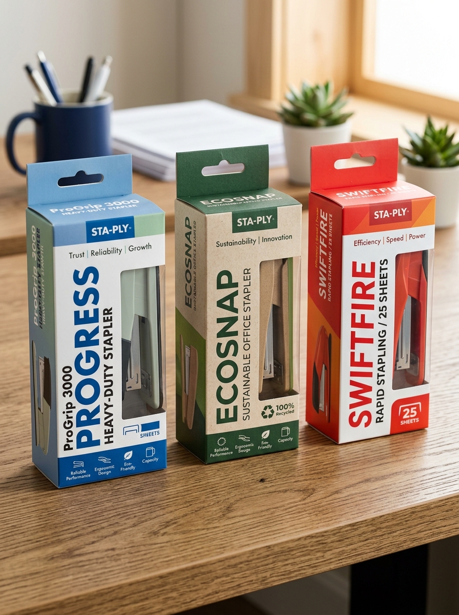
Stapler manufacturers utilize graphic elements to bridge the gap between mechanical engineering and user experience. Visual cues, such as icons depicting hand silhouettes or "soft-touch" textures, immediately signal ergonomic design. These symbols communicate comfort and musculoskeletal safety, allowing buyers to identify tools that reduce repetitive strain.
Performance is communicated through high-contrast typography and instructional infographics. Common elements include "Reduced Effort" badges with percentage metrics (e.g., 50% less force) and sheet-capacity icons that quantify power. Furthermore, "Jam-Free" logos provide psychological assurance of reliability. By integrating these graphics, brands translate complex features-like flat-clinch technology or spring-loading-into digestible data. This visual shorthand ensures that both the comfort and efficiency of the stapler are recognizable at a glance, driving informed purchasing decisions.
Material Selection and Structural Integrity for Durable Retail Display
When engineering staplers for the retail market, material selection is paramount for both mechanical performance and shelf-appeal. Premium desktop staplers typically utilize high-grade carbon steel or reinforced zinc alloys to ensure internal longevity. For the outer chassis, manufacturers often opt for impact-resistant ABS plastics or powder-coated metals that resist scratching and wear during consumer handling.
Structural integrity involves precision-engineered fulcrum points and high-tension springs that maintain consistent driving force over thousands of cycles. In a retail display environment, robust construction prevents "out-of-box" failures and maintains aesthetic quality under harsh lighting and frequent tactile interaction. By prioritizing metallurgical quality and ergonomic reinforcement, brands deliver a durable fastening solution that withstands the rigors of high-volume commercial use and intensive point-of-sale presentation.
Sustainable and Eco-Friendly Packaging Solutions for Modern Offices
As modern workplaces prioritize green initiatives, the demand for sustainable office supplies, including staplers, has significantly increased. Traditional plastic blister packs are being replaced by eco-friendly packaging solutions that minimize environmental impact. Leading manufacturers now utilize recyclable cardboard, biodegradable molded pulp, and soy-based inks to reduce their carbon footprint.
Choosing staplers housed in plastic-free packaging allows businesses to meet corporate social responsibility goals while reducing landfill waste. These sustainable solutions ensure that essential fastening tools are delivered using renewable materials without compromising product protection. By integrating circular economy principles into stationery procurement, offices can maintain high productivity while supporting a healthier ecosystem. Selecting products with FSC-certified materials further ensures that your office essentials contribute to responsible forestry and sustainable waste management practices.
Balancing Technical Specifications with Minimalist Information Architecture
Optimizing the digital presentation of stapling solutions requires a strategic balance between robust engineering specifications and minimalist information architecture (IA). Professional users require precise data regarding sheet capacity, staple gauge compatibility (such as 24/6 or 26/6), and throat depth to ensure operational efficiency.
To prevent cognitive overload, designers implement a hierarchical IA that utilizes progressive disclosure. By categorizing technical attributes-such as jam-clearing mechanisms and ergonomic force-reduction technology-into digestible sections, brands maintain a clean aesthetic without sacrificing data integrity. This semantic structure ensures that critical performance metrics remain discoverable for high-intent buyers while providing a seamless, uncluttered experience for casual users. Balancing these elements improves both search engine relevance and user conversion by aligning technical precision with intuitive navigation.
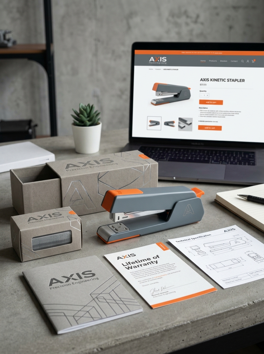
Creating a Premium Unboxing Experience for Professional Tools
For high-performance professional staplers, the unboxing experience serves as the primary indicator of quality and craftsmanship. A premium presentation reinforces the tool's precision engineering and long-term durability. Using minimalist, sustainable, high-density packaging ensures the product is protected while conveying a modern, sophisticated brand image.
Inside, the layout should showcase the stapler's ergonomic profile and sleek metallic finish. Including a curated starter kit of heavy-duty staples and a high-quality user guide adds immediate value and utility. By prioritizing tactile feedback-such as the weight of the tool and the snap of a magnetic enclosure-manufacturers transform a standard office supply into a vital professional asset. This strategic attention to detail builds consumer trust and highlights the industrial-grade reliability essential for high-volume environments.
Optimizing Shelf Impact and Competitive Differentiation in High-Volume Retail
In high-volume retail environments, staplers must transcend commodity status through strategic visual merchandising. Optimizing shelf impact requires a synergy of eye-catching packaging and ergonomic product design to disrupt consumer scanning patterns in crowded office supply aisles.
To achieve competitive differentiation, brands should emphasize proprietary innovations such as:
- Jam-free mechanisms and high-sheet capacities.
- Ergonomic silhouettes that prioritize user comfort and reduced effort.
- Sustainable materials and recyclable, eco-friendly packaging.
Leveraging tiered displays and bold color palettes enhances brand visibility. By integrating transparent packaging and clear, benefit-driven messaging, manufacturers can effectively communicate durability and precision. This strategic approach transforms functional tools into premium solutions, driving higher conversion rates and fostering customer loyalty within the competitive retail landscape.
Leave a comment