
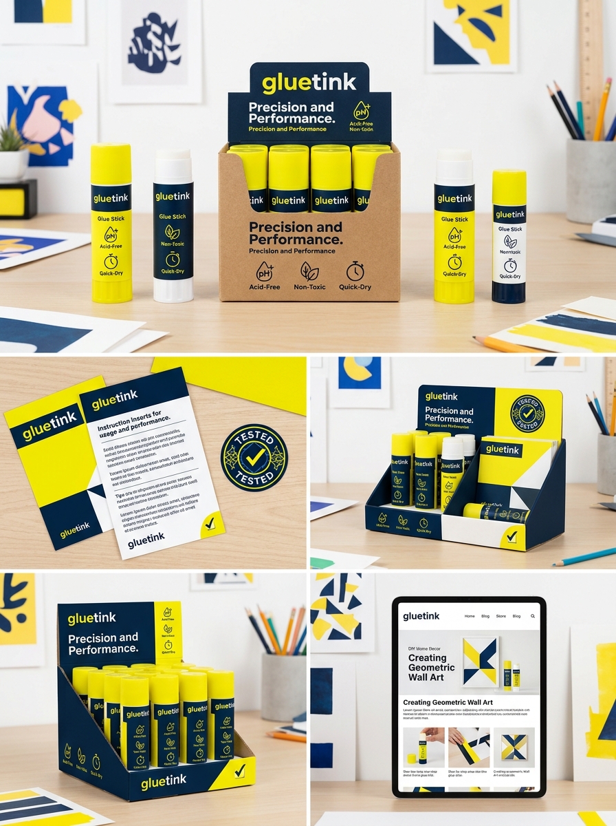
Effective glue stick packaging design serves as the critical bridge between a brand's visual identity and the user's tactile experience. Success in the stationery market hinges on a strategic fusion of aesthetics and engineering. While bold typography and cohesive color palettes capture attention on the shelf, the true value lies in functional innovation.
From ergonomic twist mechanisms that ensure smooth application to precision-engineered airtight caps that prevent premature drying, every structural detail impacts long-term product reliability. By harmonizing branding elements with practical usability, manufacturers can elevate a simple adhesive tool into a premium consumer staple. This exploration delves into the essential principles of creating packaging that resonates visually while delivering an intuitive, mess-free experience for students, artists, and professionals alike.
The Importance of Strategic Glue Stick Packaging
Strategic packaging for glue sticks is essential for maintaining product integrity and enhancing the overall user experience. Because the adhesive is highly susceptible to evaporation, airtight caps and precision-engineered casings are critical to prevent the formula from drying out, thereby significantly extending its shelf life.
Beyond preservation, effective packaging focuses on ergonomics and safety. Smooth twist mechanisms and easy-grip tubes ensure that students and professionals alike can apply the adhesive with accuracy and comfort. Furthermore, the packaging serves as a vital communication tool, highlighting non-toxic certifications and eco-friendly initiatives, such as the use of recycled plastics.
By prioritizing durable, functional, and informative designs, manufacturers protect the internal formulation while building consumer trust. Ultimately, strategic packaging differentiates a brand in a competitive market, ensuring the product remains a reliable tool for various projects.
Building a Visual Identity for Adhesive Brands
Establishing a strong visual identity for glue stick brands is essential for differentiation in the competitive stationery market. Effective branding begins with packaging design that balances aesthetic appeal with functional clarity. Utilizing strategic color psychology-such as vibrant hues for school supplies or minimalist tones for professional office adhesives-helps target specific consumer demographics effectively.
Consistency in logo typography and imagery ensures instant product recognition on crowded retail shelves. Furthermore, integrating semantic visual cues, such as intuitive icons for "non-toxic," "washable," or "acid-free" properties, communicates core product benefits at a glance. By maintaining a cohesive brand image across physical packaging and digital marketing, adhesive manufacturers foster consumer trust and long-term loyalty, ensuring their glue sticks are the preferred choice for students, crafters, and professionals alike.
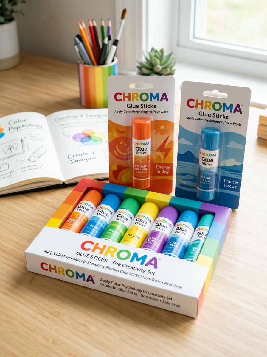
Applying Color Psychology to Stationery Product Design
Color psychology is a strategic tool in glue stick design, influencing both functional use and consumer perception. Manufacturers leverage specific palettes to guide user behavior; for instance, the iconic disappearing purple or blue adhesives use color as a visual cue for precise application, providing confidence through visibility before drying clear.
Beyond functionality, casing colors target specific demographics. Vibrant primary colors like red and yellow stimulate energy and creativity, making them ideal for early childhood education. In contrast, sleek white or transparent designs evoke a sense of professional reliability and minimalism suitable for office environments. Additionally, green packaging is frequently employed to signal eco-friendly, non-toxic, or solvent-free formulas. By aligning visual aesthetics with psychological triggers, brands enhance the user experience and create a strong emotional connection with consumers in the competitive stationery market.
Selecting Typography for Readability and Brand Voice
When designing glue stick packaging, typography is essential for both functional clarity and market positioning. For readability, designers must prioritize high-contrast, sans-serif fonts. Because glue stick tubes provide limited surface area, clear lettering ensures that critical information-such as "non-toxic" labels, drying times, and material compatibility-is legible to students and DIY enthusiasts.
Beyond utility, typography establishes the brand voice. A school-grade glue stick often features rounded, playful typefaces to signal safety and ease of use for children. Conversely, professional-grade or industrial adhesives utilize bold, geometric slabs to communicate strength and durability. By selecting the right font weight and style, manufacturers can effectively reach their target audience while ensuring that safety warnings and usage instructions are accessible at a glance.
Ergonomic Design Principles for Functional Glue Containers
Ergonomic design in glue sticks focuses on maximizing user comfort and operational efficiency. The primary principle involves the cylindrical barrel, which provides a natural grip for various hand sizes, reducing muscle strain during repetitive bonding tasks. A high-quality container features a smooth twist-up mechanism at the base, allowing for precise control over the adhesive's exposure while preventing breakage.
Modern functional designs often incorporate non-slip textures or contoured finger zones to enhance stability. Furthermore, the airtight cap is engineered for easy removal and secure replacement, ensuring the adhesive remains moist and usable. By prioritizing these human-centric factors, manufacturers improve accessibility for children and adults alike, making glue sticks indispensable tools for efficient crafting and professional office use.
Sustainable Material Choices in Modern Glue Packaging
As environmental awareness grows, the production of glue sticks is shifting toward eco-friendly alternatives. Manufacturers are increasingly replacing virgin plastics with Post-Consumer Recycled (PCR) materials for applicator tubes. This transition significantly reduces the carbon footprint and prevents plastic waste from entering landfills.
Key advancements in sustainable adhesive packaging include:
- FSC-certified cardboard for plastic-free outer retail packaging.
- Refillable designs that promote a circular economy by reusing the plastic housing.
- Bio-based polymers derived from renewable resources like cornstarch or sugarcane.
These innovations allow schools and offices to maintain high-quality adhesive performance while supporting global sustainability goals. Choosing glue sticks with recyclable or biodegradable housings is a vital step in reducing single-use plastic consumption in stationery supplies.
Safety Information and Regulatory Labeling Requirements
Ensuring the safety of glue sticks is critical, especially for school and office environments. Most high-quality adhesives are formulated to be non-toxic, solvent-free, and acid-free. However, manufacturers must comply with specific regulatory labeling requirements to guarantee consumer protection.
- ASTM D-4236: In the U.S., the LHAMA act requires all art materials to be evaluated by a toxicologist for chronic health hazards.
- EN71 Compliance: European standards regulate chemical content and mechanical safety, particularly for products used by children.
- Choking Hazard Warnings: Labels must clearly state age-appropriateness, typically noting small parts (caps) are not suitable for children under three.
Look for the AP (Approved Product) seal or CE marking on packaging. These symbols confirm the product meets rigorous safety standards and that Safety Data Sheets (SDS) are available for professional handling.
Maximizing Retail Impact and Shelf Presence
Achieving superior retail impact for glue sticks requires a strategic blend of eye-catching packaging and smart merchandising. To enhance shelf presence, brands utilize vibrant, color-coded designs that help consumers quickly distinguish between washable, permanent, and disappearing purple formulas. High-visibility PDQ trays and gravity-fed dispensers ensure products remain organized and accessible in high-traffic stationery aisles.
Semantic optimization for retail involves highlighting multi-pack configurations and eco-friendly blister cards that maximize vertical shelf space. Clear window packaging is essential for showcasing product volume, which is a key driver for back-to-school purchasing decisions. By implementing cross-merchandising strategies near paper and craft supplies, retailers can significantly increase impulse sales. Effective adhesive displays focus on brand consistency and informative labeling to capture consumer attention instantly and drive conversions.
Balancing Aesthetic Appeal with Practical Functionality
Modern glue sticks represent a sophisticated synergy between ergonomic design and high-performance adhesion. Manufacturers prioritize aesthetic appeal through sleek, colorful casings and transparent barrels that allow users to monitor remaining product levels. However, visual charm is always secondary to core utility.
The practical functionality of a premium glue stick lies in its mess-free application and consistent bond strength. Essential features include:
- Acid-free formulas: Safe for archival projects and photographs.
- Non-toxic ingredients: Ensuring safety for school and home environments.
- Twist-up mechanisms: Preventing the adhesive from drying while providing precise control.
By integrating comfortable grips with fast-drying, washable adhesives, these tools cater to both professional crafters and students, proving that everyday stationery can be both visually pleasing and highly effective.
Emerging Technologies in Adhesive Packaging Innovation
Modern glue stick packaging is undergoing a technological revolution focused on sustainability and performance. Manufacturers are increasingly utilizing PCR (Post-Consumer Recycled) plastics and compostable materials to minimize environmental footprints without compromising structural integrity.
Key innovations driving the industry include:
- Airtight Barrier Coatings: Advanced polymer layers prevent moisture loss, significantly extending the adhesive's shelf life and preventing premature hardening.
- Precision Twist Mechanisms: Enhanced internal threading ensures smooth, consistent dispensing and reduces product waste.
- Smart Labeling: Integration of QR codes and thermo-chromic indicators to provide digital usage guides and temperature safety alerts.
These advancements prioritize user convenience and eco-consciousness, ensuring that adhesive applicators remain efficient, mess-free, and environmentally responsible in the evolving stationery market.
Leave a comment