
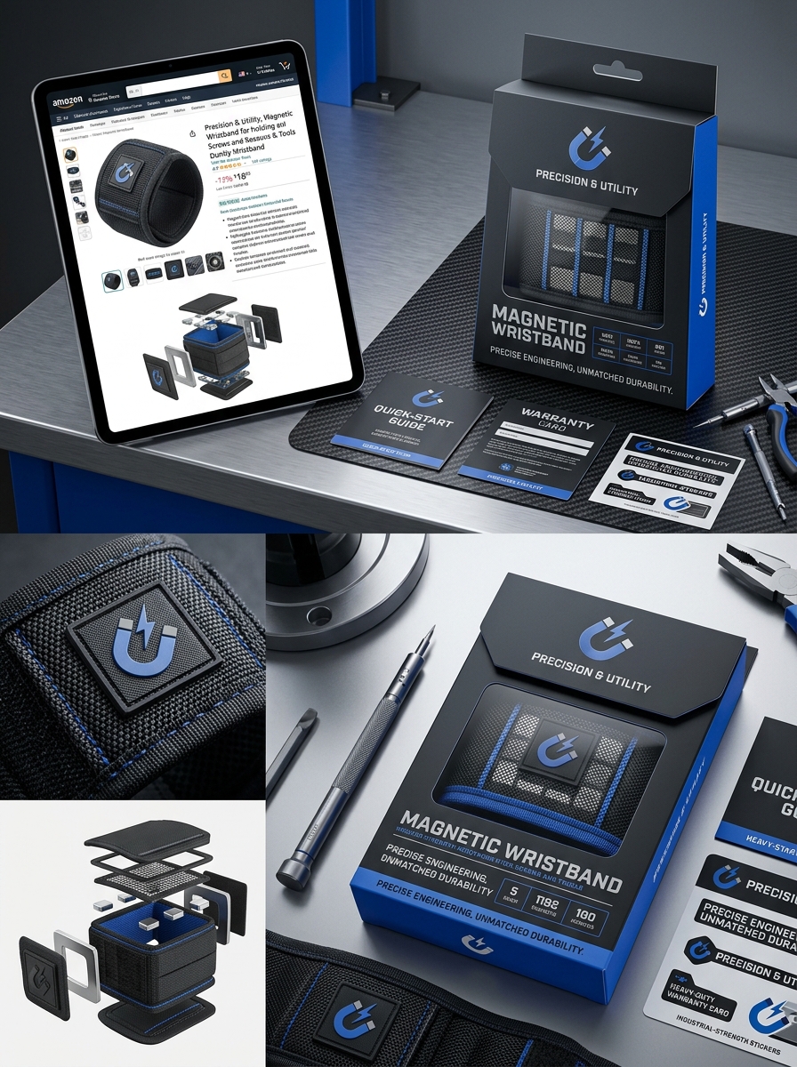
Magnetic wristbands have evolved into essential utility tools for DIY enthusiasts and professionals, yet their market success often hinges on the first physical interaction: the packaging. Designing effective magnetic wristband packaging requires a sophisticated balance between structural integrity and visual storytelling. Because these products contain powerful magnets, the packaging must prioritize safety and durability while simultaneously capturing the consumer's attention through clean, modern aesthetics.
Strategic design concepts, such as high-contrast color palettes and clear window cut-outs, allow buyers to visualize the product's utility immediately. By adhering to specific visual aesthetic guidelines-including minimalist typography and premium material finishes-brands can communicate reliability and professional quality. This exploration covers the foundational elements of packaging design that protect internal components while creating a compelling brand narrative that resonates with hardware consumers globally.
Evolution of Functional Tool Accessory Packaging
The packaging for magnetic wristbands has undergone a significant transformation, moving from industrial utility to high-end retail presentation. Initially, these functional accessories were housed in simple polybags or heat-sealed blister packs, prioritizing basic protection over consumer experience.
As the DIY and gifting markets expanded, manufacturers shifted toward semantic-rich, eco-friendly cardboard designs. Modern packaging now features magnetic closures, transparent viewing windows, and detailed technical specifications. This evolution reflects the transition of the magnetic wristband from a niche hardware item to a popular gift. By optimizing compact, durable layouts, brands reduce shipping footprints and environmental impact while enhancing the "unboxing" appeal. Today's packaging serves a dual purpose: ensuring product safety during transit and providing an informative, premium aesthetic that resonates with both professional tradespeople and home hobbyists.
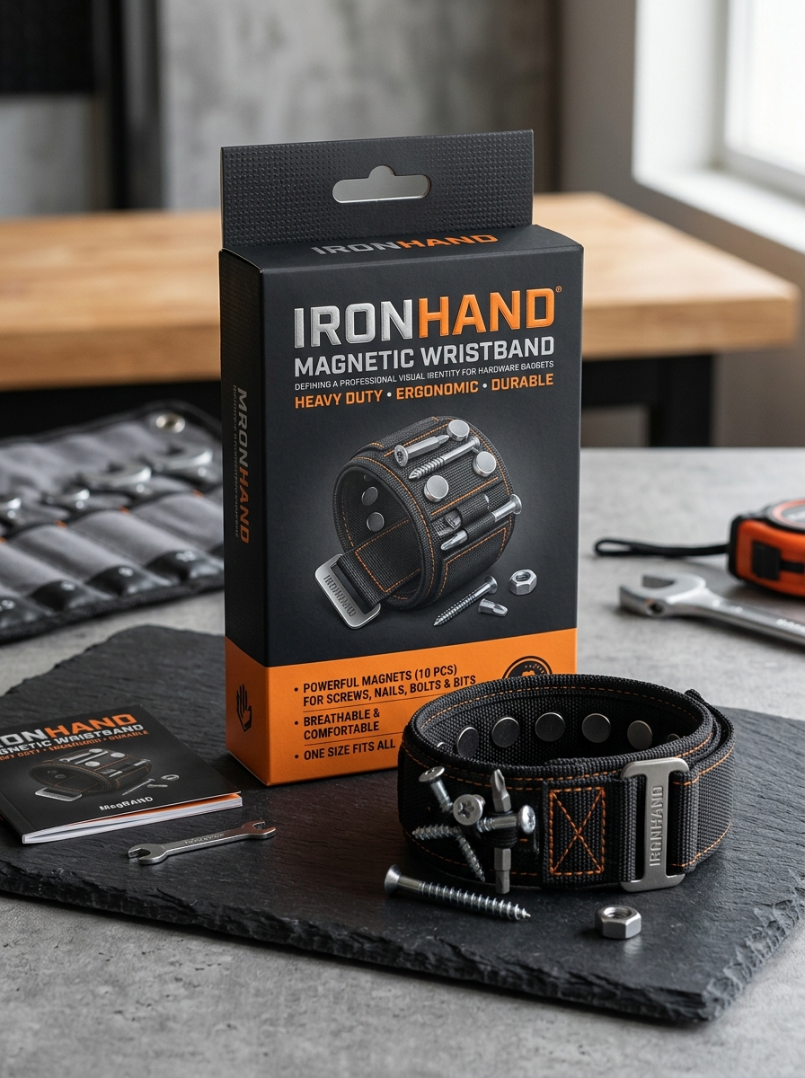
Defining a Professional Visual Identity for Hardware Gadgets
Establishing a professional visual identity for hardware products, such as a magnetic wristband, is essential for building consumer trust and market authority. This process begins with a cohesive brand aesthetic that reflects industrial durability and practical utility.
Key elements include:
- Product Photography: High-resolution imagery highlighting premium materials like 1680D ballistic polyester and integrated neodymium magnets.
- Color Palette: Utilizing bold, high-contrast colors-often black, orange, or blue-to signal professional-grade equipment.
- Consistent Branding: Uniform typography and logo placement across packaging and digital platforms.
By blending technical diagrams with lifestyle visuals showing the gadget in action, brands communicate reliability. A polished visual language ensures that a magnetic wristband is perceived as an indispensable professional tool rather than a generic accessory, driving higher perceived value and customer loyalty.
Balancing Structural Integrity with Premium Aesthetic Appeal
A superior magnetic wristband must bridge the gap between rugged utility and professional design. To ensure structural integrity, these tools are often constructed from 1680D ballistic polyester or reinforced nylon, providing the puncture resistance necessary to hold sharp screws, nails, and drill bits securely.
The premium aesthetic appeal is achieved through a streamlined, ergonomic silhouette that eliminates unnecessary bulk. High-density stitching and breathable padded mesh offer a sophisticated finish that ensures long-term comfort during extended use. By embedding powerful neodymium magnets within a sleek, contoured frame, the wristband maintains a high-end look without compromising its heavy-duty performance. This synergy of form and function ensures the tool is as durable as it is visually impressive for professional contractors and DIY enthusiasts alike.
The Impact of High Resolution Product Imagery and Use Cases
High-resolution product imagery is vital for showcasing the intricate details of a magnetic wristband. Clear, zoomable photos allow customers to verify the quality of the 1680D ballistic polyester and the placement of powerful magnets, building immediate consumer trust. Visual clarity ensures that the product's durability and professional-grade construction are evident at a glance.
Complementing these visuals with practical use cases bridges the gap between interest and conversion. By displaying the wristband in real-world scenarios-such as home renovations, automotive repairs, or electrical work-buyers can better visualize the tool's utility. Seeing the wristband securely holding screws, nails, and drill bits during a project highlights its efficiency as a hands-free solution. Combining high-quality photography with contextual applications effectively communicates value, helping DIY enthusiasts and professionals understand how this accessory simplifies complex tasks.
Material Selection Strategies for Heavy Utility Products
For a magnetic wristband to excel in heavy utility environments, material selection must prioritize durability, magnet strength, and user comfort. The outer shell should utilize 1680D ballistic nylon, an industrial-grade fabric known for its exceptional resistance to abrasions, tears, and water.
The core functionality relies on N52 Neodymium magnets, which offer the highest magnetic flux density to securely hold heavy bolts, wrenches, and drill bits. To ensure long-term wearability, the interior must feature a breathable padded mesh. This helps manage moisture and prevents skin irritation during high-intensity labor. By combining rugged synthetic fibers with rare-earth magnets, manufacturers create a high-performance tool that withstands the rigors of construction and automotive repair while maintaining ergonomic efficiency.
Leveraging Transparency and Die Cut Windows for Visual Proof
In the tool accessory market, magnetic wristband packaging utilizes transparency and die-cut windows to provide immediate visual proof of product quality. By allowing consumers to see the actual fabric texture and the specific placement of the embedded industrial-strength magnets, manufacturers build instant brand trust.
These strategic design elements serve a dual purpose: they showcase the rugged durability of materials like 1680D ballistic polyester while highlighting the magnetic surface area. For a DIY enthusiast or professional contractor, this "see-through" feature validates the tool's capability to hold heavy screws, nails, and drill bits securely. Integrating clear apertures into the packaging effectively bridges the gap between marketing claims and physical reality, ensuring the magnetic tool holder meets high-performance standards before the purchase is even made.
Optimizing Typography and Hierarchy for Technical Specifications
Effective technical communication for magnetic wristbands requires a structured typographic hierarchy. By utilizing clear headings and varying font weights, you ensure that critical data-such as magnet pull force (N52 Neodymium) and material durability (1680D ballistic polyester)-is immediately scannable for the user.
Key strategies for optimizing these specifications include:
- Logical Categorization: Grouping physical dimensions separately from performance metrics.
- Visual Contrast: Using bold labels to distinguish between attribute names and their specific values.
- Semantic List Structures: Implementing unordered lists to break down magnet counts and weight capacities.
This semantic approach improves user comprehension and accessibility while enhancing SEO by allowing search engines to index vital product features and technical capabilities more accurately.
Color Psychology in Modern Construction and DIY Branding
In the competitive landscape of professional tools, the color of a magnetic wristband is more than an aesthetic choice; it is a strategic branding element. Color psychology significantly influences buyer perception and job site functionality.
- Safety Orange and Neon Yellow: These high-visibility hues are synonymous with caution and professional safety standards, ensuring the wristband-and the wearer-remain visible in complex work environments.
- Industrial Black and Cobalt Blue: Often used to convey reliability, strength, and technical authority. These darker tones are preferred for their ability to mask grease and debris, maintaining a professional image during heavy-duty DIY projects.
- Bold Red: Triggers energy and urgency, often used by brands to signify power and high-performance capabilities.
By aligning magnetic wristband designs with these psychological triggers, manufacturers enhance brand loyalty and ensure tools resonate with the professional identity of modern tradespeople.
Elevating the Giftability Factor through Thoughtful Unboxing Design
A magnetic wristband is a highly practical tool, but its appeal as a premium gift relies heavily on presentation. By focusing on thoughtful unboxing design, brands can transform a functional utility item into a memorable experience for DIY enthusiasts and handymen.
High-quality, gift-ready packaging-featuring sleek graphics, protective inserts, and tactile finishes-immediately increases the perceived value of the product. When a recipient opens a well-organized box to find the wristband securely displayed, it signals professional quality and attention to detail. This "wow factor" eliminates the need for additional gift wrapping, making it an attractive, convenient choice for shoppers. Ultimately, an intentional unboxing strategy bridges the gap between a rugged magnetic tool and a sophisticated gift, ensuring the product stands out in a competitive marketplace.
Sustainable Packaging Solutions for the Tool and Hardware Market
As the demand for eco-friendly DIY accessories grows, manufacturers are revolutionizing how the magnetic wristband is presented to consumers. In the modern tool and hardware market, sustainable packaging solutions focus on reducing single-use plastic waste by utilizing biodegradable materials and recyclable corrugated cardboard.
These eco-conscious designs effectively protect the magnetic components and durable nylon fabric during transit while aligning with global environmental standards. By incorporating FSC-certified paper and soy-based inks, brands can deliver high-quality hardware tools while significantly minimizing their carbon footprint. Transitioning from traditional plastic blister packs to plastic-free, paper-based alternatives ensures these essential wearable tool holders meet the expectations of modern, environmentally aware professionals and hobbyists seeking high-performance, green hardware options.
Leave a comment