
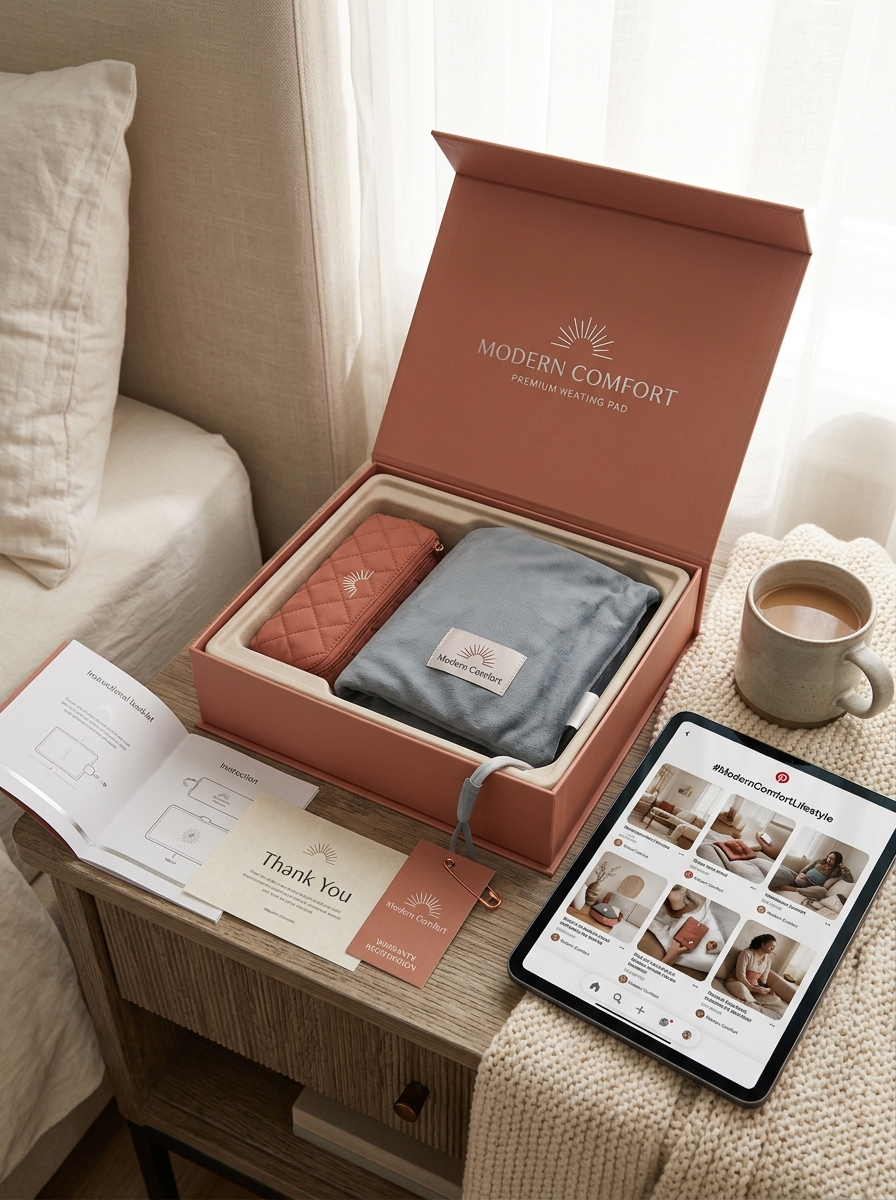
Modern wellness branding requires a strategic fusion of functionality and artistry. When developing heating pad packaging design, manufacturers must look beyond basic utility to evoke immediate feelings of warmth, comfort, and relief. By implementing sophisticated aesthetic principles, brands can transform standard thermal therapy tools into premium self-care essentials that resonate with consumers on an emotional level.
This analysis explores the critical visual concepts that define industry-leading packaging-ranging from soothing color palettes and tactile finishes to minimalist typography that communicates clarity and trust. Effective design does more than protect the product; it enhances the unboxing experience and strengthens shelf presence. Mastering the balance between technical specifications and high-end imagery is the key to capturing the attention of the modern, health-conscious shopper seeking both quality and style.
The Evolution of Modern Wellness Packaging Aesthetics
The visual presentation of the heating pad has undergone a significant transformation, shifting from clinical, medical-grade boxes to sophisticated lifestyle packaging. This evolution reflects the integration of heat therapy into daily self-care rituals rather than just injury recovery. Modern wellness brands now utilize minimalist design, earthy color palettes, and soft-touch matte finishes to evoke a sense of immediate therapeutic relief.
Contemporary packaging priorities have moved toward sustainability and premium materials, often featuring eco-friendly cardboard and clear, elegant typography. By aligning with home decor trends, manufacturers ensure that heating pads feel like luxury accessories. This strategic shift in aesthetics not only enhances shelf appeal but also reinforces the product's role as an essential component of the modern holistic wellness toolkit, focusing on comfort, accessibility, and high-end visual storytelling.
Applying Minimalist Design Principles to Heating Products
Modern heating pads are evolving into sleek wellness tools by embracing minimalist design. This approach prioritizes core functionality through intuitive interfaces, such as single-button temperature controls and integrated auto-shutoff sensors. By removing unnecessary visual clutter, manufacturers focus on tactile comfort and premium materials like organic linen or plush micro-fibers that blend seamlessly into contemporary home aesthetics.
A "less is more" philosophy ensures the user experience remains effortless, focusing entirely on targeted thermal relief. Compact, cordless, and foldable designs further enhance portability without sacrificing surface area. Ultimately, integrating minimalism into heat therapy products creates a harmonious balance between sophisticated technology and streamlined operation, transforming a traditional medical necessity into a stylish, functional lifestyle accessory.
Color Psychology Strategies for Warmth and Relaxation
Color psychology significantly influences the therapeutic effectiveness of a heating pad by shaping the user's sensory perception. Selecting specific hues can enhance the feeling of warmth or deepen a state of relaxation. For example, warm tones like deep red or terracotta subconsciously signal heat and vitality, making the thermal therapy feel more immediate and intense.
In contrast, cool tones such as soft blue or sage green are strategically used to trigger the parasympathetic nervous system, promoting stress relief and mental calm during use. Neutral shades like charcoal or slate offer a grounding, professional aesthetic that aligns with modern wellness trends. By integrating these visual cues, heating pads transcend basic functionality, providing a holistic sensory experience that optimizes both muscle recovery and psychological tranquility for better pain management.
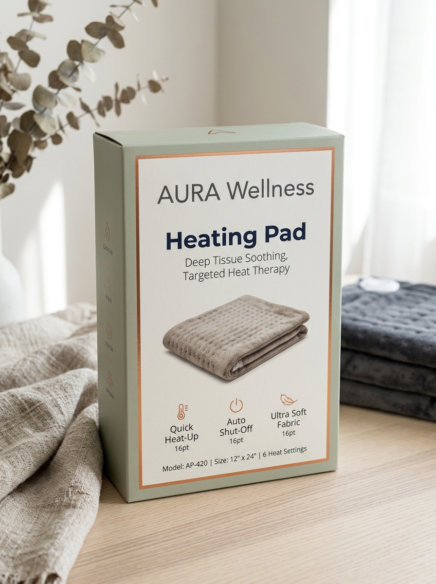
Typography Selections for Readability and Brand Sophistication
Selecting the right typography for heating pads is a strategic balance between aesthetic luxury and functional clarity. To project brand sophistication, premium wellness brands often employ clean, minimalist sans-serif fonts that evoke a sense of modern medical reliability and restorative comfort.
Prioritizing readability is crucial, as users must easily navigate safety instructions, heat levels, and timer settings. Effective typographic strategies include:
- High Contrast: Ensures text is legible against fabric textures or backlit digital controllers.
- Optimal Kerning: Prevents character crowding, which is vital for instructional manuals.
- Visual Hierarchy: Uses bold weights to highlight critical safety warnings and usage tips.
By integrating elegant typefaces with accessible layouts, manufacturers enhance the user experience while reinforcing a professional, trustworthy identity in the therapeutic wellness market.
Leveraging Tactile Finishes and Premium Material Textures
Modern heating pads transcend basic functionality by integrating high-end tactile finishes that prioritize user comfort. Utilizing premium materials such as ultra-soft microplush, luxurious velvet, and breathable coral fleece significantly enhances the therapeutic experience. These sophisticated textures provide immediate sensory relief, which is essential for effective stress reduction and pain management.
Beyond aesthetic appeal, these material choices improve heat distribution and thermal retention. High-quality, hypoallergenic fabrics ensure skin safety and long-term durability, while moisture-wicking properties maintain a dry, comfortable environment during extended use. By focusing on superior textile engineering, manufacturers create ergonomic products that offer a spa-like feel. This attention to tactile detail ensures the heating pad is as soothing to the touch as it is effective at delivering targeted thermotherapy.
Establishing Visual Hierarchy for Technical Product Specifications
When presenting technical specifications for a heating pad, establishing a clear visual hierarchy is essential for user safety and conversion. By prioritizing data, manufacturers help consumers quickly identify critical features like heat settings and safety certifications.
Effective hierarchy utilizes semantic formatting to group key attributes:
- Performance: List temperature ranges, wattage, and rapid-heat technology first.
- Safety & Compliance: Highlight the automatic shut-off timer and UL/ETL certifications.
- Physical Dimensions: Detail the pad size (e.g., King Size 12" x 24") and cord length.
- Material Composition: Specify fabric types like micro-plush or machine-washable polyester.
Structured HTML tags improve SEO by allowing search engines to parse technical data efficiently. A logical flow ensures customers can compare heating levels and safety features at a glance, enhancing the overall user experience.
Integrating Lifestyle Photography to Build Emotional Resonance
Effective marketing for a heating pad transcends technical specifications by utilizing lifestyle photography to forge a deep emotional connection. Instead of merely showcasing heat settings, visual storytelling captures the soothing relief of a warm wrap during a quiet evening or the comforting support provided for menstrual cramps and muscle recovery.
By placing the product in authentic, relatable environments-such as a cozy living room or a post-workout setting-brands help customers visualize the heating pad as an essential tool for self-care and holistic wellness. This approach transforms a functional medical accessory into a symbol of comfort and relaxation. High-quality imagery that reflects the user's daily life builds trust and resonance, addressing the sensory needs of the audience while highlighting the product's role in enhancing their overall quality of life.
Sustainable Design Concepts for Eco-Conscious Health Brands
Eco-conscious health brands are revolutionizing the heating pad industry by prioritizing circular economy principles and material transparency. Sustainable design begins with the outer shell, replacing synthetic polyesters with organic cotton, hemp, or biodegradable linen. These natural textiles enhance breathability while reducing microplastic shedding during use.
For thermal retention, brands are pivoting toward eco-friendly fillers such as flaxseeds, cherry pits, or recycled clay beads rather than chemical-based gels. In electric models, focus is placed on energy-efficient low-wattage components and modular construction, allowing users to replace covers or cords rather than discarding the entire unit. By integrating non-toxic dyes and plastic-free packaging, health brands ensure that thermal therapy aligns with environmental stewardship. This holistic approach to product development reduces the carbon footprint of pain management solutions while appealing to the values of modern, environmentally aware consumers.
Harmonizing Digital Interface Elements with Physical Box Layouts
Achieving synergy between a heating pad's digital controller and its physical packaging is essential for a seamless user experience. Designers must align the visual hierarchy of the digital interface-such as heat intensity icons and timer displays-with the information architecture presented on the box layout.
Effective harmonization involves several key semantic strategies:
- Visual Consistency: Mirroring the typography and color palettes from the box art onto the device's LED display to reinforce brand recognition.
- Ergonomic Mapping: Ensuring physical button placements reflect the instructional diagrams printed on the packaging.
- Intuitive Navigation: Using universal symbols for temperature control and safety shut-off that bridge the gap between the tactile product and its digital functions.
By integrating these design elements, manufacturers reduce cognitive load, allowing users to transition effortlessly from unboxing to therapeutic relaxation.
Shaping a Cohesive Visual Narrative for Therapeutic Relief
Designing an effective heating pad requires a strategic balance between clinical efficacy and domestic comfort. Shaping a cohesive visual narrative involves integrating ergonomic contours with high-quality, breathable fabrics like micro-plush or fleece. By utilizing a soothing color palette-such as deep charcoal or soft slate-manufacturers communicate a sense of calm and professional-grade reliability.
The visual identity extends to intuitive digital controllers and clear LED displays, ensuring the user experience is as seamless as the thermal therapy itself. When the aesthetic matches the function, it reinforces the perception of targeted pain relief and safety. This strategic design approach transforms a medical tool into an essential wellness accessory, fostering trust and promoting deeper relaxation for users seeking relief from muscle tension, cramps, or chronic discomfort.
Leave a comment