
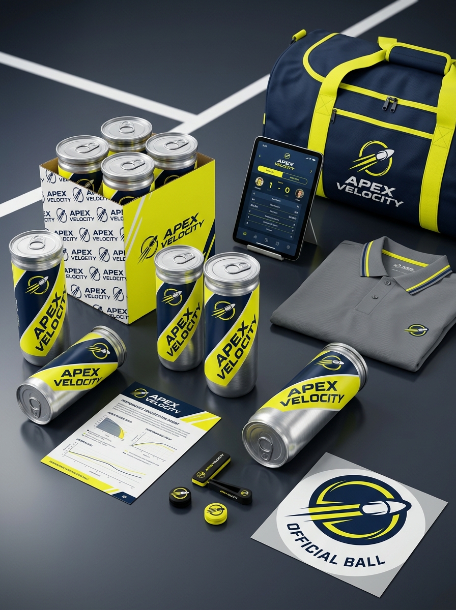
Tennis ball packaging serves as more than just a pressurized vessel; it is a critical touchpoint for brand identity and consumer perception. Exceptional design must balance the practical constraints of cylindrical canisters with the high-energy spirit of the sport. By mastering the core principles of color theory, bold typography, and tactile material finishes, designers can transform standard equipment into iconic sports assets.
Effective tennis ball can aesthetics rely on creating a visual impact that resonates both on the retail shelf and the court. This guide explores the essential design elements-from minimalist transparency to dynamic graphic patterns-that drive shelf appeal and reinforce brand loyalty. Understanding these nuances is vital for creating packaging that protects the product while communicating professional-grade quality to athletes and enthusiasts worldwide.
The Psychology of the Pressurized Cylinder Shape
The pressurized cylinder of a tennis ball can evokes a specific psychological response in players, signaling freshness and professional readiness. Its iconic design is more than functional; it serves as a visual metaphor for stored energy and precision. The tactile rigidity of the cylindrical tube suggests a premium product maintained under optimal conditions, building anticipation for the game ahead.
Crucially, the shape facilitates the ritualistic "pop" sound upon opening-a powerful auditory anchor that triggers a sensory satisfaction associated with new beginnings. This geometric form also provides a sense of consistency and reliability, reinforcing a player's confidence. By housing the balls in a pressurized vessel, the packaging creates a psychological transition from preparation to peak performance, ensuring the athlete perceives the equipment as high-velocity and elite.
Defining Brand Identity Through Sport-Centric Color Palettes
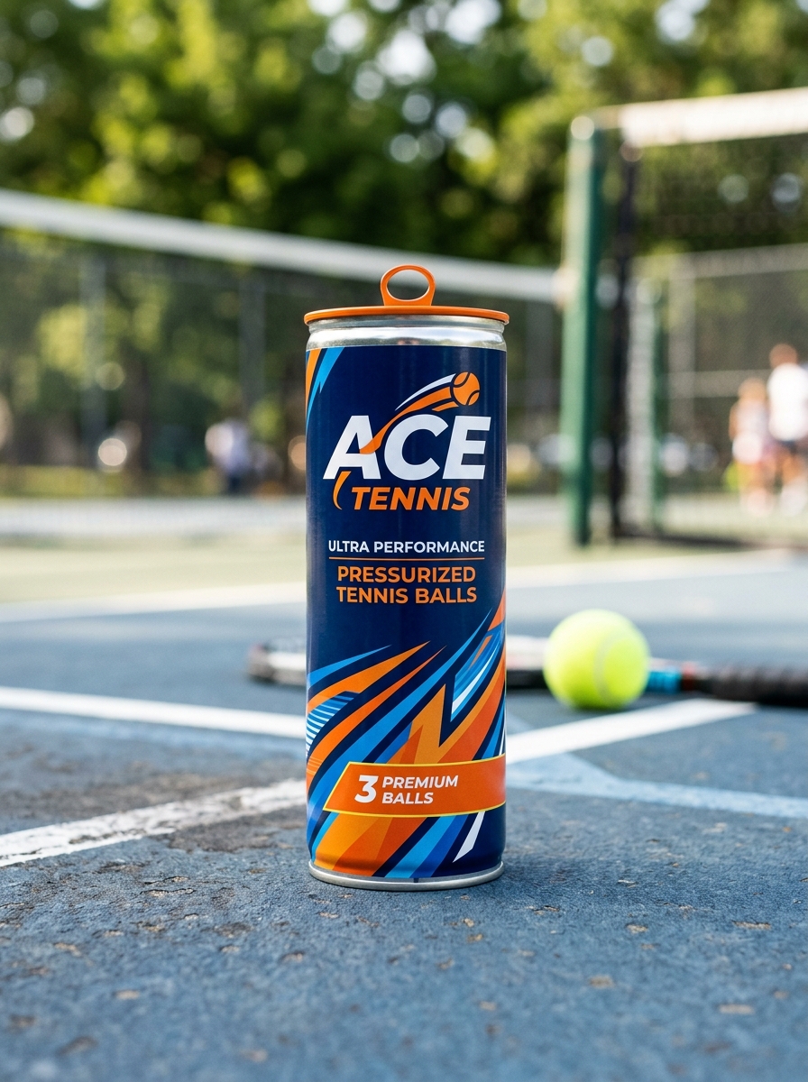
For any tennis ball can, the visual design is a critical component of brand storytelling. Manufacturers utilize sport-centric color palettes to create immediate emotional connections with players. While the "optic yellow" of the balls is a constant, the surrounding packaging acts as a canvas for brand differentiation.
Leading brands leverage high-contrast schemes-such as deep blues, vibrant reds, or metallic golds-to signal product tiers, from championship grade to professional tournament use. These strategic color choices improve shelf presence and communicate performance attributes like durability and pressurized consistency. By integrating these hues into the cylindrical container's design, companies reinforce their brand identity, ensuring their equipment is instantly recognizable on the court and in-store. This alignment of color and function transforms a simple pressurized tube into a symbol of athletic quality and heritage.
Optimizing Typography for Rapid Cylindrical Readability
Designing typography for a tennis ball can requires specialized adjustments to combat the visual distortion caused by a curved substrate. Because the surface recedes from the viewer, standard typefaces can appear compressed or illegible at the edges.
To maximize cylindrical readability, designers implement the following semantic optimizations:
- Condensed Fonts: Utilizing narrow typefaces allows more characters to remain within the viewer's direct line of sight before the "wrap" occurs.
- Increased Tracking: Expanding letter spacing compensates for the natural optical crowding caused by the container's curvature.
- High-Contrast Stroking: Bold weight distributions and high-contrast color palettes ensure brand elements remain distinct under harsh court lighting.
By accounting for these geometric variables, manufacturers ensure that key technical data-such as pressure ratings and felt type-is instantly digestible for players and retailers alike.
Integrating Motion Graphics and Dynamic Court Patterns
Modern branding for the tennis ball can leverages motion graphics and dynamic court patterns to create a high-impact visual identity. By incorporating rhythmic lines and kinetic geometry into the packaging design, manufacturers mirror the fast-paced energy of professional play. These patterns are strategically engineered to enhance brand recognition during high-definition broadcasts and digital streaming.
Integrating these dynamic elements allows for augmented reality (AR) triggers directly on the can's surface. When scanned via mobile devices, the static patterns transform into interactive training drills or player statistics, bridging the gap between physical equipment and digital engagement. This synergy of graphic design and motion technology optimizes the consumer experience, turning a standard utility item into a centerpiece of modern sports storytelling and fan interaction.
The Impact of Texture and Specialized Finishes on Premium Feel
In the competitive sporting goods market, the tennis ball can serves as the primary tactile touchpoint between a brand and an athlete. Integrating specialized finishes-such as matte coatings, soft-touch textures, or metallic foils-significantly elevates the perceived value and premium feel of the product.
These architectural textures do more than enhance visual aesthetics; they provide a non-slip grip and superior moisture resistance. High-end finishes, including embossed branding and UV gloss accents, create a sensory unboxing experience that signals professional-grade quality and elite performance. By focusing on packaging ergonomics and sophisticated surface treatments, manufacturers reinforce brand prestige, ensuring the product resonates with players who equate high-quality packaging with the superior bounce and durability of the tennis balls inside.
Balancing Technical Product Data with Minimalist Design
Designing high-performance tennis ball packaging requires a strategic fusion of complex engineering data and minimalist aesthetics. Consumers need immediate access to technical specifications, such as internal pressure levels, felt composition, and ITF certification, to ensure the equipment meets professional standards.
Achieving this balance involves using clean typography and purposeful whitespace to present technical product data without overwhelming the visual experience. By prioritizing information hierarchy, manufacturers can highlight durability and bounce consistency while maintaining a sleek, modern brand identity. This approach ensures that the tennis ball can serves as both a functional pressurized vessel and a premium marketing tool, bridging the gap between high-performance sports science and contemporary minimalist design.
Enhancing the Sensory Experience of the Pressure Seal
Opening a fresh can of tennis balls is a ritualistic experience defined by the iconic auditory "pop." This pressurized release, typically set at 14 psi, serves as an immediate sensory indicator of ball freshness and internal bounce integrity. Manufacturers meticulously engineer the metal ring-pull and vacuum seal to ensure this sound is sharp and consistent.
The sensory experience extends beyond sound to include:
- Olfactory Cues: The distinct, nostalgic scent of new rubber and felt confirms the product is pristine.
- Tactile Feedback: The mechanical resistance and smooth peel of the lid provide a sense of quality and security.
This multisensory feedback loop builds player confidence. While a silent seal suggests "dead" balls, a vibrant hiss guarantees high-performance play, making the pressure seal a critical psychological touchpoint in the sport.
Differentiating Product Tiers Through Visual Hierarchy
In the competitive tennis market, visual hierarchy on a tennis ball can is essential for guiding consumers between recreational, championship, and professional-grade tiers. Manufacturers use strategic design elements to communicate performance levels instantaneously.
- Color Palettes: Premium "Pro" tiers often utilize metallic golds, silvers, or matte blacks to signify high-end quality, whereas entry-level cans typically feature bright, high-contrast primary colors.
- Typography and Scale: Bold, dominant headings highlight specific felt types, such as Extra Duty or Regular Duty, ensuring players identify court compatibility quickly.
- Iconography: Strategic placement of ITF (International Tennis Federation) seals and technical diagrams illustrates internal pressurization and felt durability.
By organizing these elements logically, brands create a clear value proposition, helping players select the correct pressurized can based on their skill level and court surface requirements.
Advancing Sustainability with Eco-Friendly Can Innovations
Traditional tennis ball cans have long presented recycling challenges due to their composite construction of pressurized plastic and metal. However, the industry is now prioritizing sustainability through cutting-edge material innovations. Modern eco-friendly packaging solutions include 100% recyclable PET plastics and redesigned pull-tabs that simplify the waste separation process.
Beyond traditional shapes, some manufacturers are introducing pressurized cardboard tubes and reusable pressure-retaining canisters. These advancements significantly reduce the carbon footprint of the sport by minimizing single-use plastic waste. By integrating biodegradable materials and circular economy principles, these innovations ensure that maintaining peak ball performance no longer comes at the expense of the environment. Transitioning to these sustainable alternatives is a vital step toward a greener future for athletes and clubs worldwide.
Future Trends in Athletic Equipment Brand Storytelling
The future of brand storytelling for athletic equipment, specifically the tennis ball can, is evolving toward sustainability and digital immersion. Manufacturers are pivoting from traditional pressurized packaging to eco-friendly, circular materials, making environmental responsibility a core narrative.
Modern brands leverage the sensory experience-such as the iconic "pop" upon opening-to forge emotional connections with players. Furthermore, smart packaging trends are integrating QR codes and AR technology directly onto the container, offering athletes instant access to training drills or supply chain transparency.
By blending heritage with high-tech functionality, storytelling transforms the humble tennis ball can from a disposable commodity into a symbol of conscious innovation. This shift ensures that even basic equipment communicates a brand's commitment to performance and the planet.
Leave a comment